Ke Gusto?
Brand Identity Design and Packaging Design.
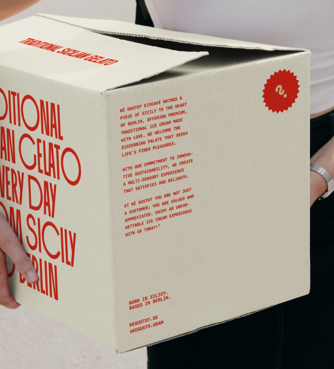
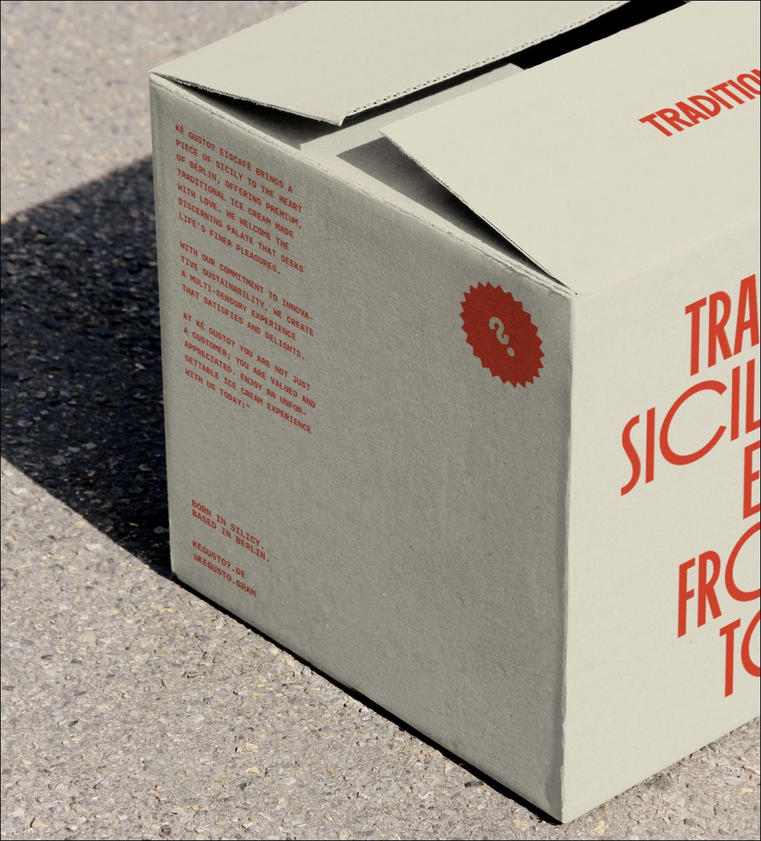
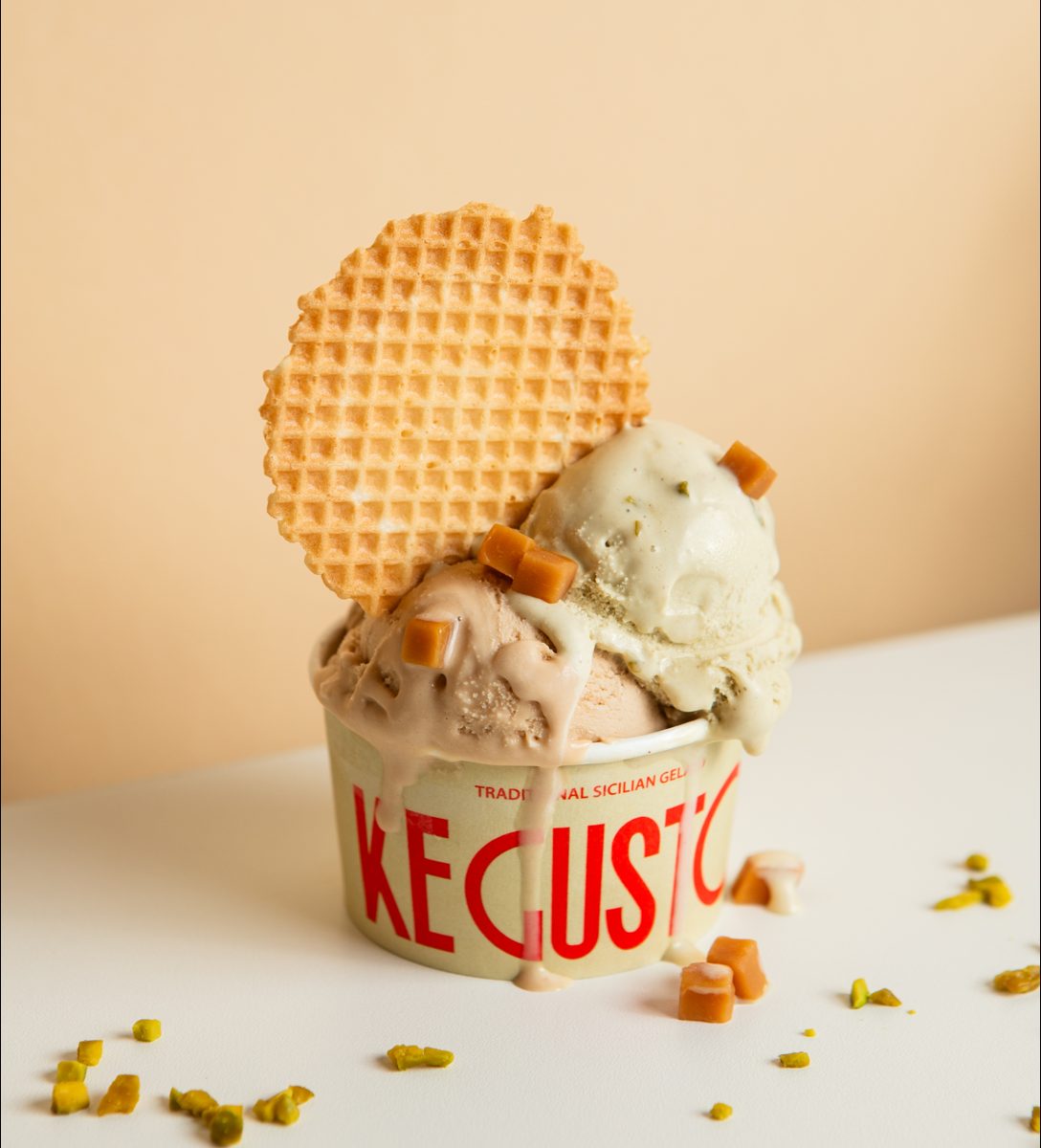
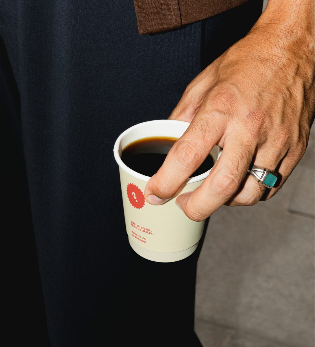
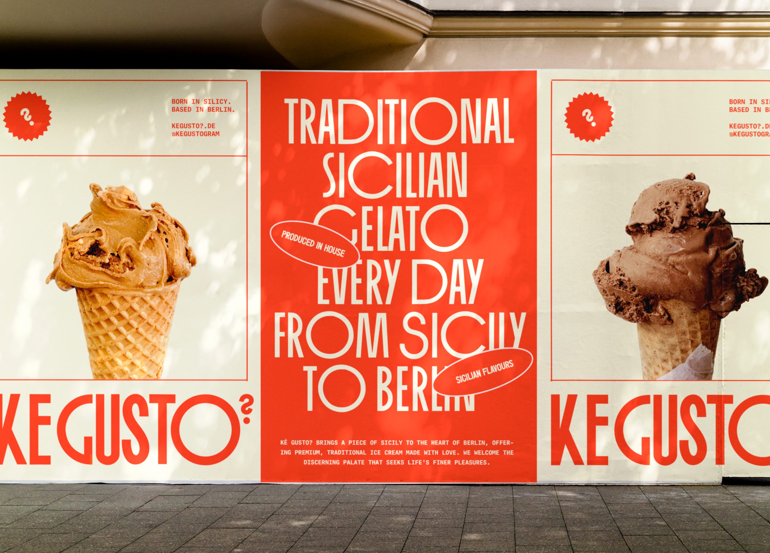
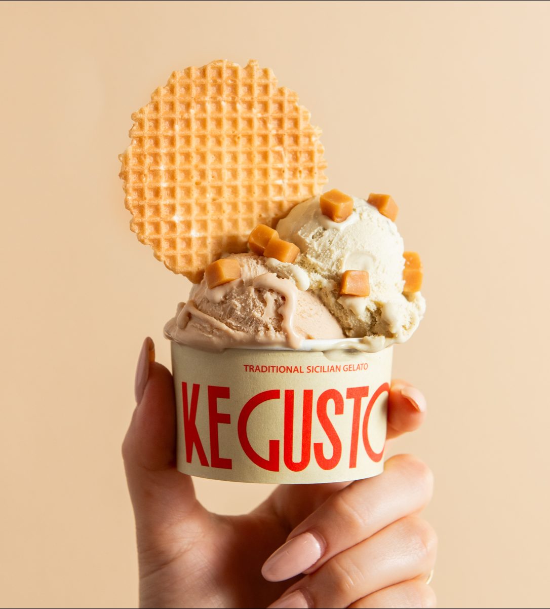
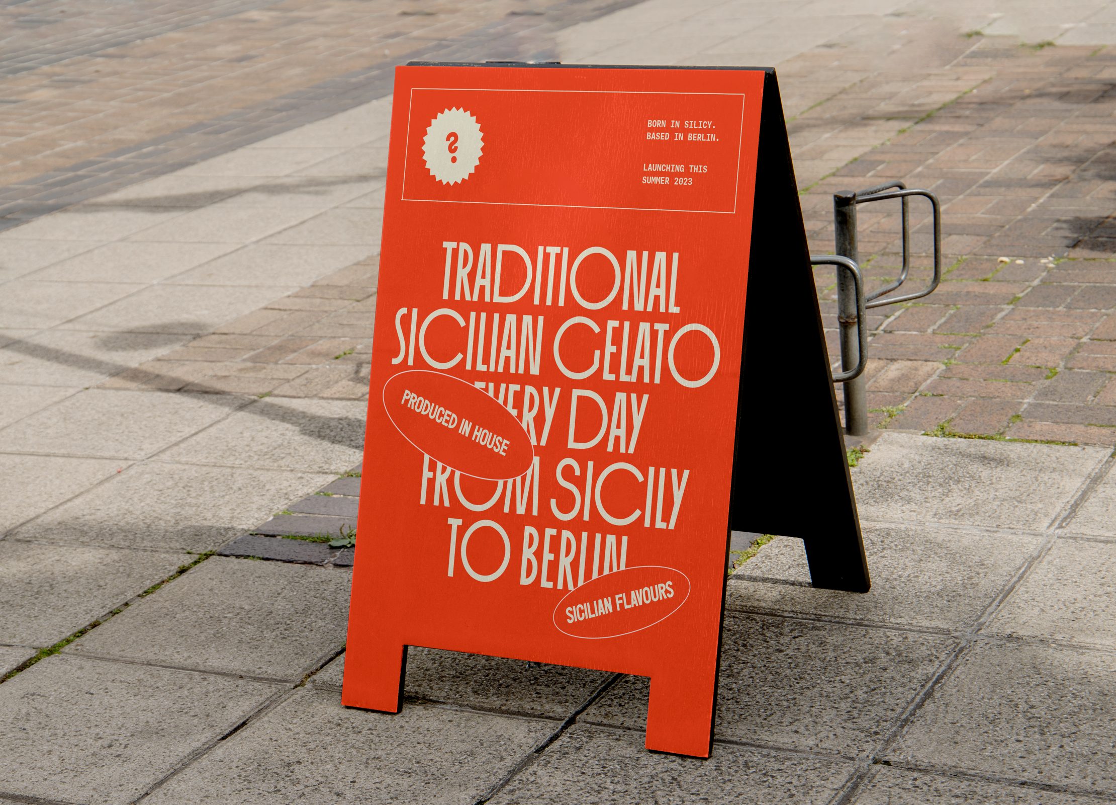
Bringing a piece of Sicily to the heart of Berlin, Ké Gusto? Gelato Cafe offers premium and traditional gelato and coffee made with love, welcoming a sophisticated audience with a discerning palate who seek the finer things in life. Ké Gusto?, translating to 'Which flavour?" Italian, centres the brand around a commitment to innovative sustainability, passionately creating a multi-sensory experience that guarantees to satisfy every time.
Positioning Ké Gusto? as the innovative and sophisticated purists of the Berlin ice cream market - offering traditional and authentic Italian experience delivered in a modern and contemporary way - we needed to define an original brand identity that is bold, modern and loud, putting a modern twist on traditional Italian typography and imagery whilst removing the risk of blending the masses of Italian ice creameries competing in Berlin - who focus on visually communicating their heritage classically and traditionally.
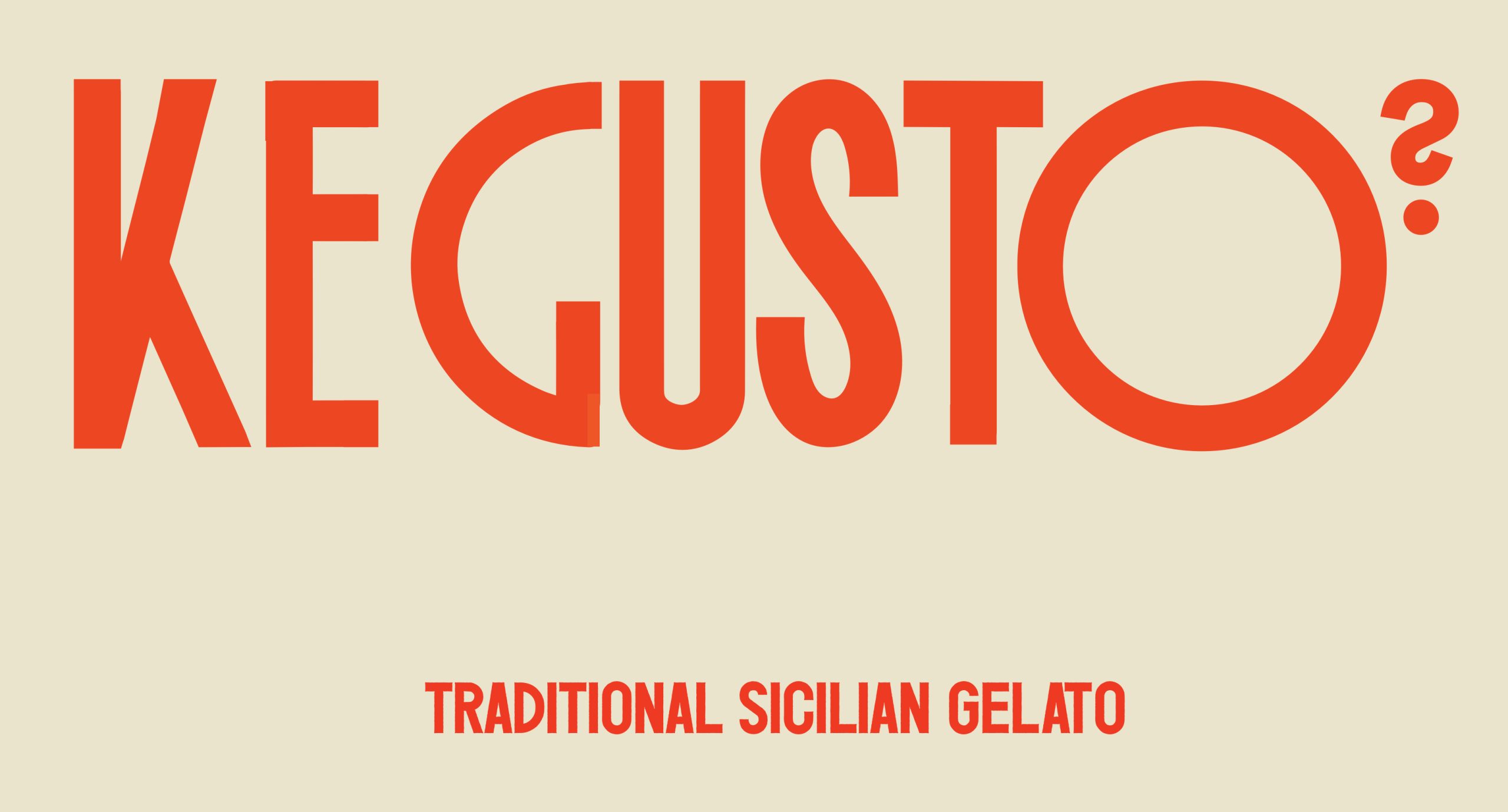
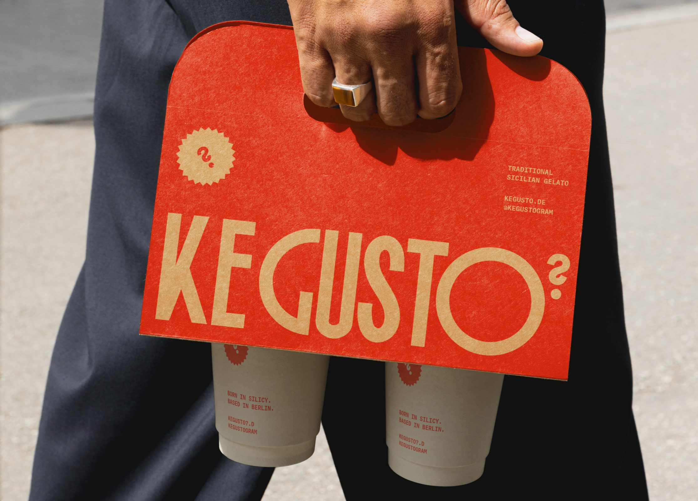
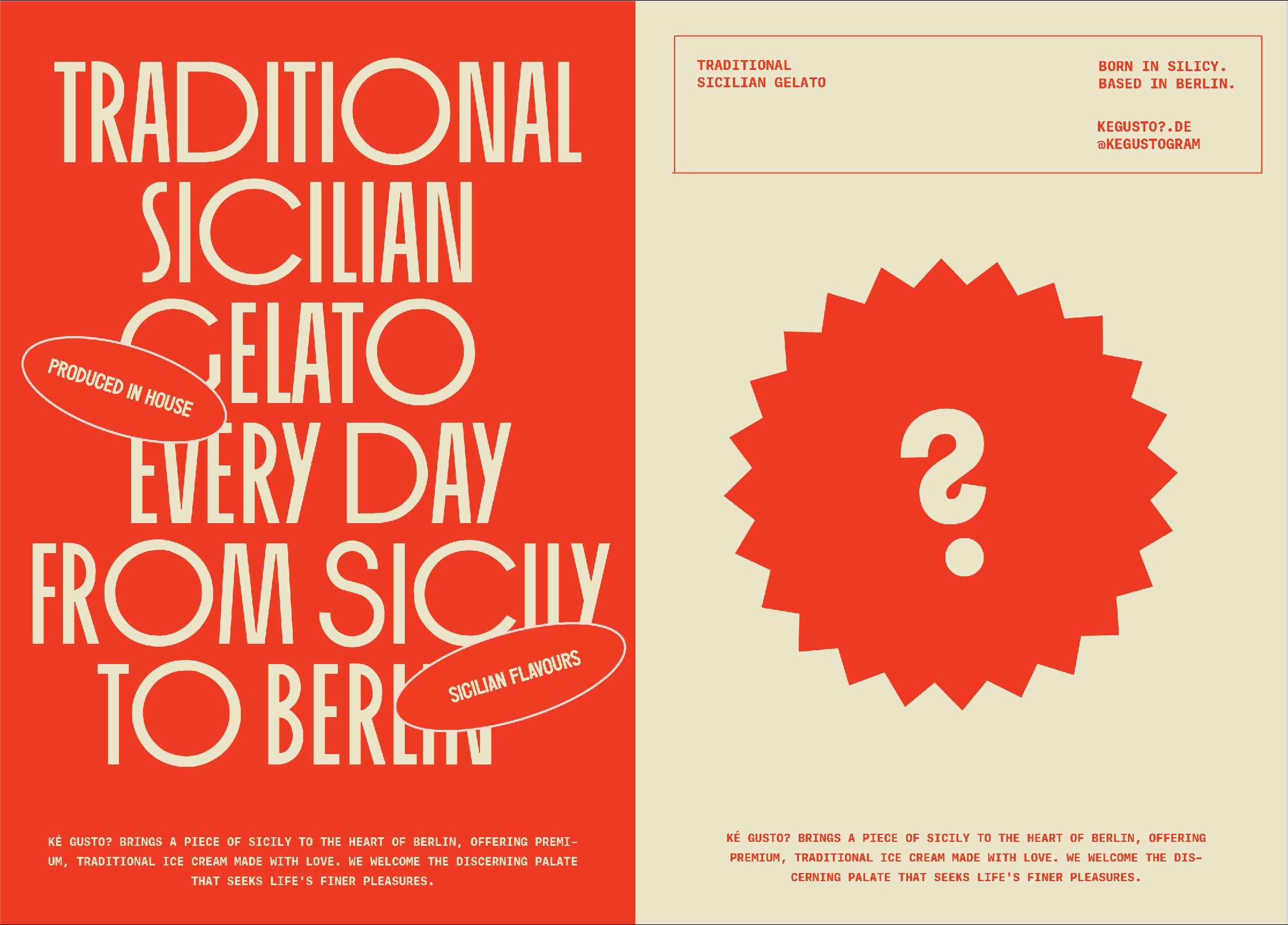
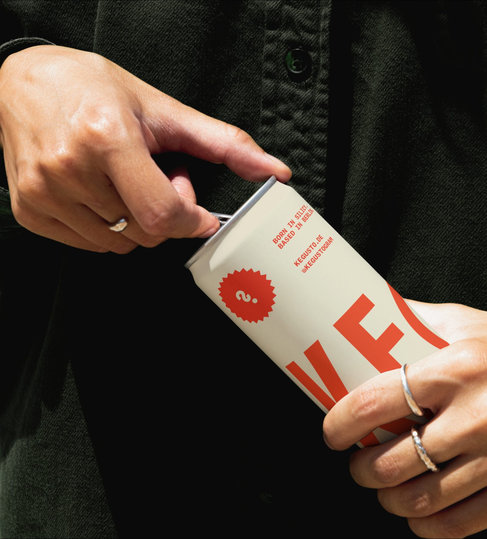
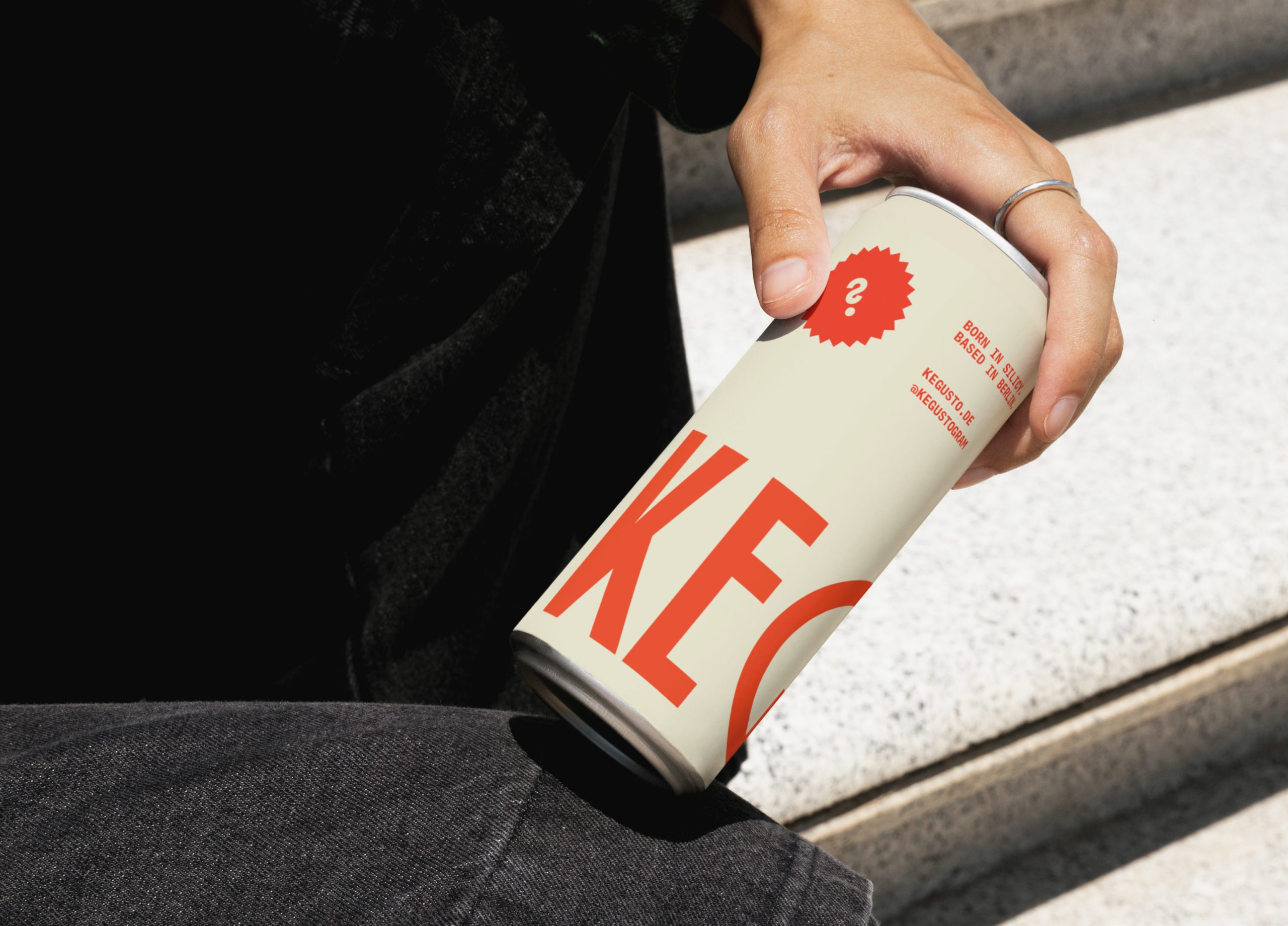
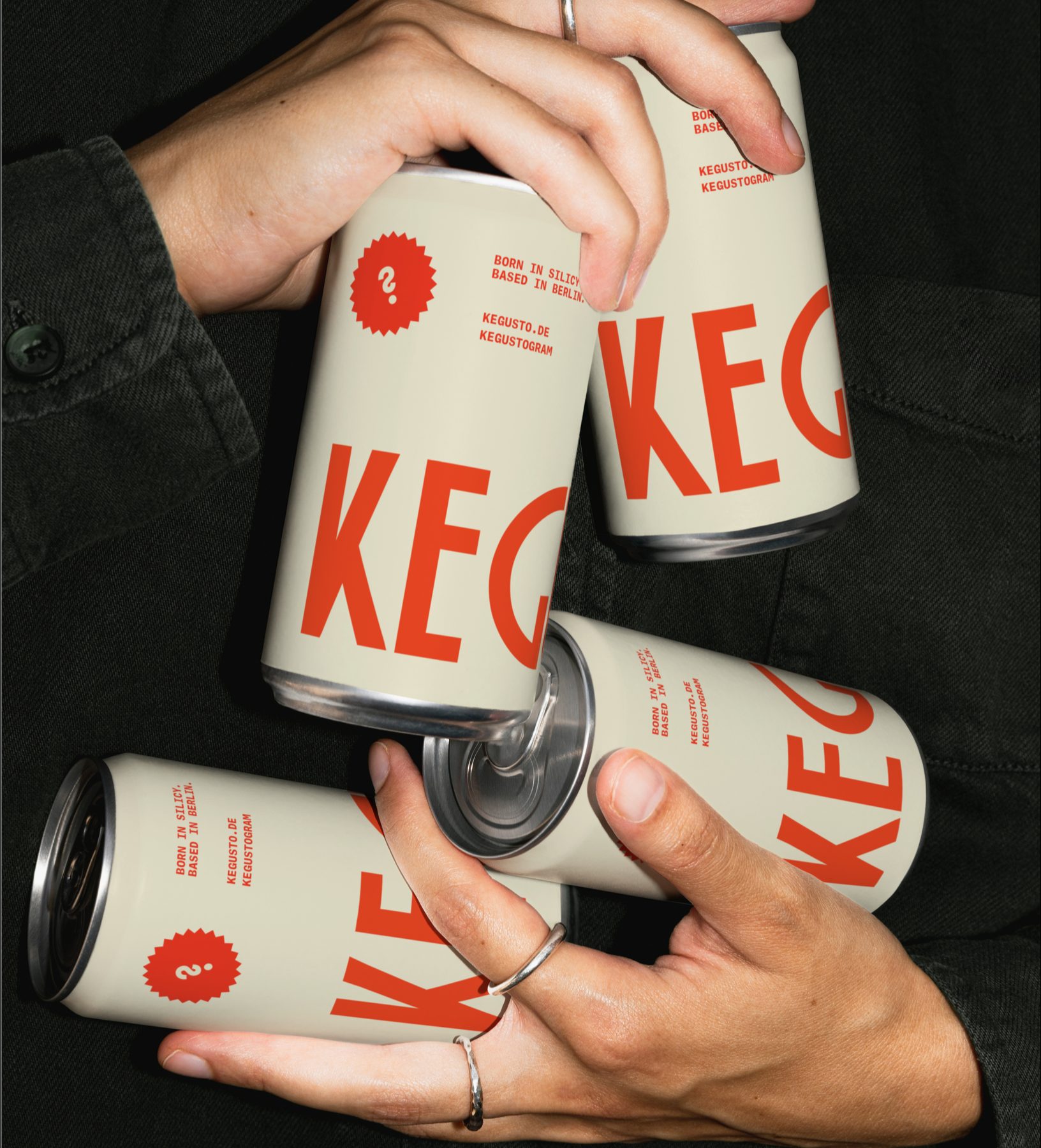
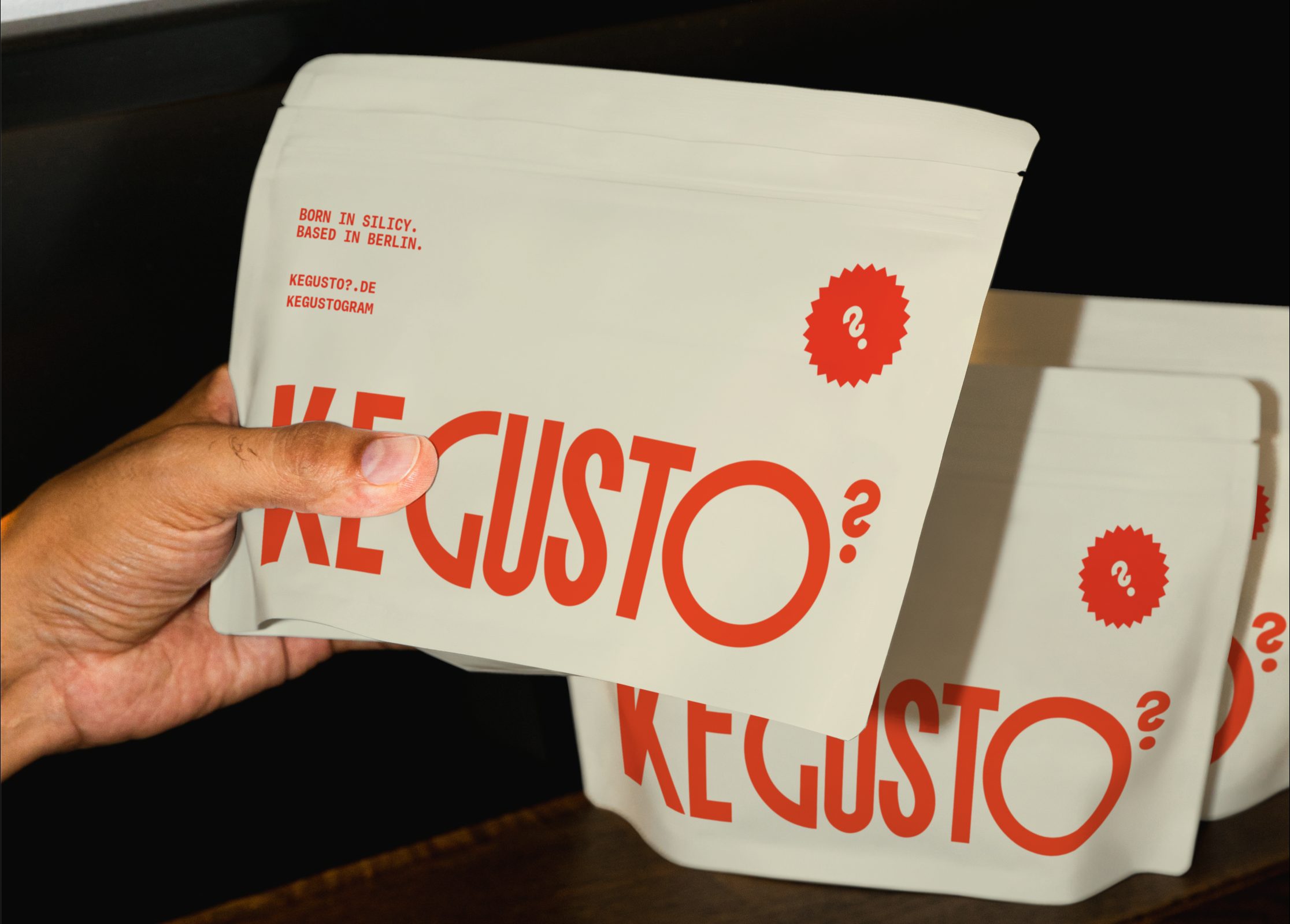
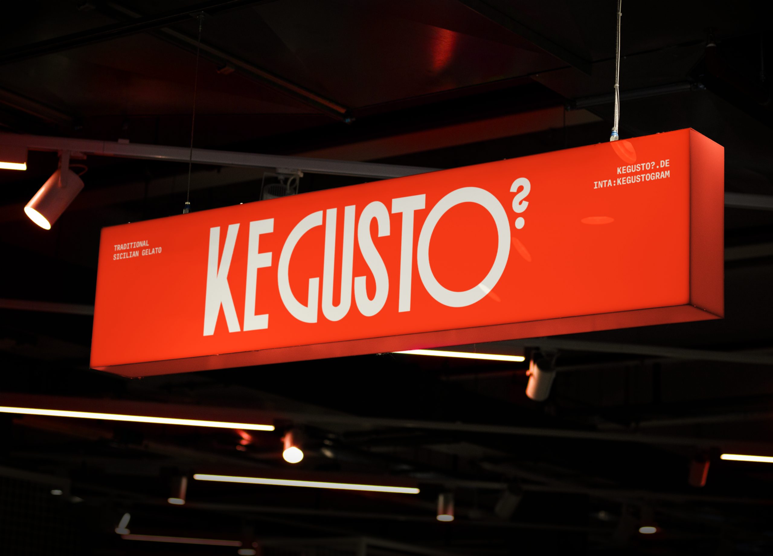
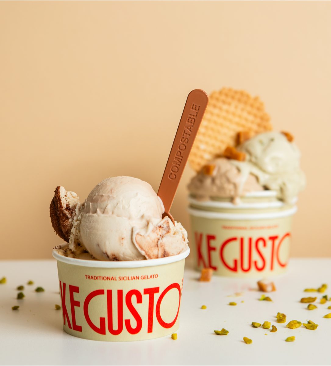
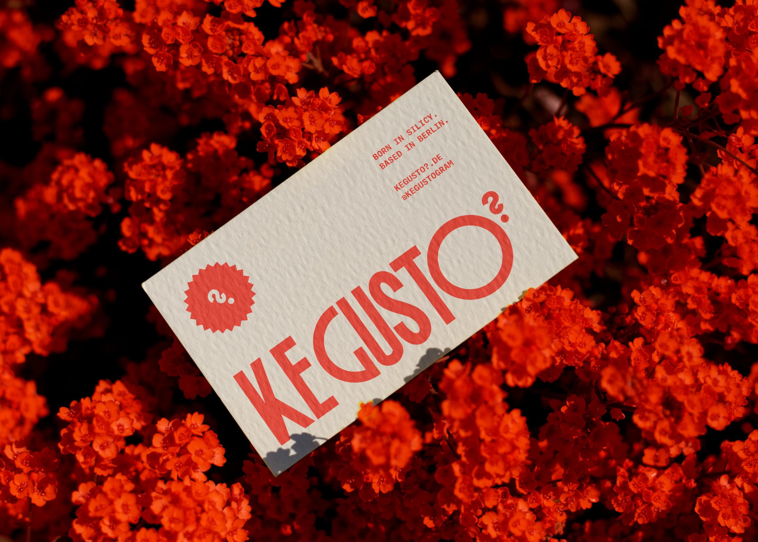
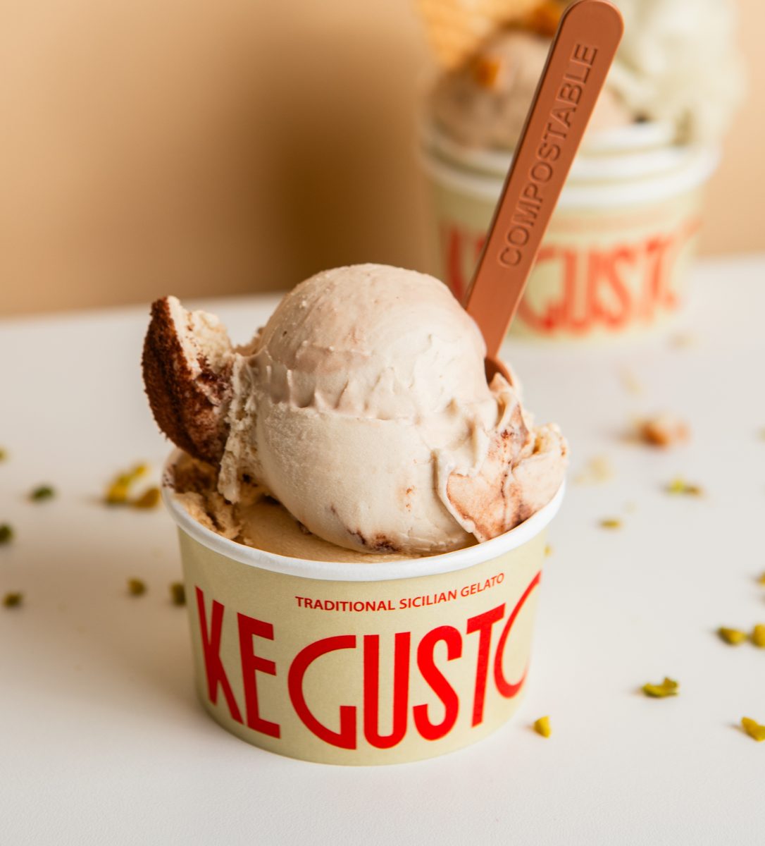
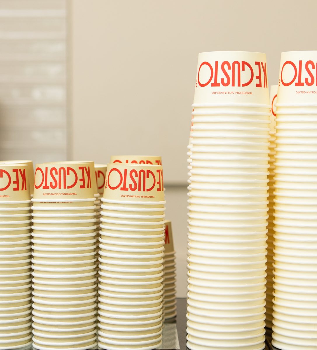
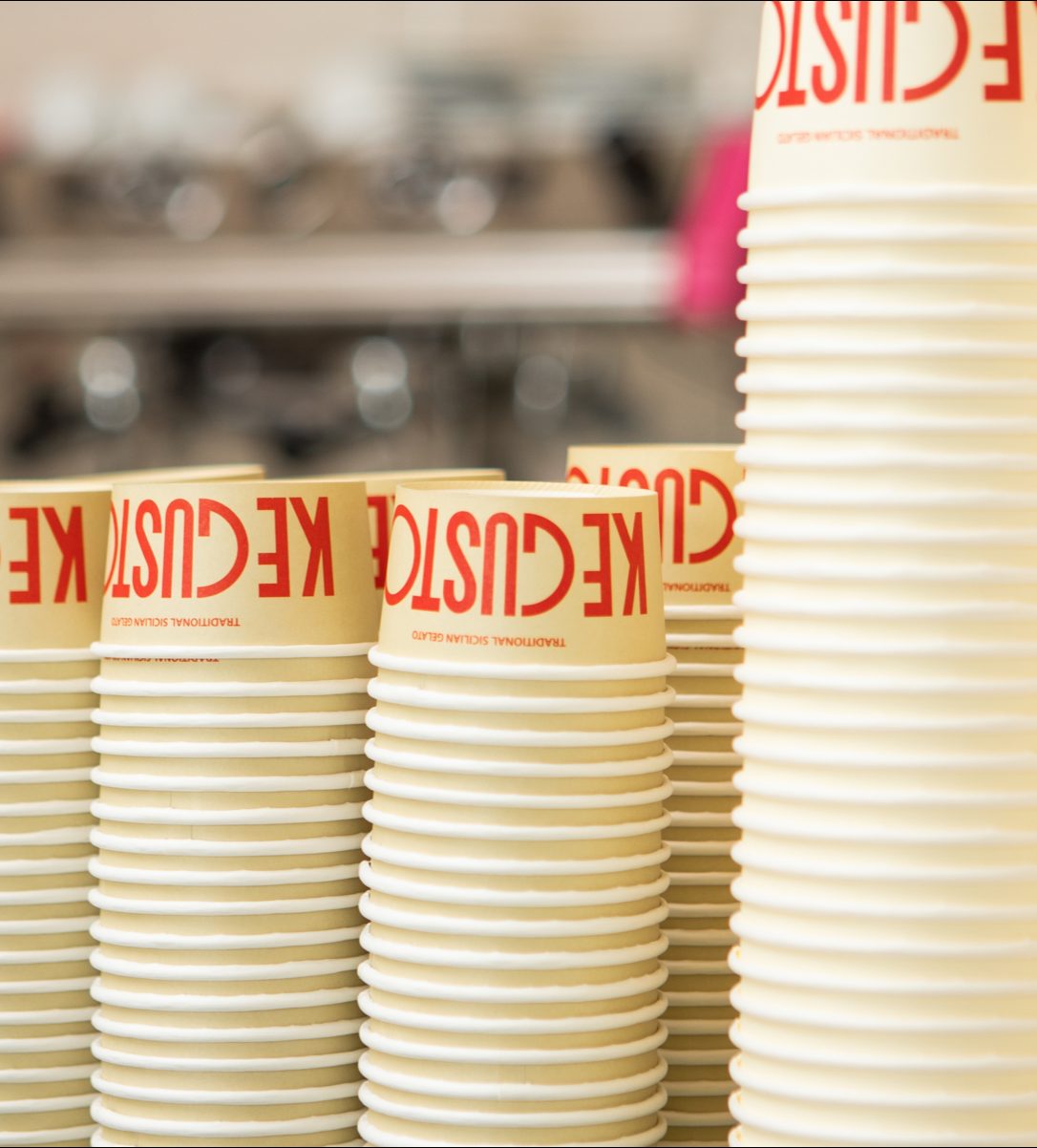
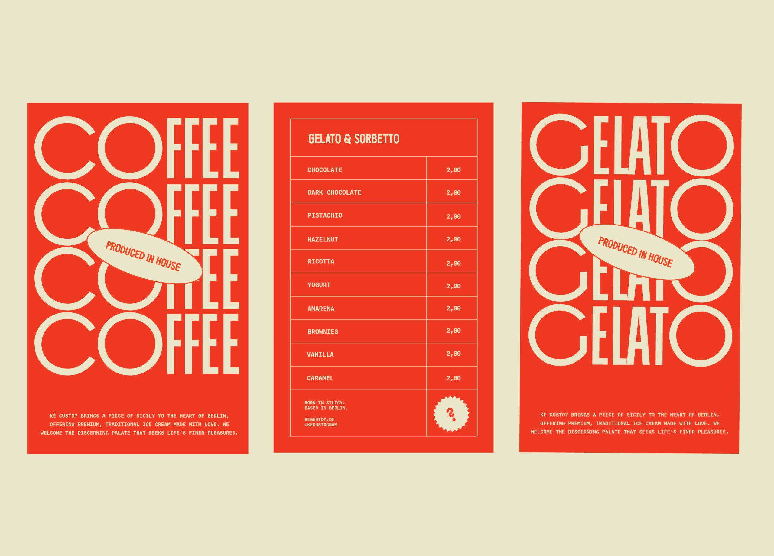
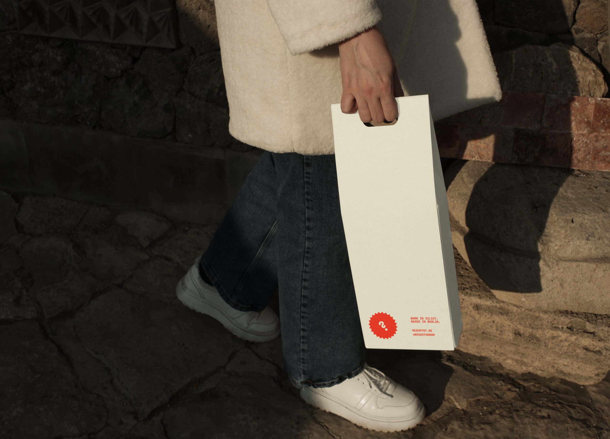
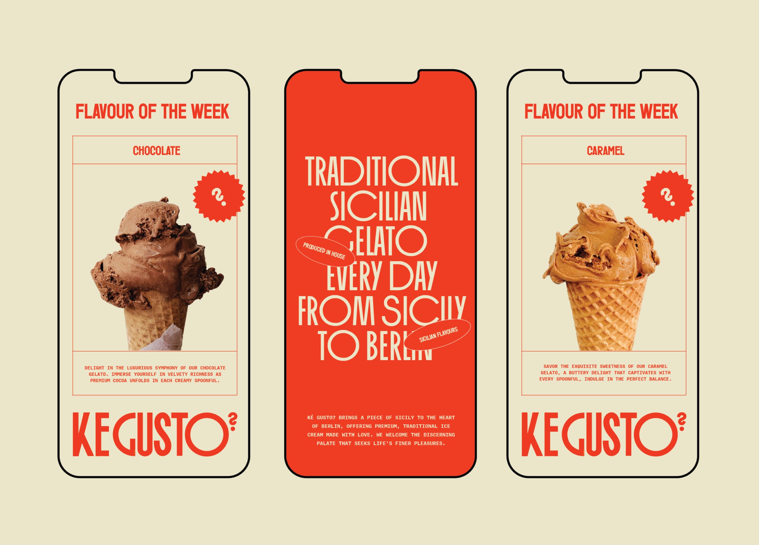
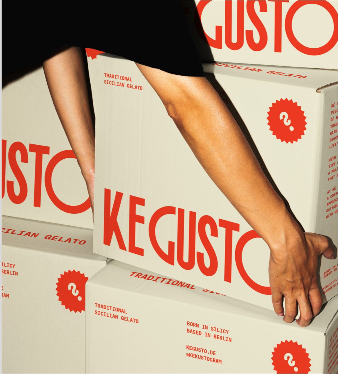
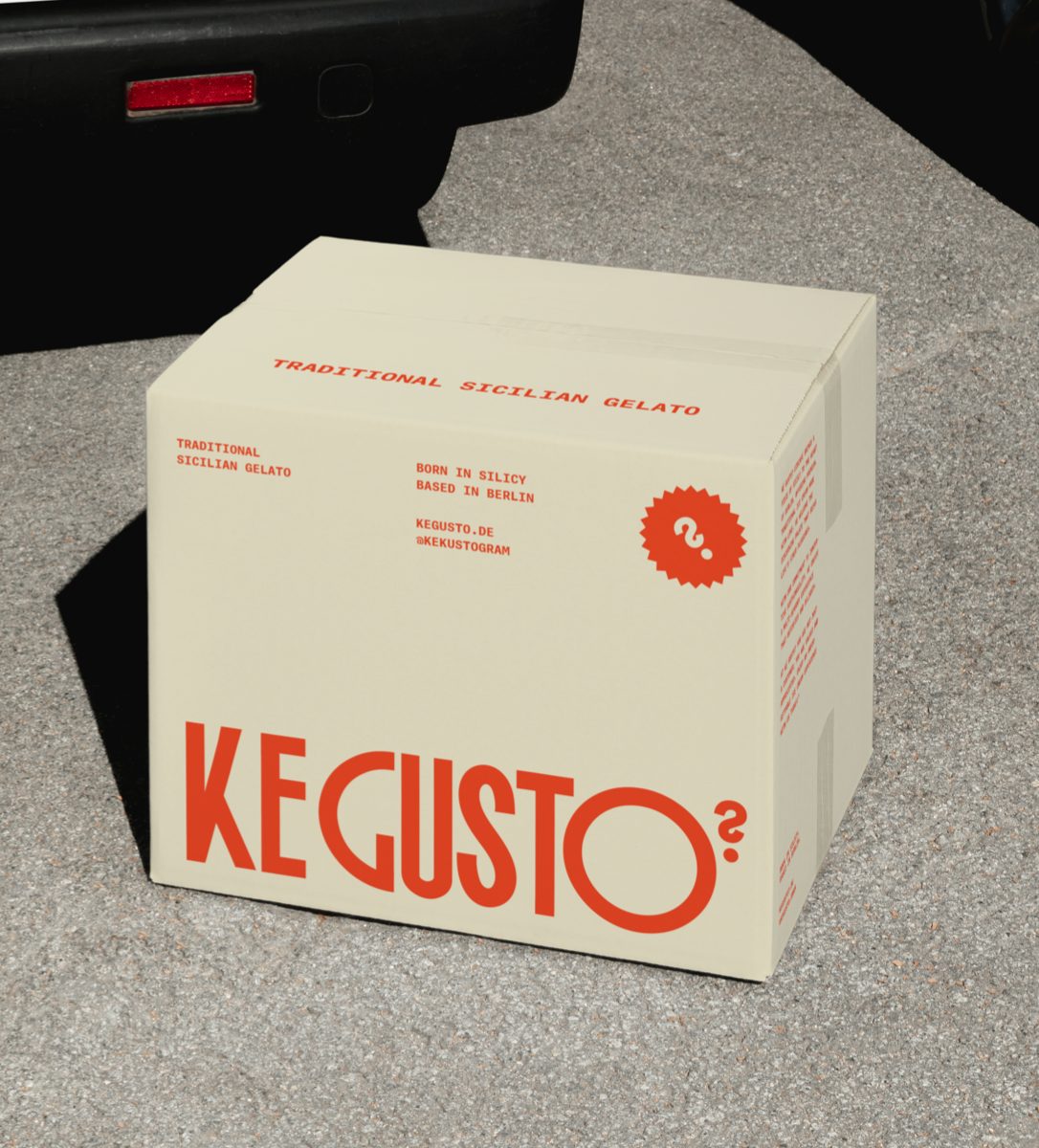
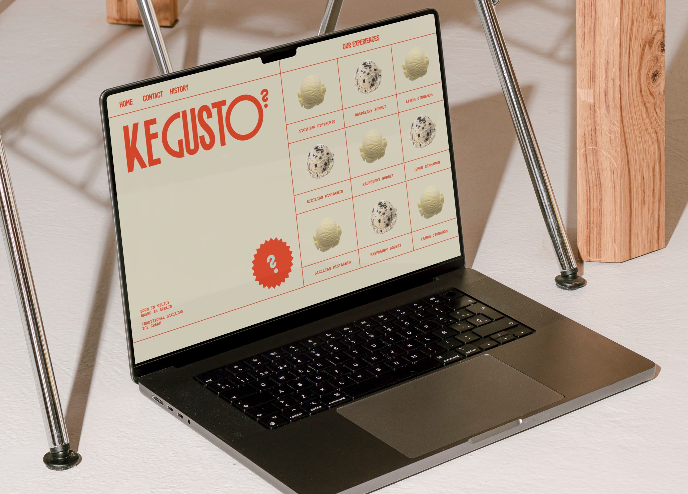
Inspired by traditional Italian san serif typography, Ké Gusto?’s customised wordmark visually communicates a sense of elevation without feeling too exclusive, focusing on creating a modern rendition of traditional Italian typography, representing a modern approach to a traditional product, in a premium yet approachable way. The wordmark explores the use of wide extended letterforms within the ‘O’and ‘G’ creating recognisable Italian heritage and character. The question mark from the wordmark is extracted to create a recognisable brand symbol and stamp of approval across all brand touchpoints, making direct reference to the meaning of the brand name, 'Which flavour?".
Allowing the customised typographic wordmark to act as the hero of the brand, this key foundation lets the surrounding brand language such as typography, bold colour and photography take a back seat, whilst remaining informative and user-friendly to a range of age groups. Our final choice of colour palette balances a bright rich orange with a light beige through a duotone treatment, creating a sophisticated yet energetic feel that speaks to a broad age group. The pastel tones make a visual connection to the ice cream itself whilst the vibrant block colour orange is used across brand touch-points for improved shelf recognition, catching attention and insistent brand memorability within Berlin.
From the core identity through to brand language, campaign design & packaging design, Ké Gusto?’s mission was to create a contemporary multi-sensory experience that appealed to the ice cream connoisseurs of Berlin, putting a modern spin on the traditional and serving up an unforgettable experience with each scoop.
Location: Berlin, Germany
Photography Art Direction: https://www.alphin.com/
Mockups by: Format Mockups & Bendito Mockup