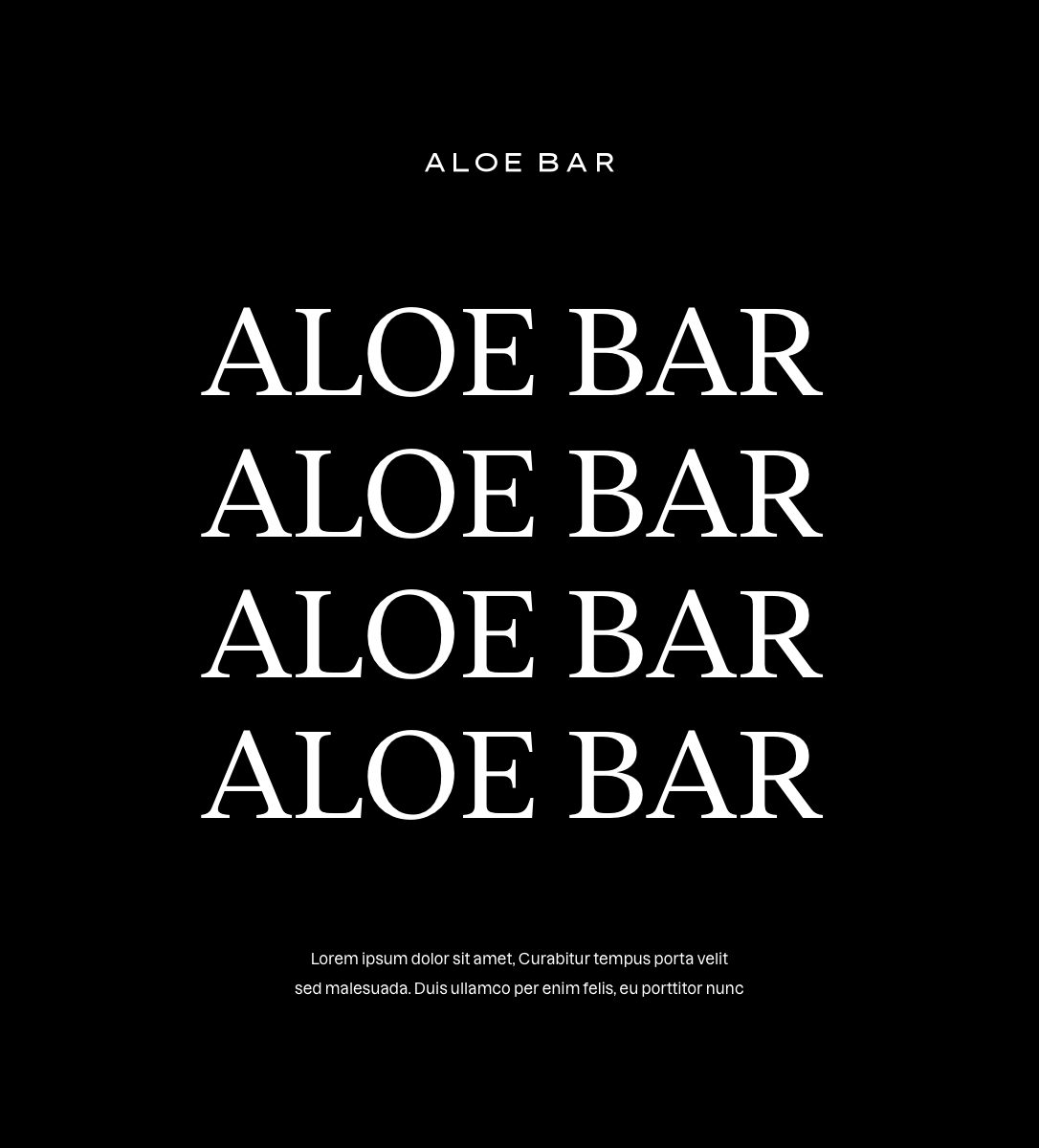
Aloe Bar
Brand Identity Design, Packaging And Art Direction
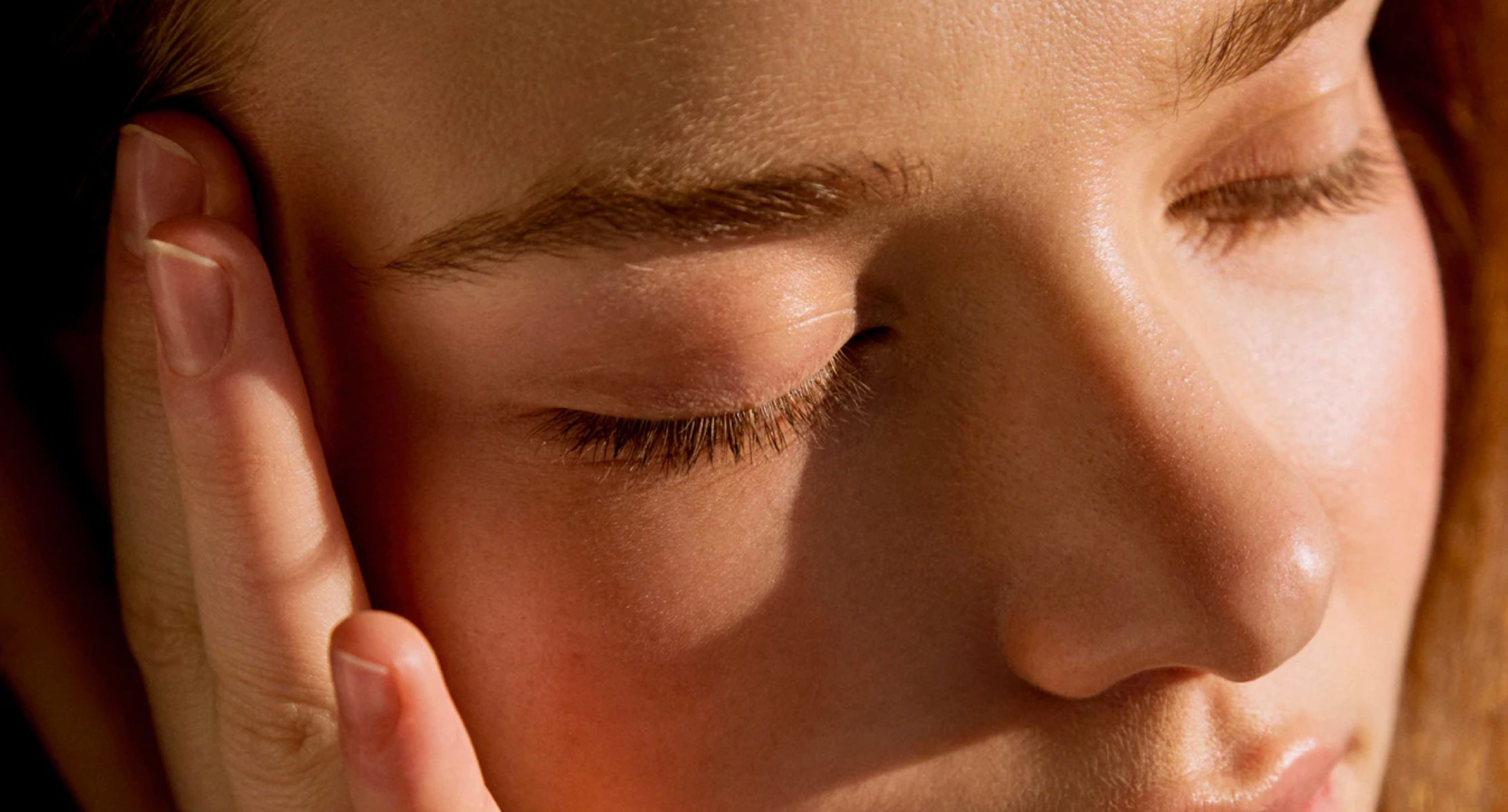
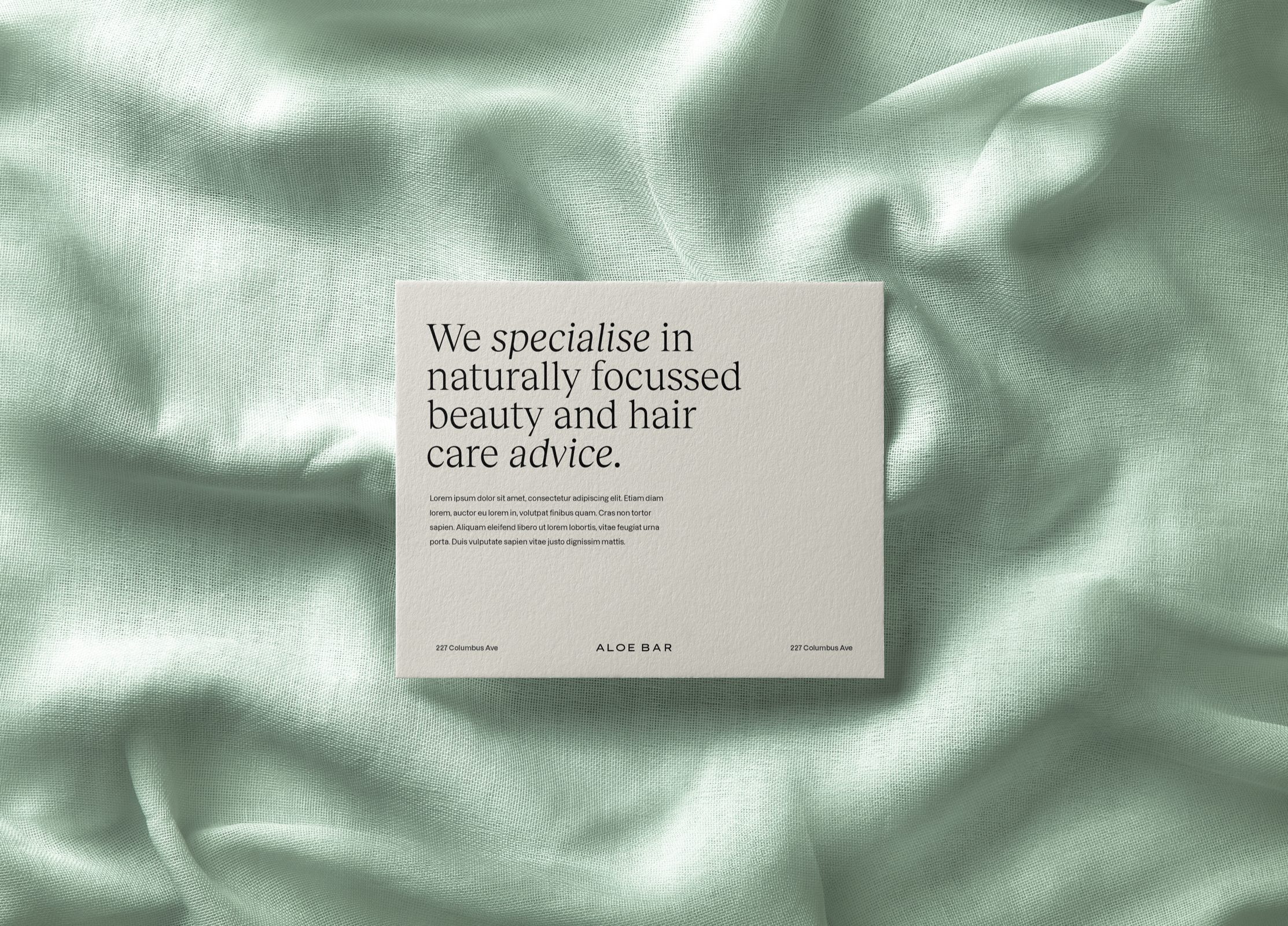
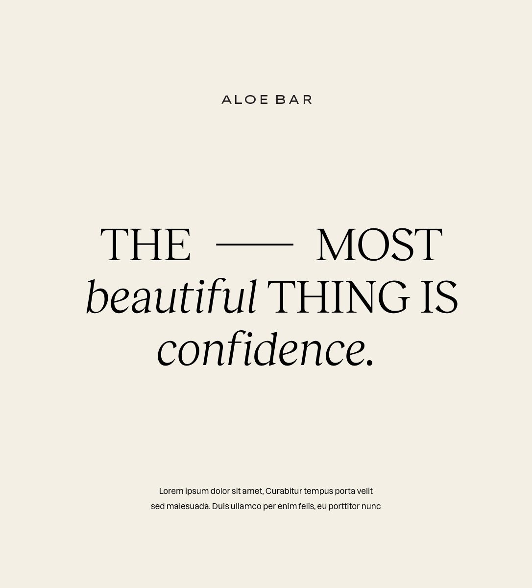
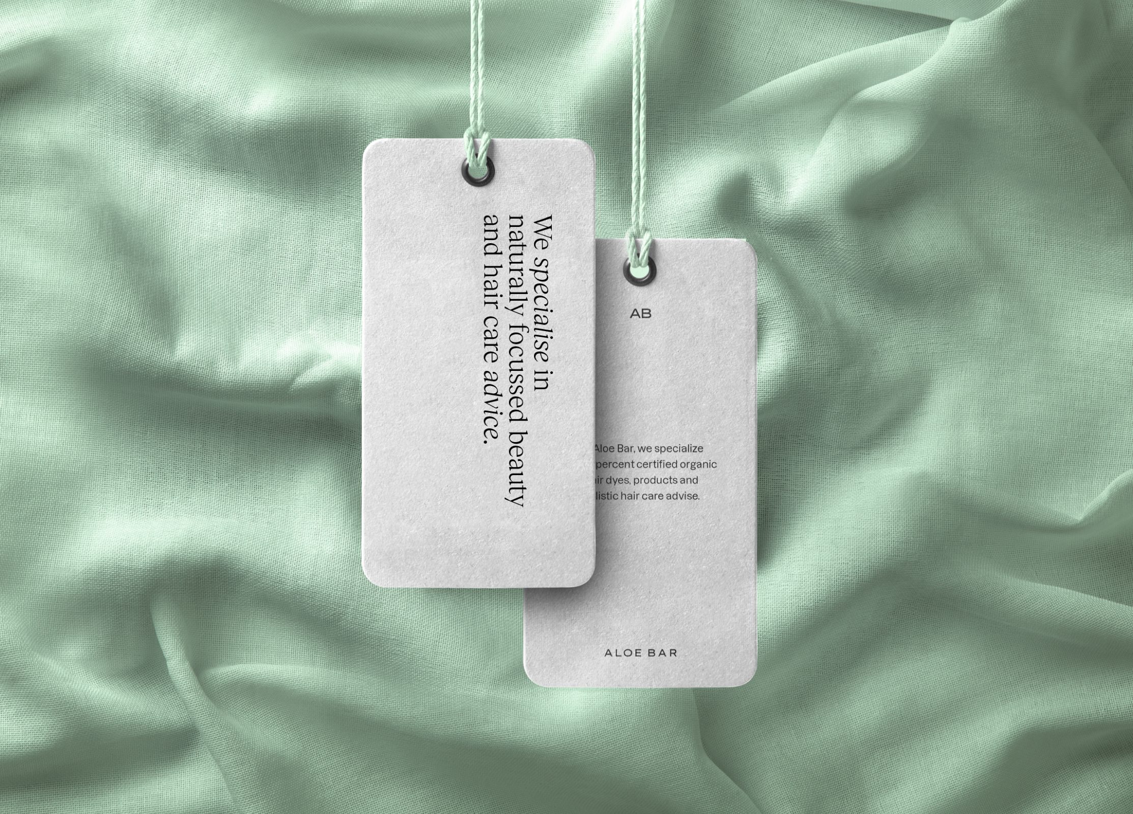
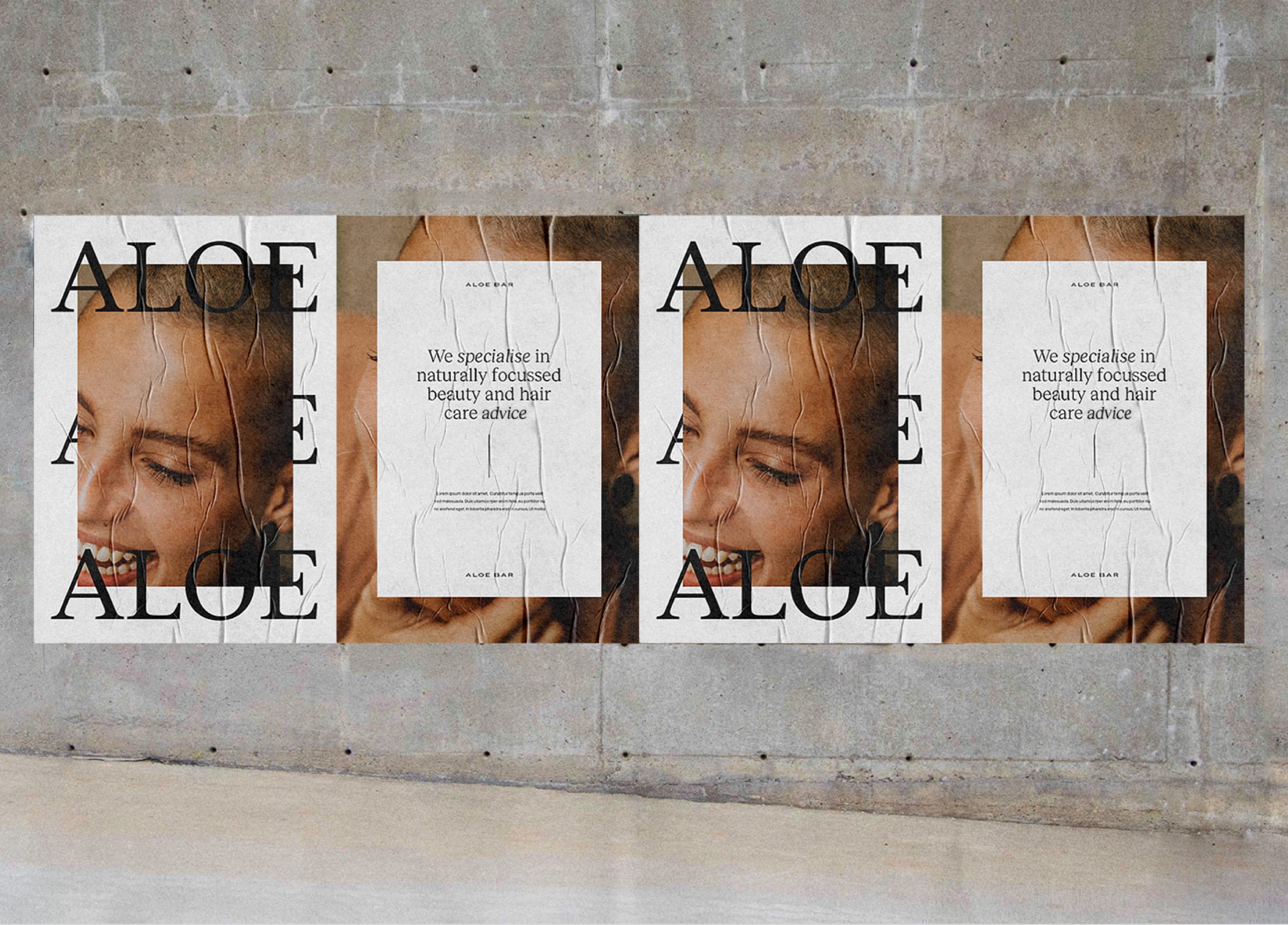
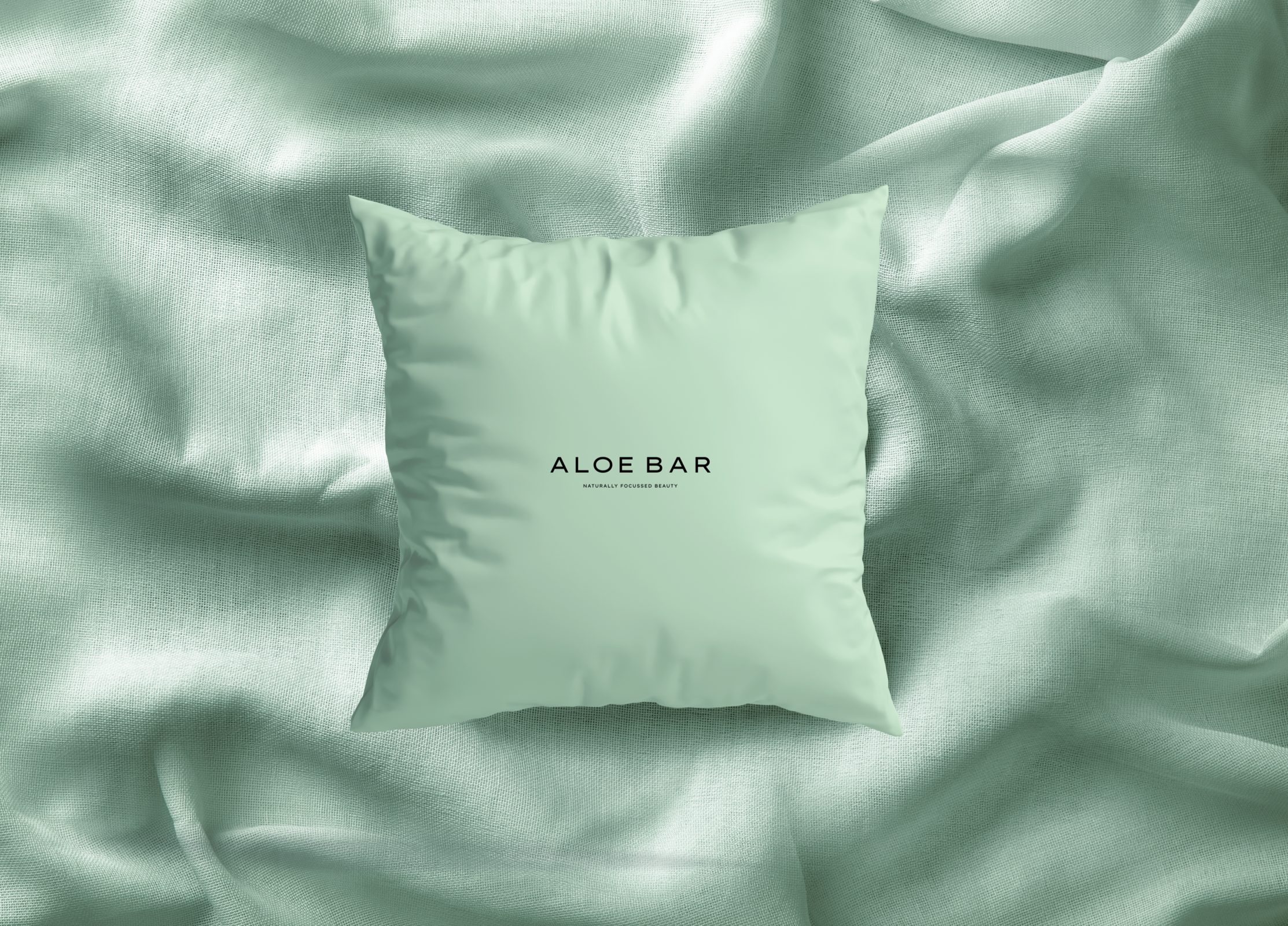
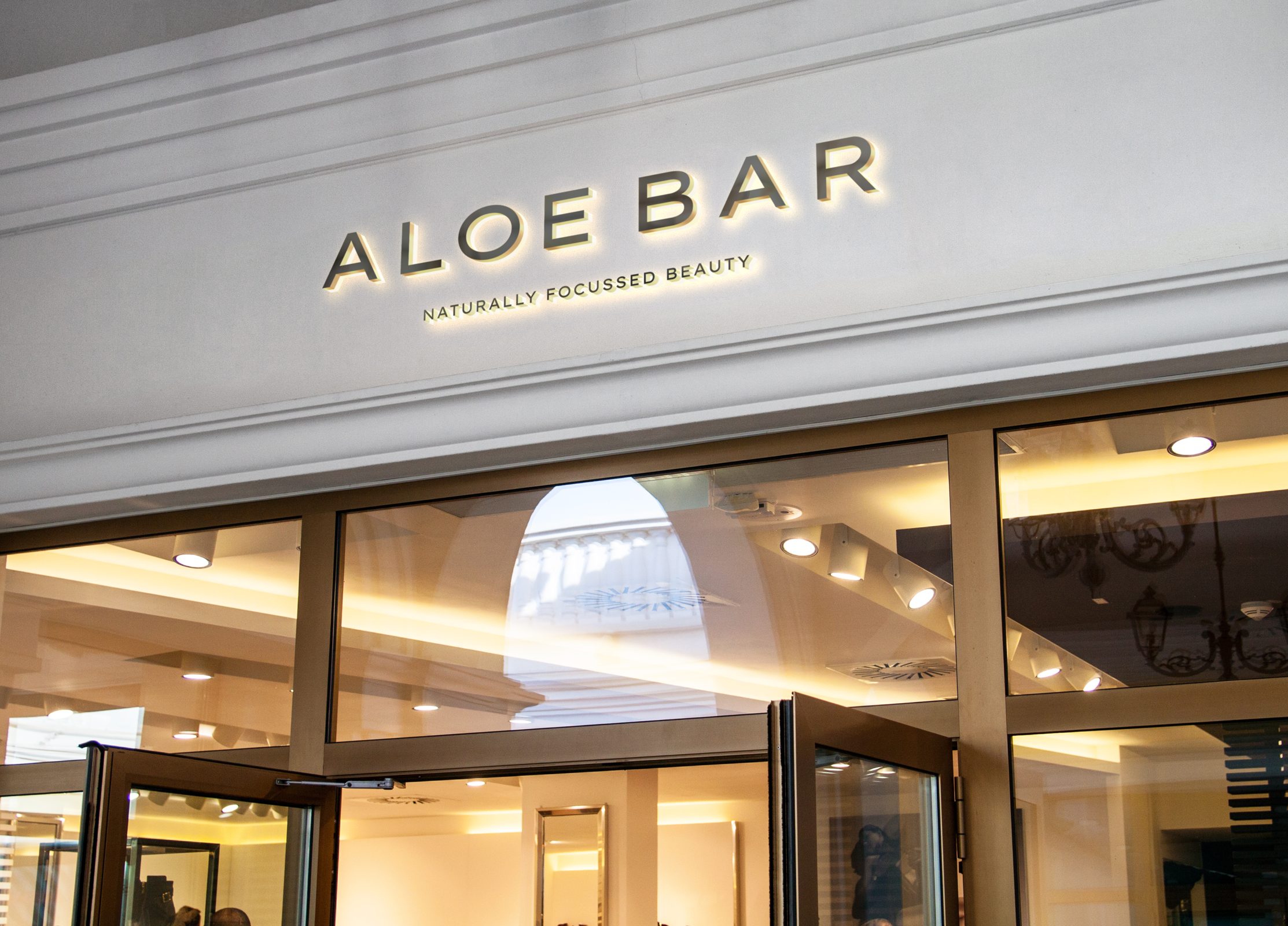
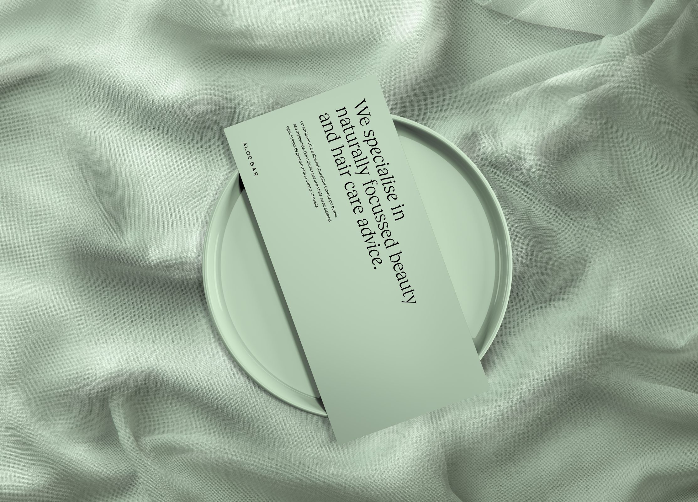
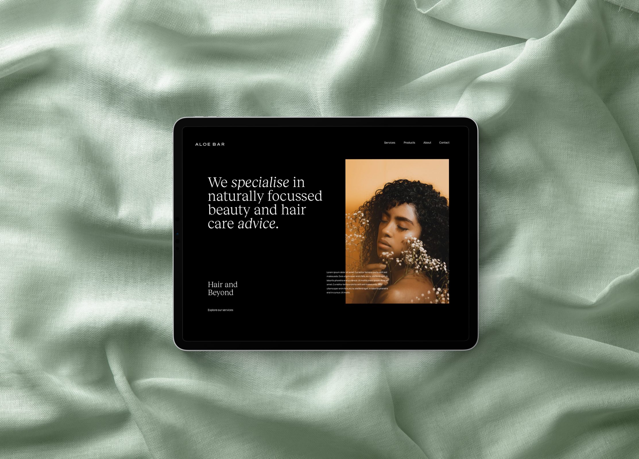
Located in the city of London, Aloe Bar is a premium hair salon boasting the highest quality of natural and organic hair treatments where women can come to relax and leave feeling beautiful. With a focus on not being literal, the brand identity focusses on the power of ultra-clean minimalism to represent the ‘clean’ approach Aloe bar takes towards there services, using only 100% natural and ‘clean products’. The choice of spaced out uppercase sans-serif typography within the logo mark represents strength and confidence and reinforces Aloe Bar’s belief in the power of using natural products to strengthen your hair, without making a literal reference to aloe vera. A choice of slanted Italics is paired with the brand mark to create a sense of maturity and a wealth of knowledge. The colour green that was chosen is known to create a sense of harmony, inner peace, and approachability, representing how the customers of Aloe Bar feel when they leave.
Store Location: London - UK & Toronto, Canada