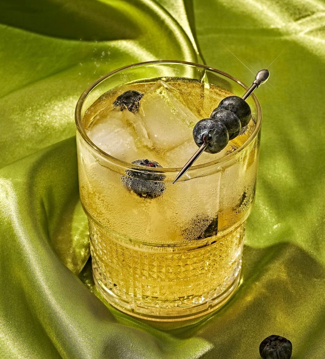
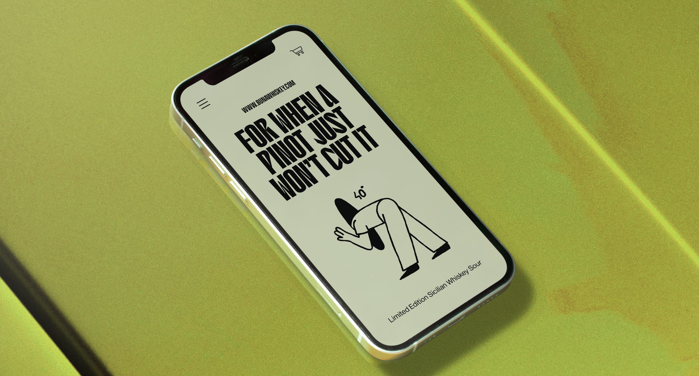
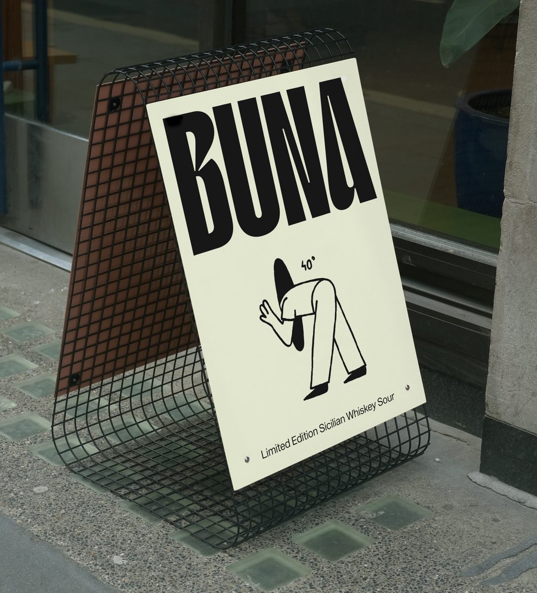
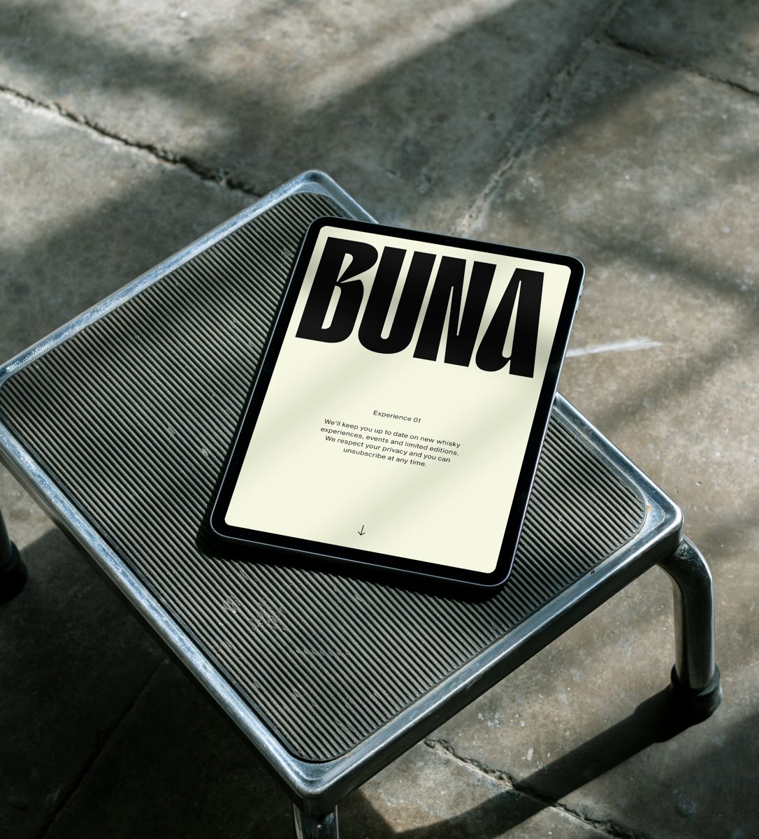
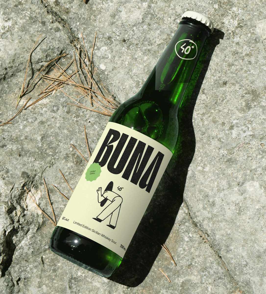
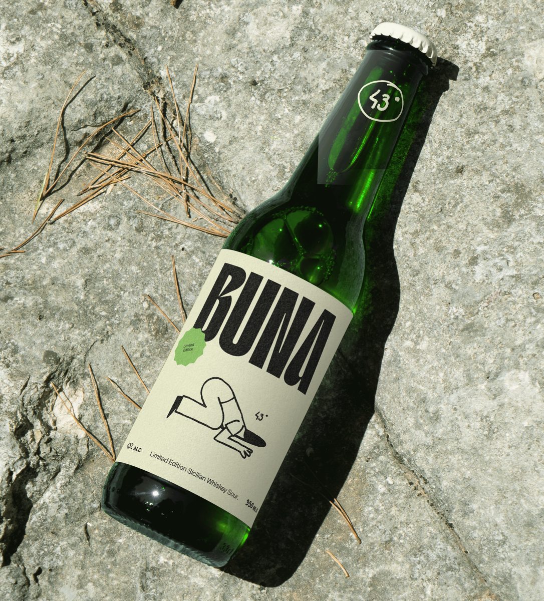
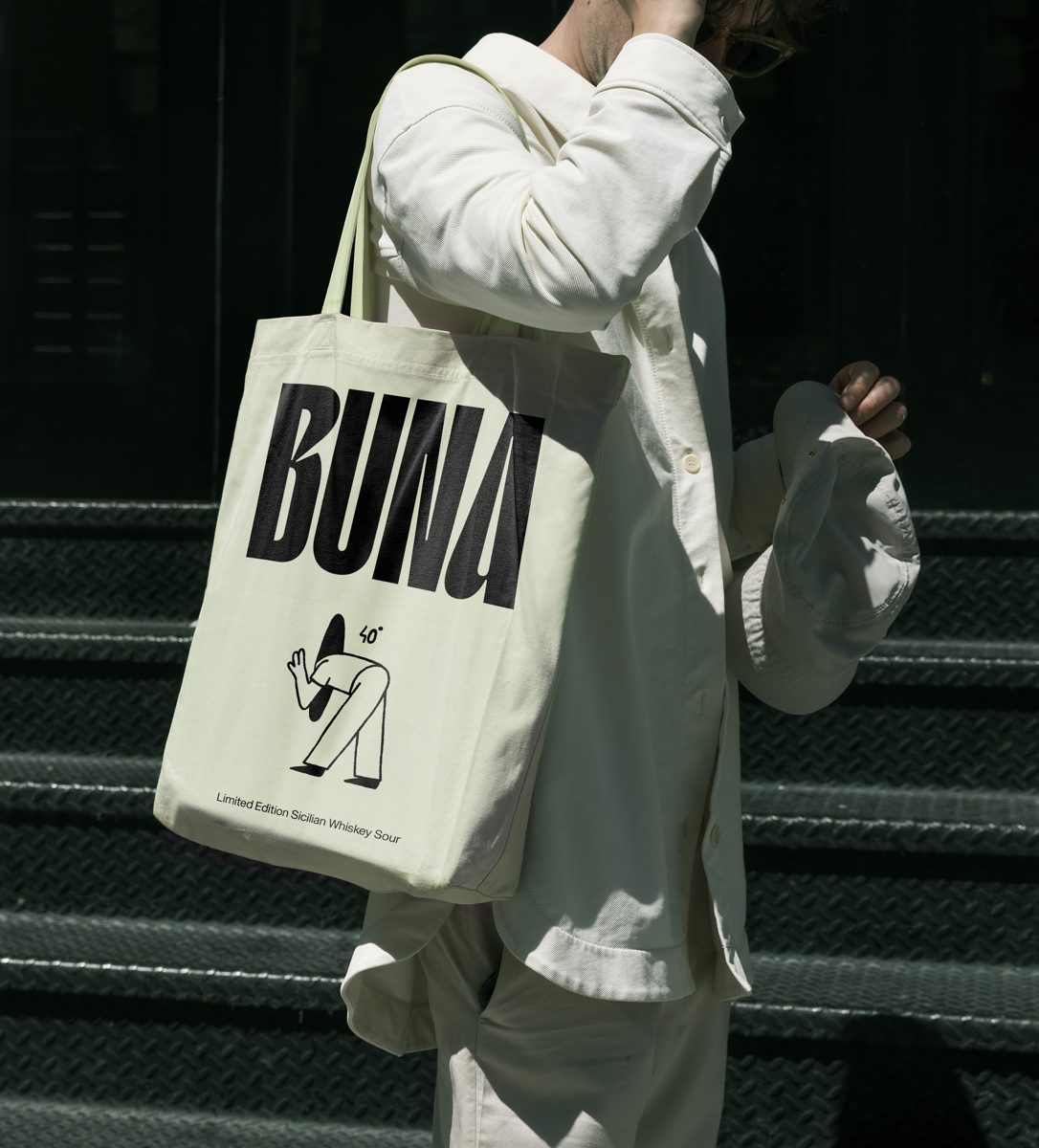
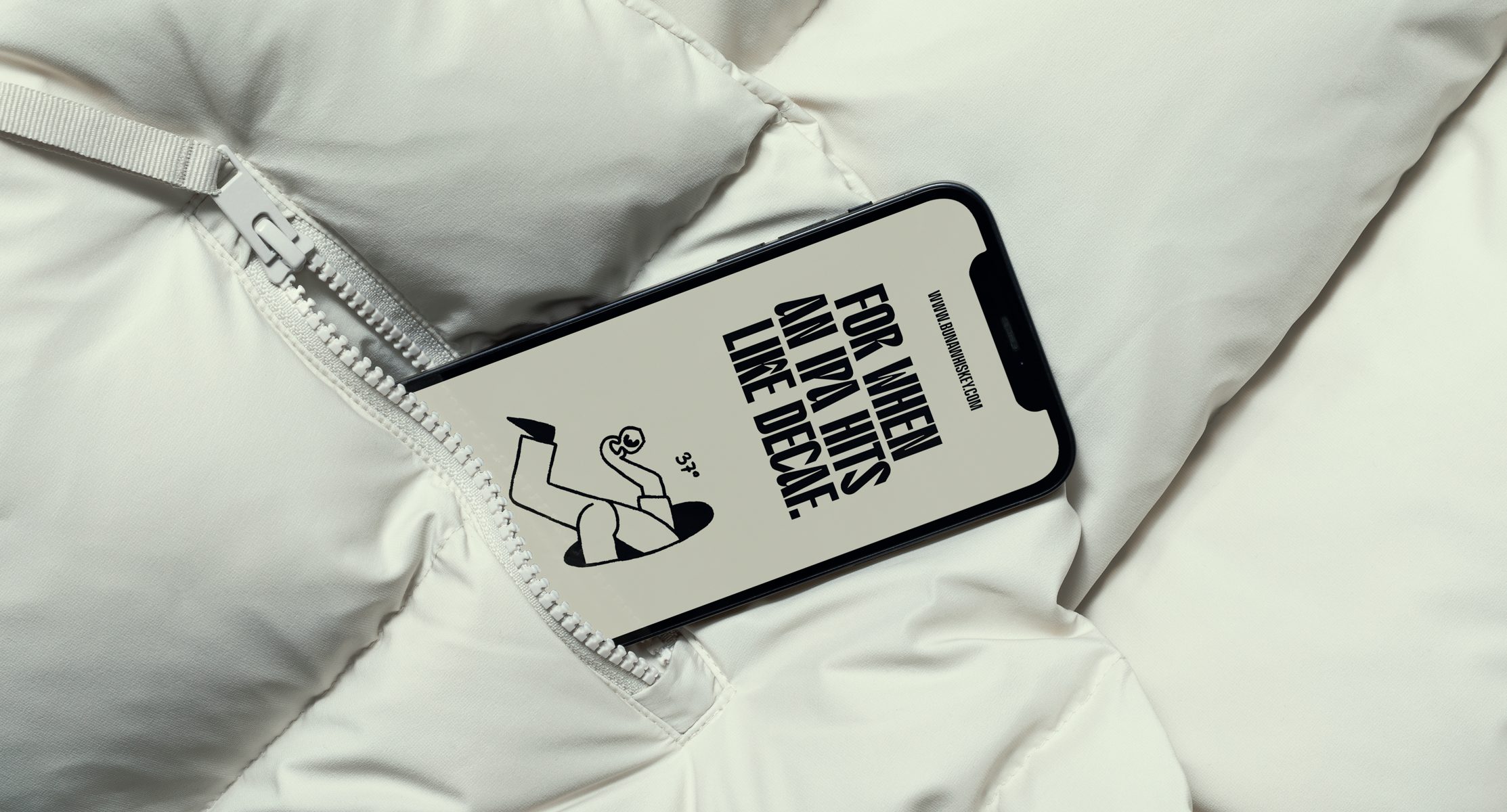
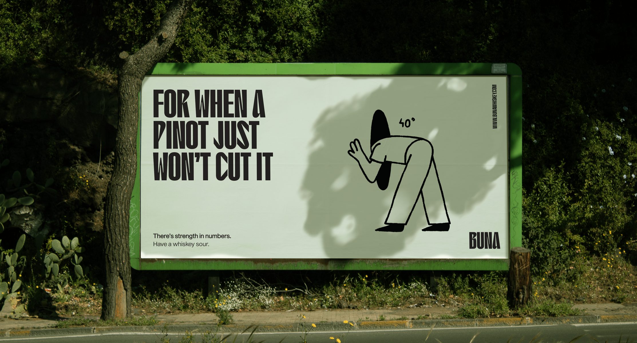
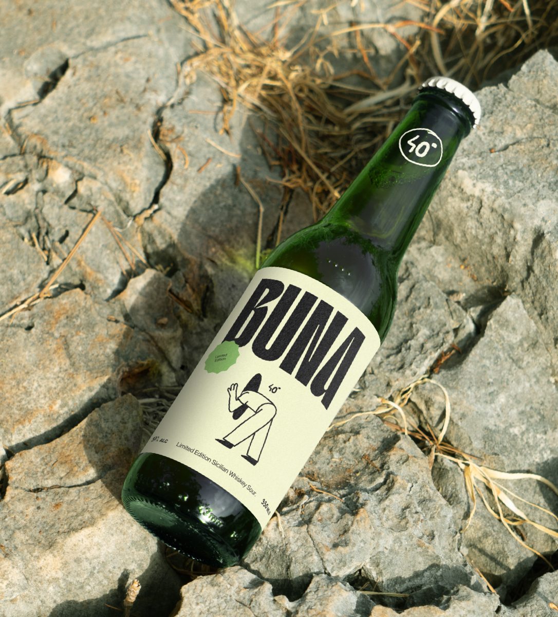
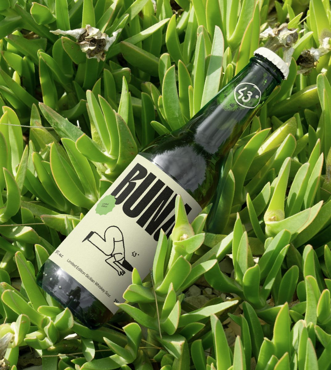
It doesn’t take deep analysis to identify that the trends within the whiskey market have not evolved a whole lot over the past decade. That is to say, it is full of tartan, bagpipes, and heather. But as the saying goes, if it isn’t broken don’t fix it. Well, we broke it. And then fixed it, positioning boutique whiskey and whiskey sour cocktails in a contemporary way that breaks the rules of what is known and expected, paving a new trajectory for the whiskey market. In an increasingly over-saturated market of archaic and outdated whiskey brands, BUNA is a limited edition Sicilian boutique whiskey sour brand that strives to be at the forefront of this pivotal shift within the new expectations of the market.
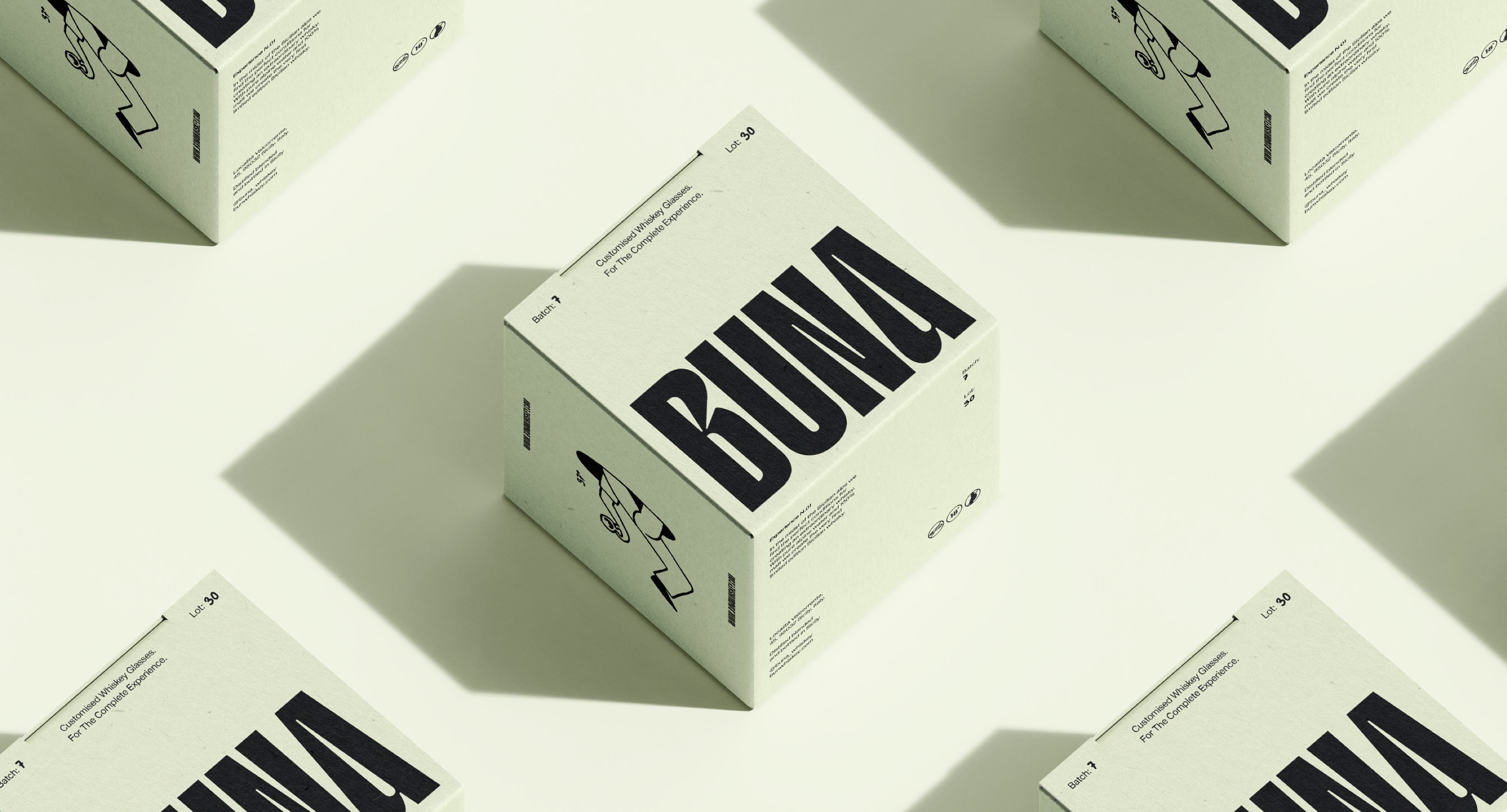
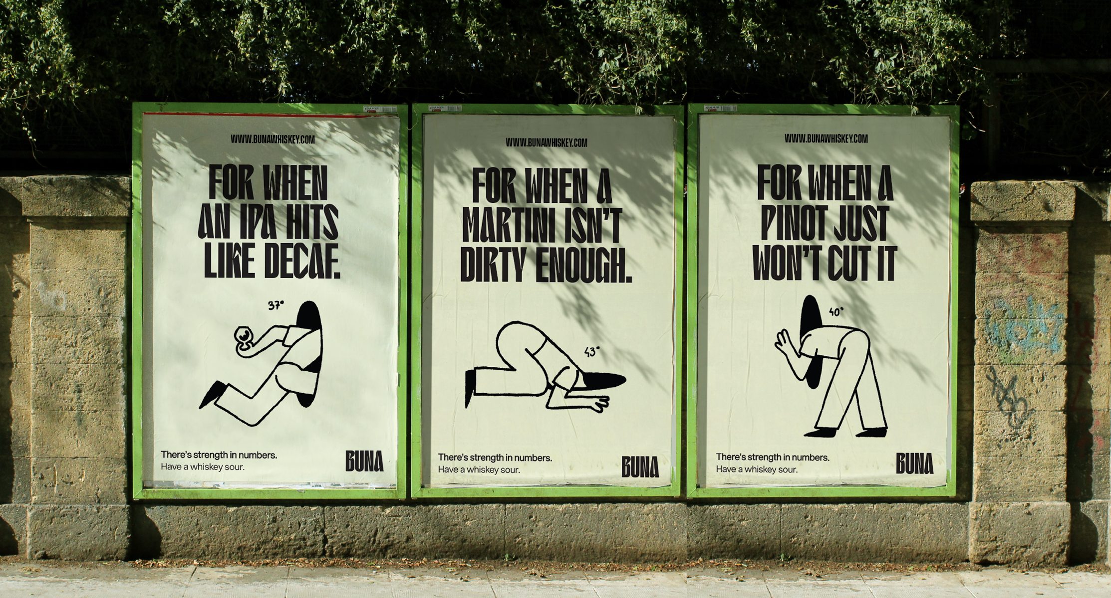
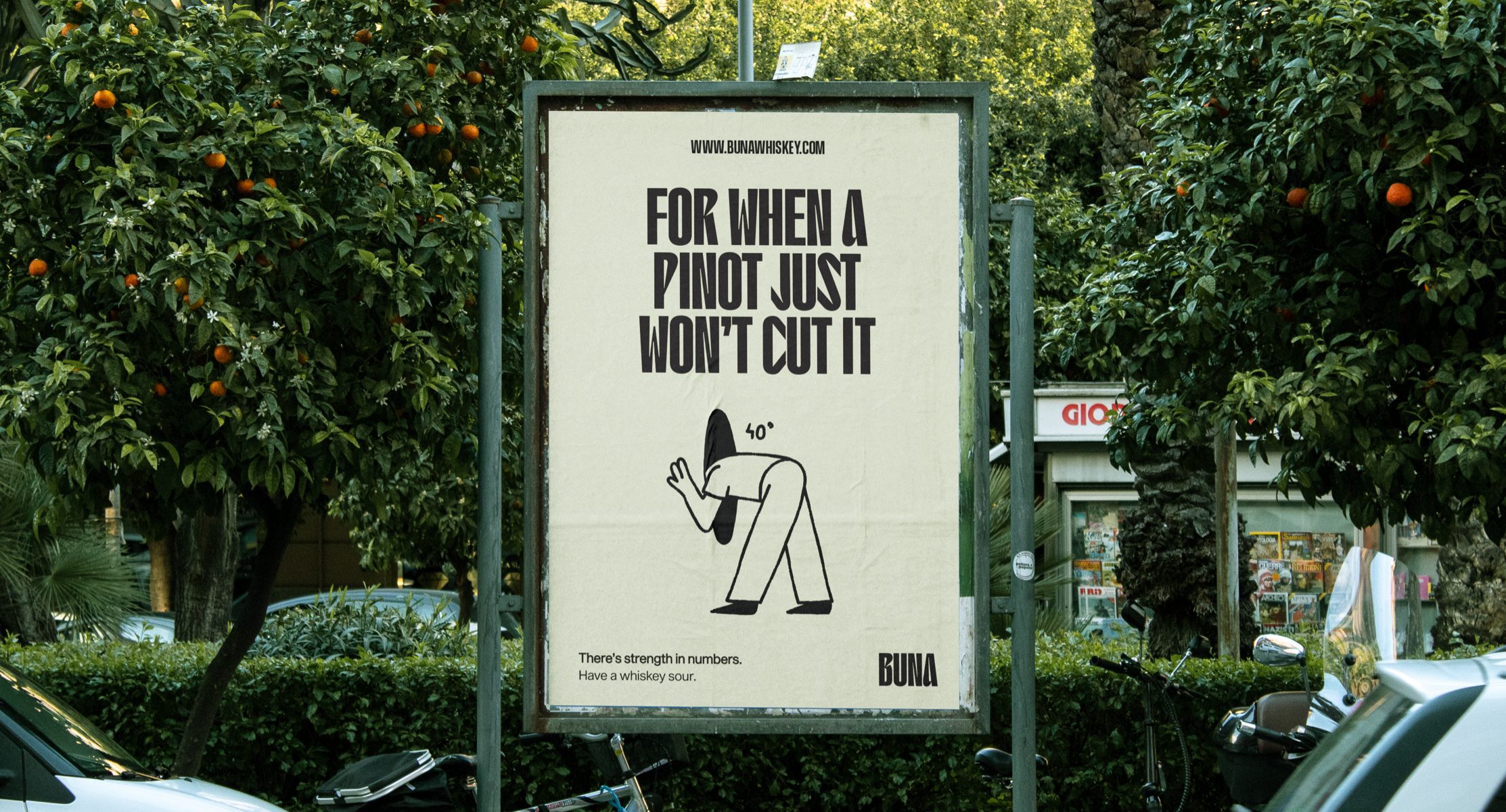
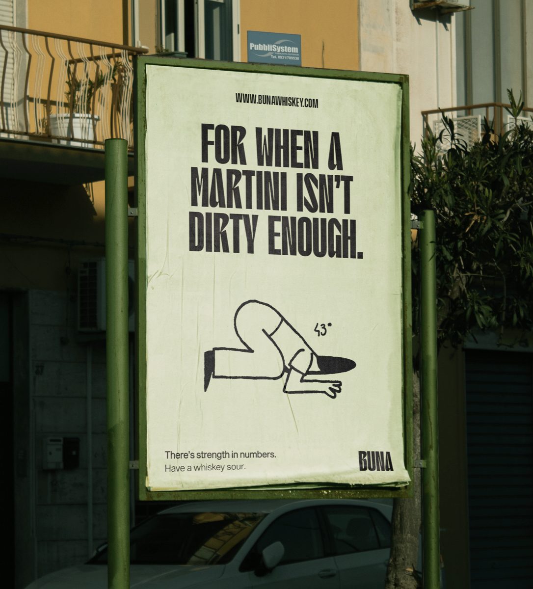
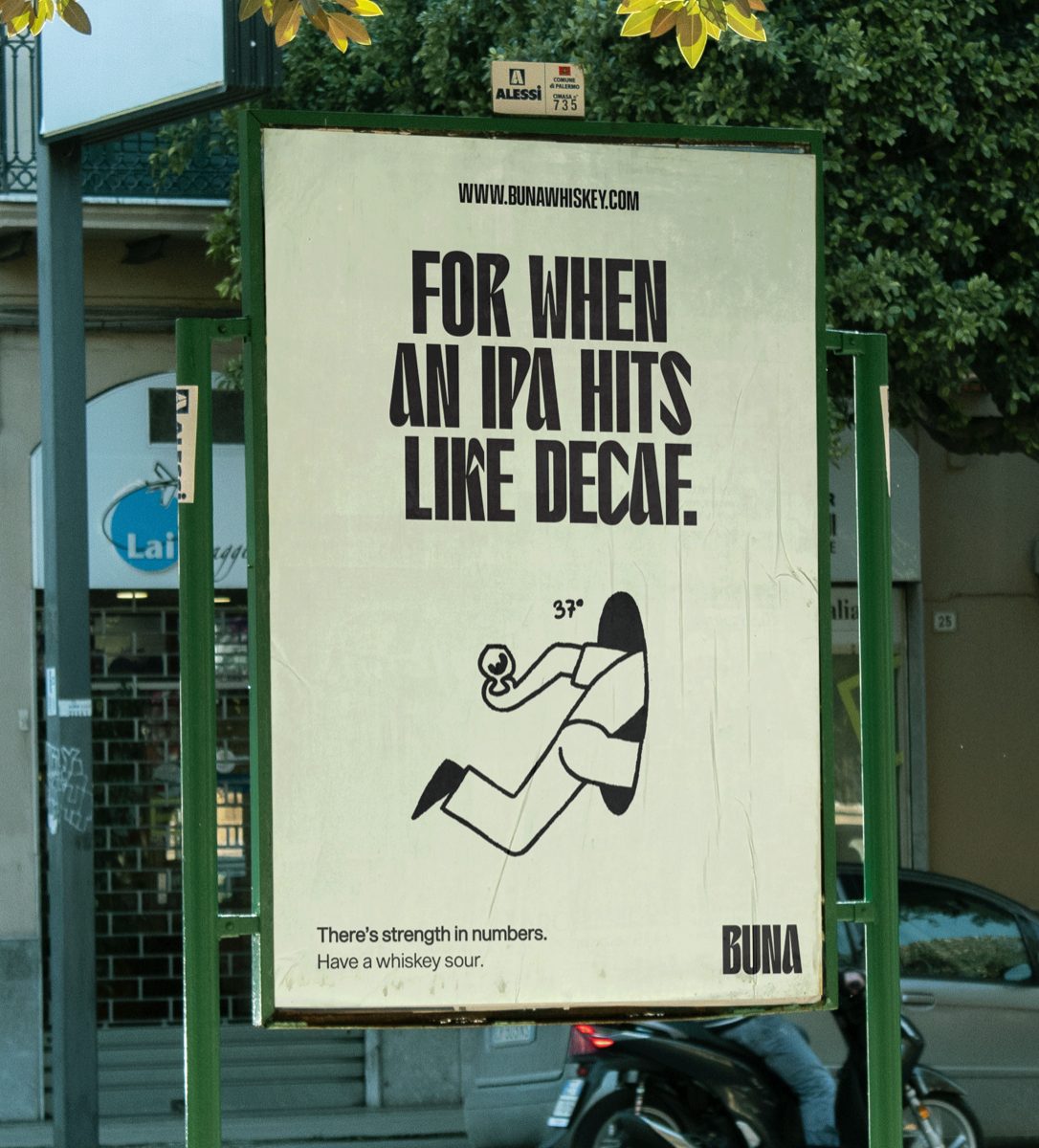
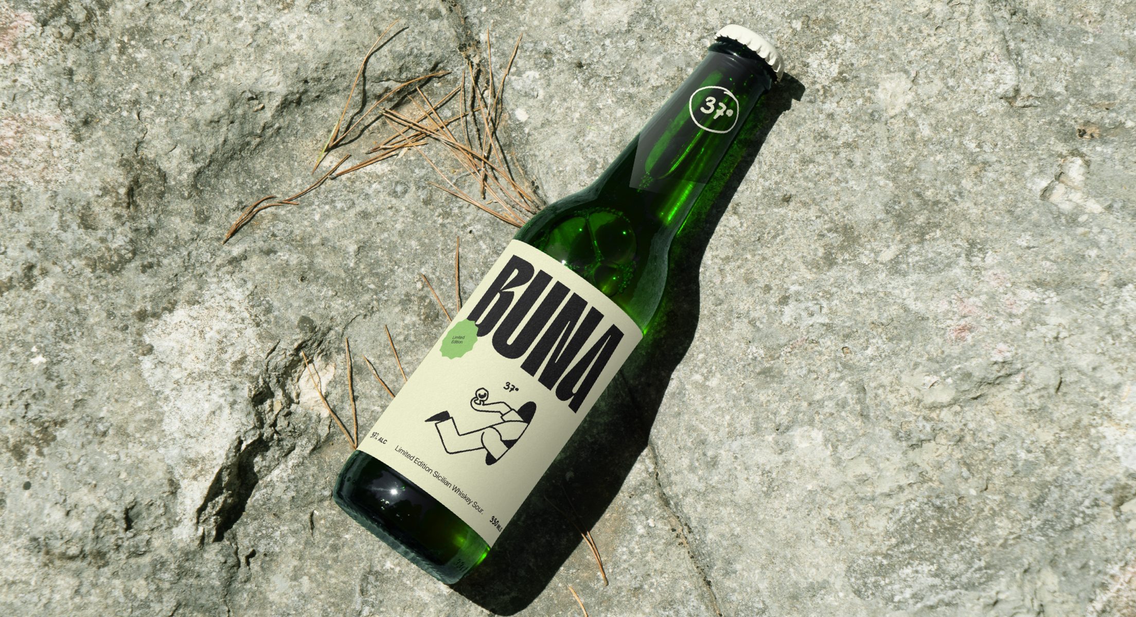
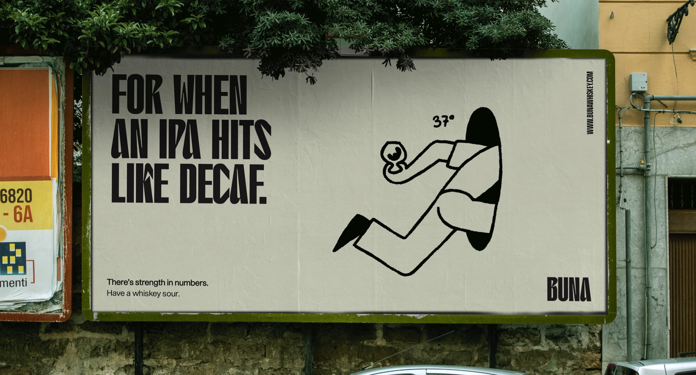
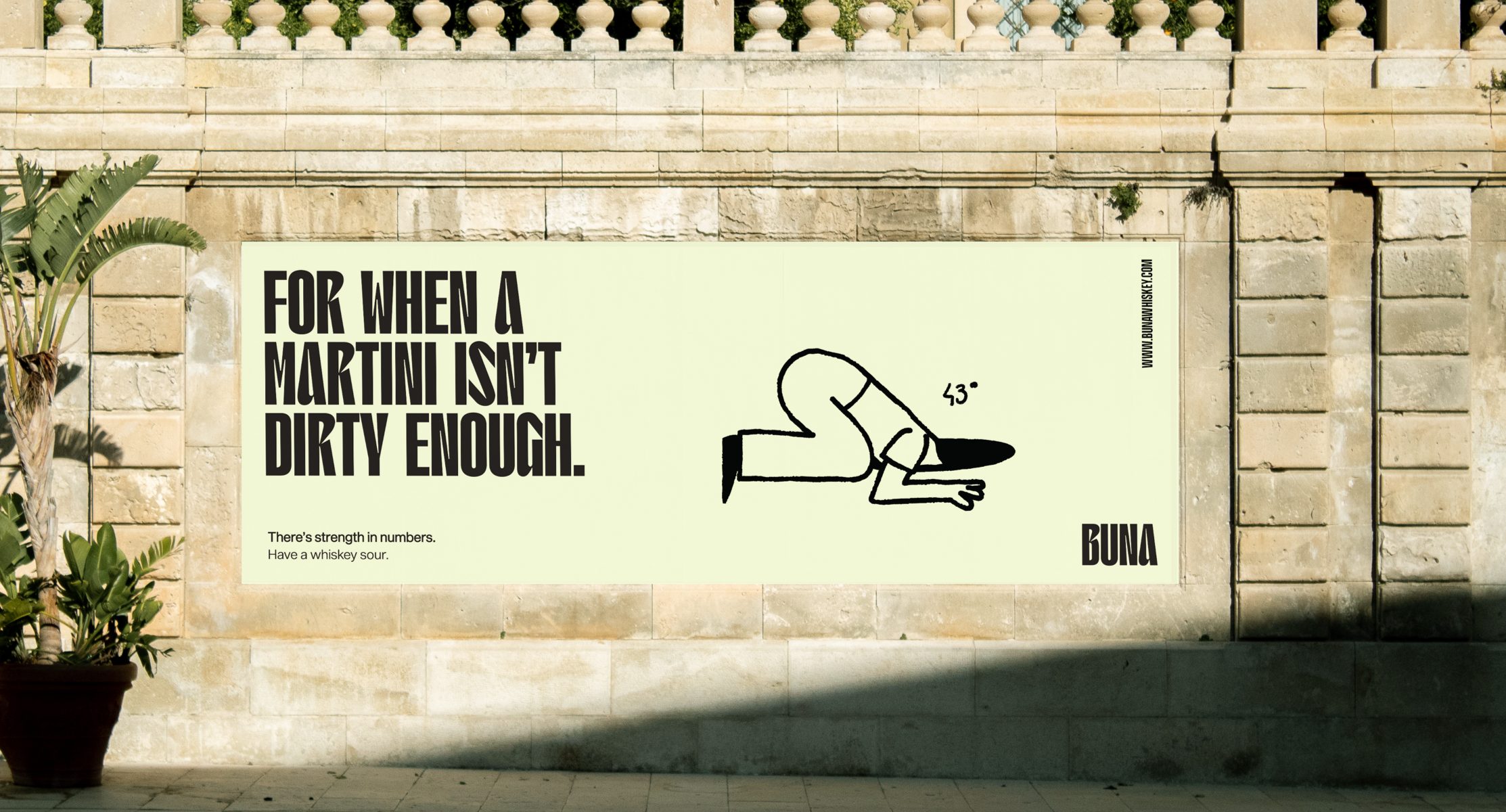
From the core identity through to brand language, packaging and campaign design, Buna’s mission was to create a contemporary whiskey sour experience that appealed to entry-level whiskey drinkers, educating the audience through a loud and outspoken tone of voice that draws comparisons to other beverages they may drink on a regular basis. The strong tone of voice is humanized and grounded with a complimentary series of hand-drawn illustrations to add a warm and playful touch to the dynamic. The illustrations were incorporated to innocently play with the idea of healthy escapism and inject some honest relatability into the brand experience through tongue-in-cheek humor.
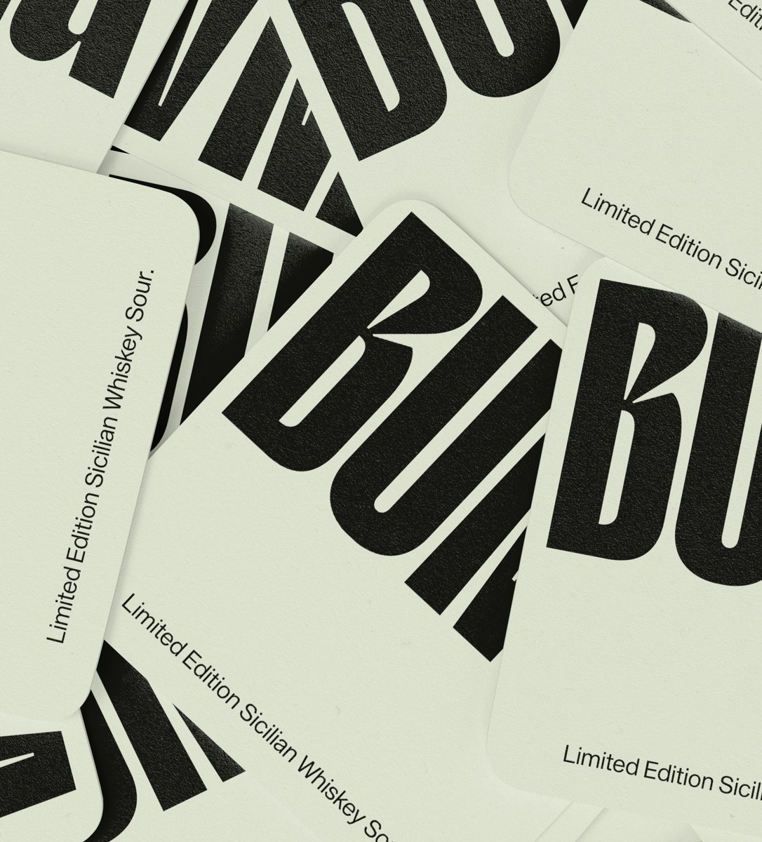
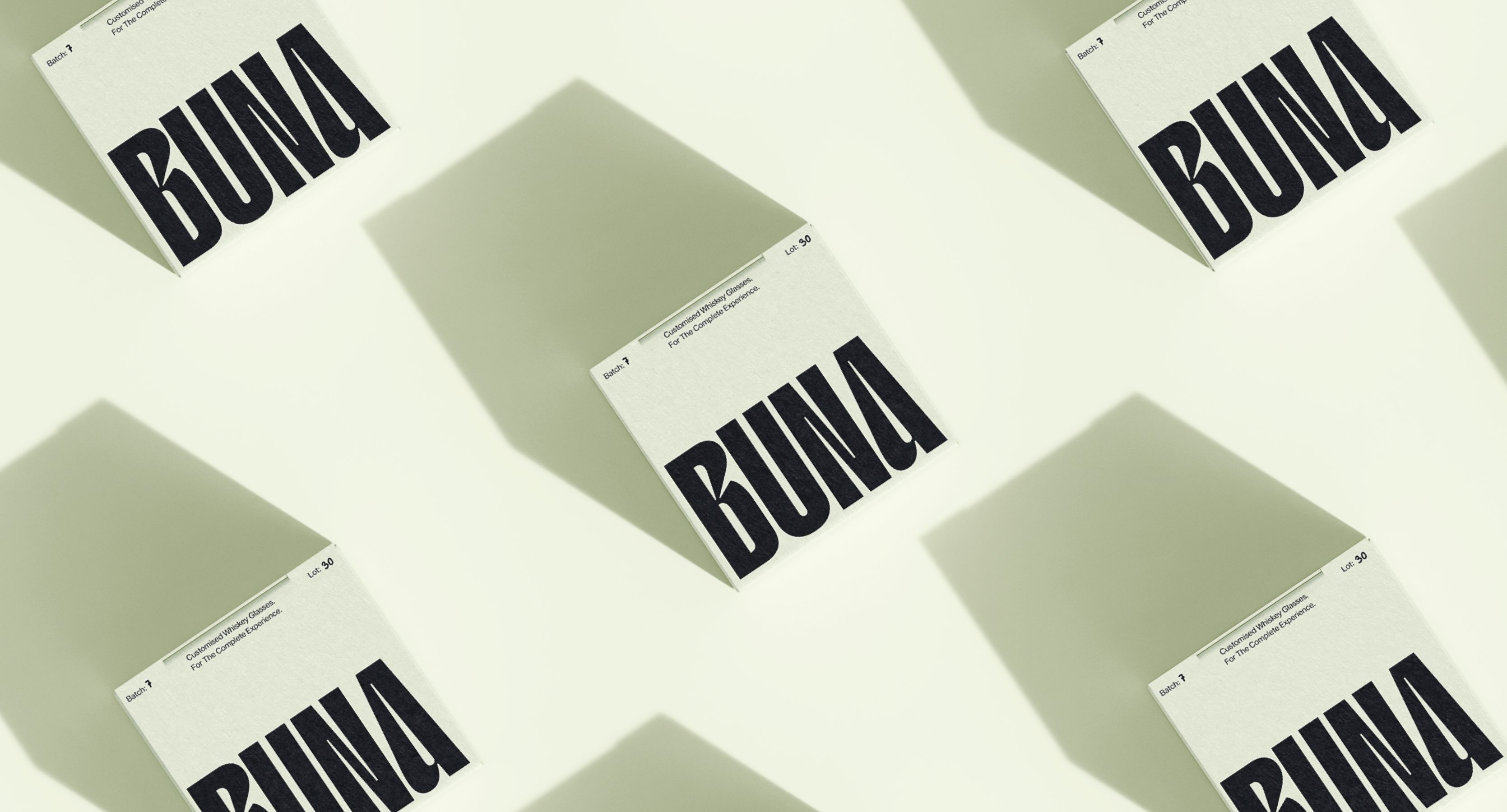
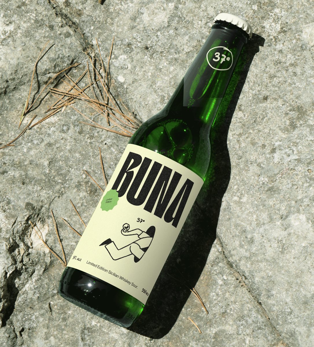
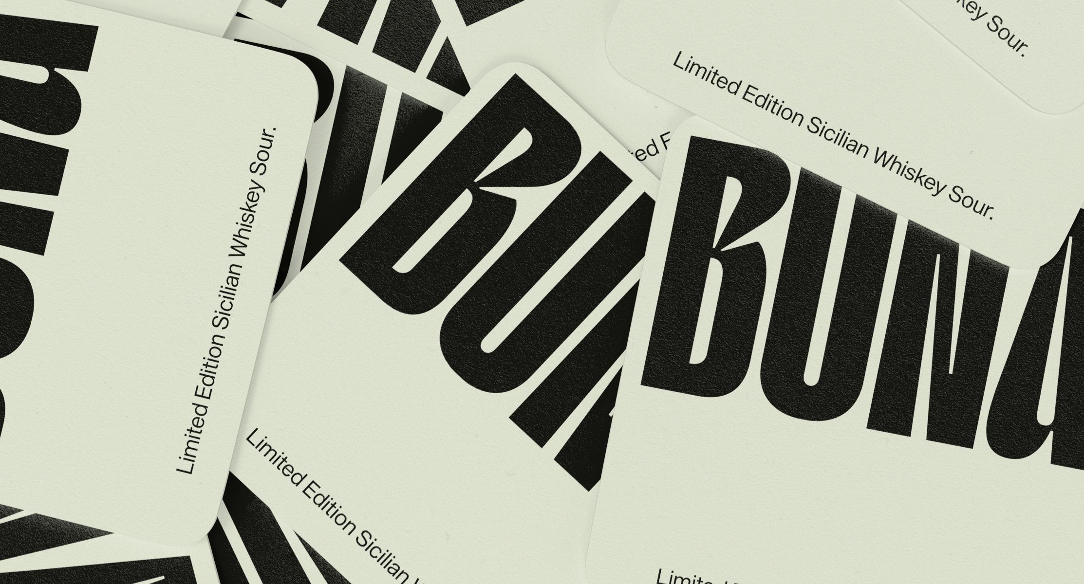
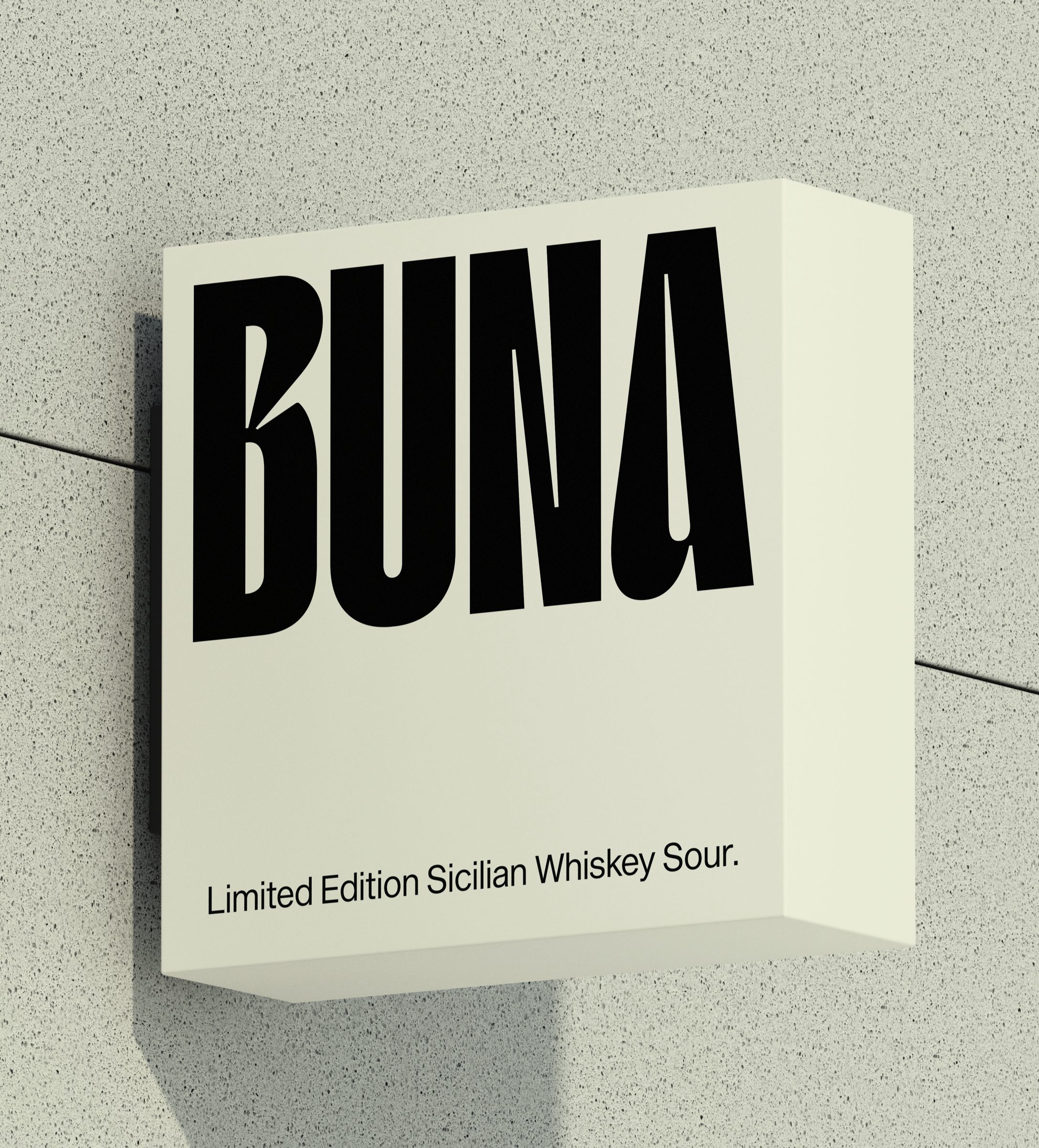
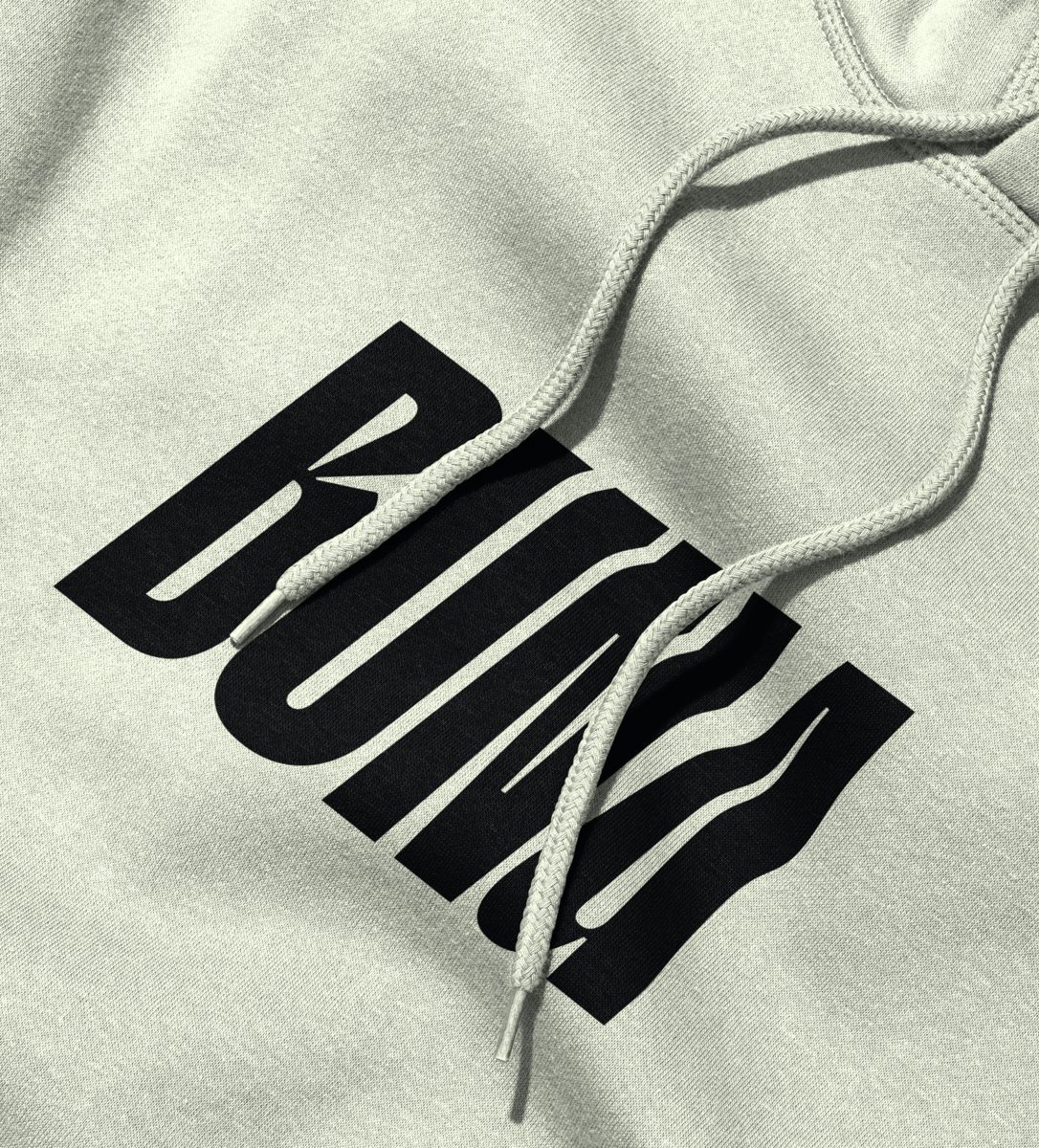
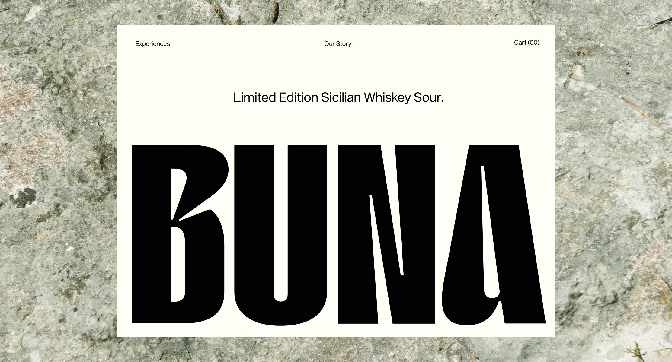
Centering the brand's logo mark and illustrations at the heart of the brand, the brand identity uses unapologetically bold logomark and typography by TYPE01 to convey an unmissable brand message and stand out against the sea of traditional whiskey brands. The brand's outspoken tone of voice, illustrations and typography are balanced with a neutral brand palette and hand-drawn typographic elements reinforce the meticulously handcrafted production and unique bottling process of each limited edition batch of Buna's whiskey sour.
Location: Sicily, Italy.
Illustrations: Antonio Carceles - @g_carceles
