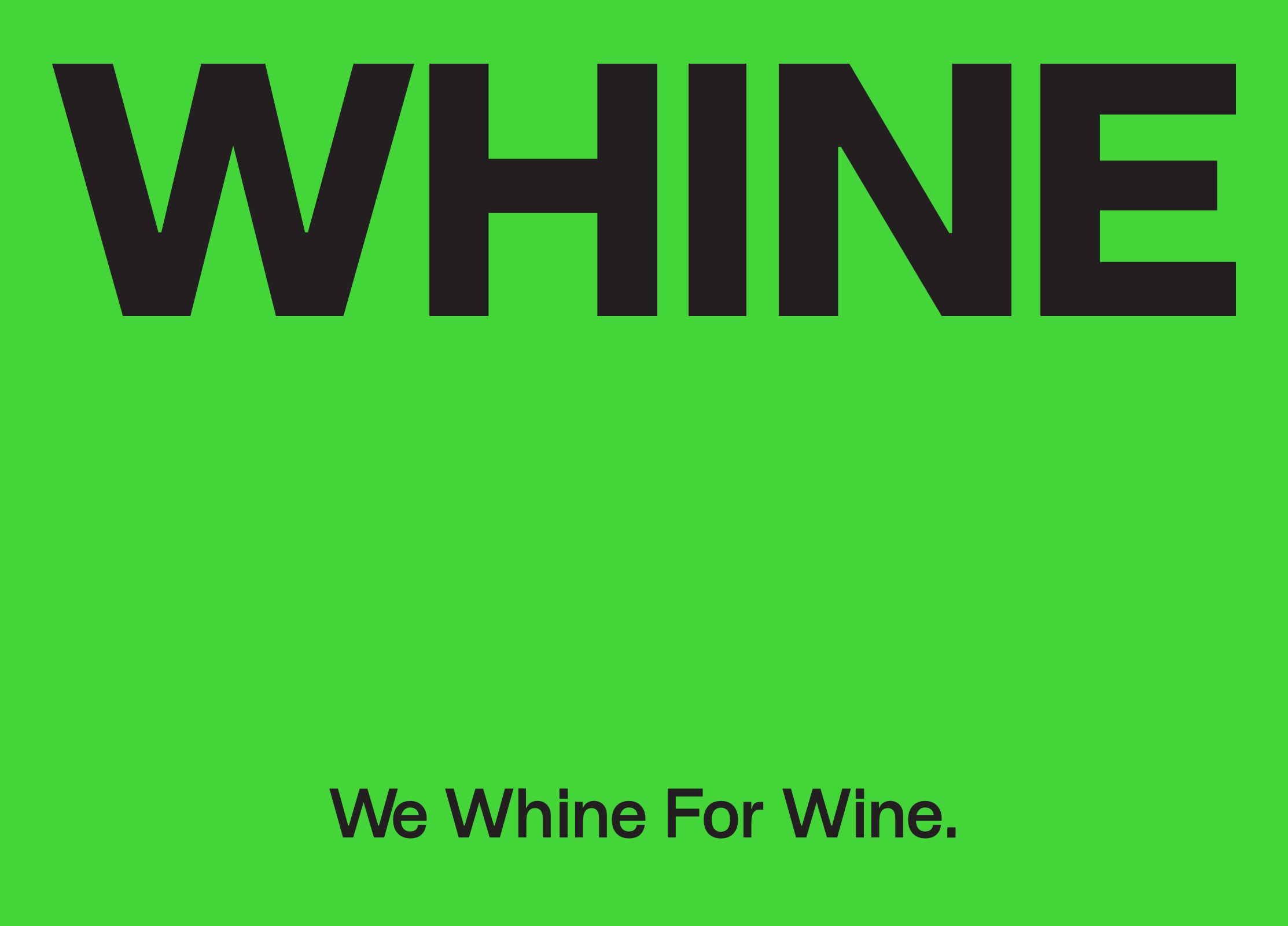
WHINE
Brand Identity Design, Packaging Design And Art Direction.
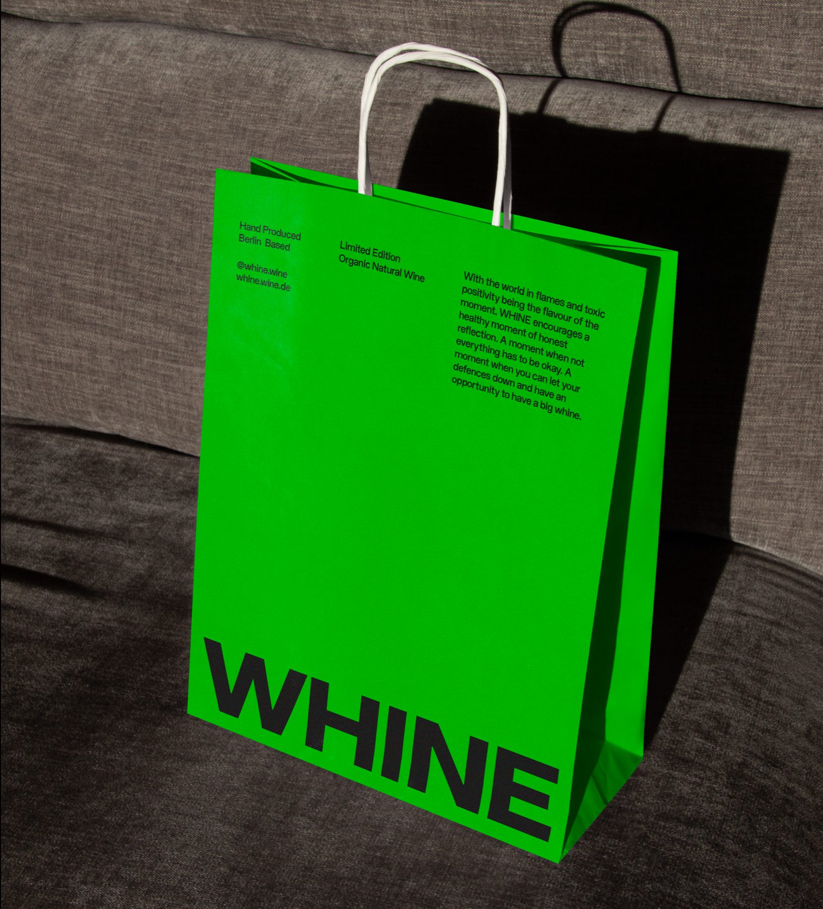
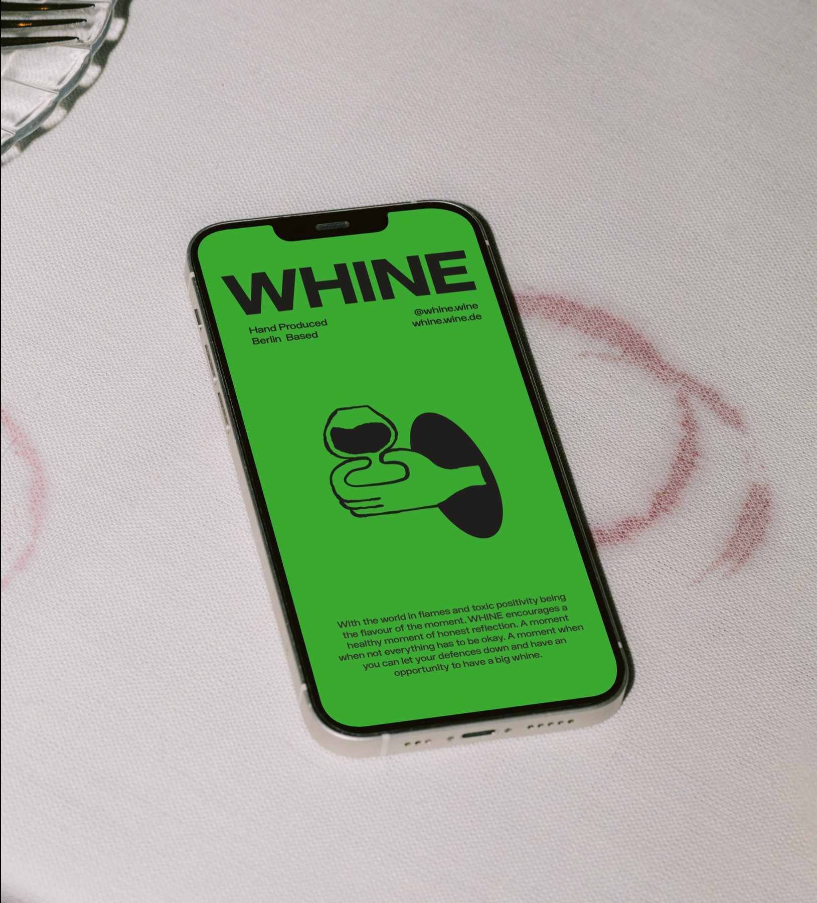
With the world in flames and toxic positivity being the flavour of the moment, WHINE, an emerging Berlin-based natural wine brand encourages a healthy moment of honest reflection. A moment to pause. A moment when not everything has to be okay. A moment when you can let your defences down and freely have a whine - whilst sipping on a glass of WHINE's organic natural wine.
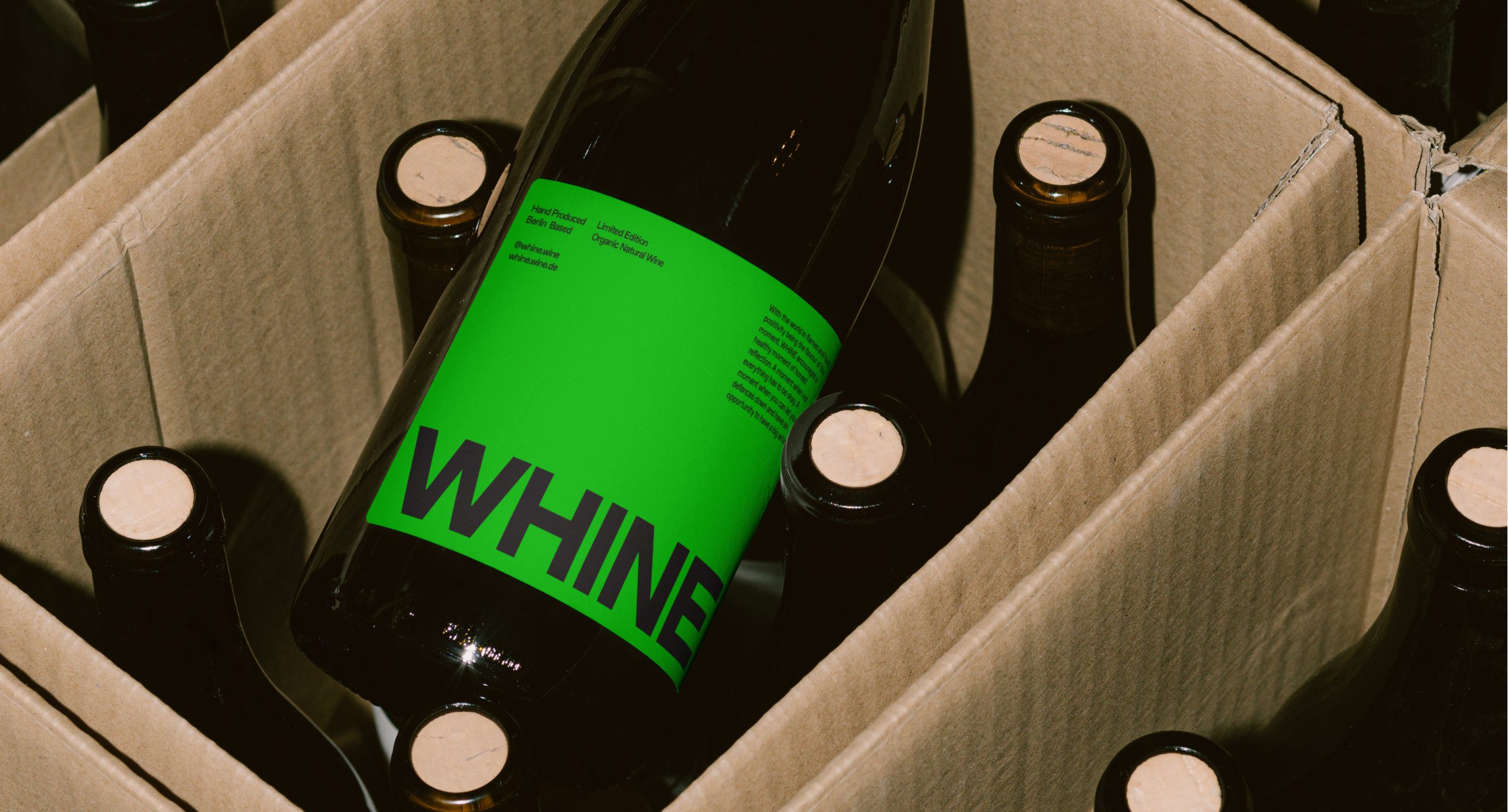
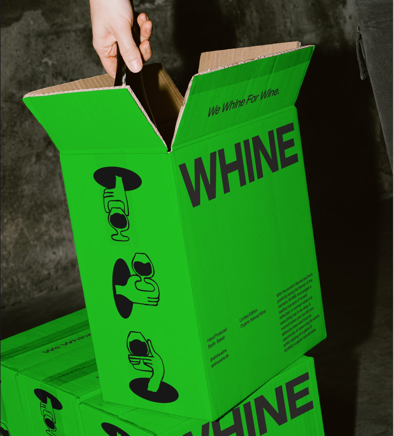
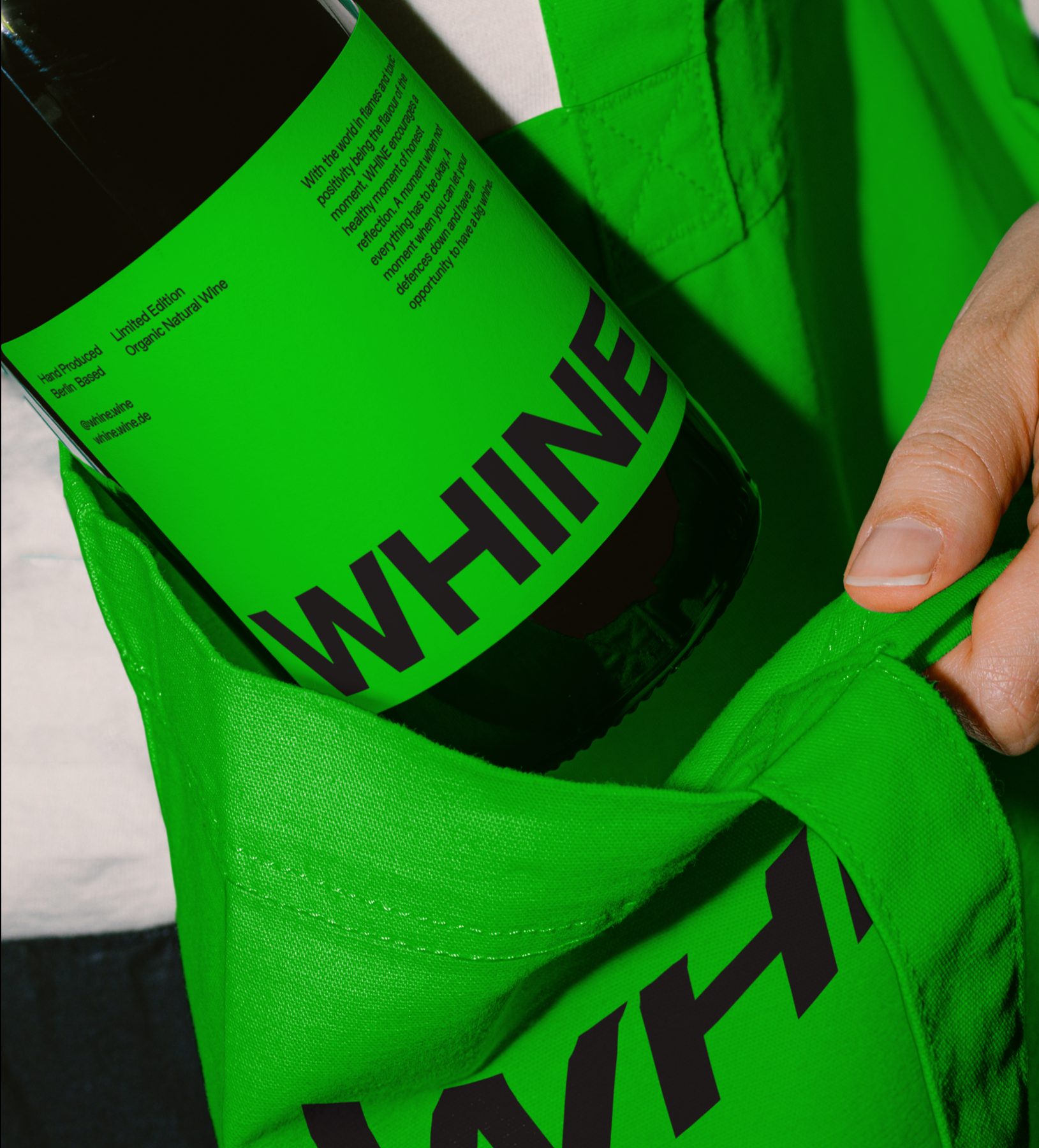
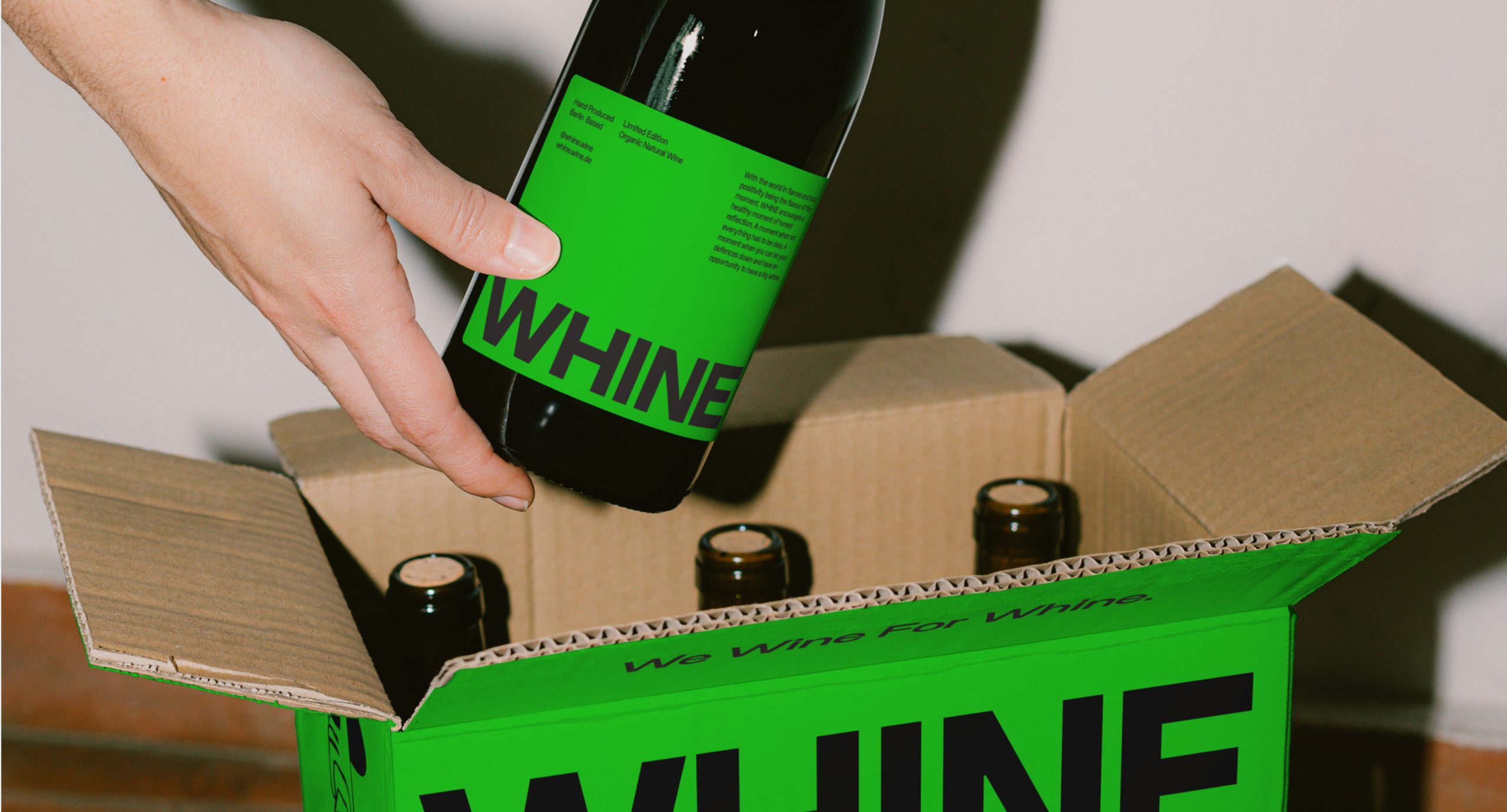
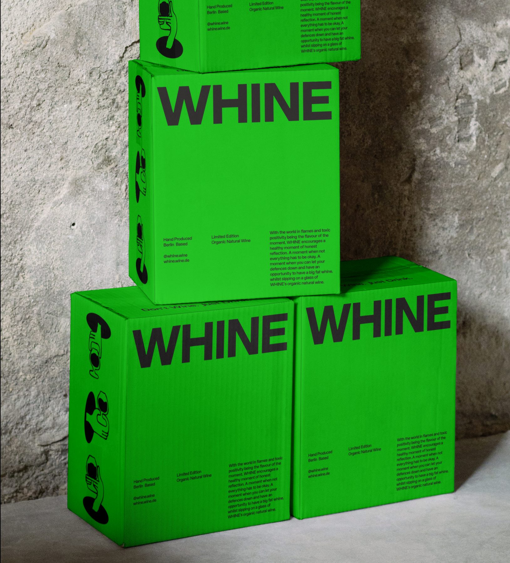
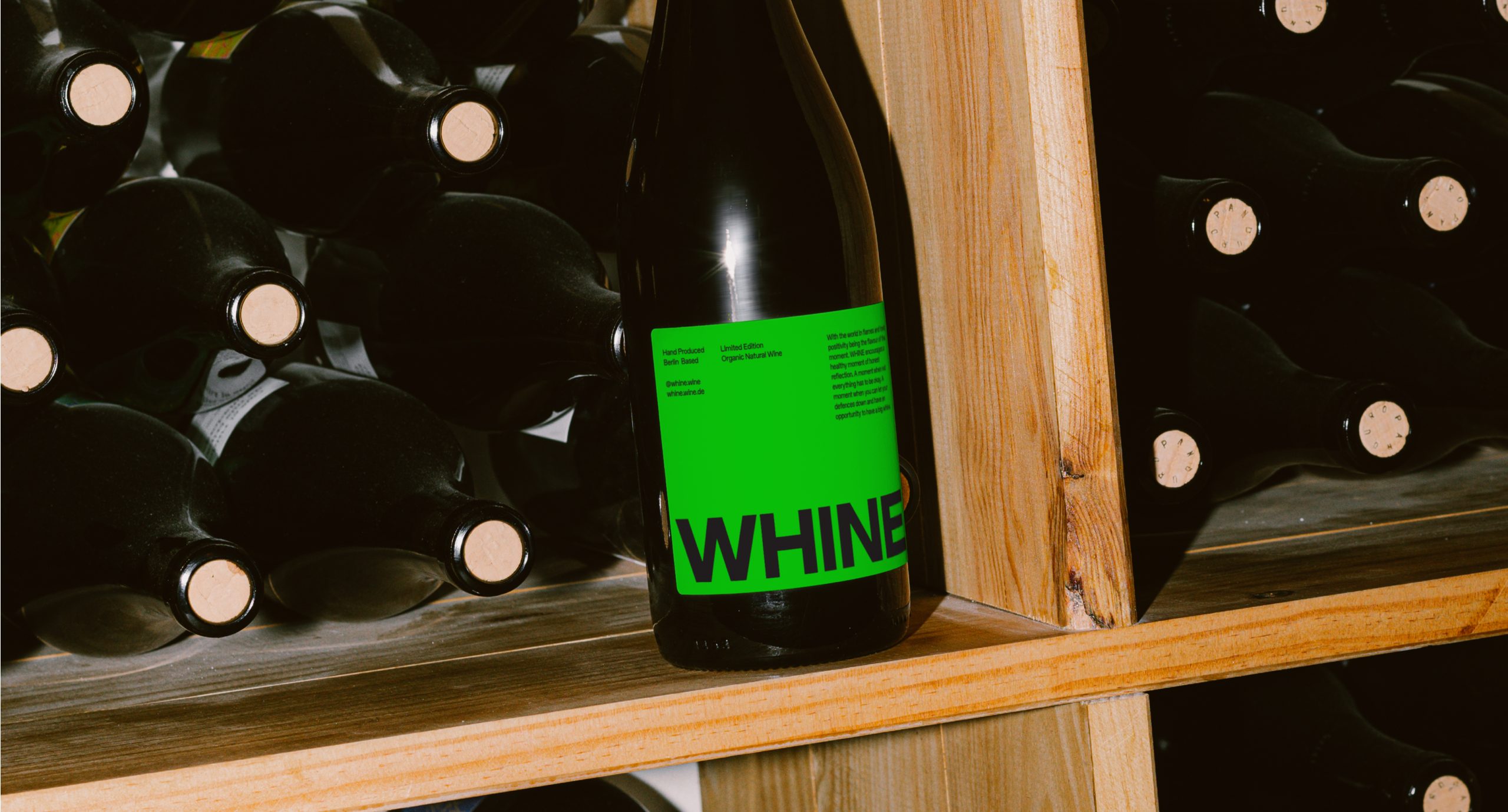
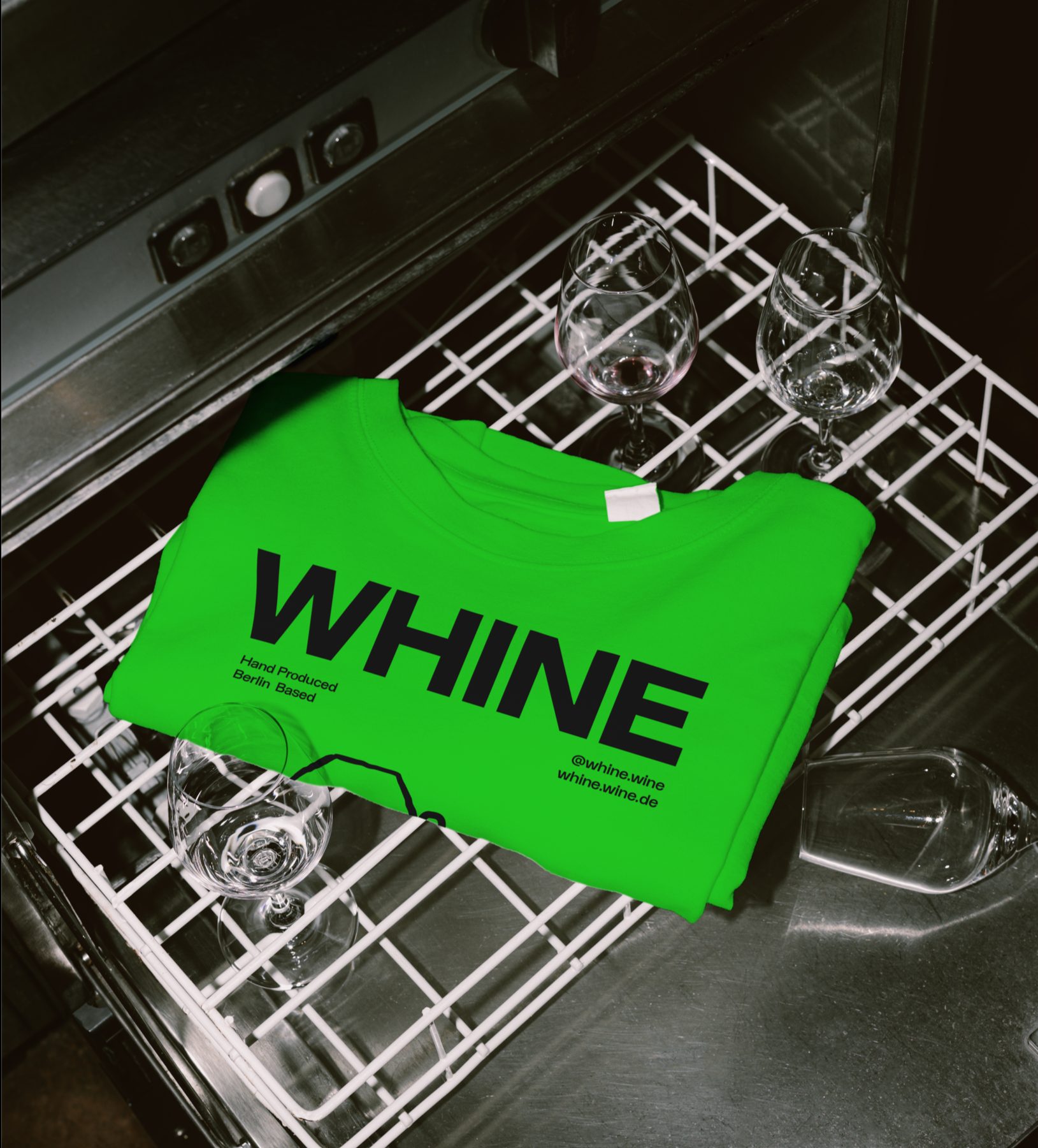
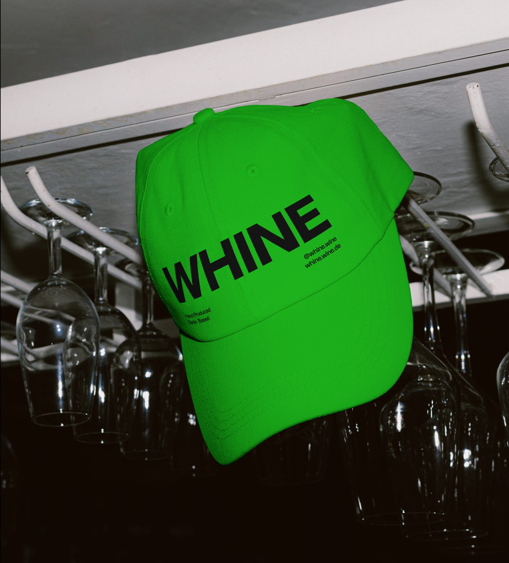
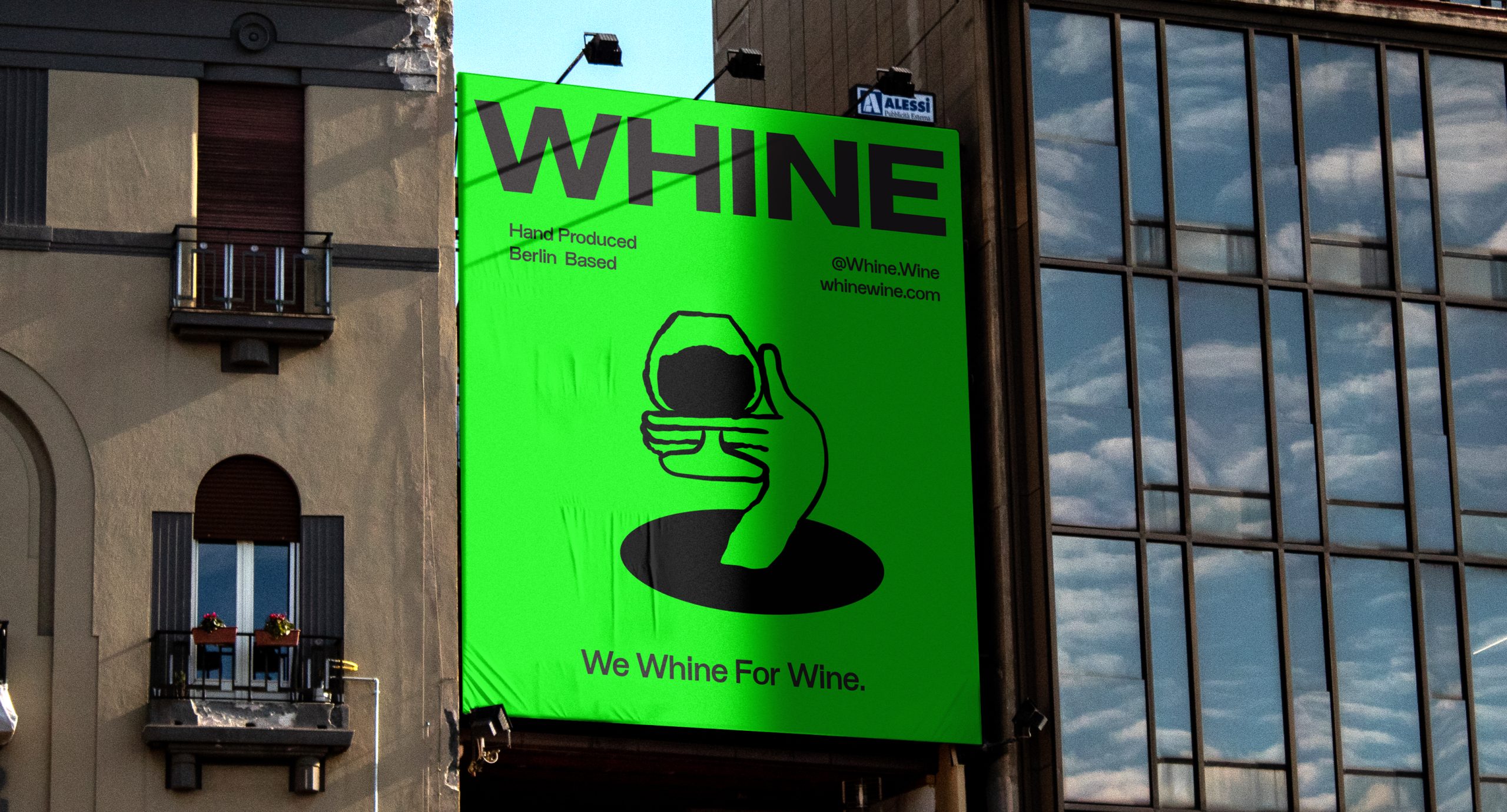
With the organic natural wine market becoming more saturated by the day, the market seems to be overpopulated by brands using graphic and typographic styles that pay homage to the organic side of the product, focussing on portraying the natural ingredients and formulation process of the product. To challenge this trend, WHINE features a monotone use of bright primary green, referencing the natural make-up and process of producing the wine, whilst creating an unmissable colour-fueled shelf presence for the brand - challenging what is known within the organic natural wine category through bright, vibrant colour and bold typography.
Centering the logomark at the core of the brand identity, the logomark design is bold and understated, yet draws attention to the brand name tapping into a sense of humour and relatability for the audience. The brand identity uses a juxtaposition between bold use of block colour, stripped back san serif typography and negative space to create an unmissable product both in the overcrowded drink aisle as well as in outdoor spaces.
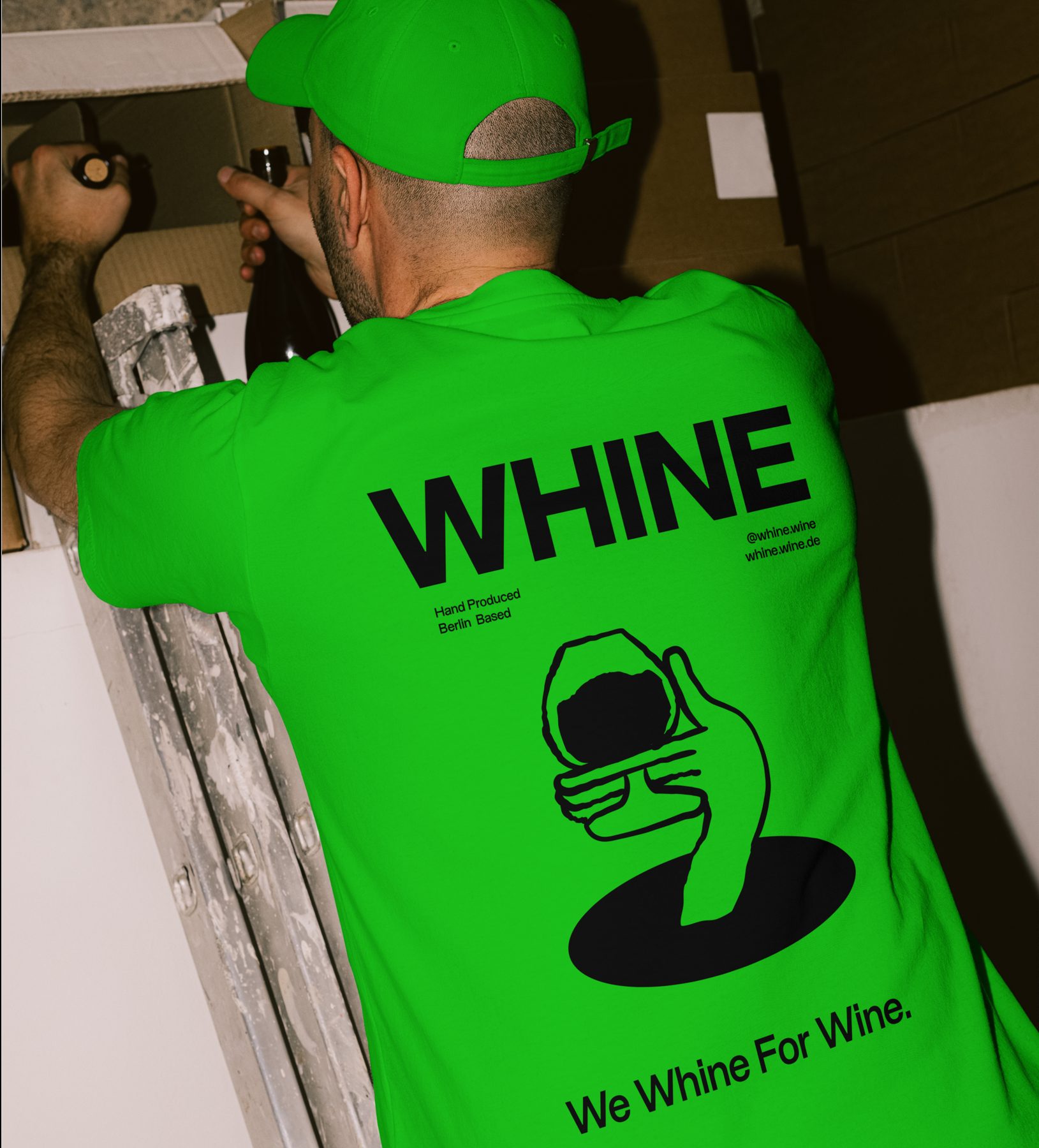
From the brand identity design through to packaging design, merchandise design and campaign design, the brand boasts confidence, honesty and relatability through supporting illustrations by Antonio Carceles, balancing a bold unapologetic approach with a sense of human relatability; designed to challenge the toxic positivity movement, current packaging trends and what is known so far within the organic natural wine category.
Location: Berlin, Germany.
Illustrations: Antonio Carceles - @g_carceles