Cora
Brand Identity Design & Packaging Design
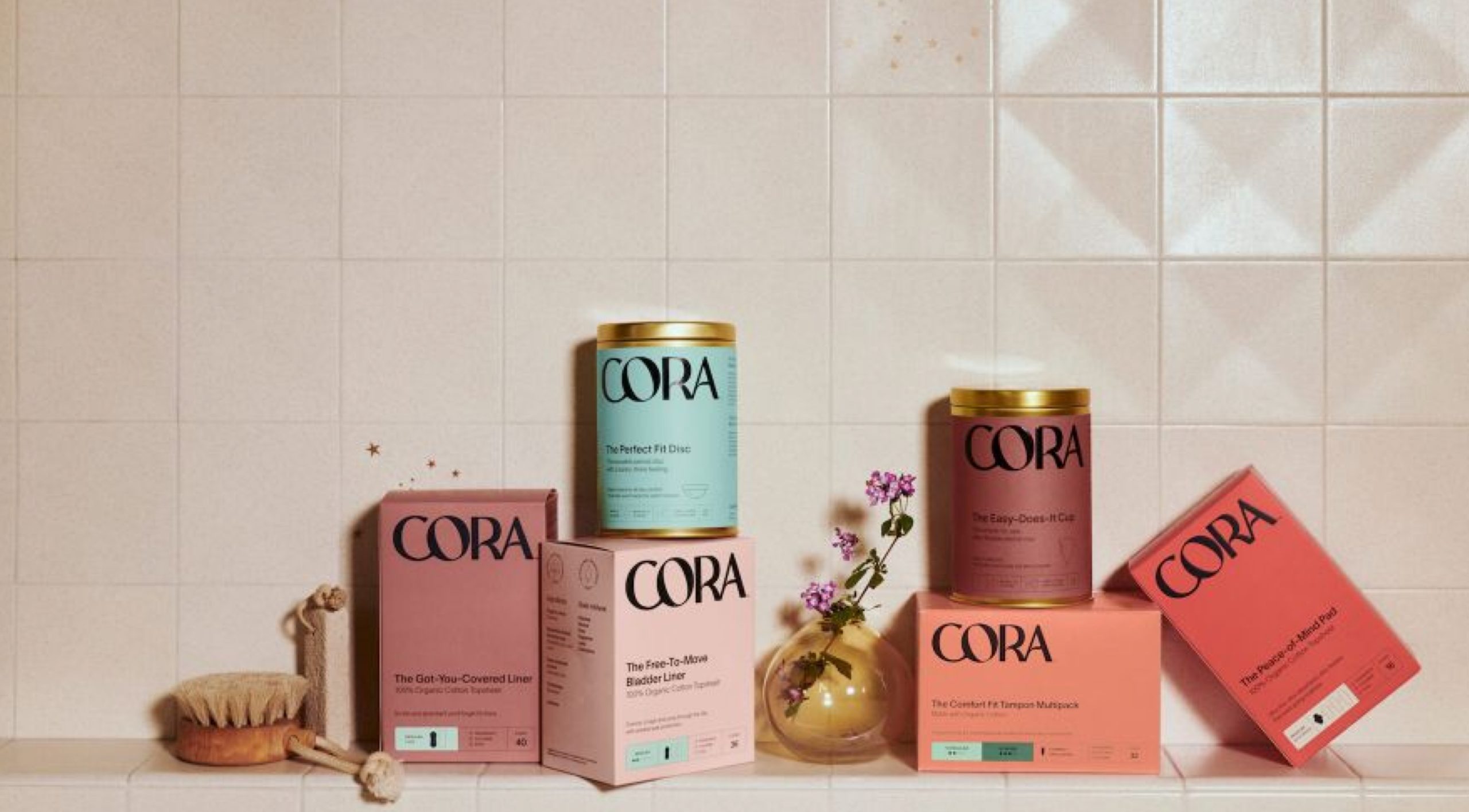
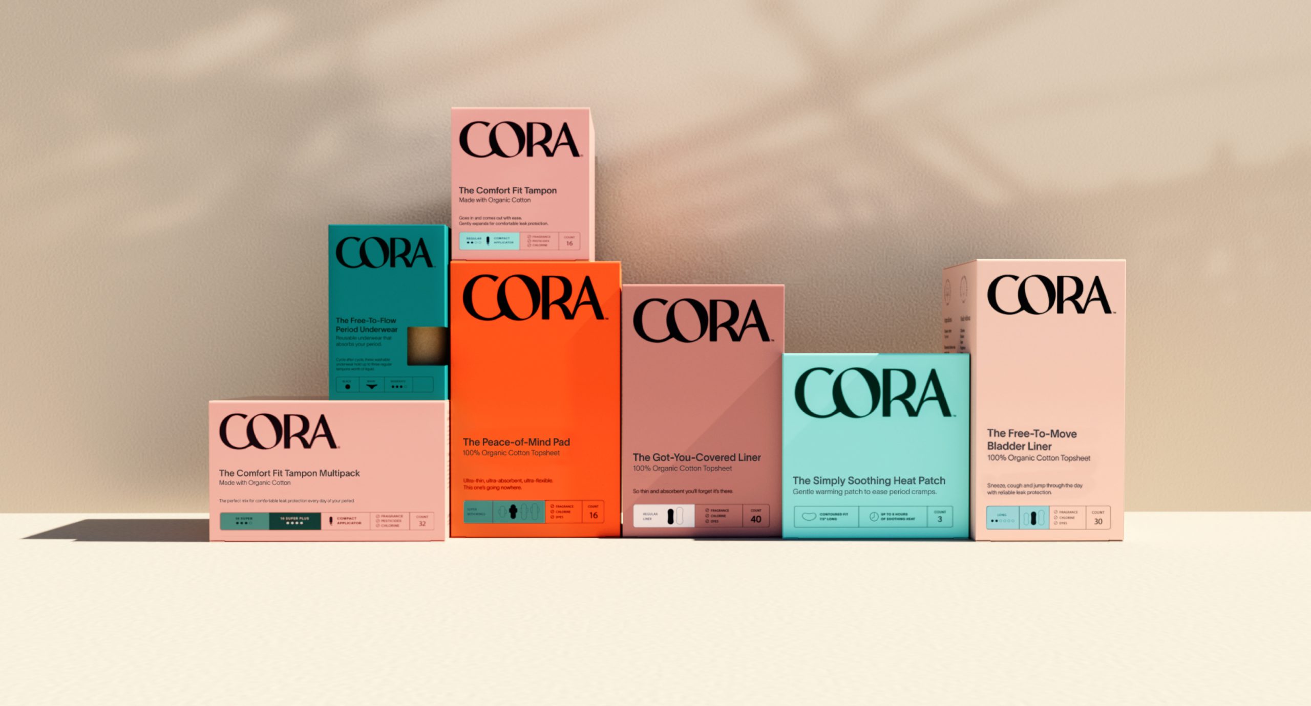
Since its conception in 2016, Cora —a leading US-based period care and wellness company— has been consciously caring for, informing and nurturing millions of people on their journey of physical care and wellbeing.
In the context of a fast-changing natural period care market, Cora needed a new brand identity that reclaimed its stand-out on shelf, reinforced its relevance to the millennial consumer and cemented its place as a leader in the menstrual care category.
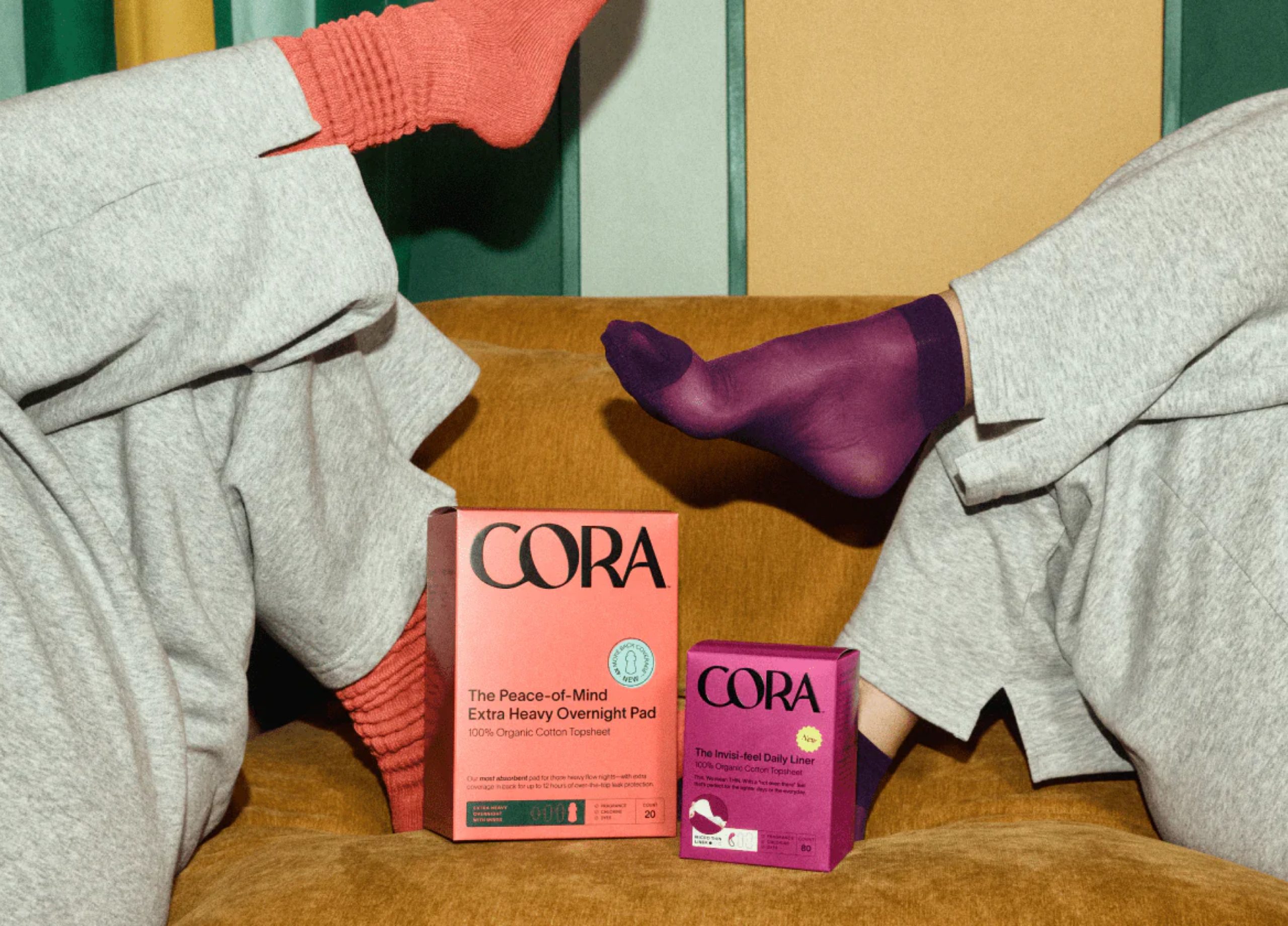
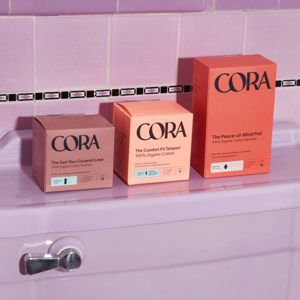
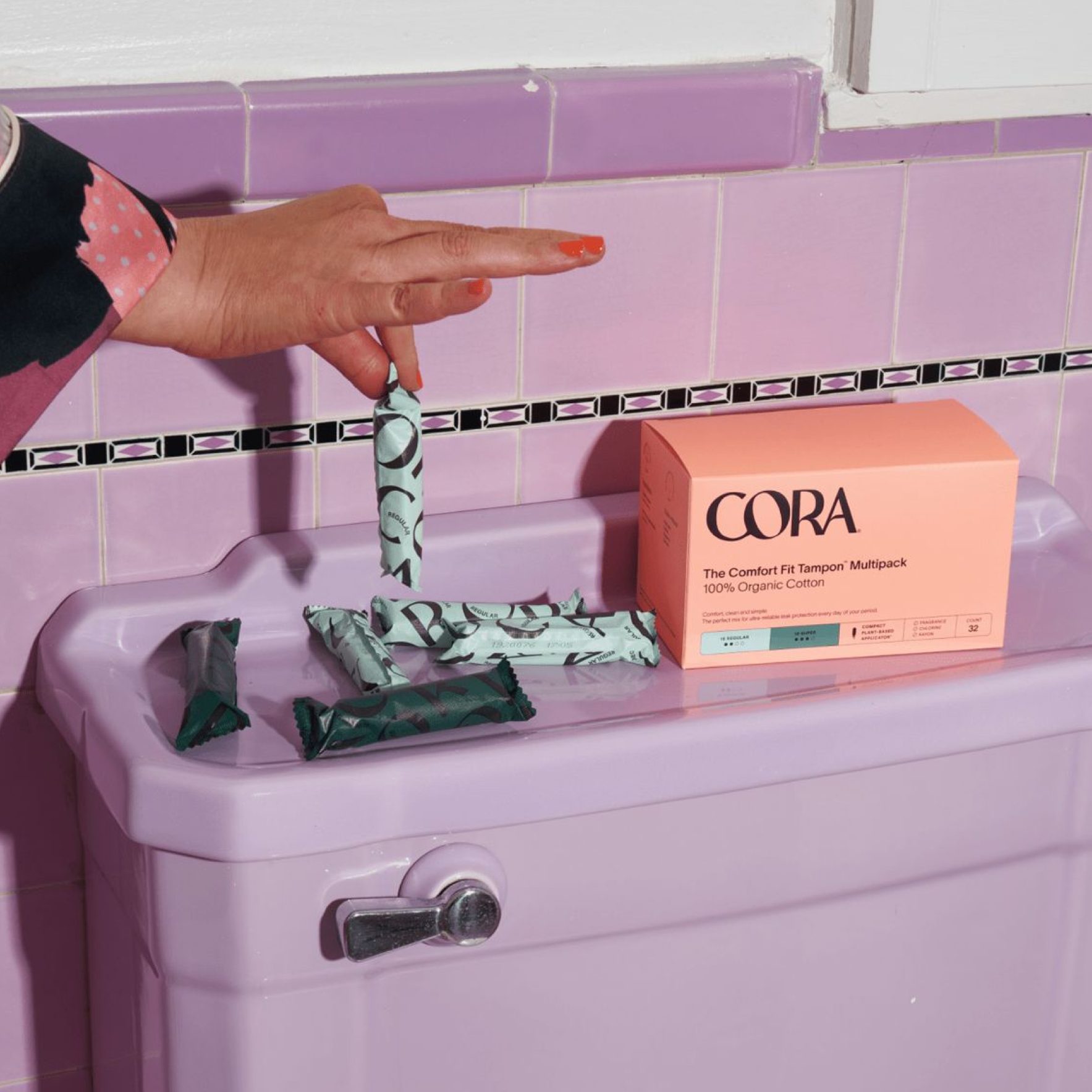
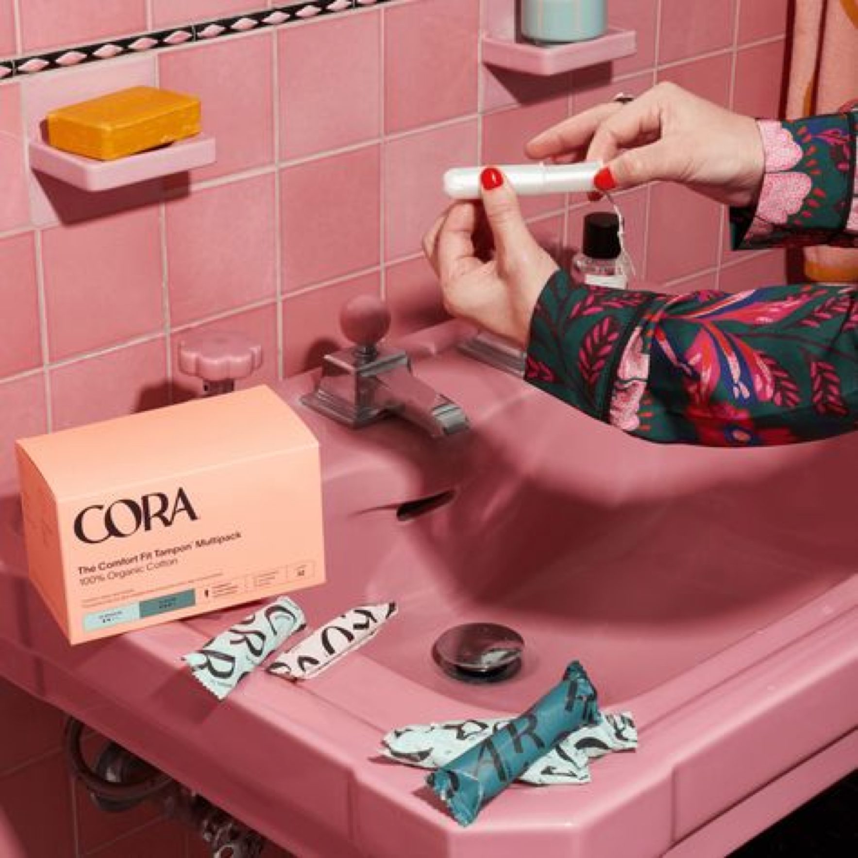
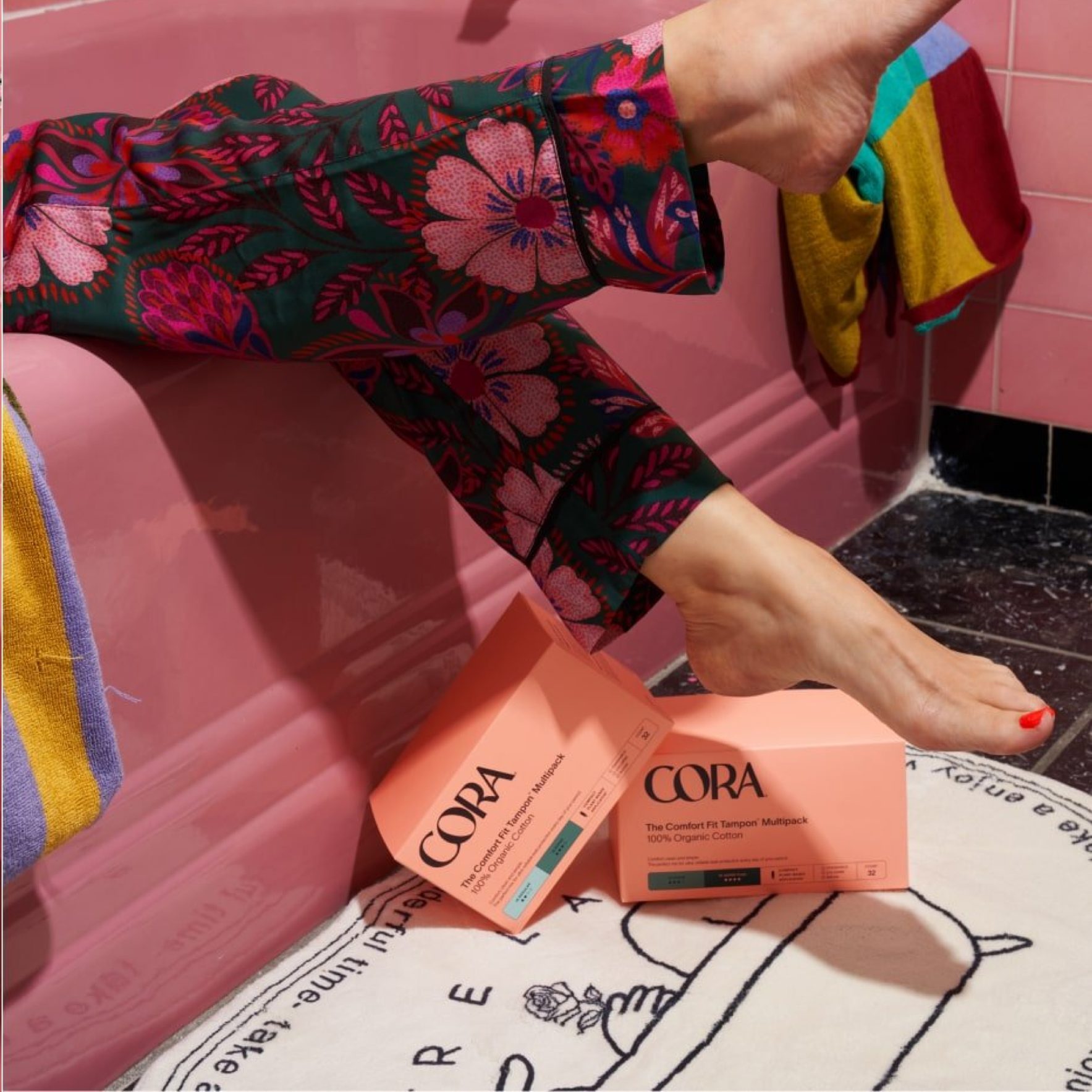
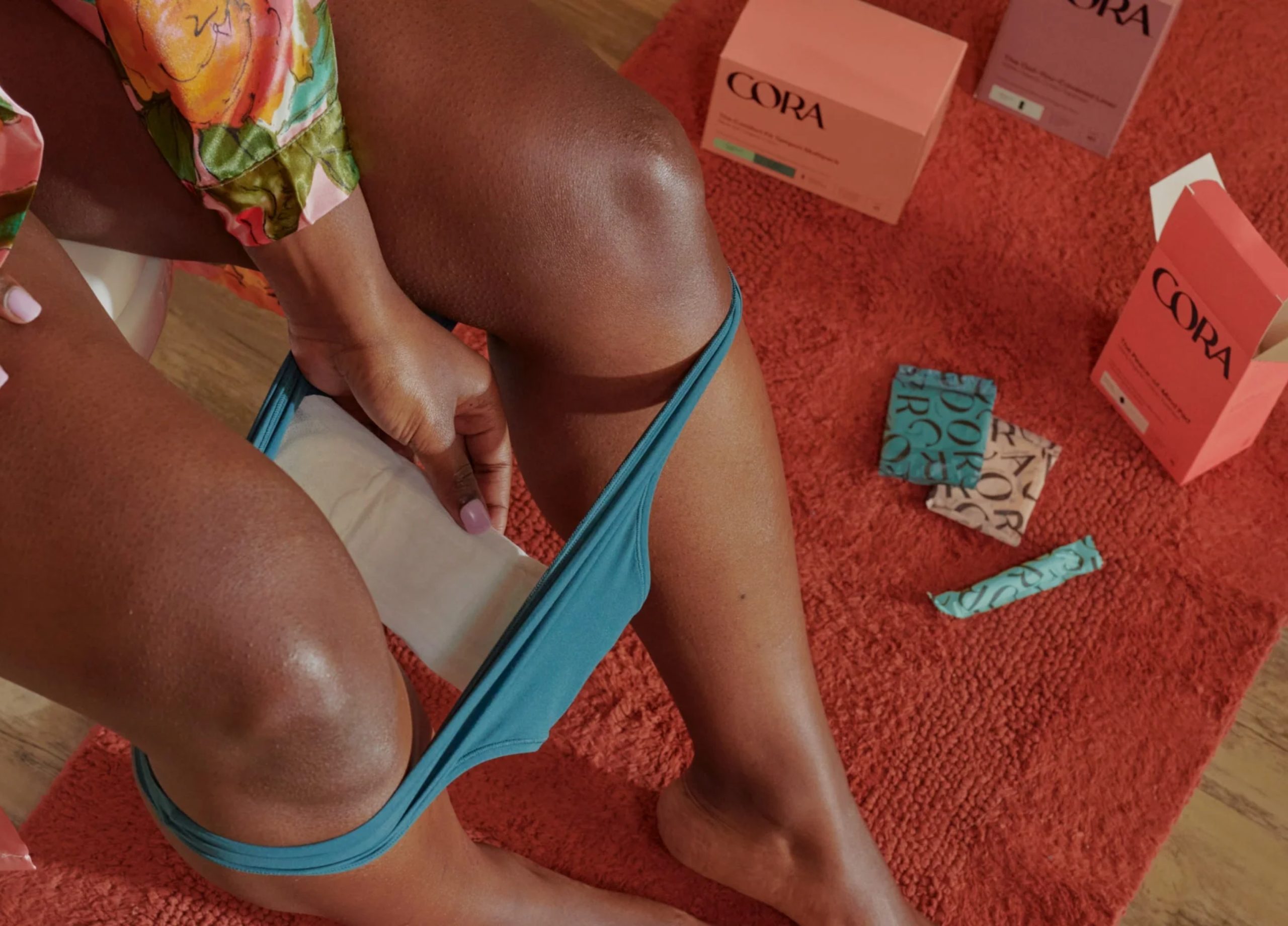
The new identity gives Cora’s packaging, tone of voice and communications a bold look and feel, positioning it as the brand that shifts the conversation from an impersonal experience to a more relatable and personal one, rooted in comfort. This way, the identity reflects the brand mission to champion and be a partner in their consumers’ wellbeing, but also to champion them culturally, recognizing that bodies and experiences are unique and ever-evolving.
This project was completed whilst freelancing with the team at Mother Design.
See the full case study at: https://www.motherdesign.com/w...