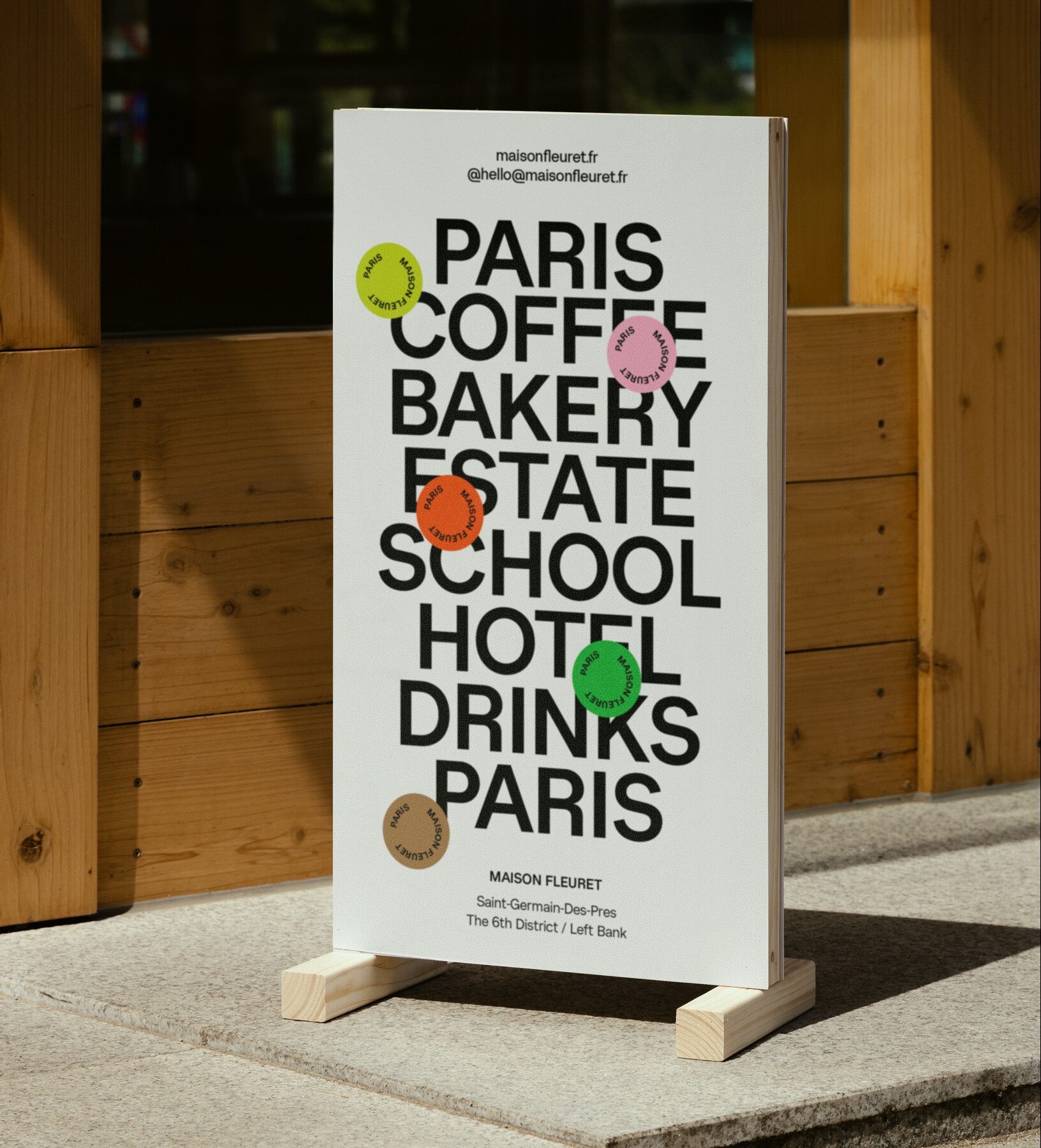
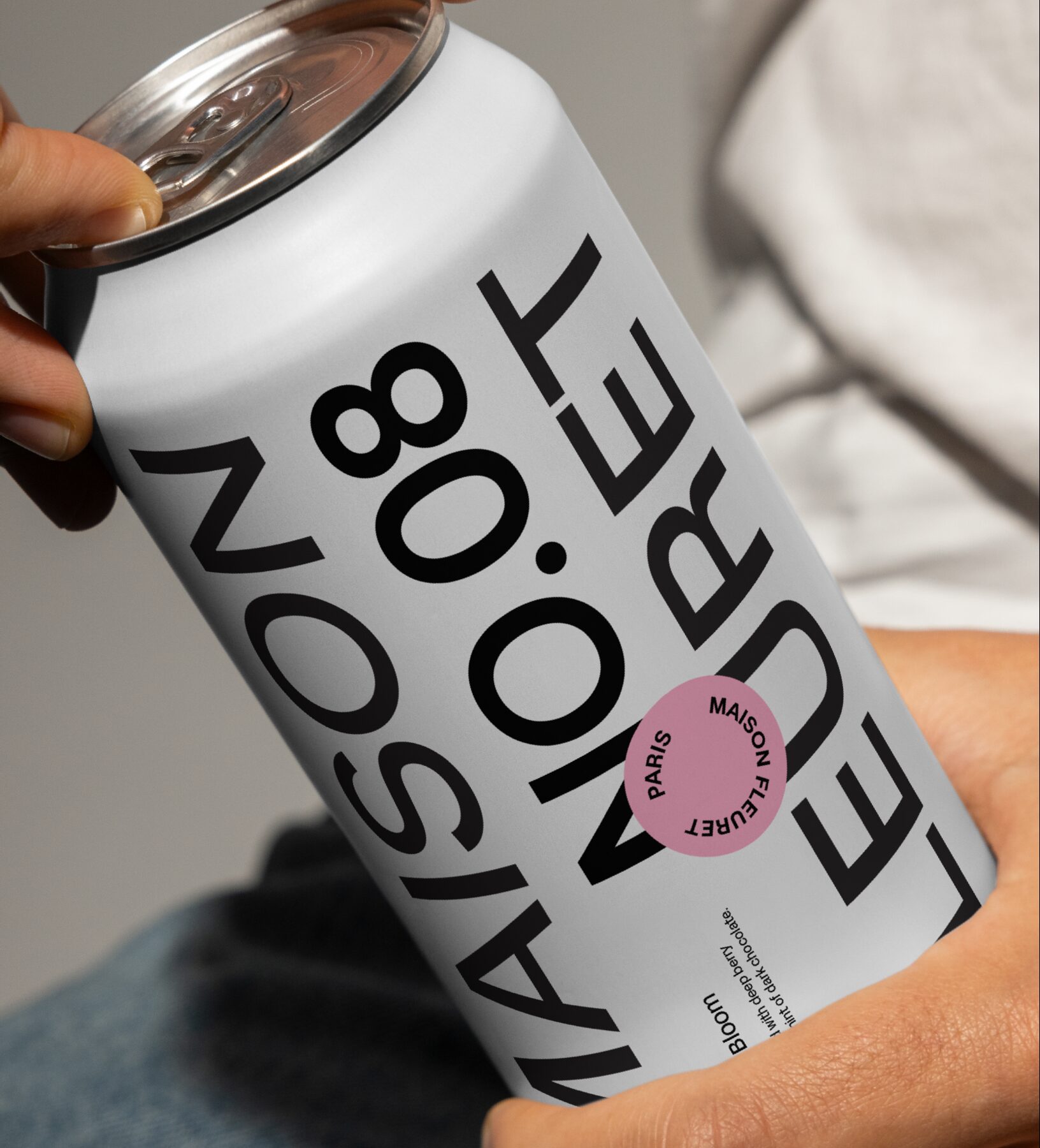
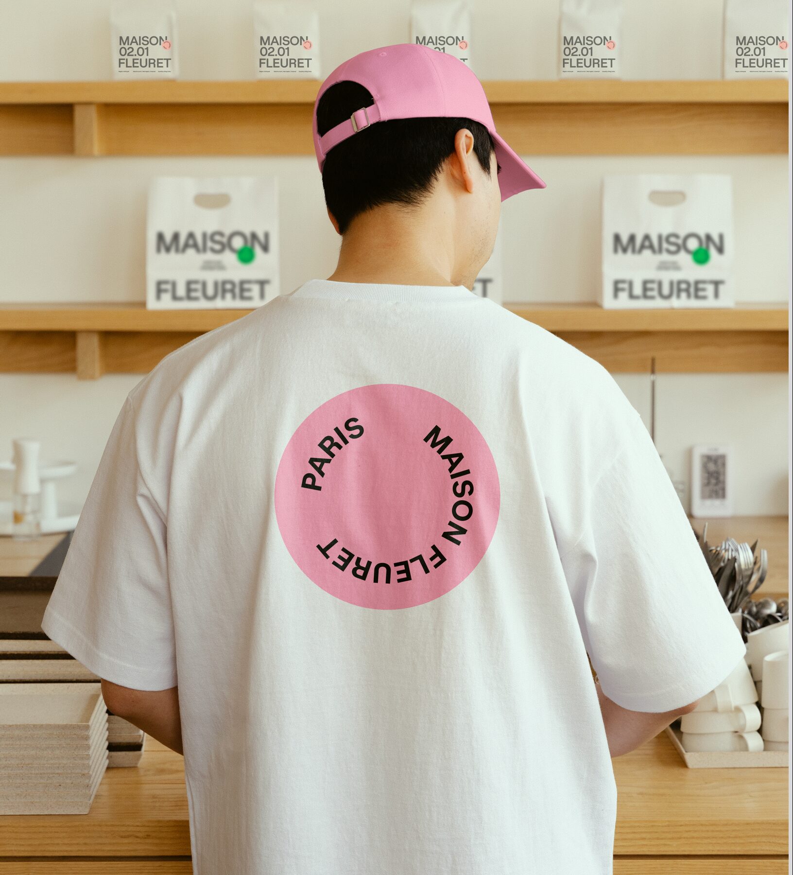
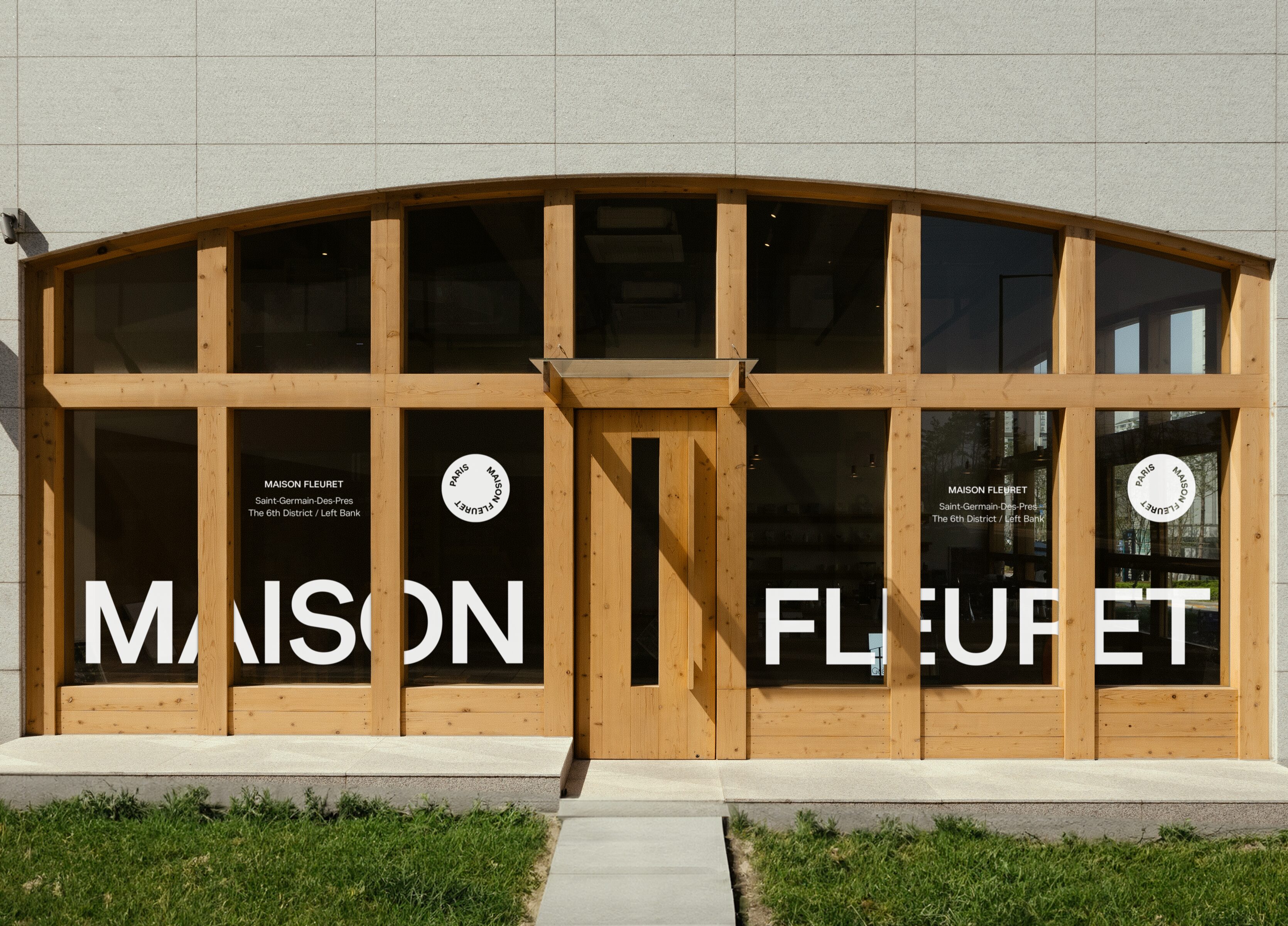
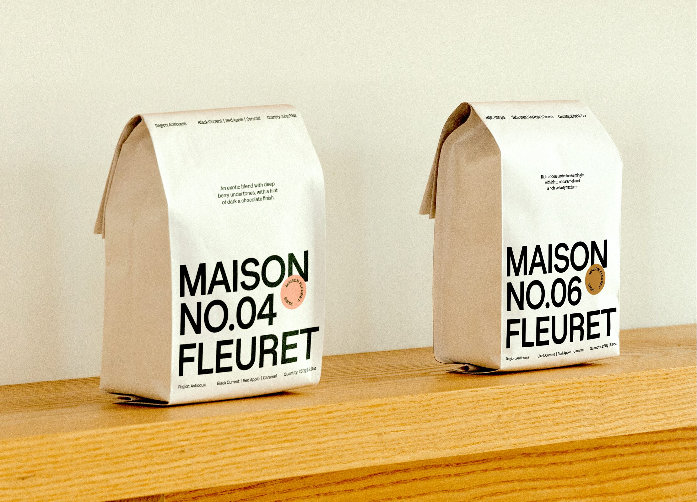
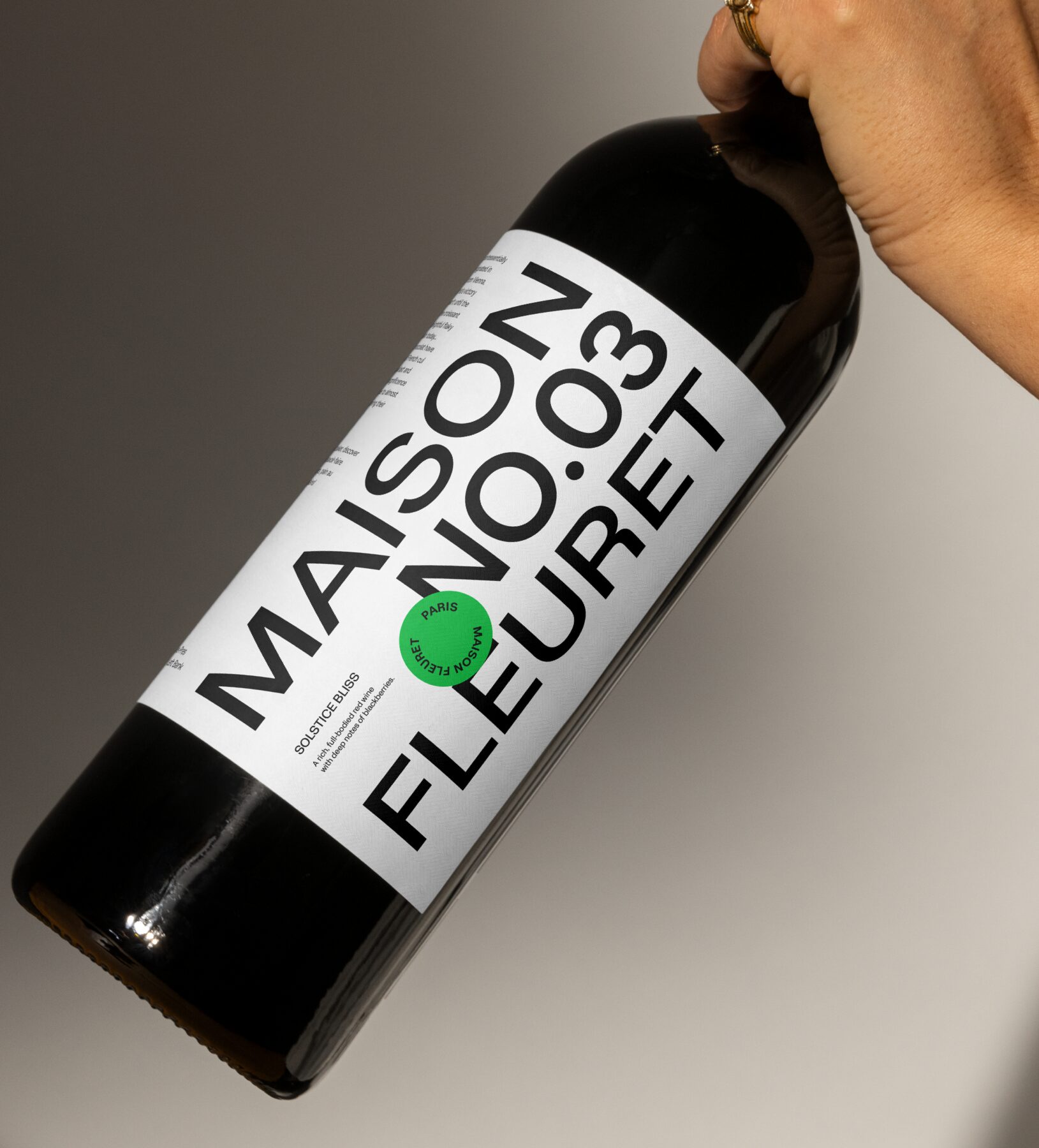
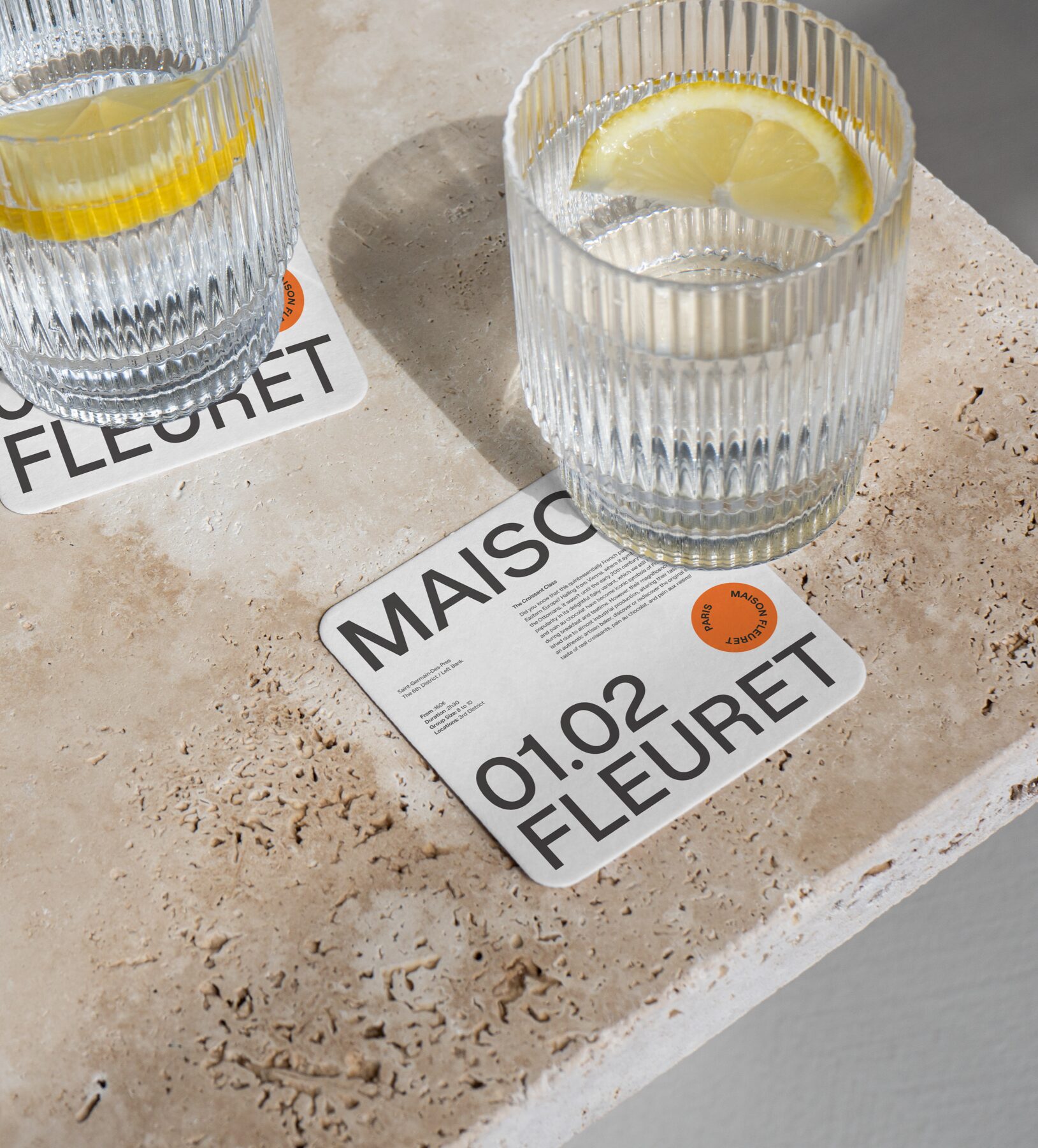
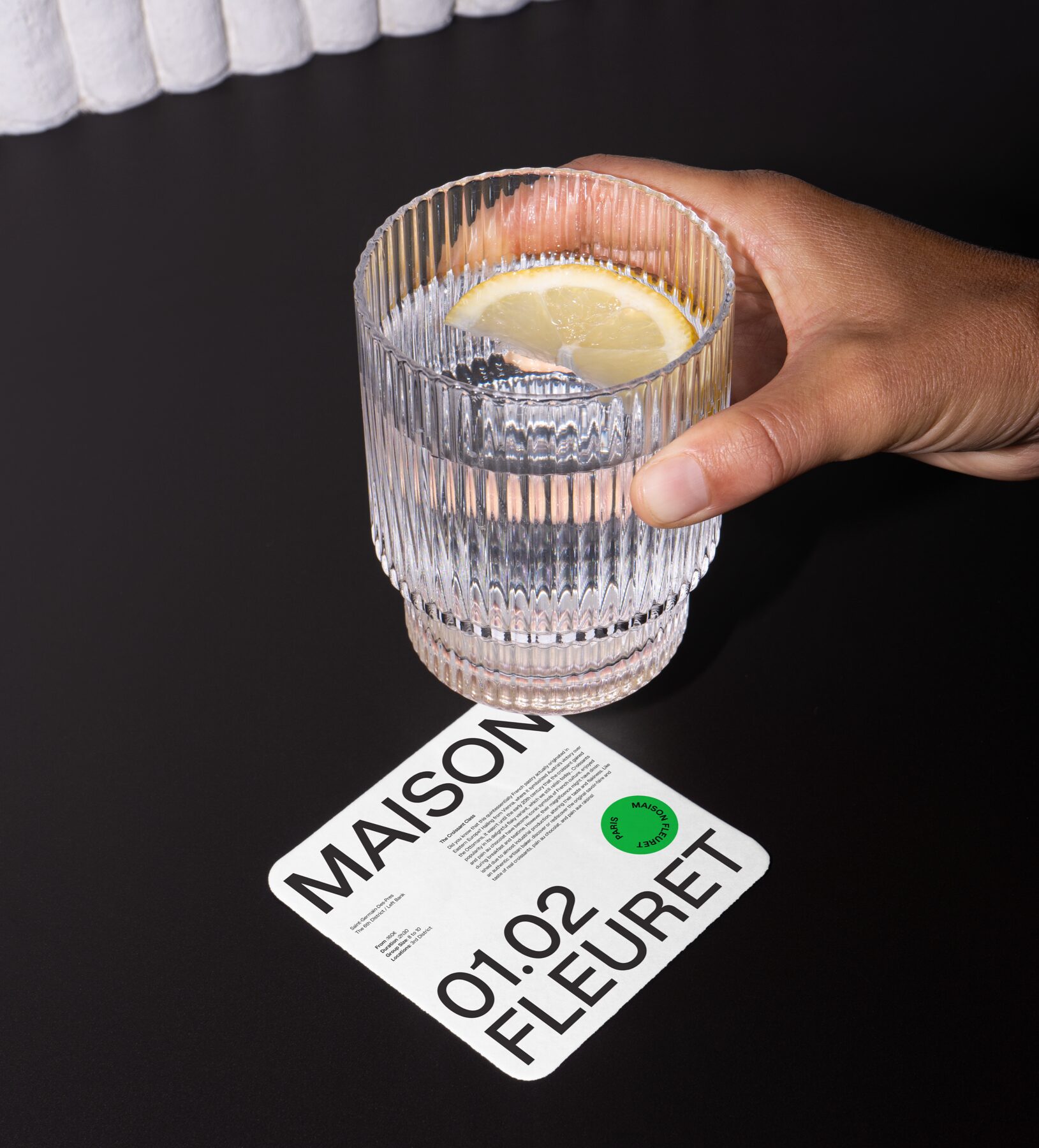
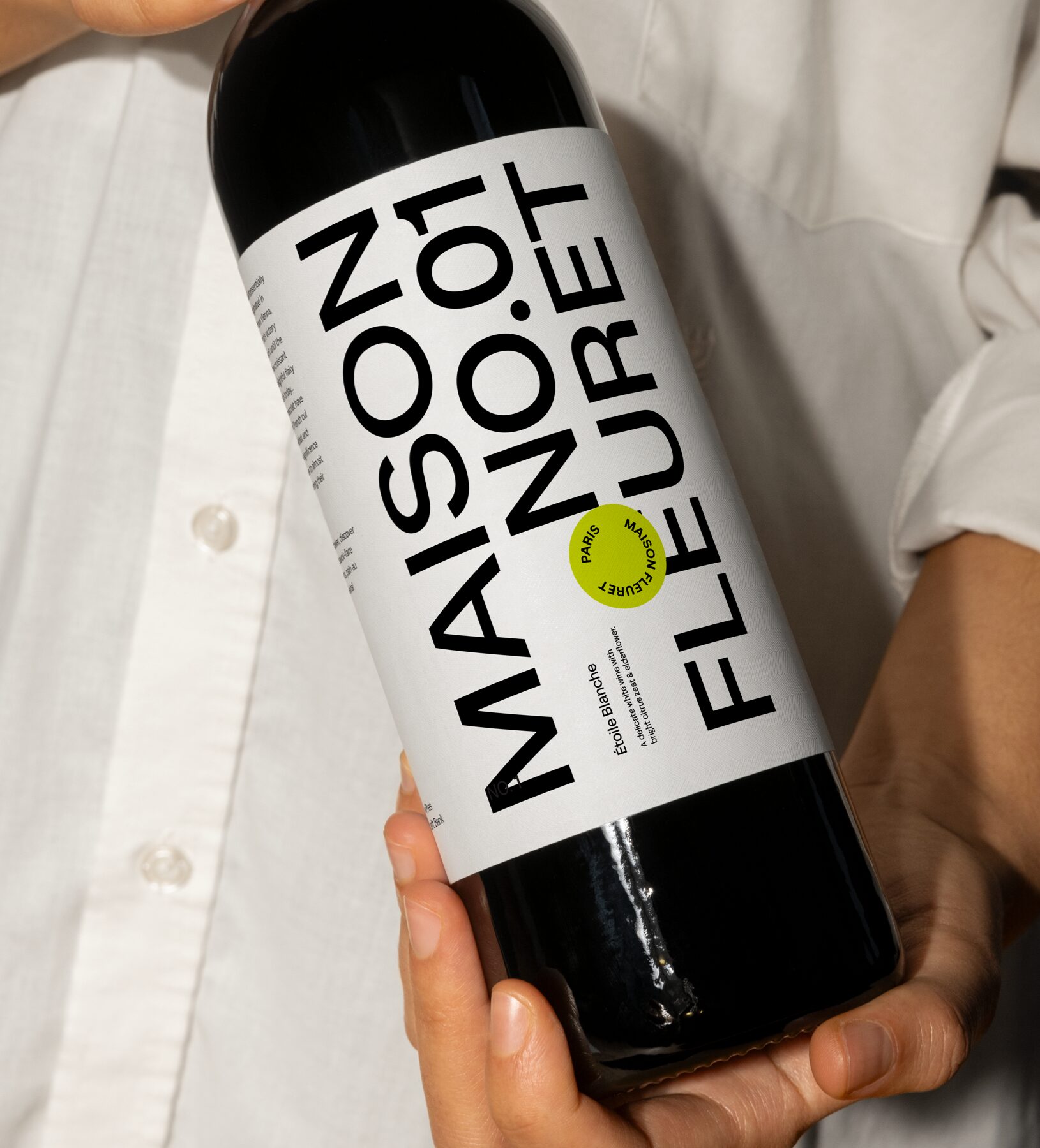
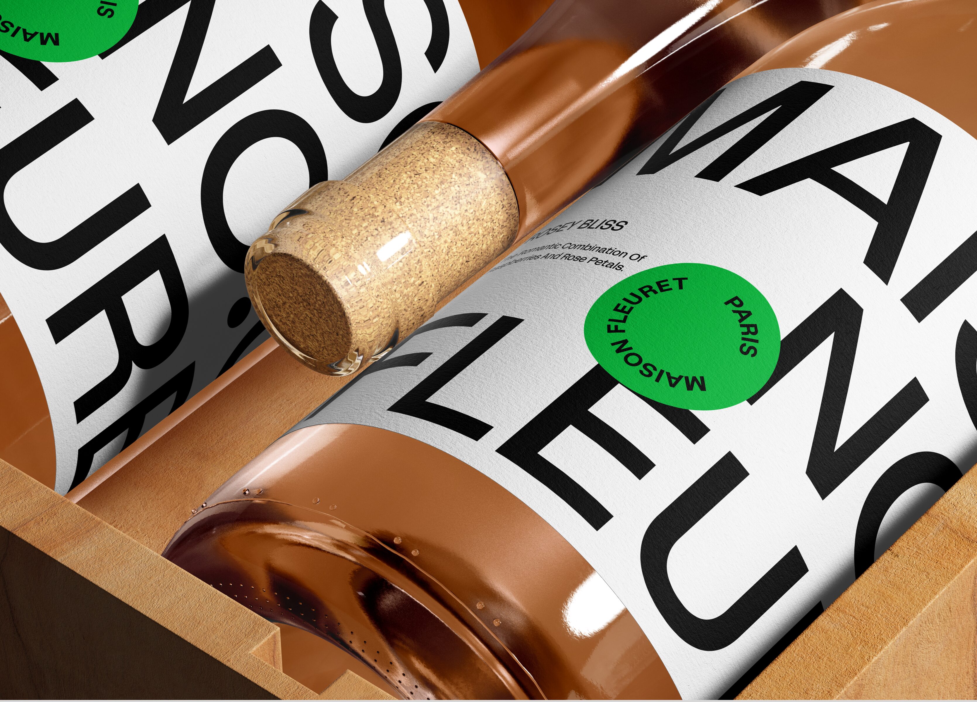
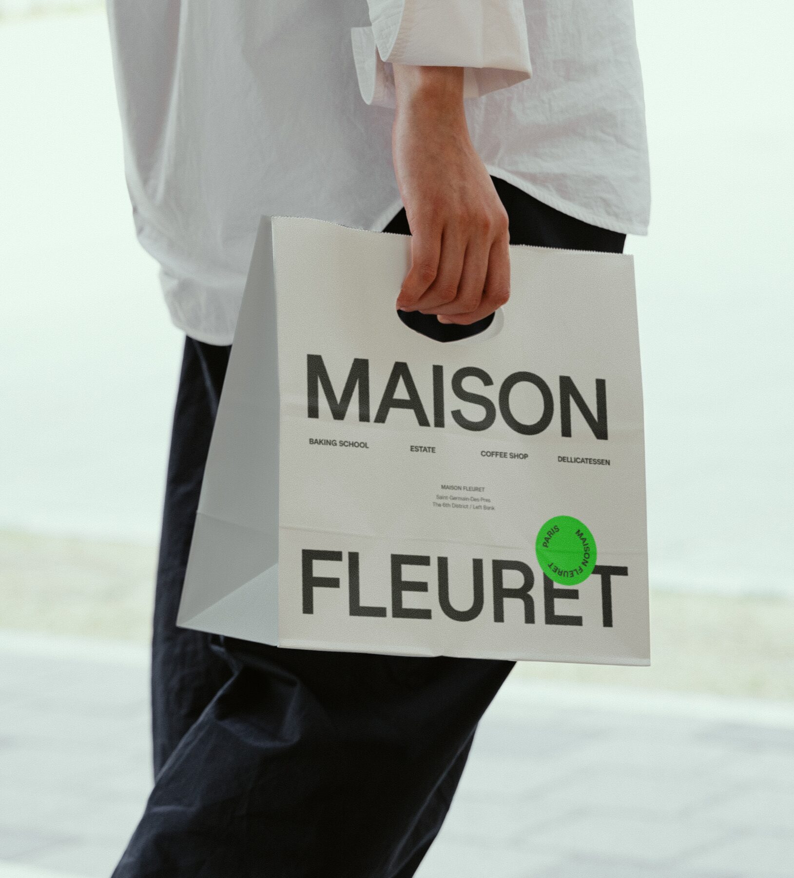
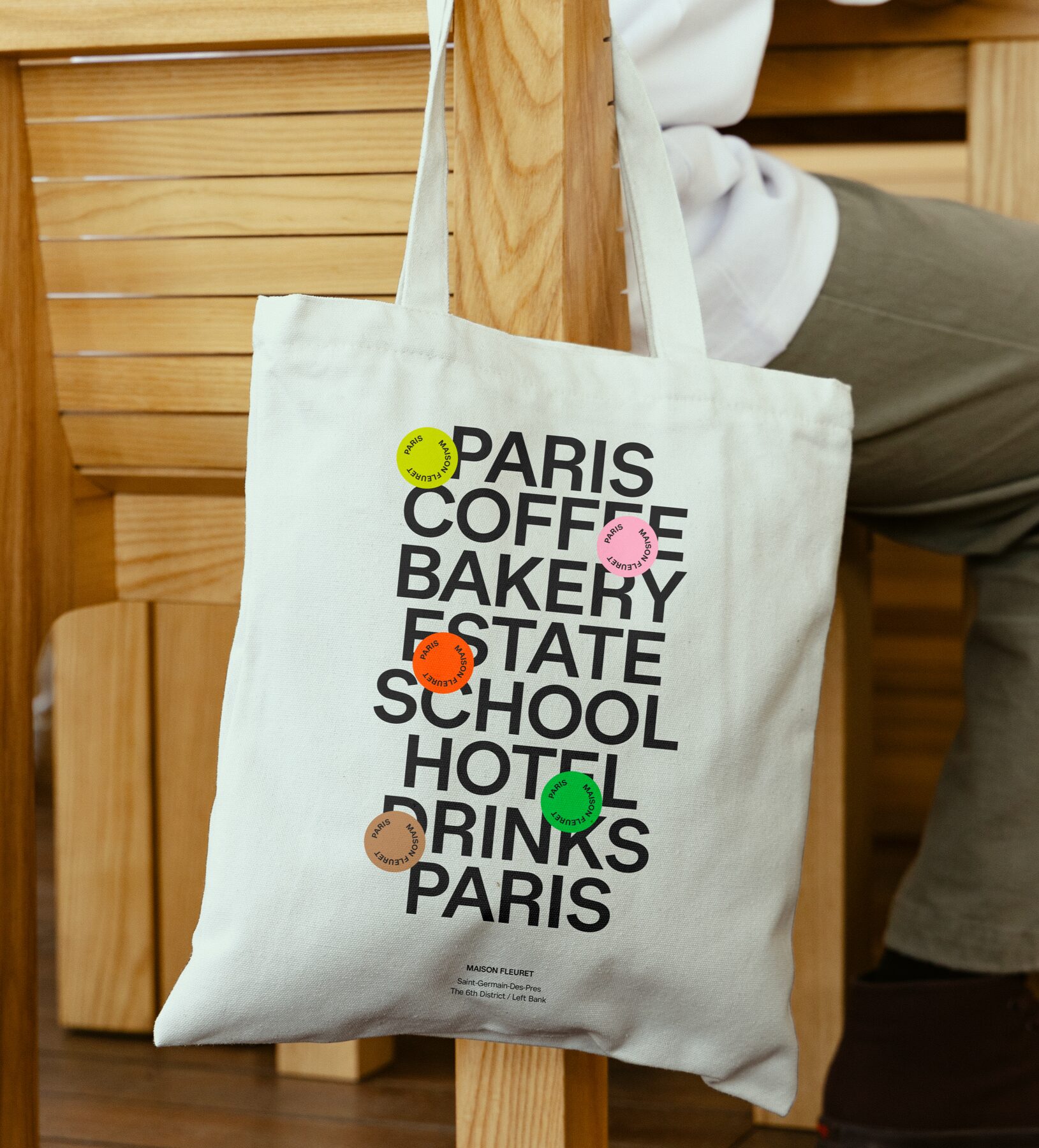
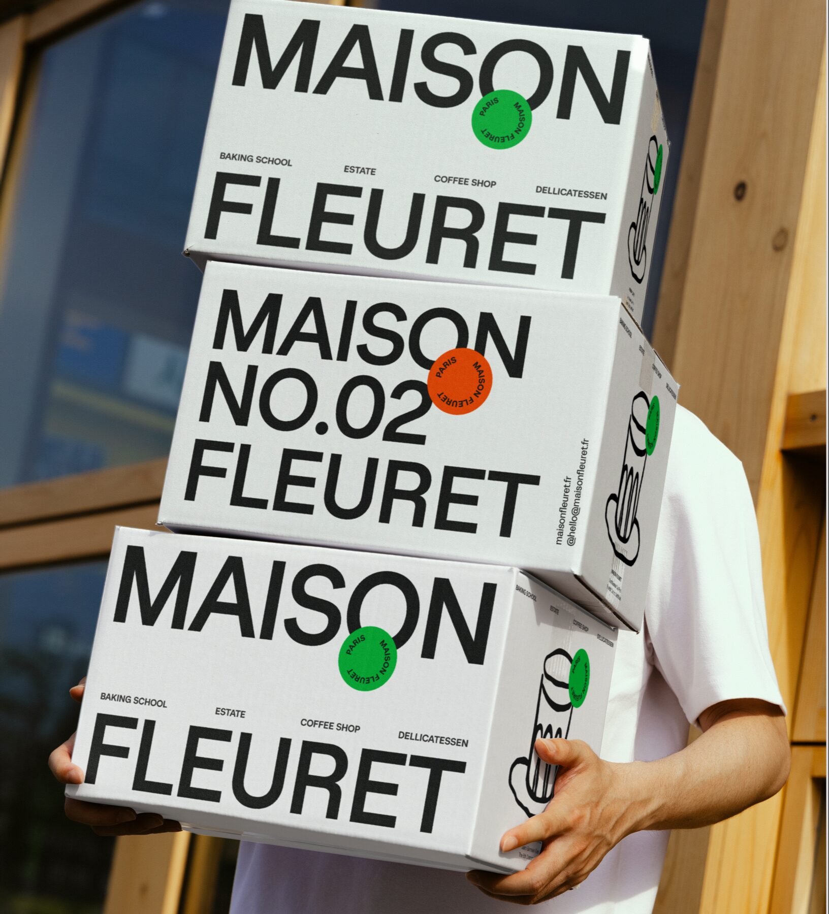
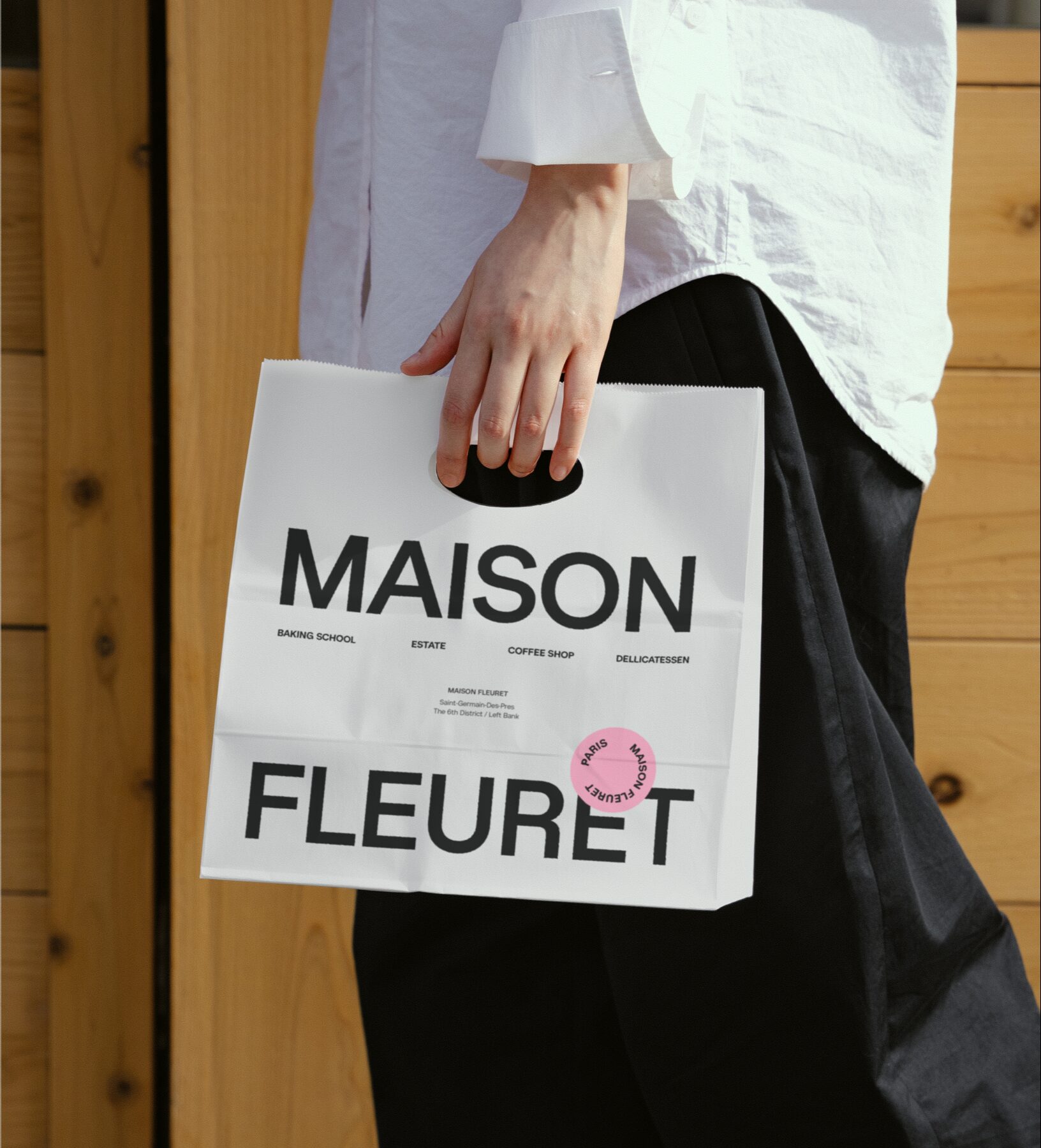
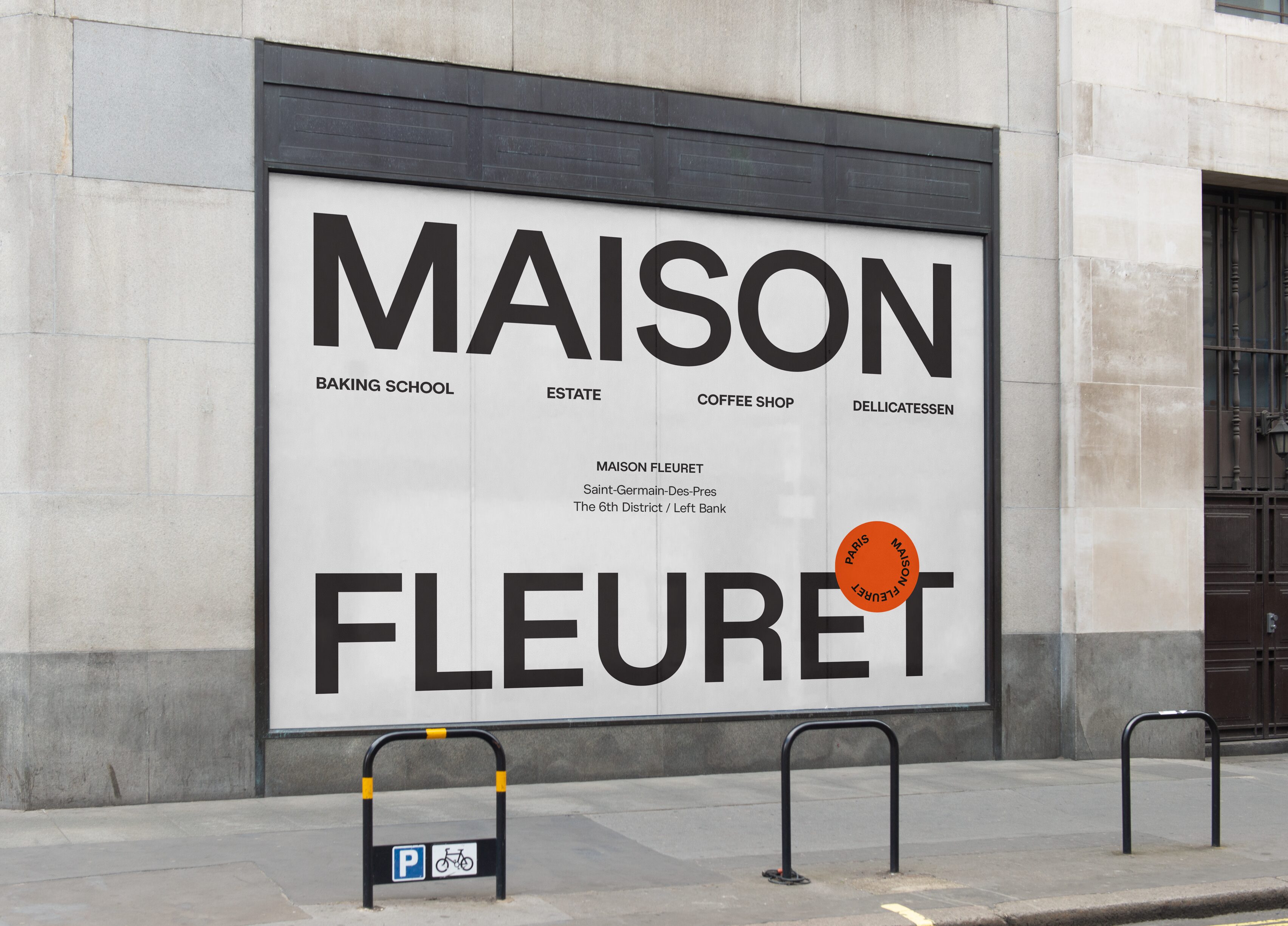
Maison Fleuret, located in the heart of Paris, is a refined multi-faceted brand encompassing a coffee shop, baking school, estate, hotel, and an exclusive product line featuring wines, premium coffee blends, and cold brews. Catering to an international and discerning French clientele, the brand is deeply rooted in French tradition, authenticity, and sophistication, ensuring an elevated experience at every touchpoint.
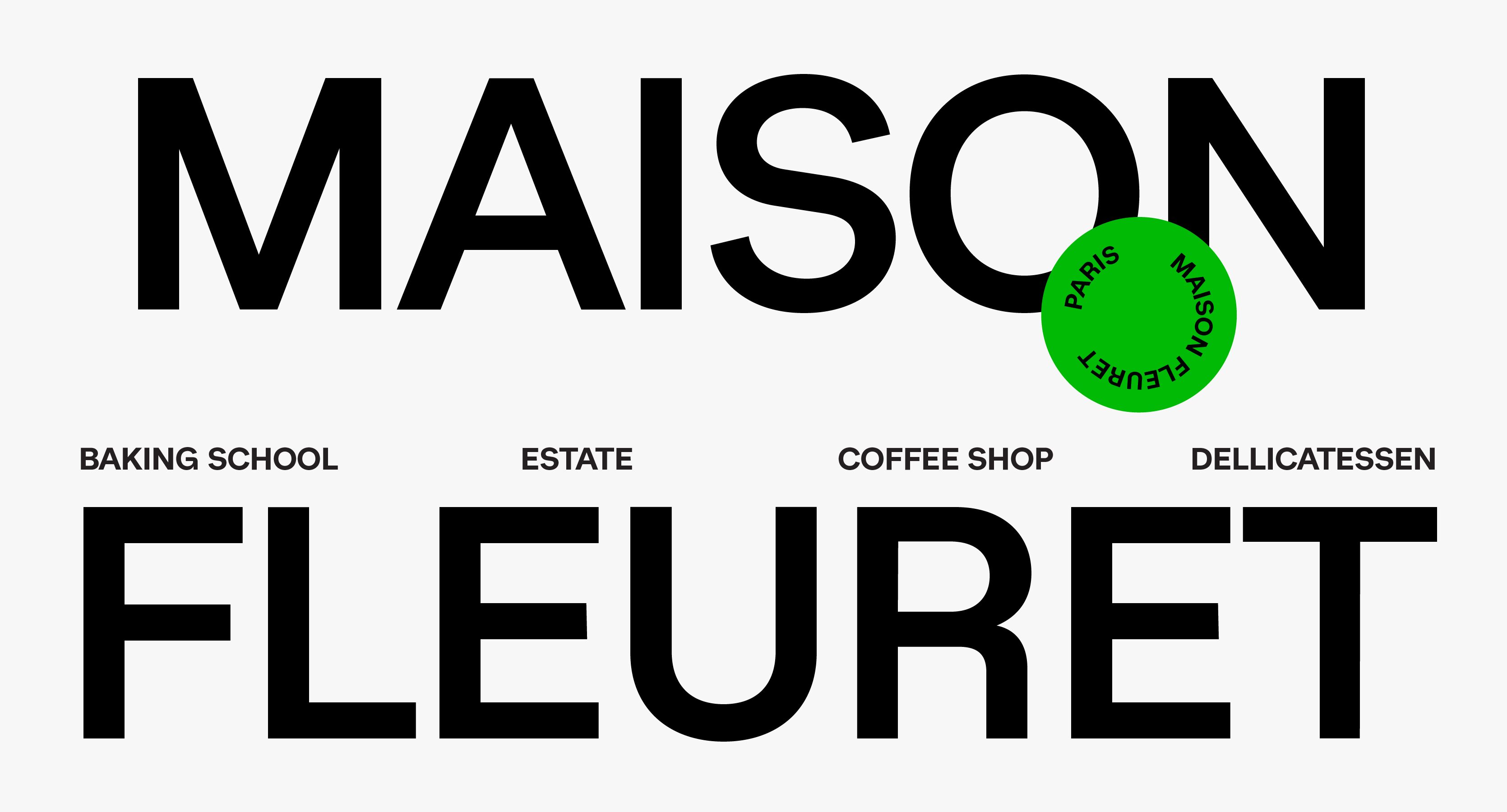
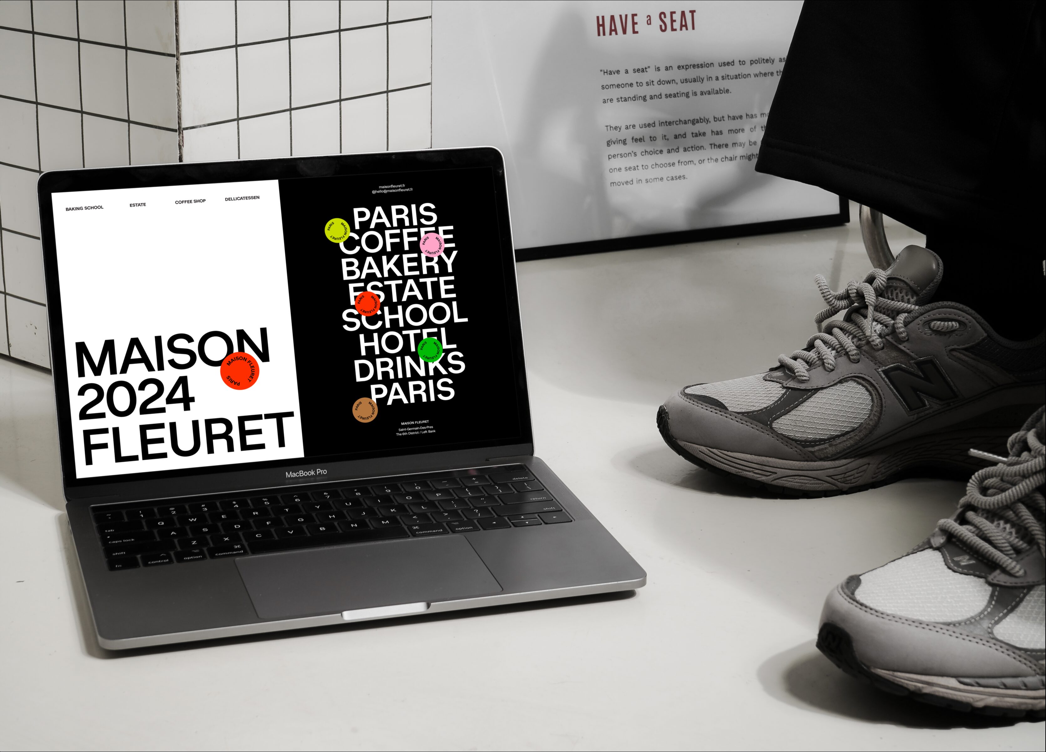
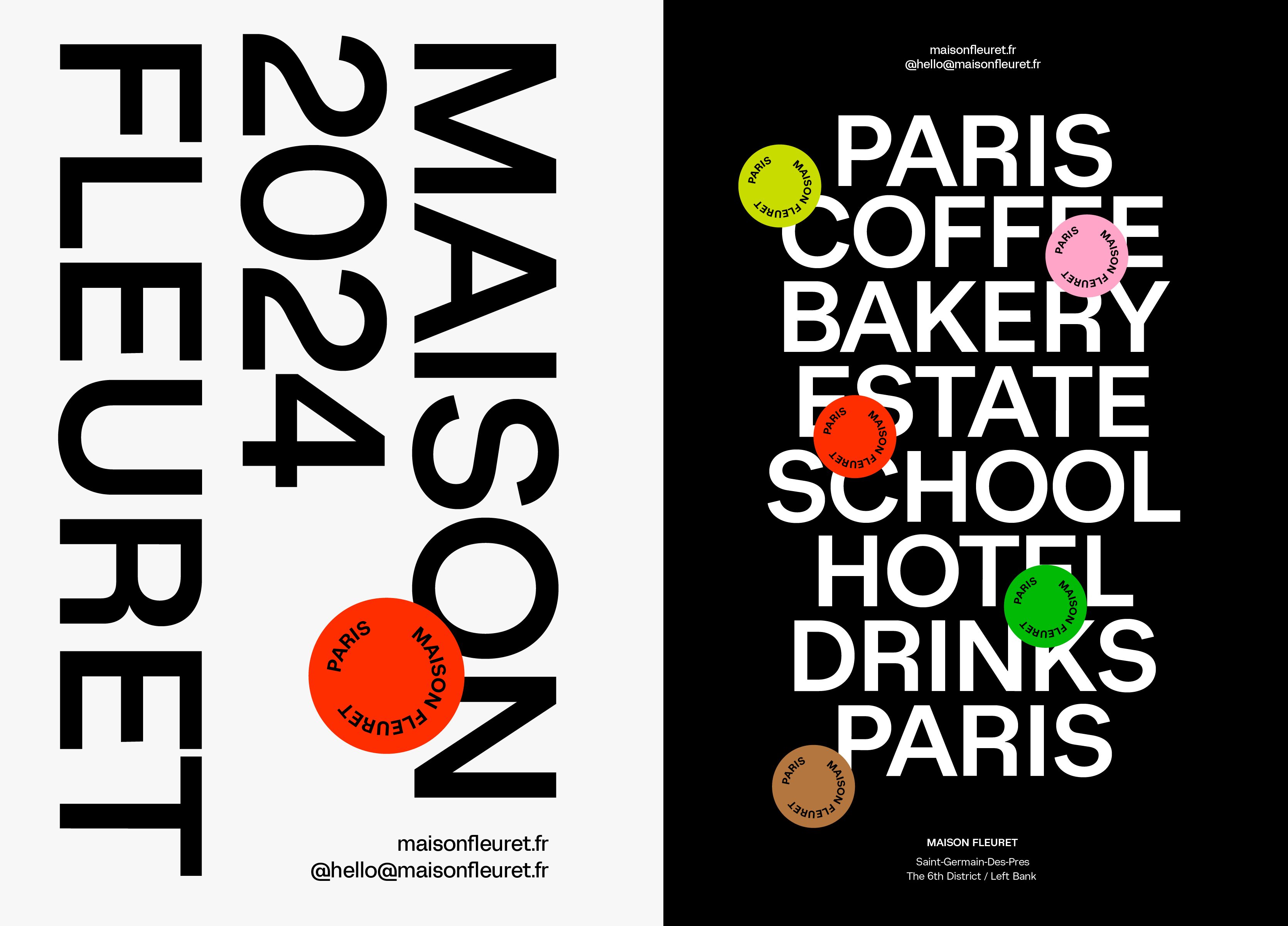
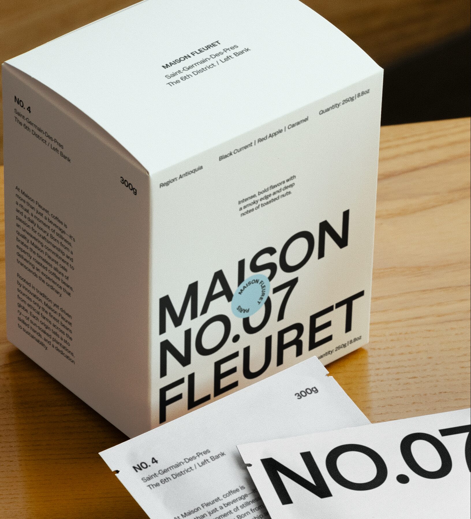
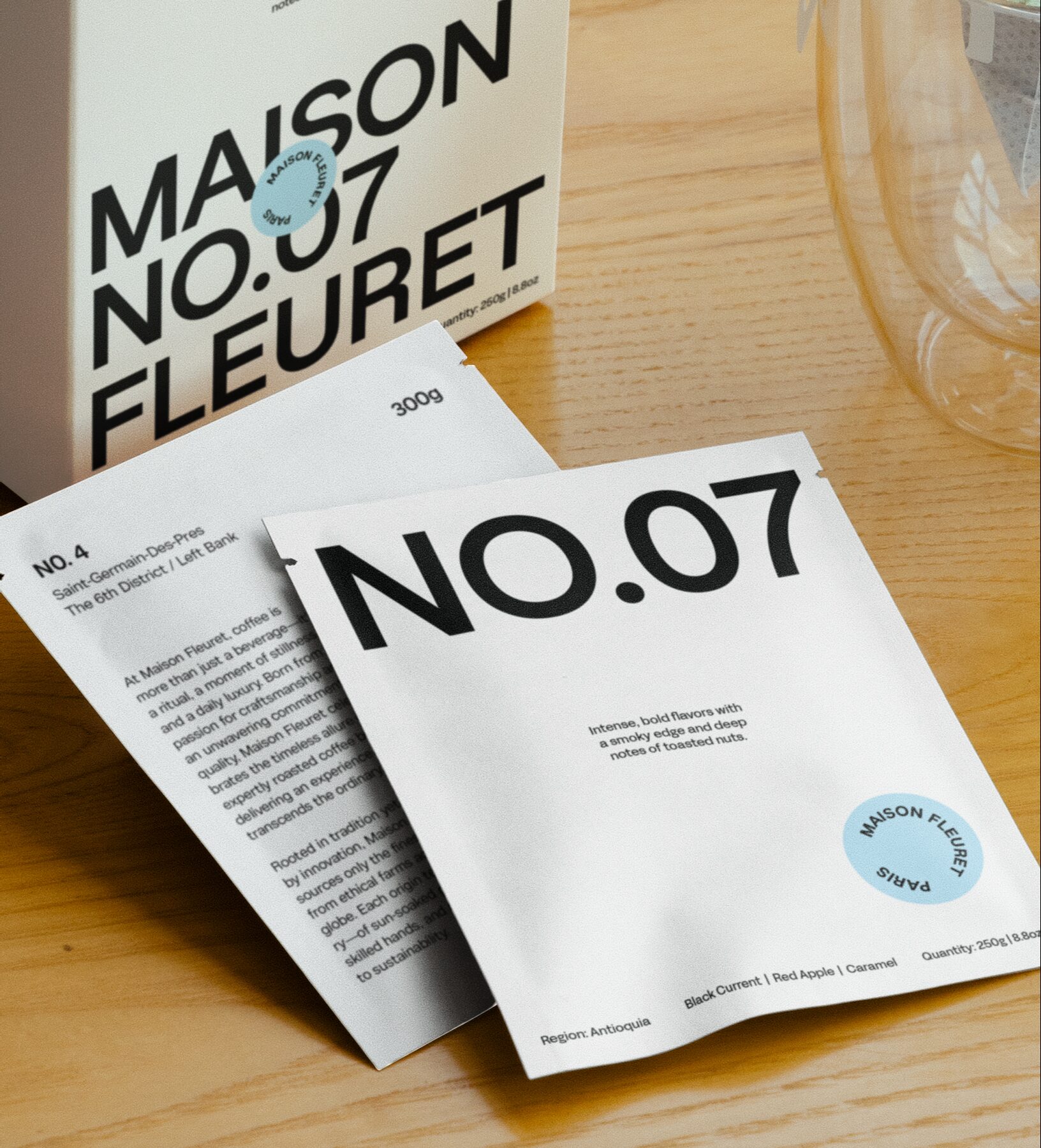
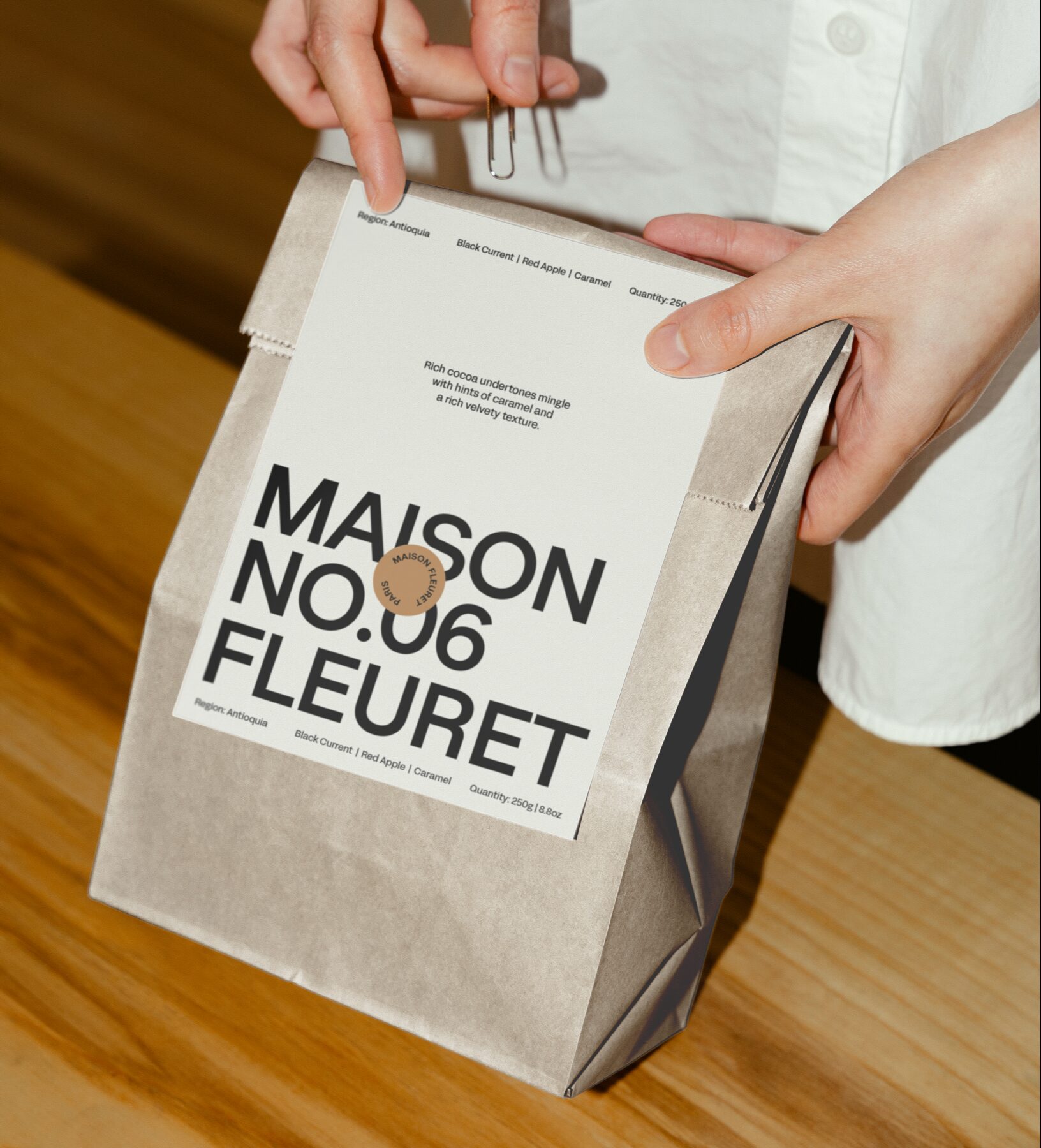
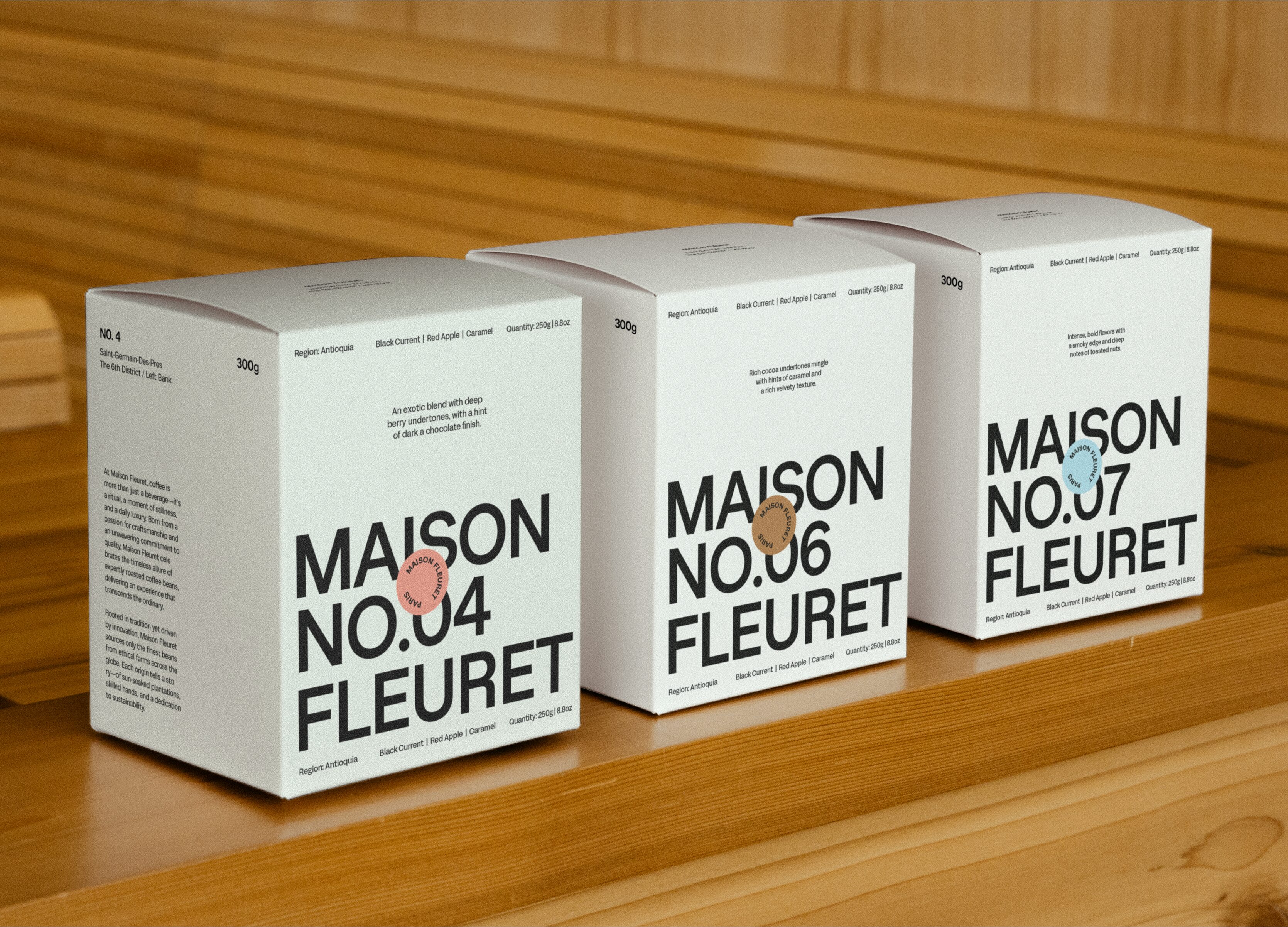
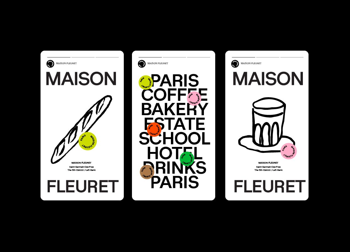
The brand identity is intentionally understated, timeless, and neutral, allowing flexibility across diverse brand categories and touchpoints. At its core lies a custom typographic logomark, crafted from a refined version of Sterling Sans. This versatile design allows the logomark to be deconstructed and adapted seamlessly across various applications. The typeface extends into the brand’s primary typography system, reinforcing consistency and elegance.
Illustration plays a supporting role within the design system, offering unique visual cues tailored to each sub-category. These illustrations are strategically applied across different brand expressions to enrich the overall narrative.
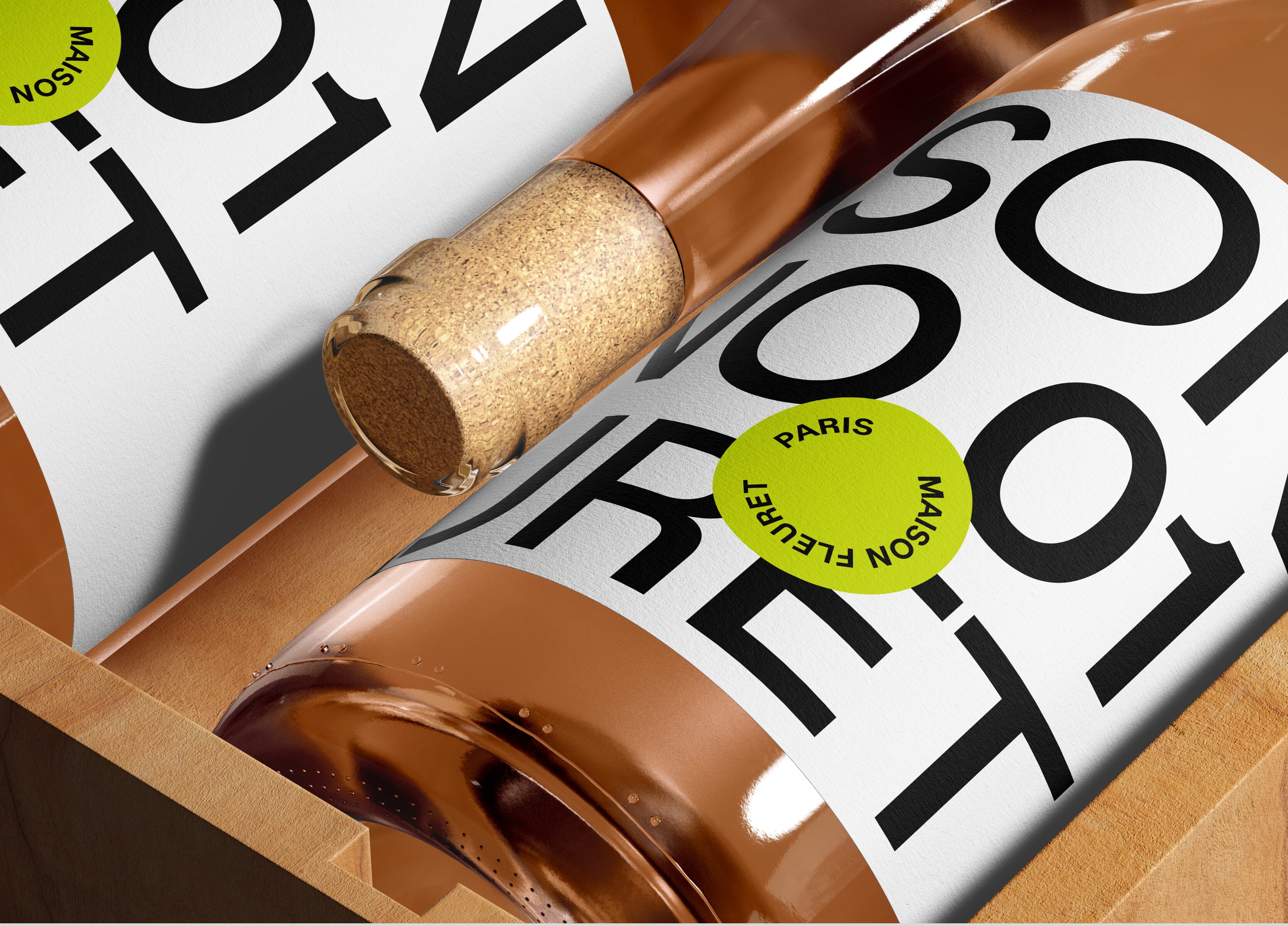
Maison Fleuret’s packaging design relies on a sophisticated color and numeric system to distinguish product lines, such as coffee blends and wines. Inspired by the precision and clarity of luxury cosmetic packaging, this system offers a clear visual hierarchy that communicates flavor profiles and product experiences effortlessly. The result is a cohesive and refined brand experience where every detail reflects Maison Fleuret’s commitment to tradition, authenticity, and timeless sophistication.
Mockups by:
Mockup Maison
Darkroom Mockups
Scene Number Mockups
Location: Paris, France
Illustrations: Antonio Carceles
