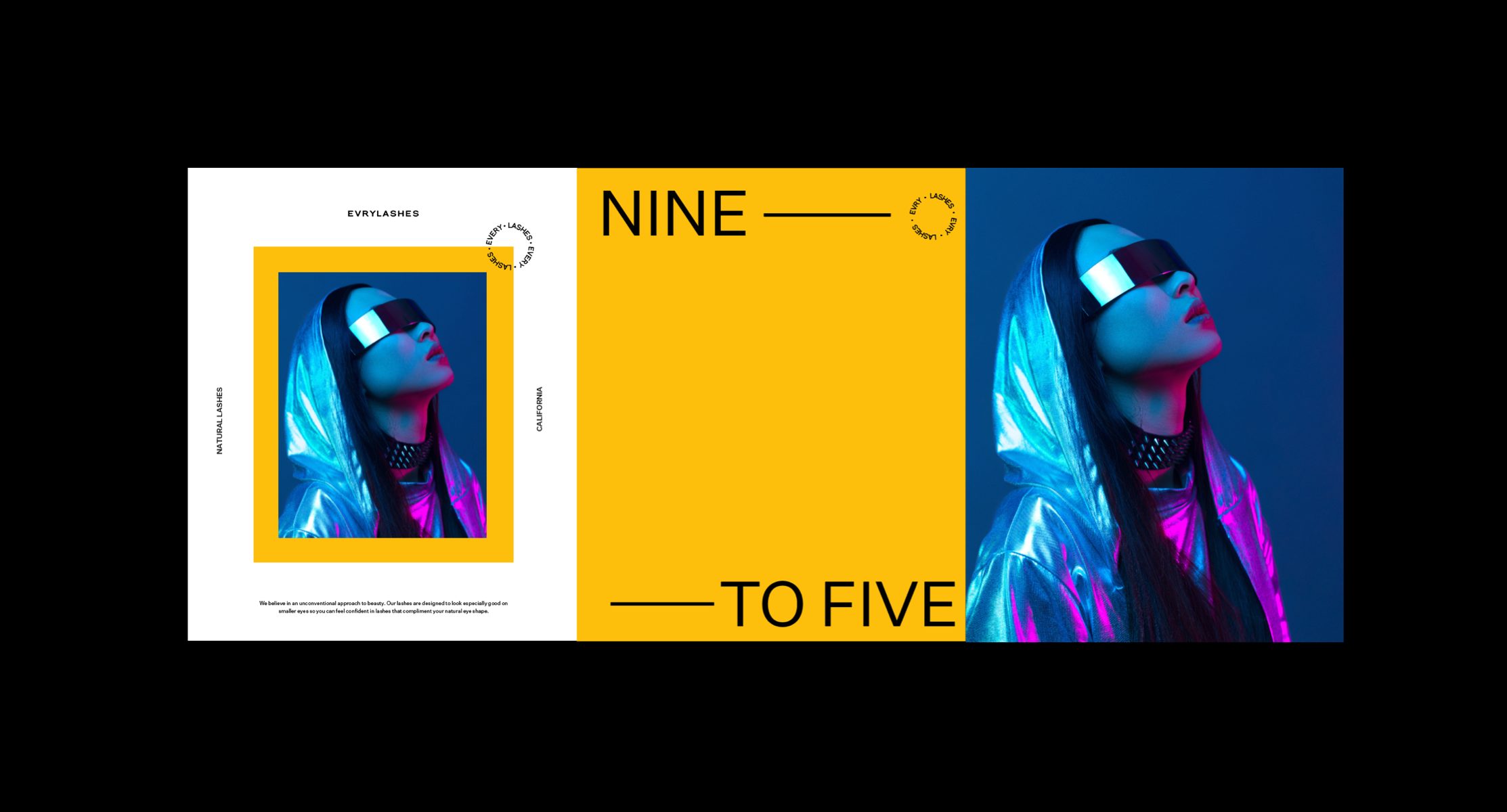
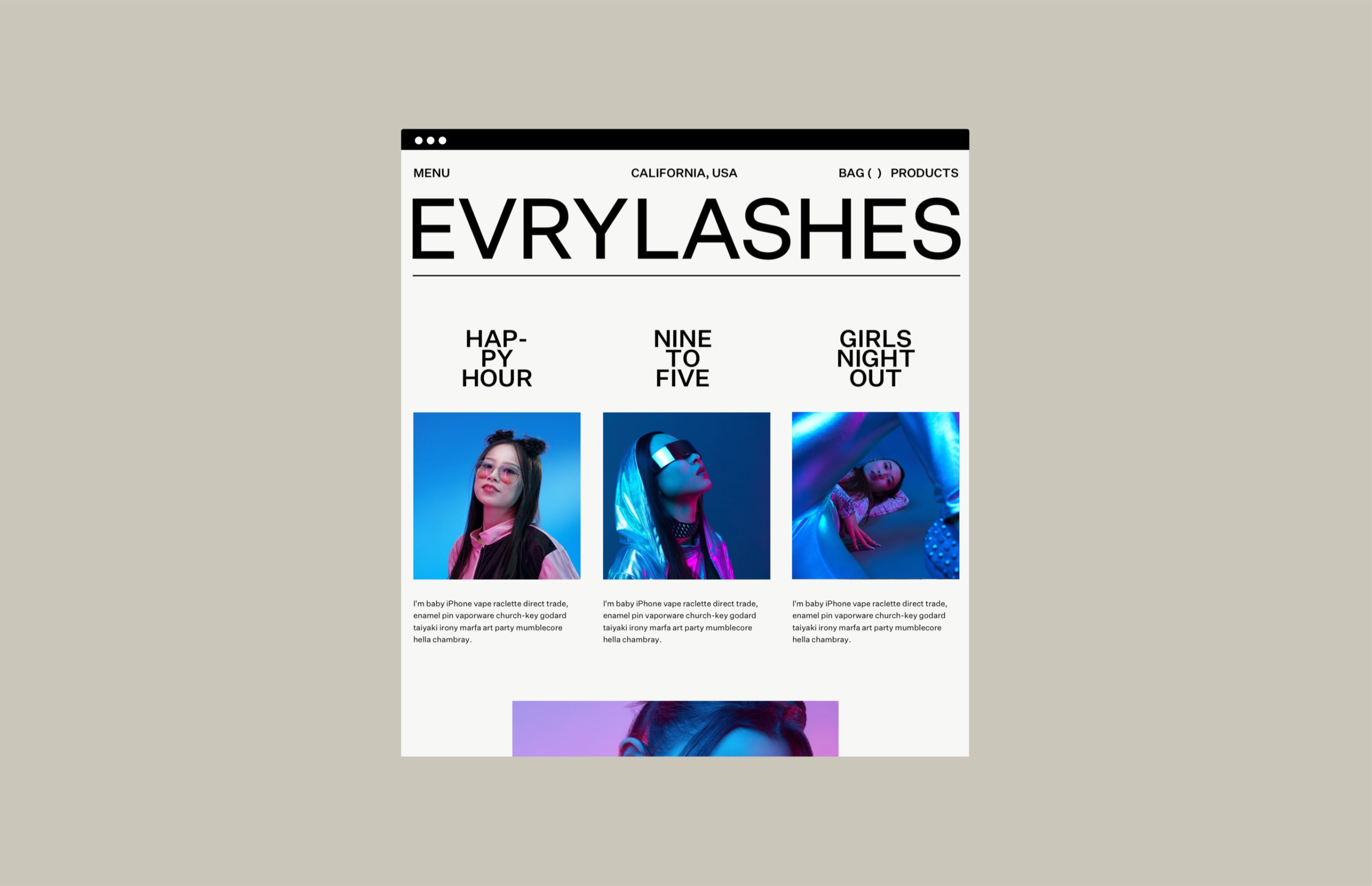
EVRYLASHES
Brand Identity Design, Art Direction And Packaging Design
Two distinct forms of racism have been perpetuated by beauty brands in recent years.
The first involves racist language, references, and stereotypes that are ridiculously blatant and ignorant. The second revolves around product ranges with a stunning lack of diversity. Racism is being been repeatedly addressed, but continuously occurs when brands neglect to cater for diversity.
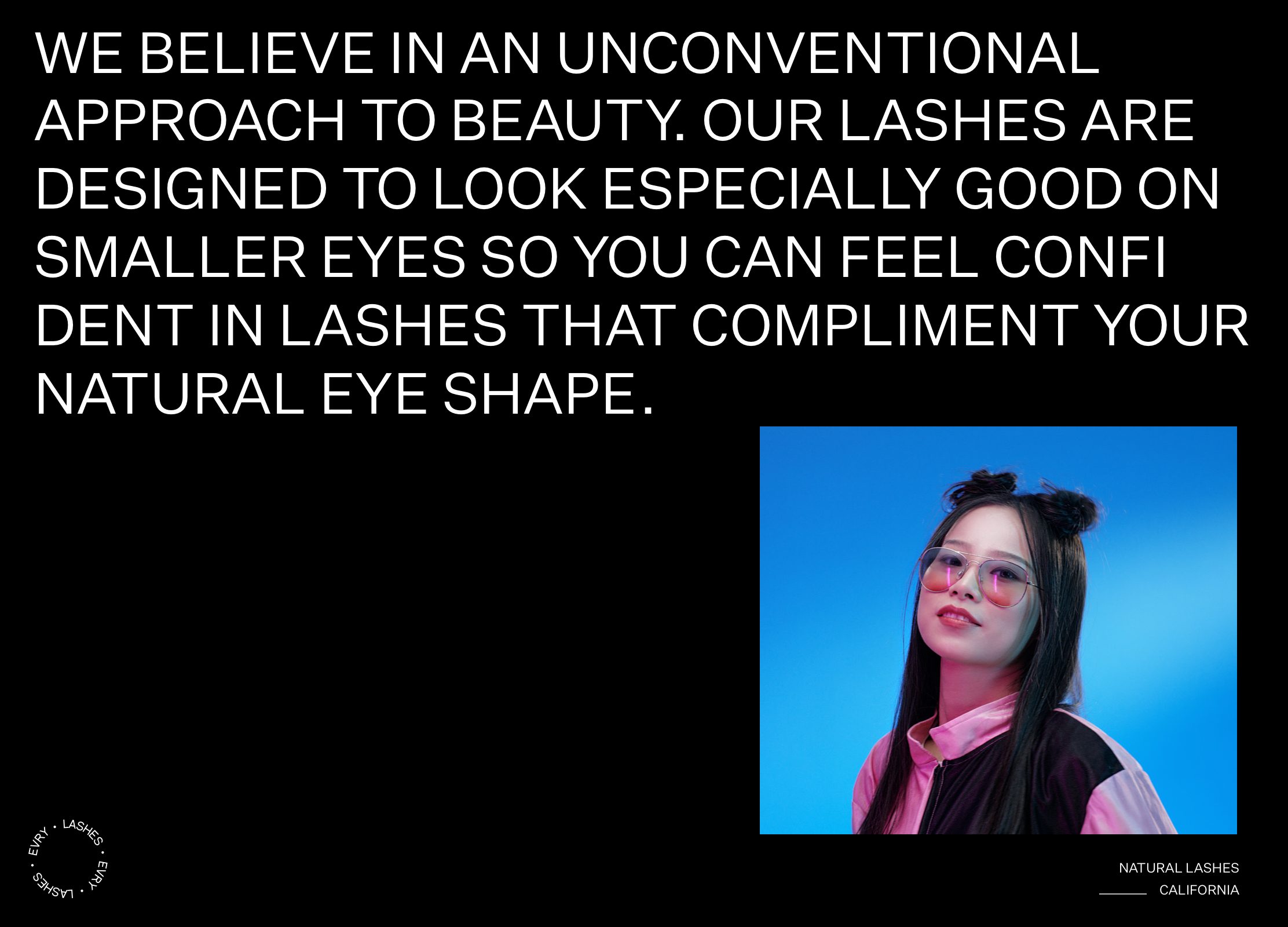
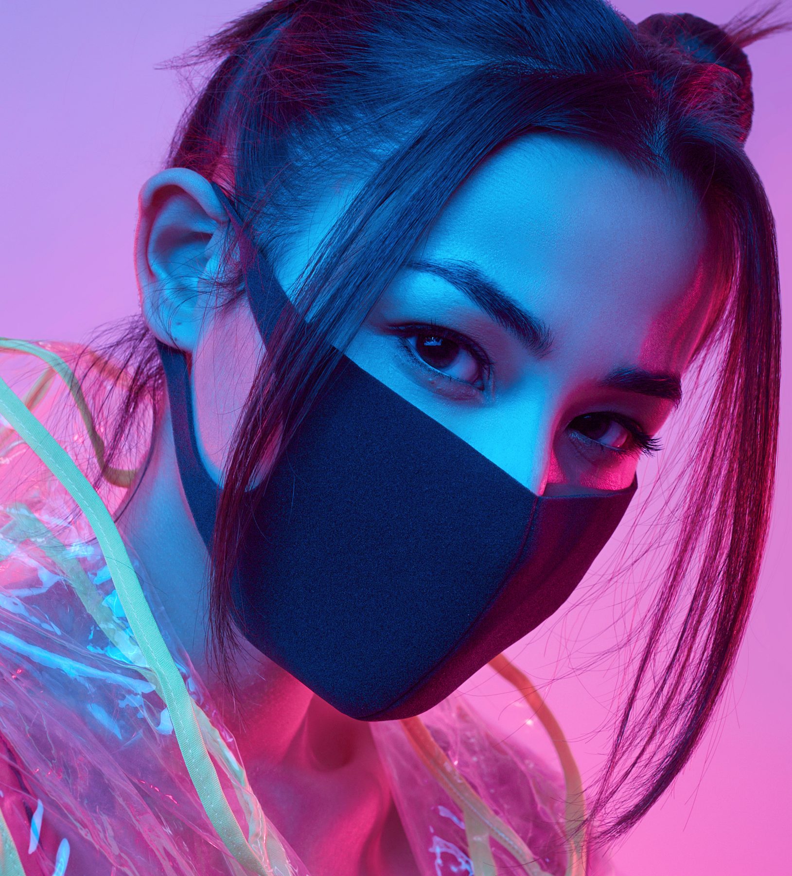
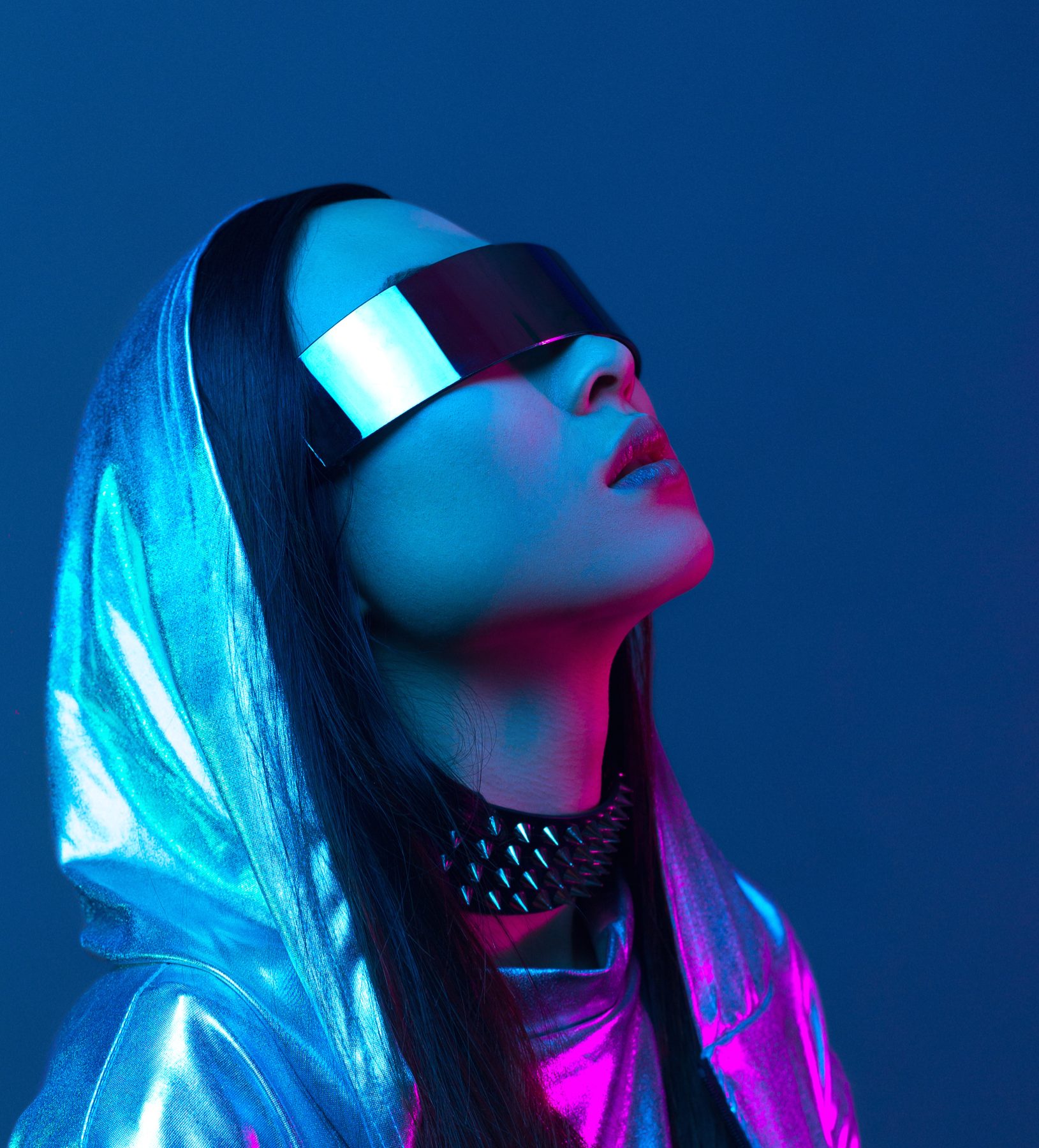
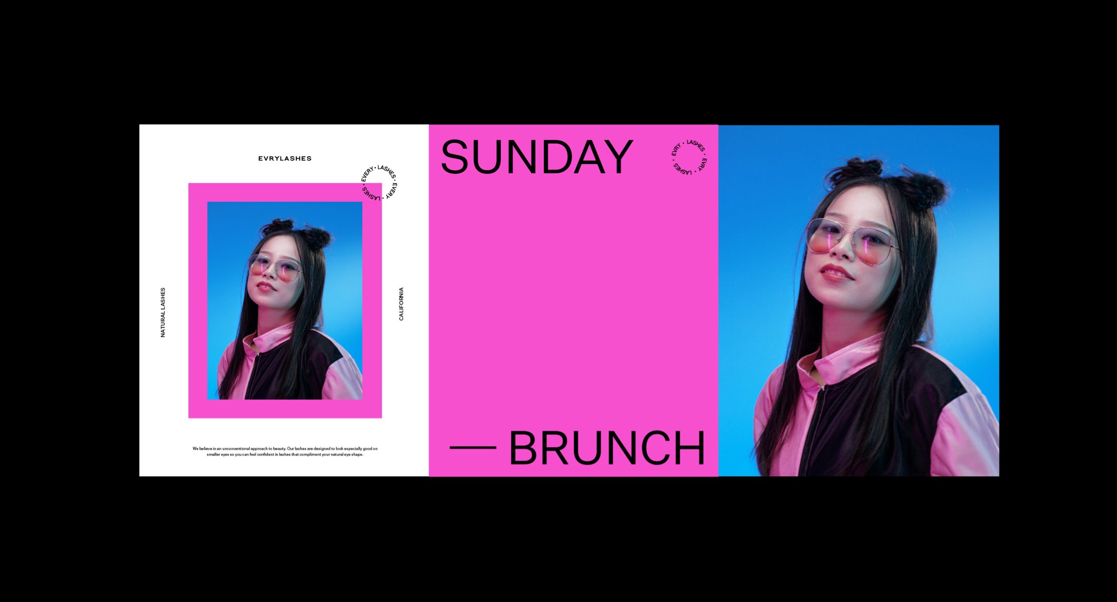
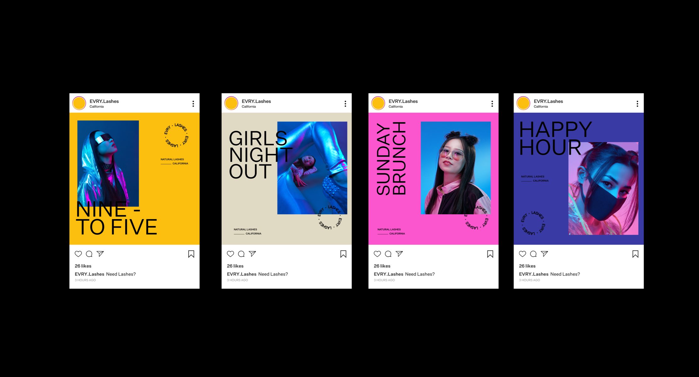
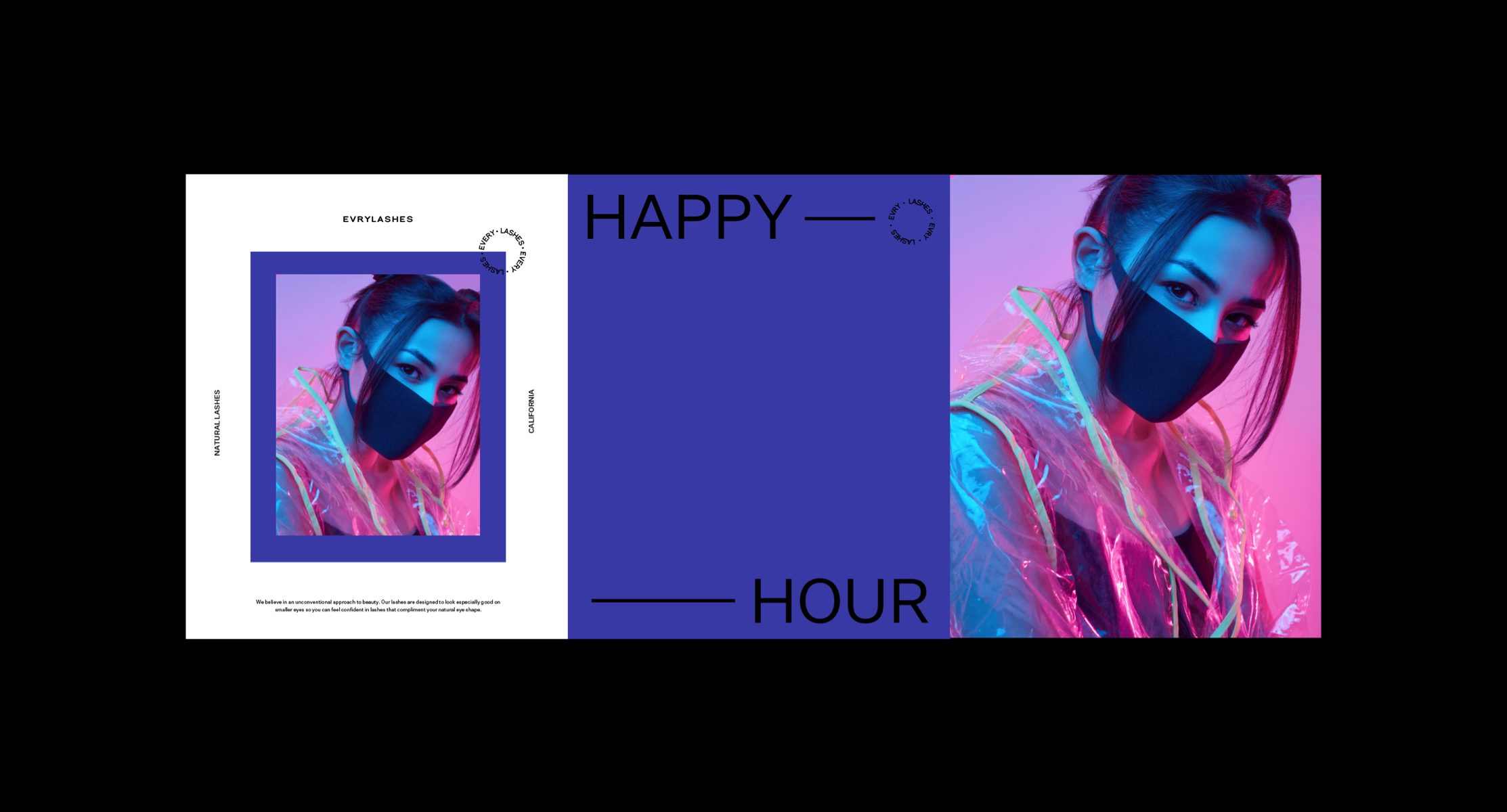
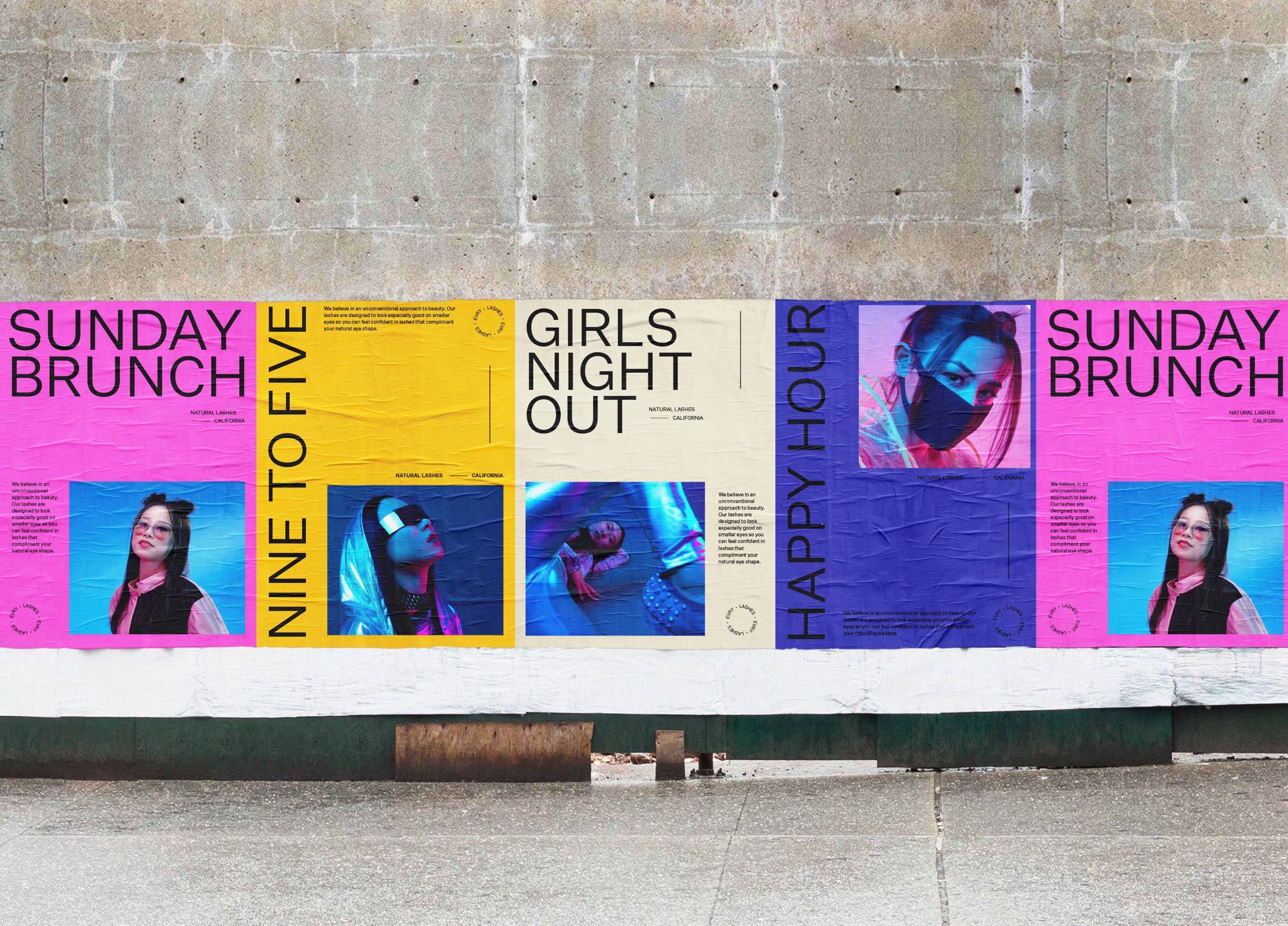
EVRYLASHES are a false eyelash brand based in California who are bravely disrupting the pressuresome, rigid and archaic boundaries of the beauty industry with a bold new approach to unconventional and inclusive beauty. The product range is specifically designed to suit smaller eye types, so Asian women can feel empowered, included and confident that their lashes complement their natural eye shape. The sophisticated product is perfect for busy women that value natural beauty; Women looking to maintain a natural and effortless look, whilst feeling confident and empowered through using a product is tailored specially for them.
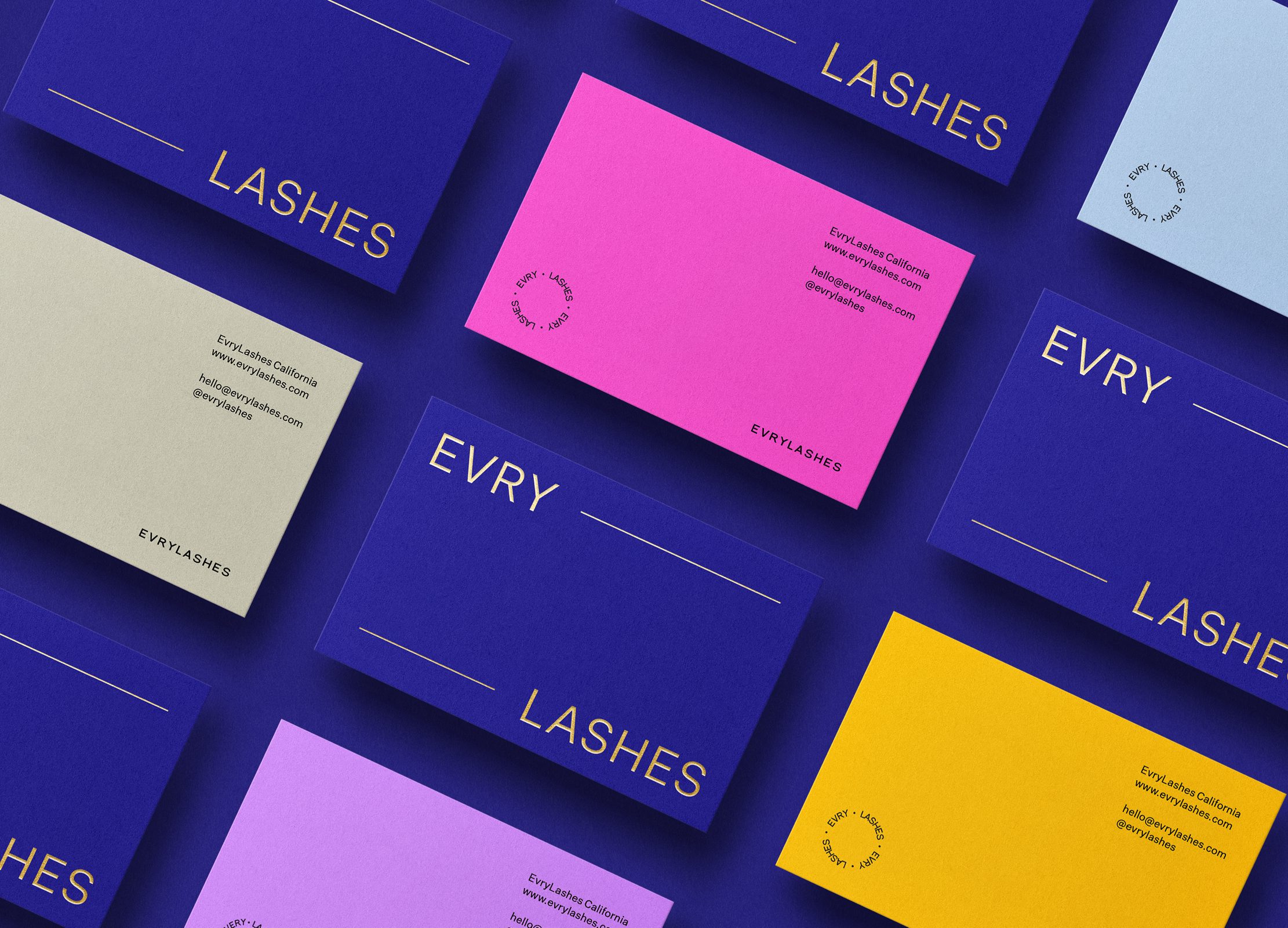
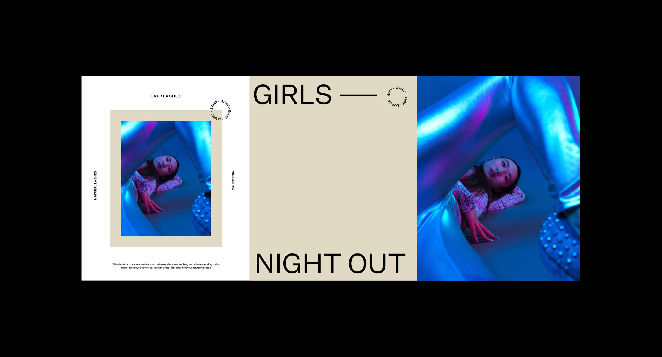
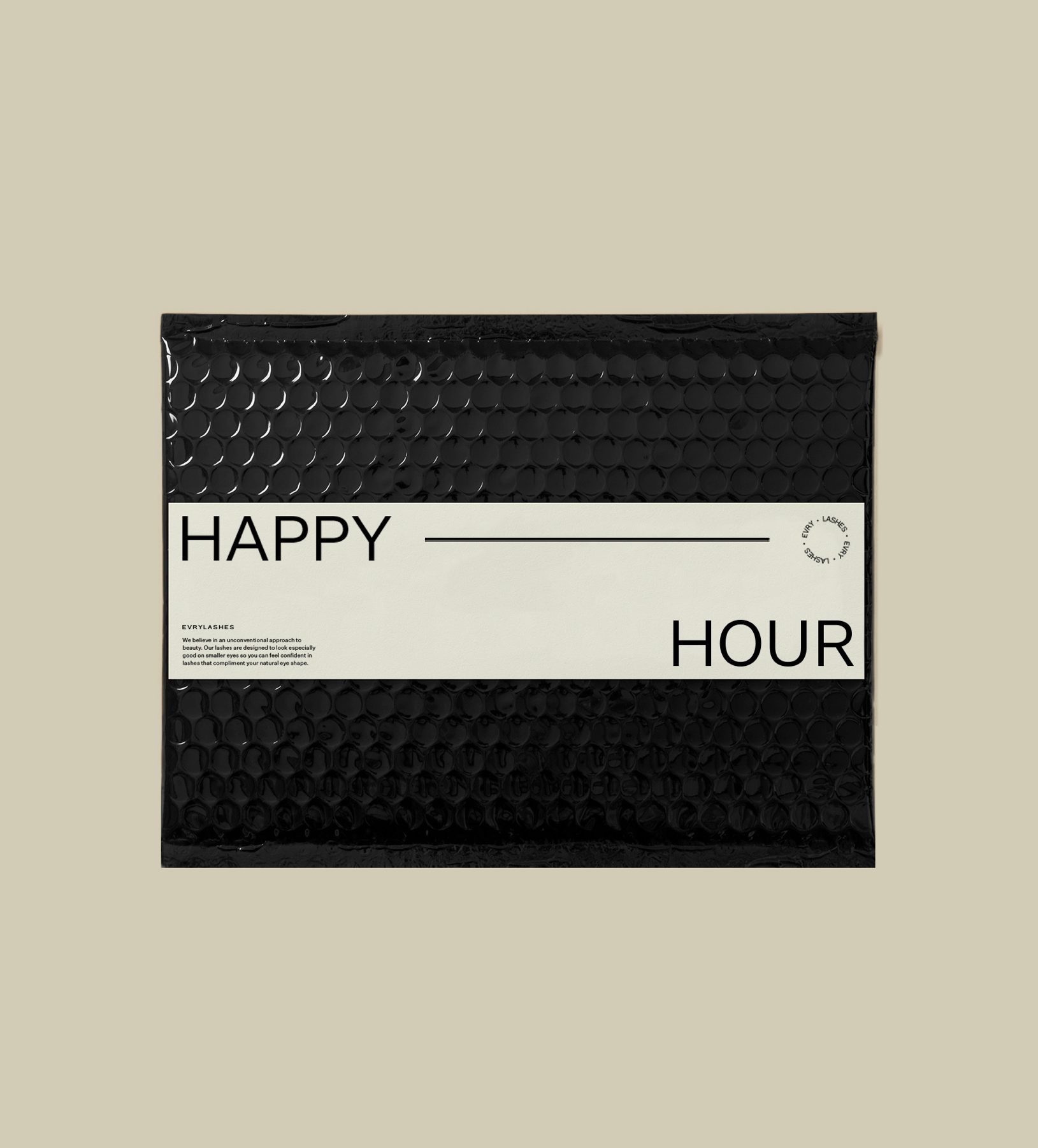
The EVRYLASHES brand needed a loud and confident voice to speak to Asian women who felt uncomfortable and alienated wearing false eyelashes designed for western eye shapes. The branding utilizes fine and delicate typography combined with an unapologetic color palette that boats confidence and female empowerment into the minds of frustrated women with the wrong products available to them.
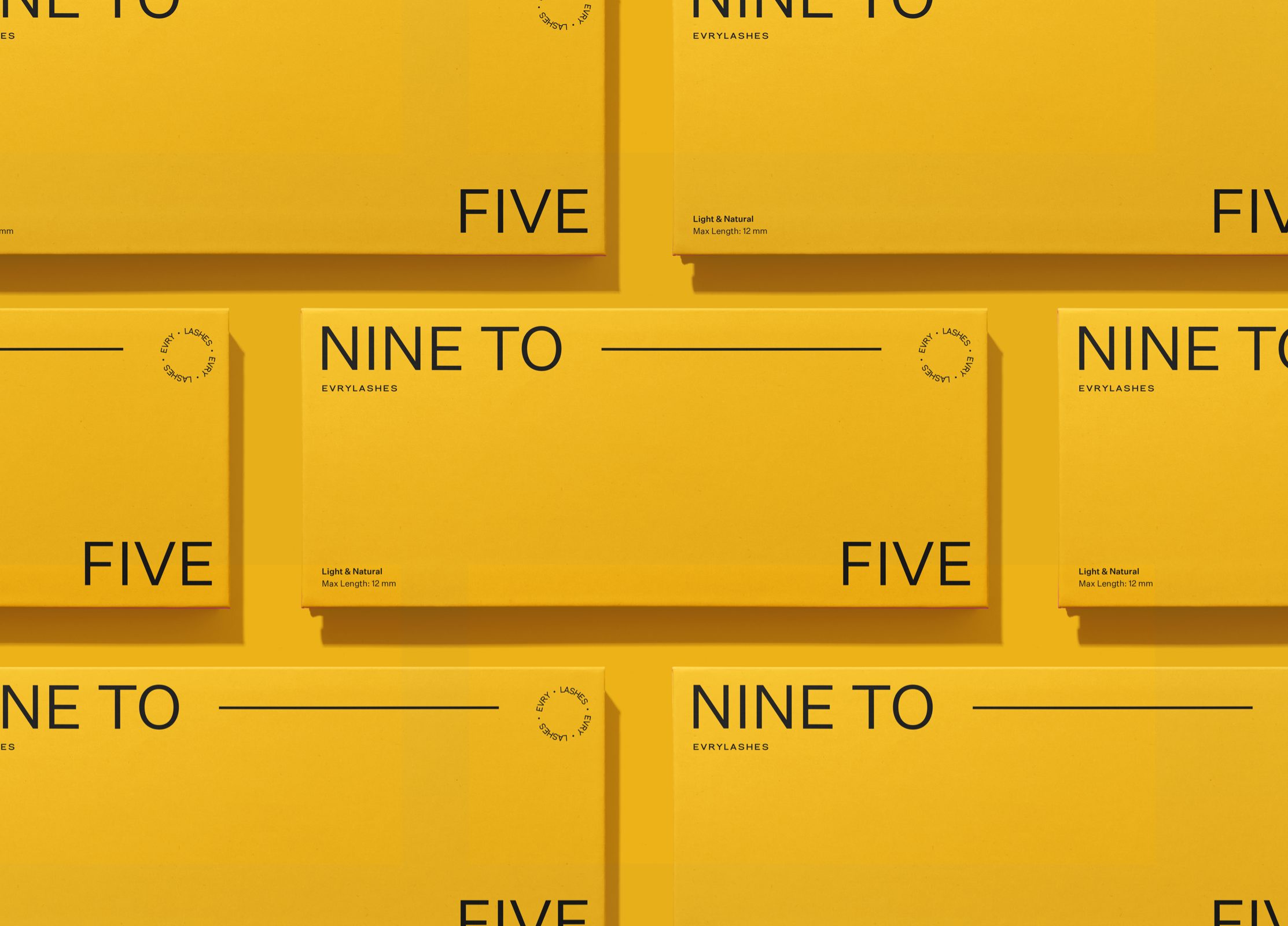
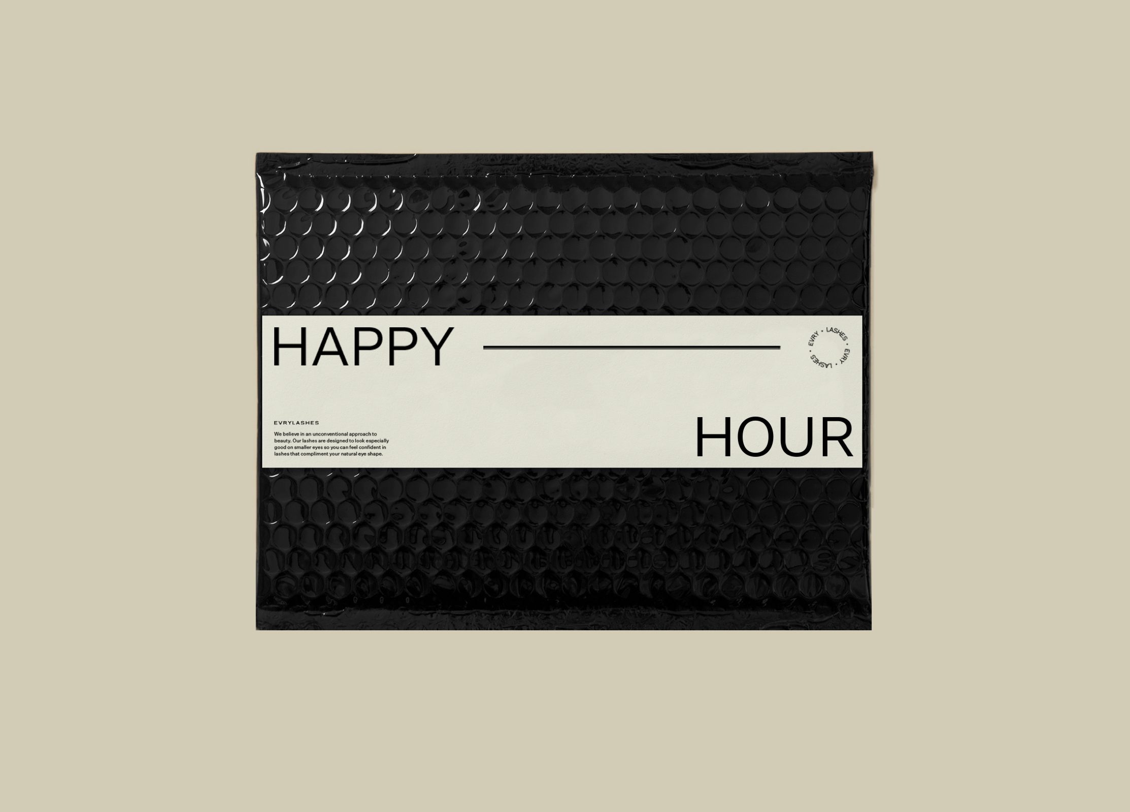
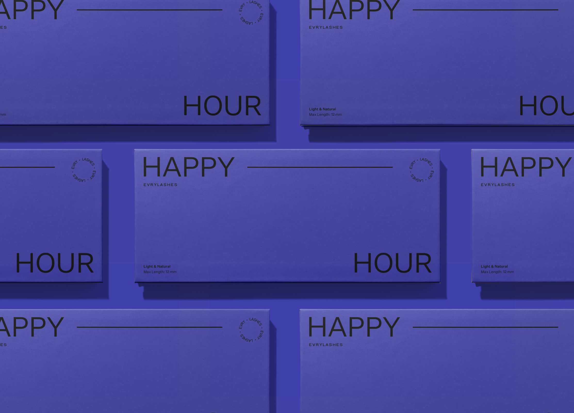
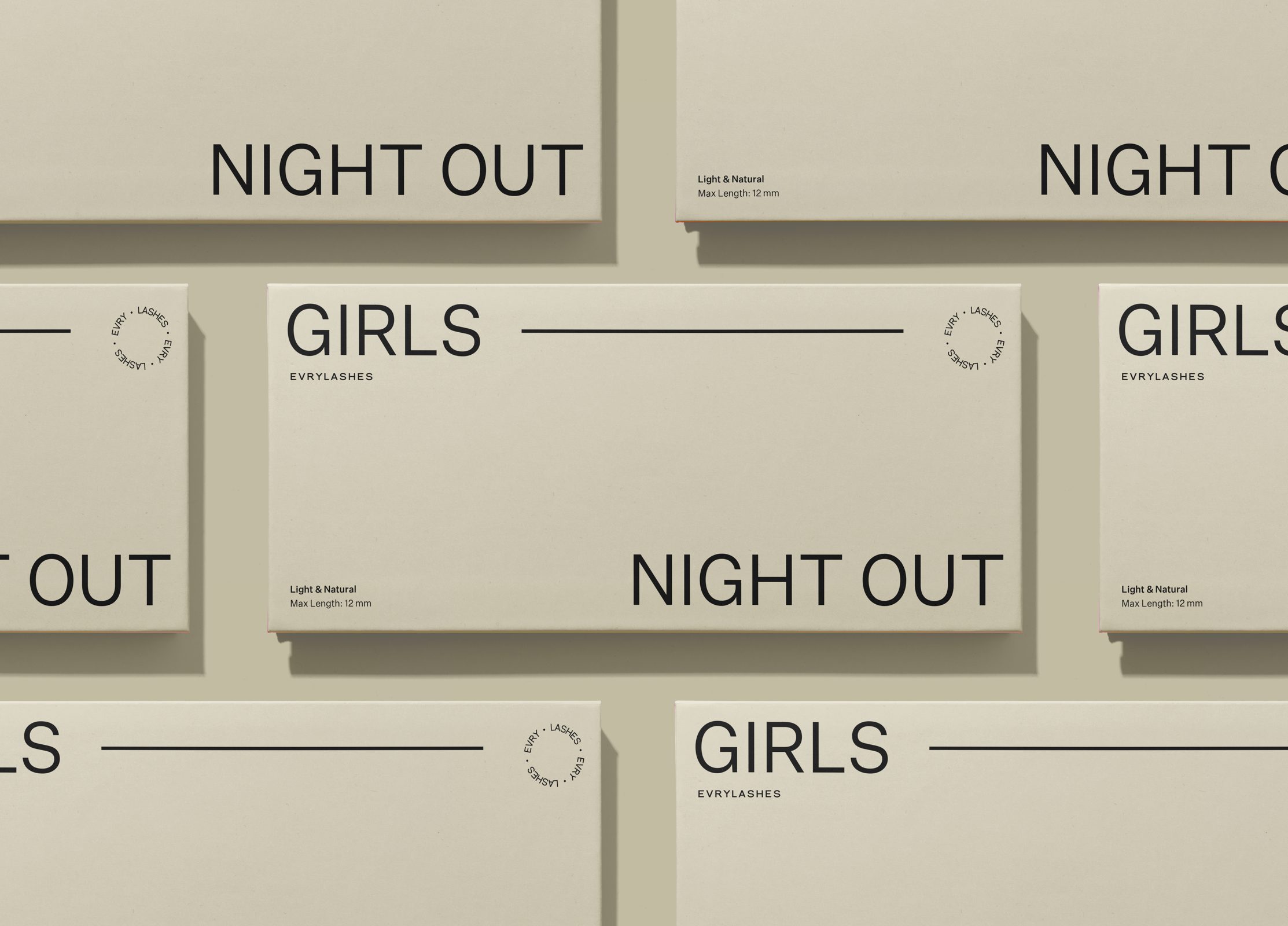
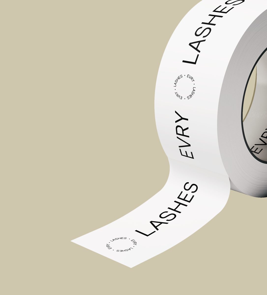
An understated logo mark represents the idea of inclusivity and maintains a sense of simplified beauty. The scope of the project extended to supporting advertising campaign material, designing and producing five product package designs and supporting print collateral.
Location: California, United States