Kihara By Sony Music
Brand Identity Design And Art Direction
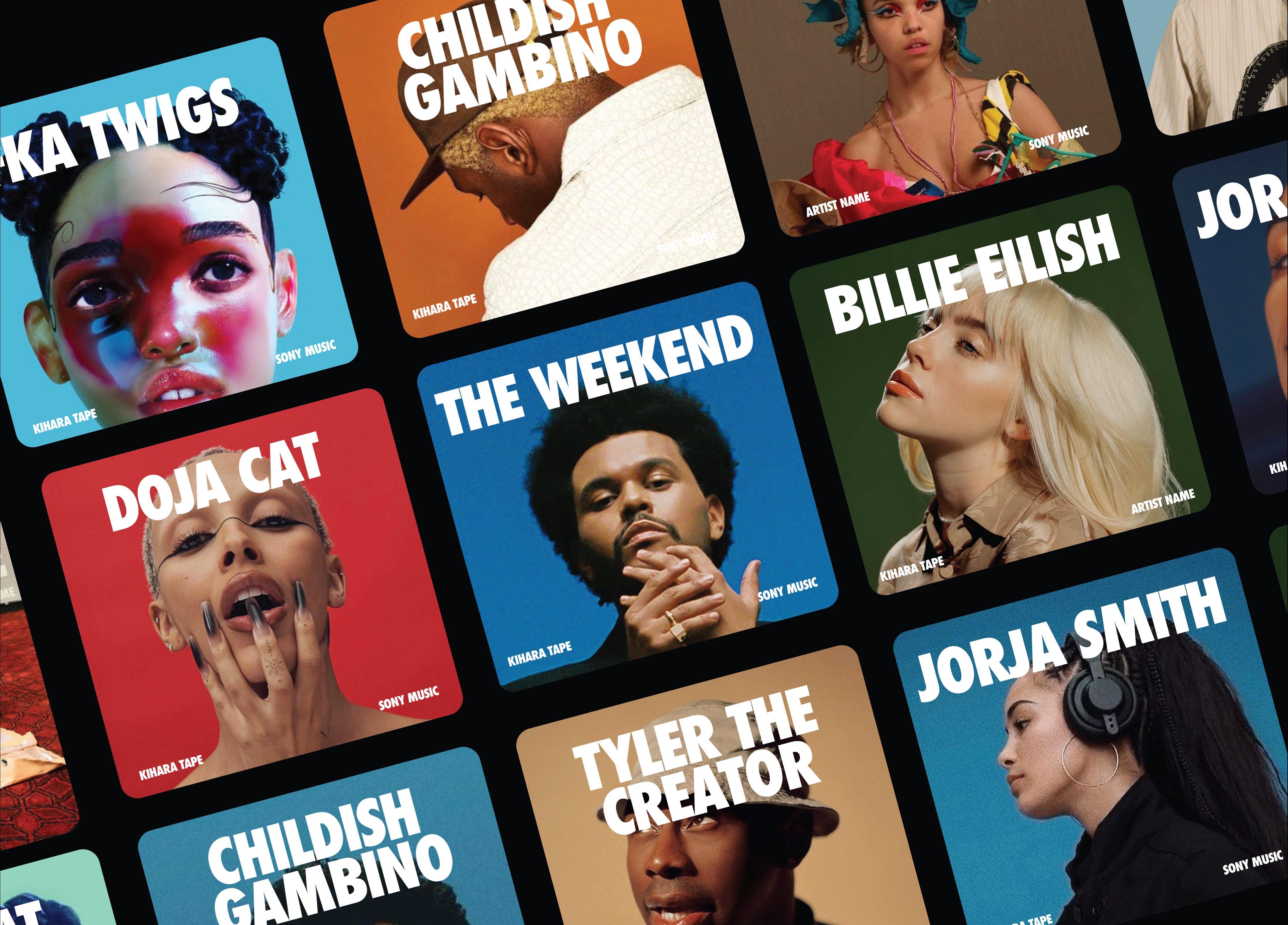
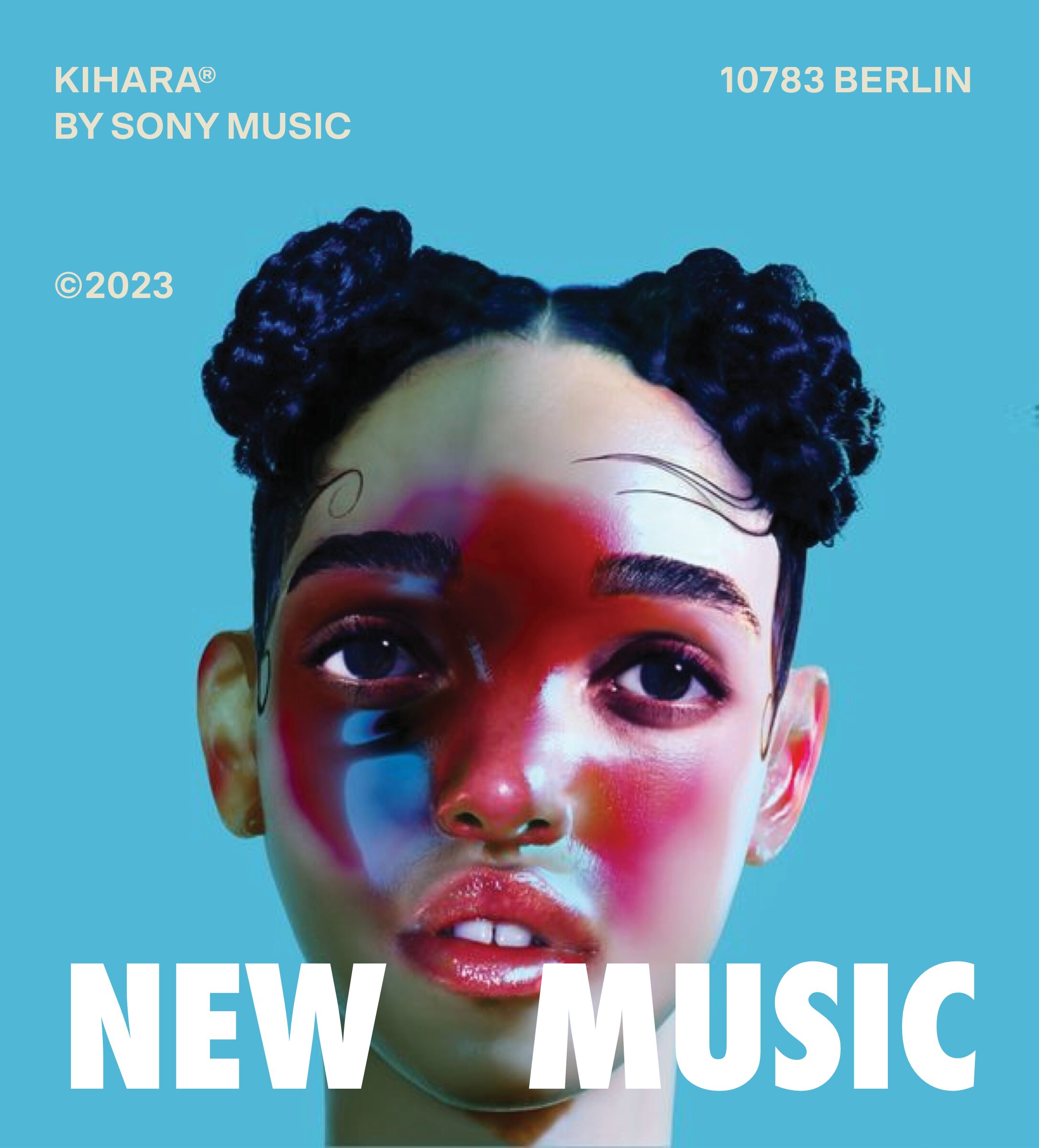
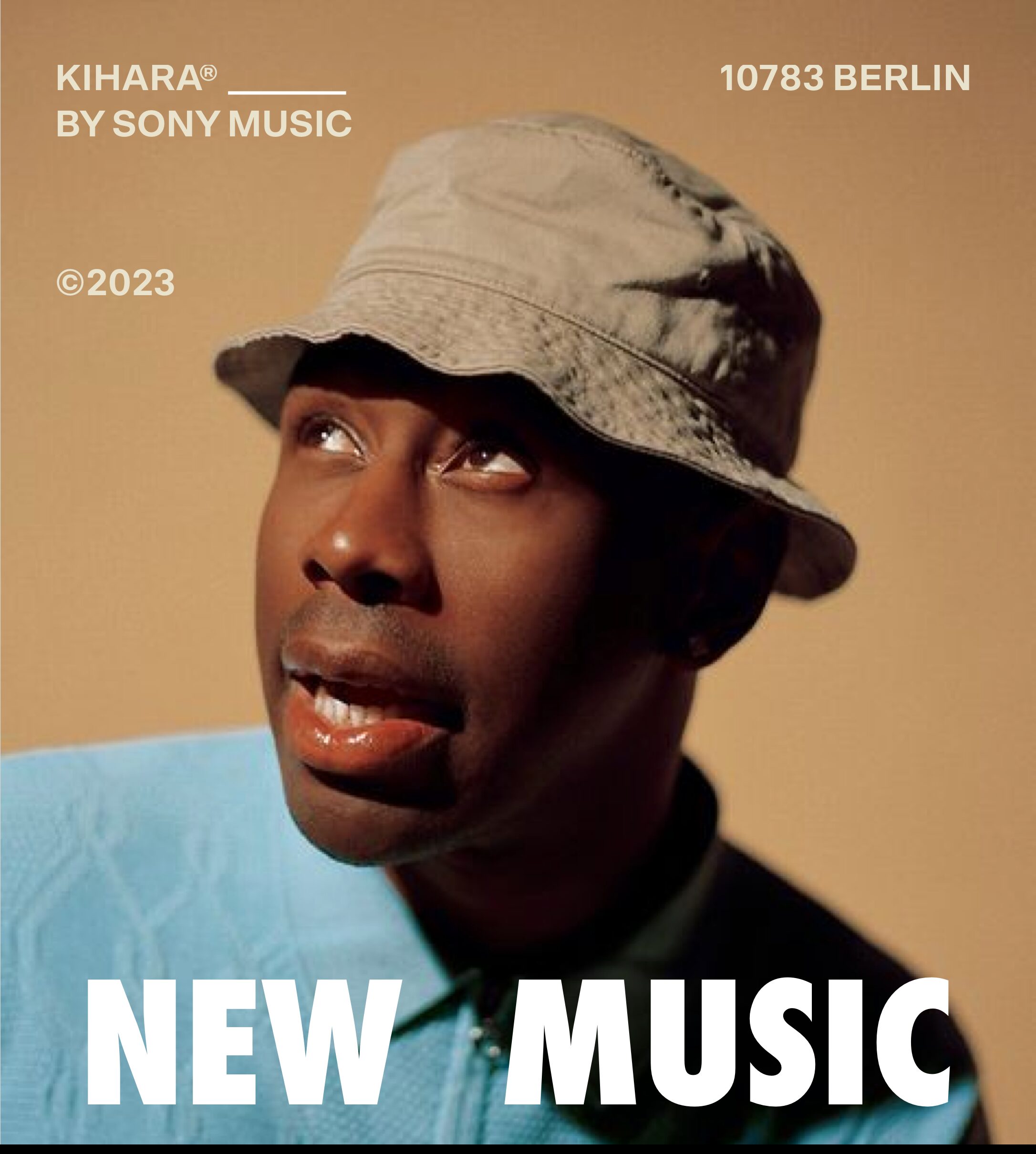
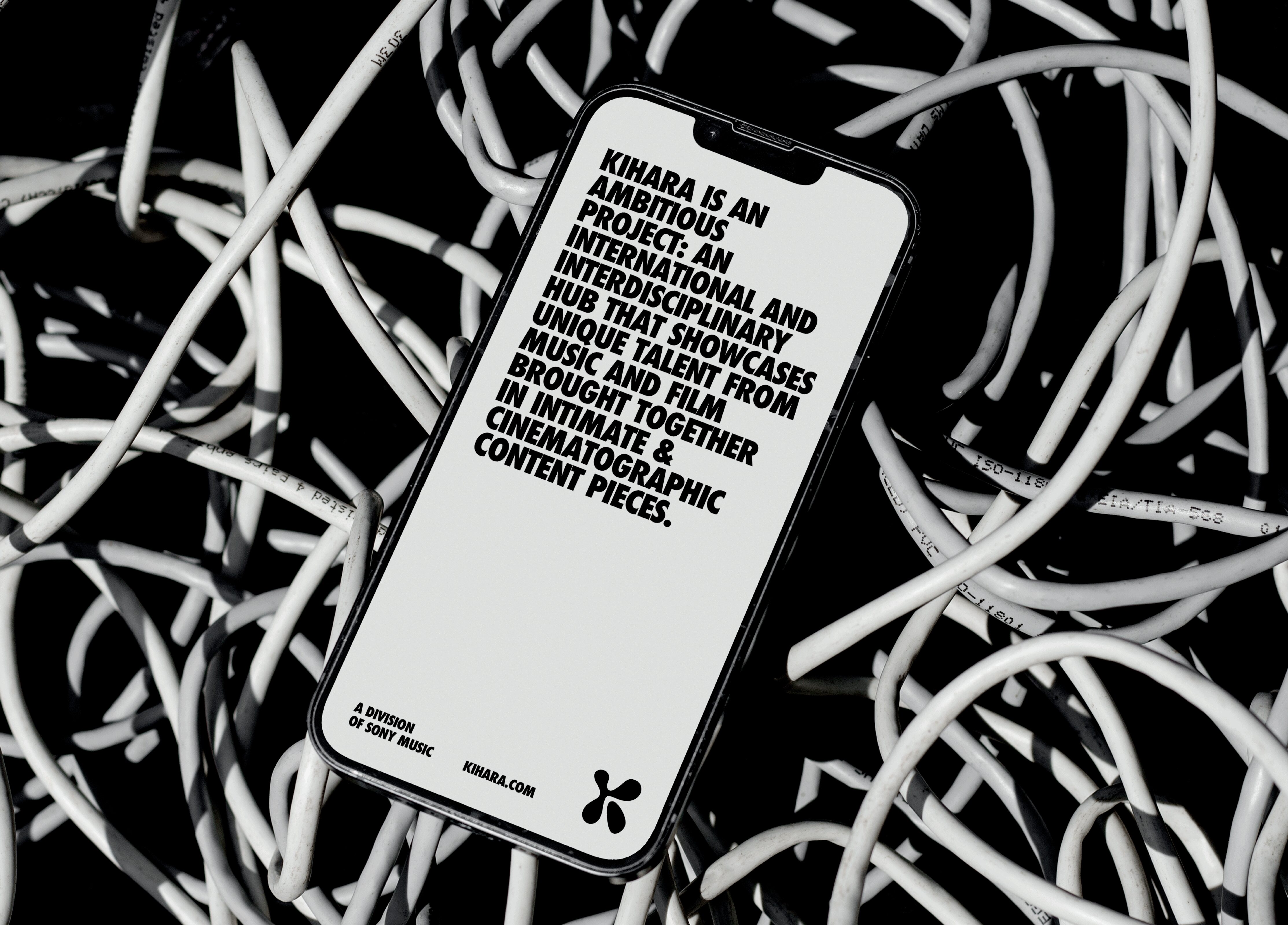
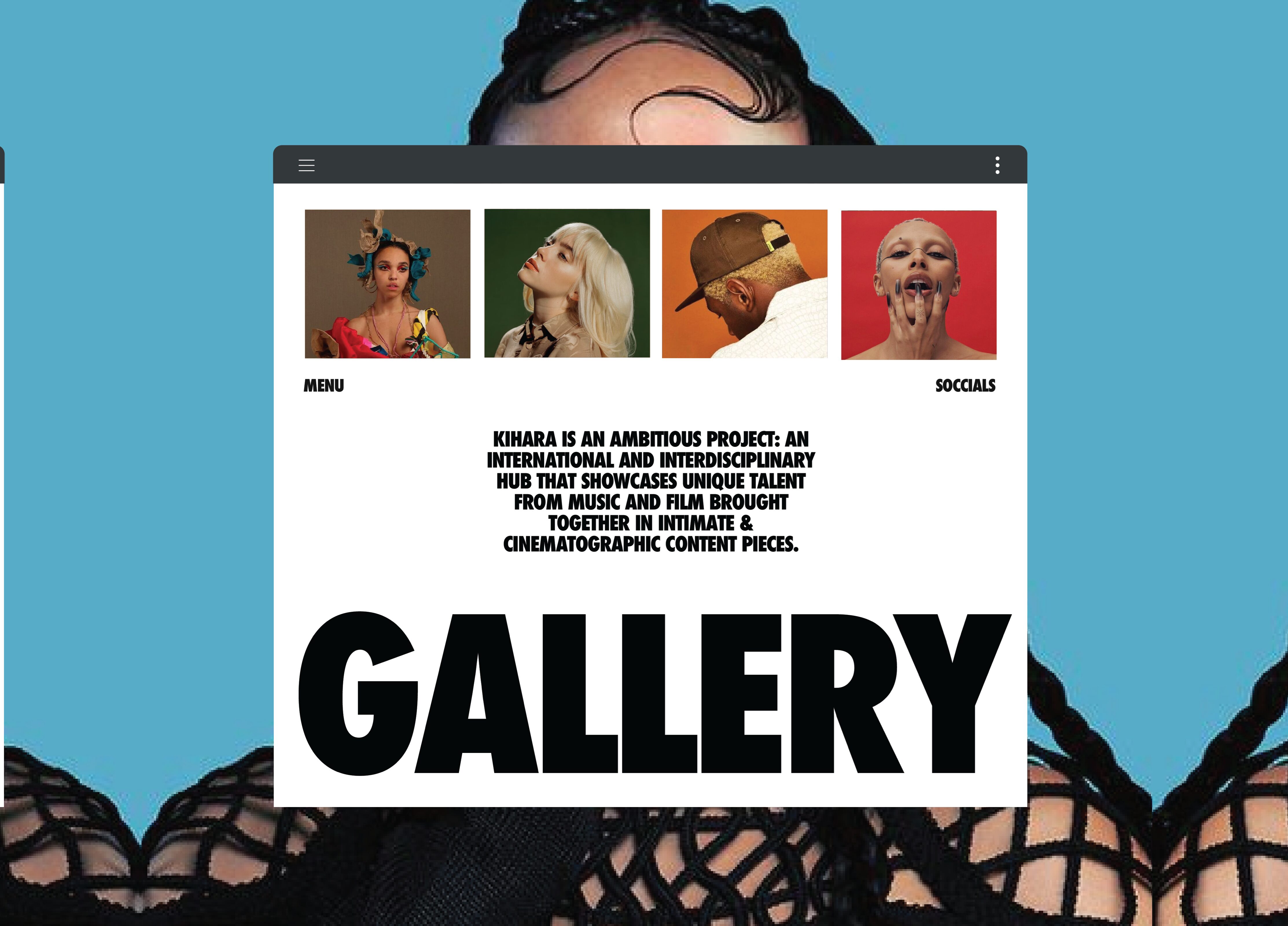
KIHARA, a division of Sony Music Germany, is an ambitious project: an international and interdisciplinary hub that showcases unique talent from music and film brought together in intimate & cinematographic content pieces. Working at the intersection of music and film, we are committed to create a platform that drives awareness and recognition for extraordinary talents among artists, music enthusiasts, brands, and a fast moving audience. The project is dedicated to place music in the context of culture; Featuring your favorite artists, new talent, and everything in between.
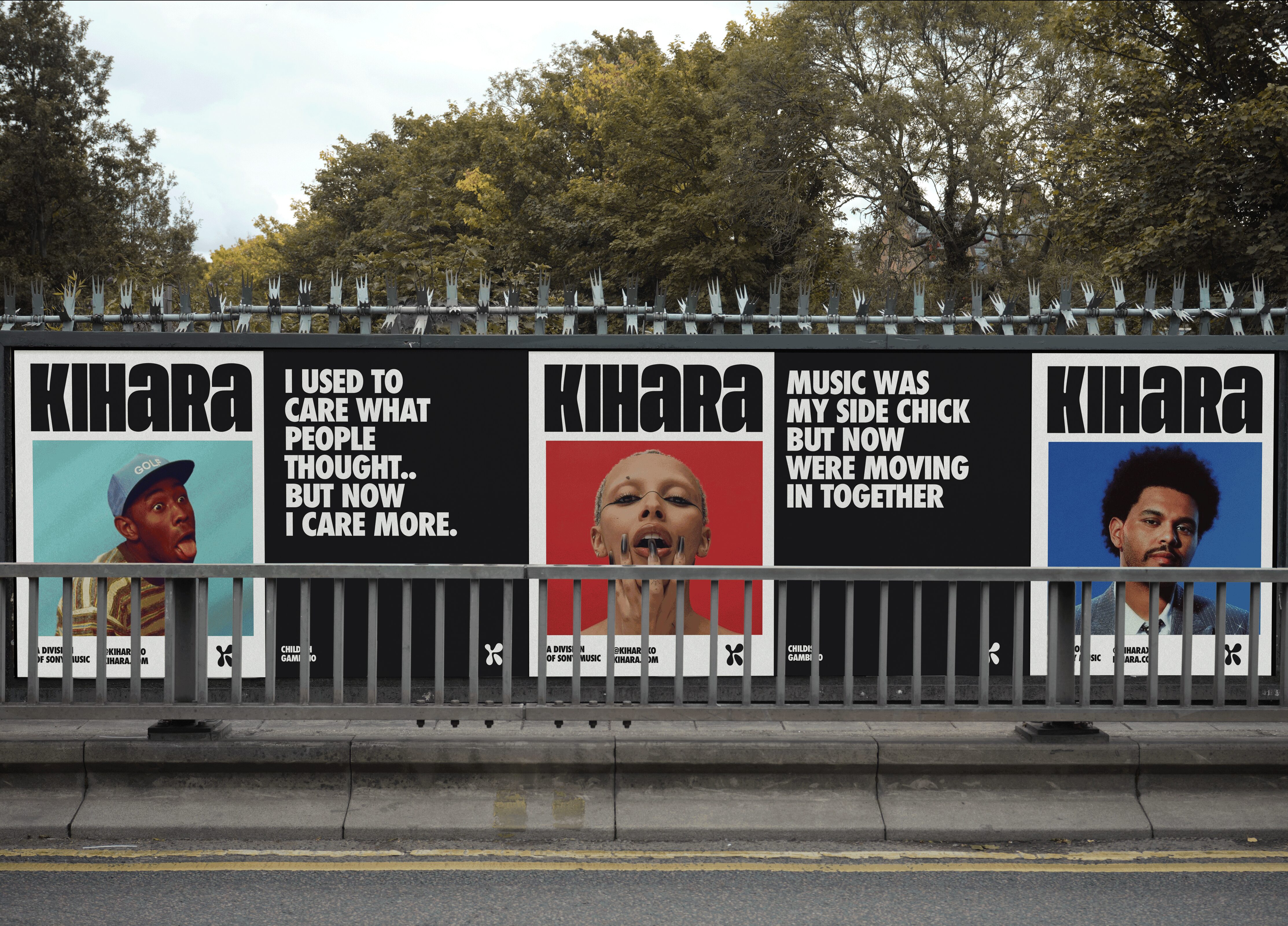
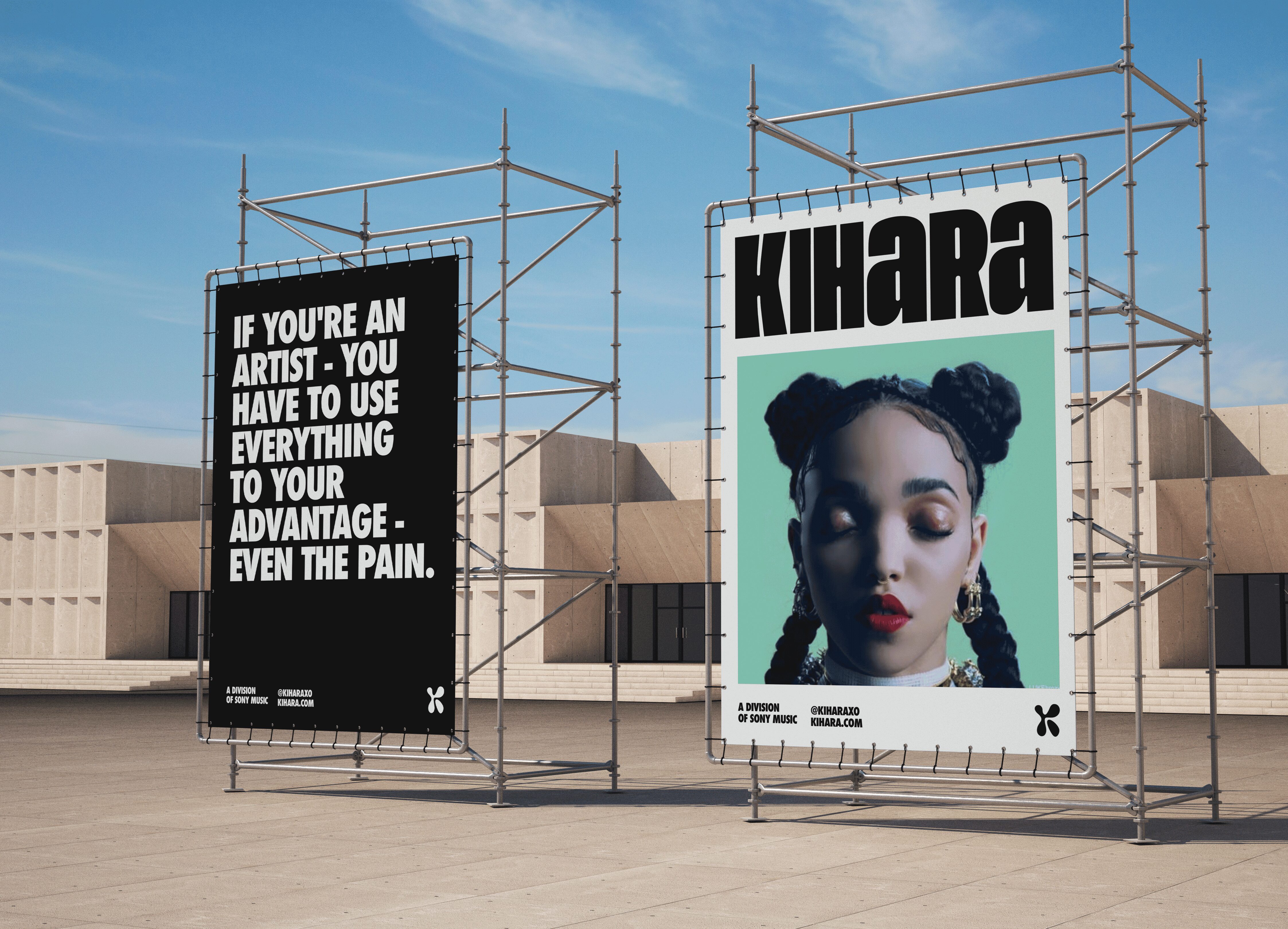
Much like the fashion world, trends within the music world come and go like the wind, so it was important for us to take a very holistic and flexible approach to the new brand for KIHARA, a division of Sony Music, to create a versatile brand that could house multiple artists, all with their own unique style, under one cohesive look & feel.
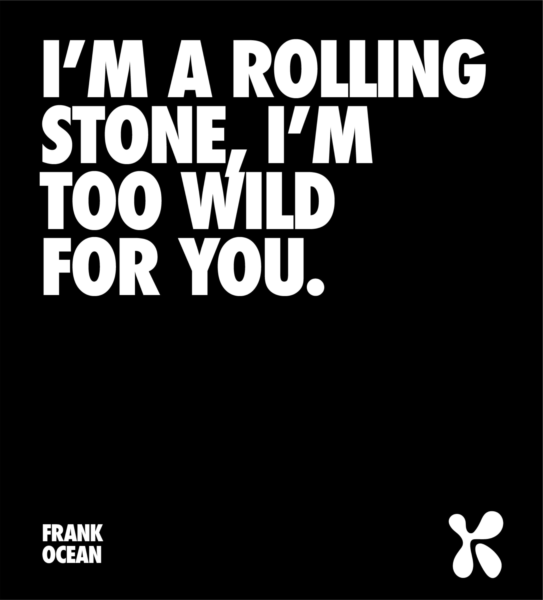
From the logomark, through to the brand voice, visual brand identity & art direction, our visual solution takes a progressive, characterful yet timeless approach positioning the brand as the unapologetic, cutting edge intersection between intimate cinematographic production & music; Shaping a new culture around music and speaking to an audience of music, fashion and entertainment tastemakers with a thirst for visual aesthetics and hype-culture.
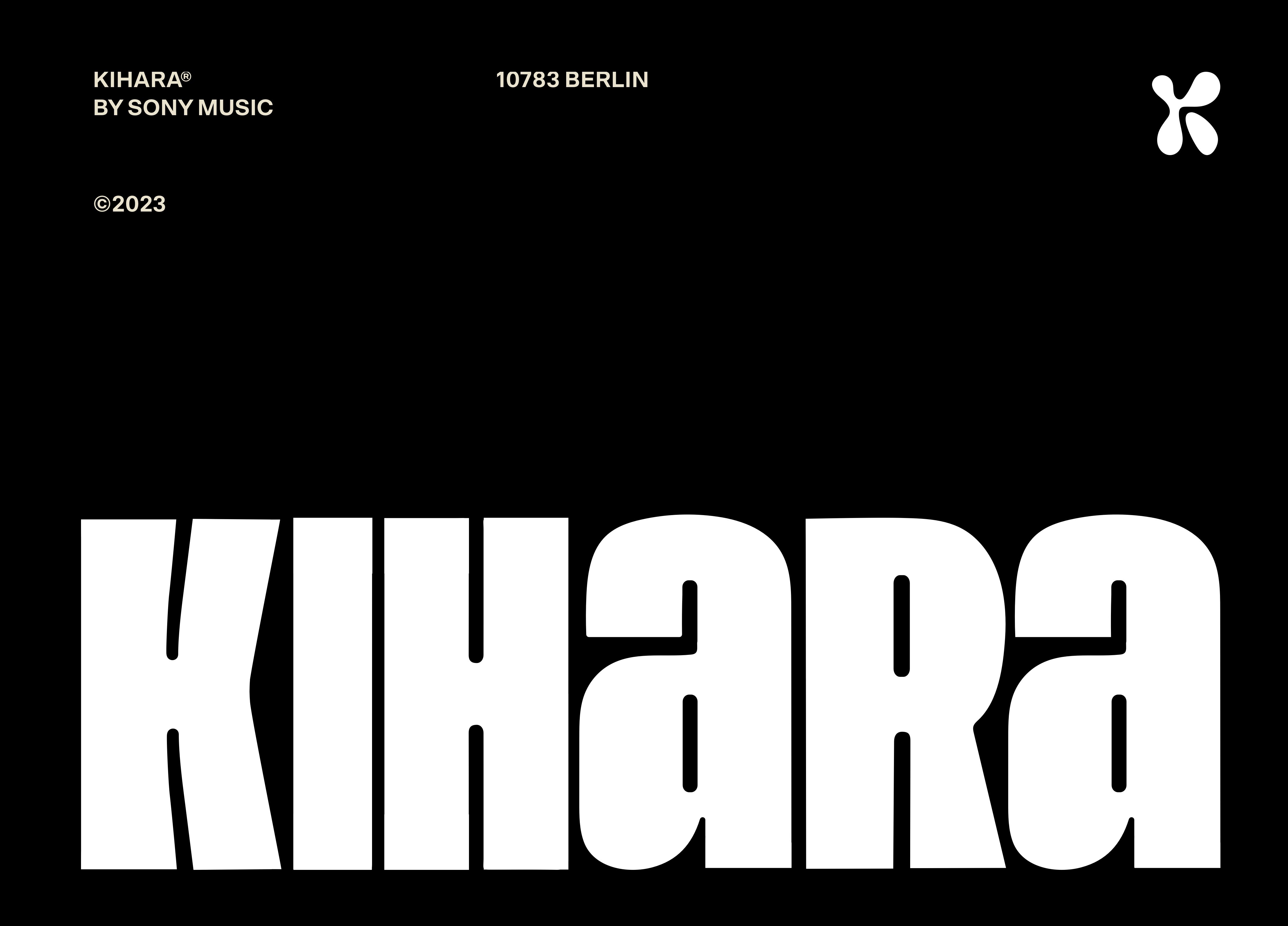
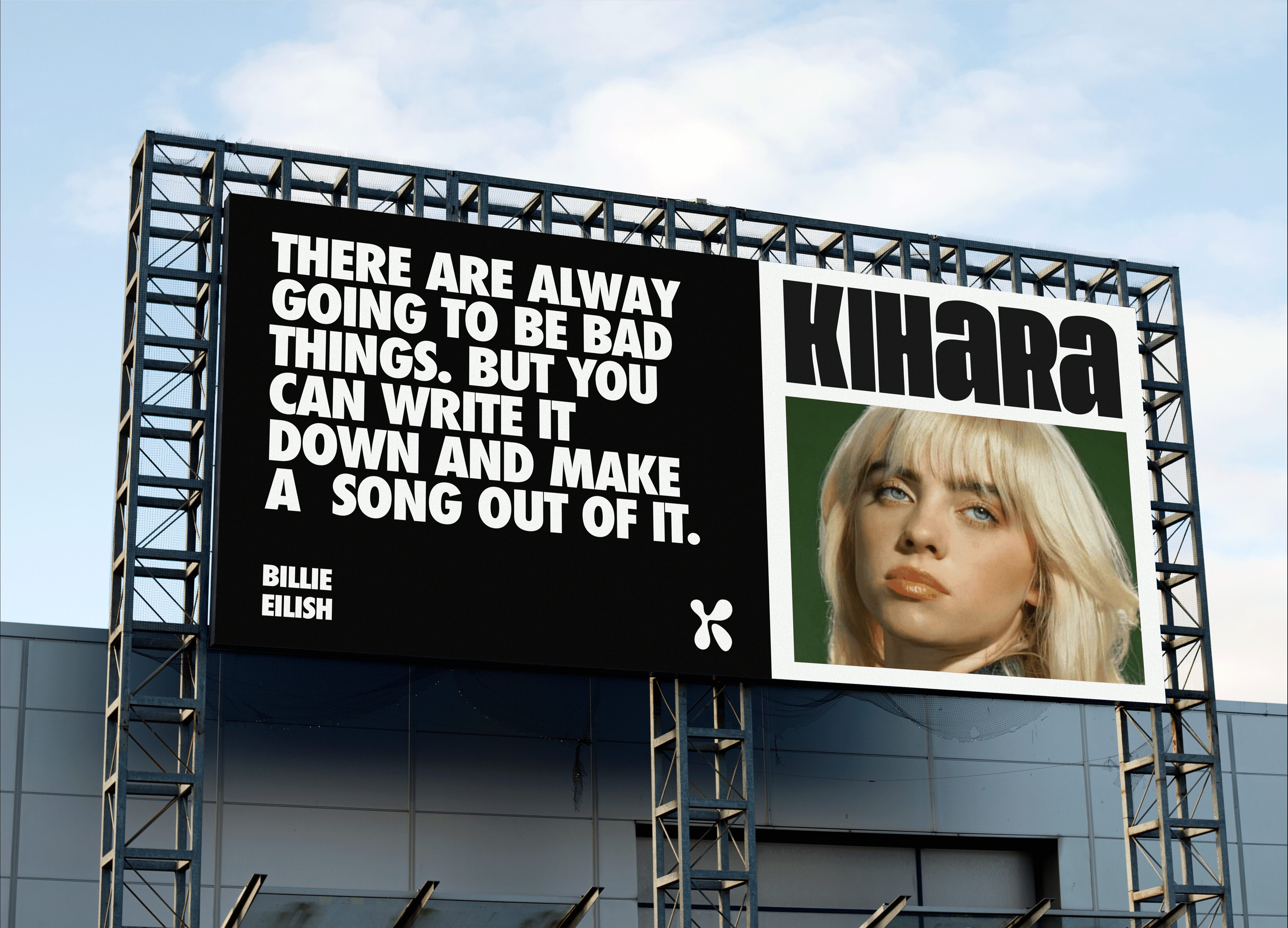
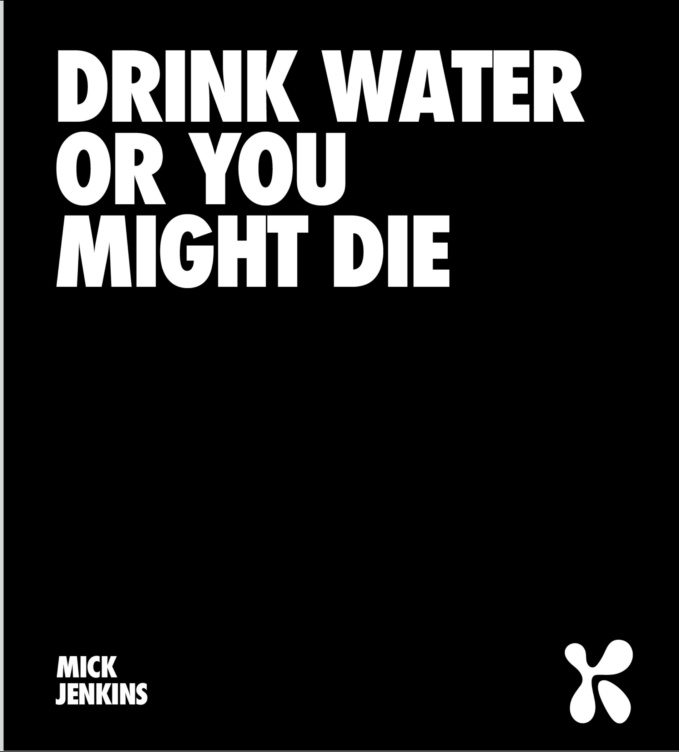
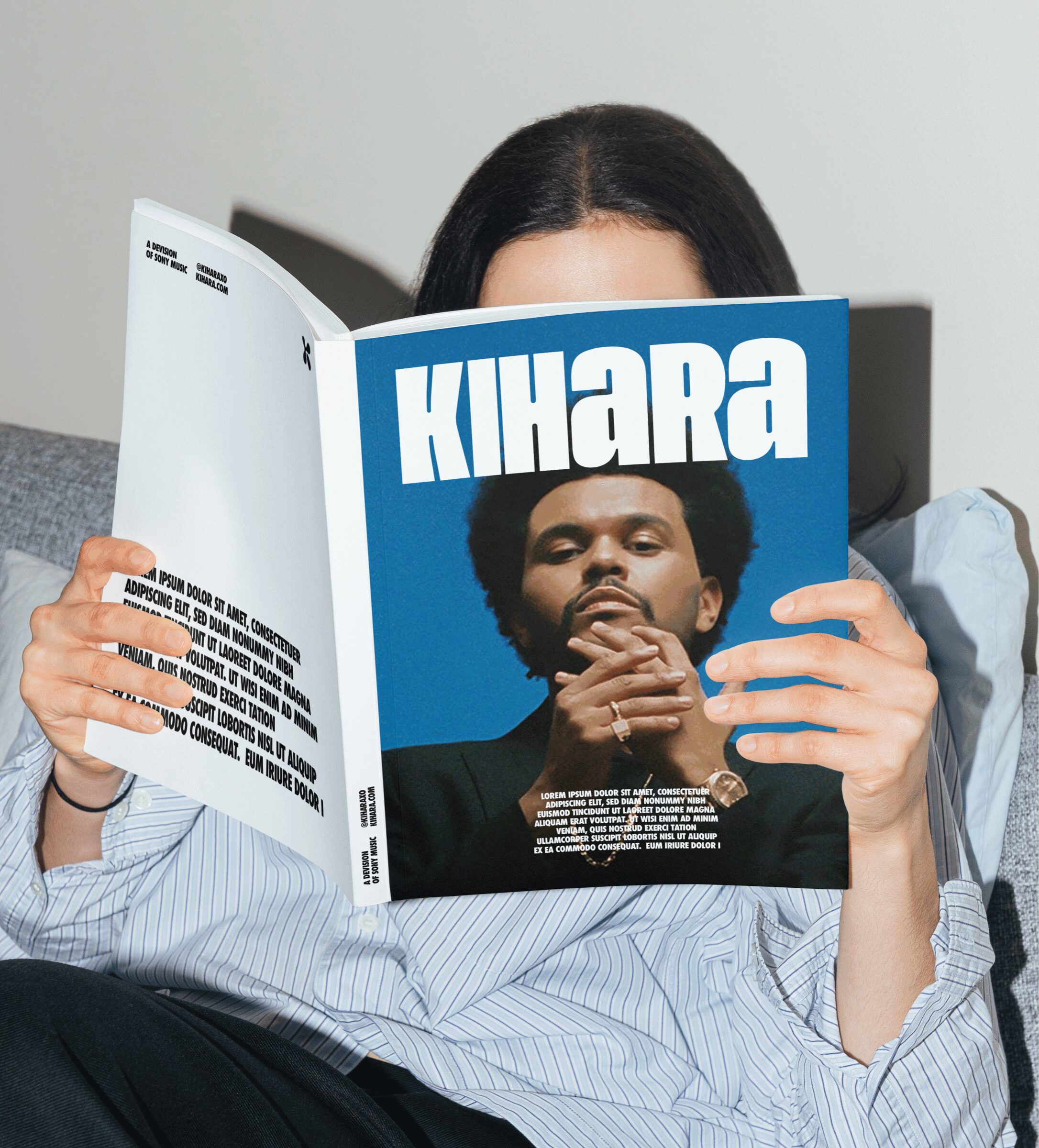
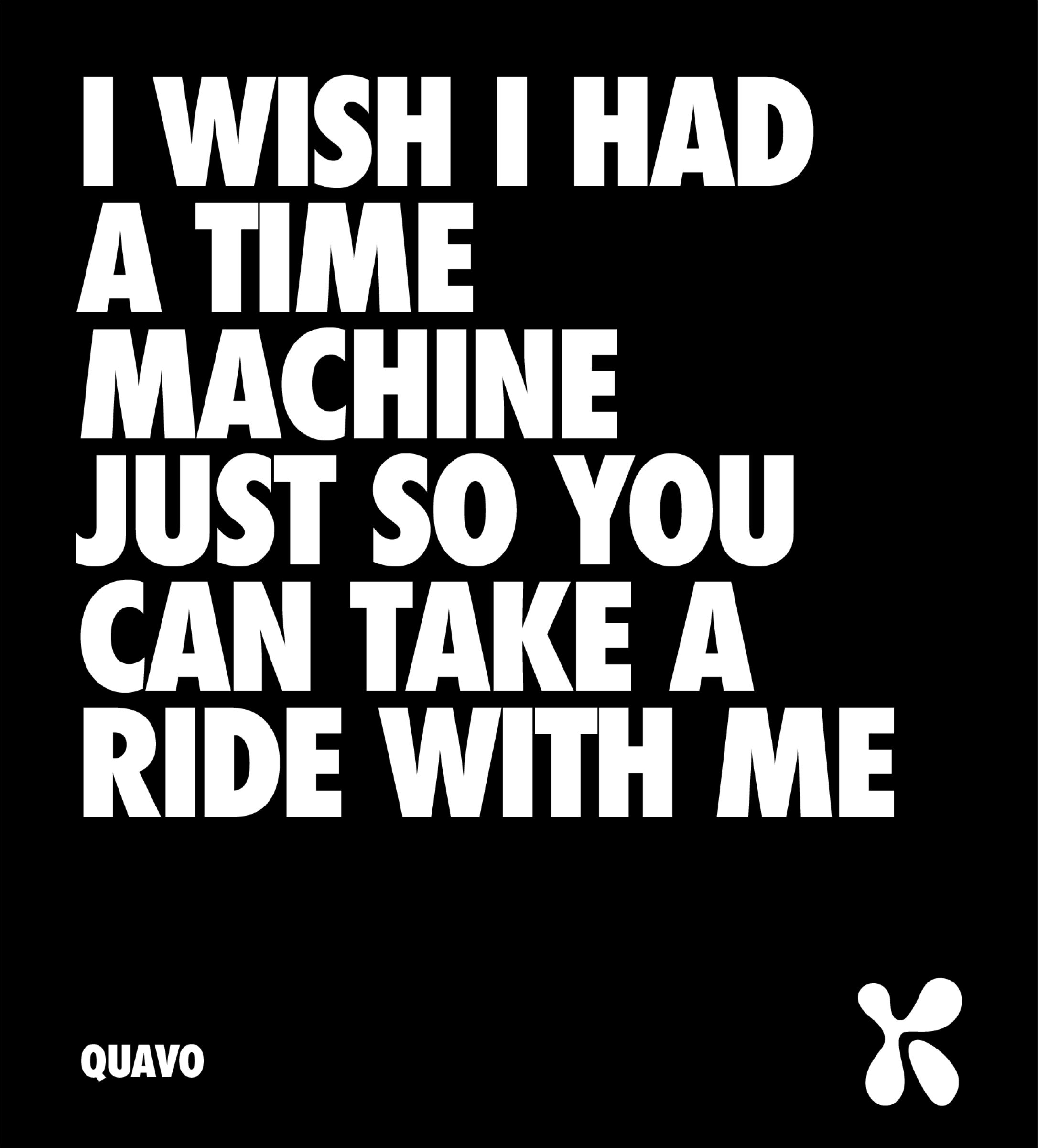
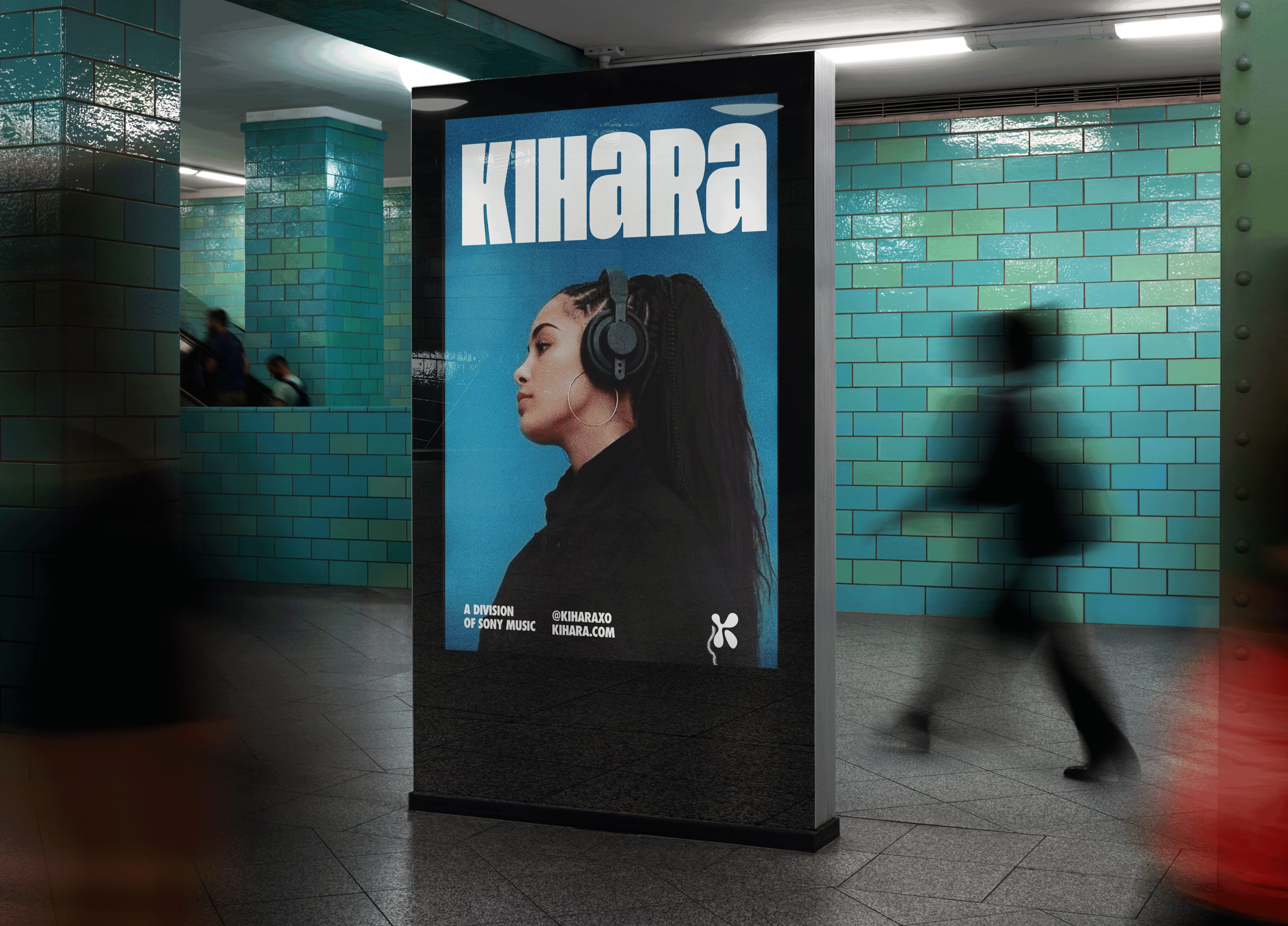
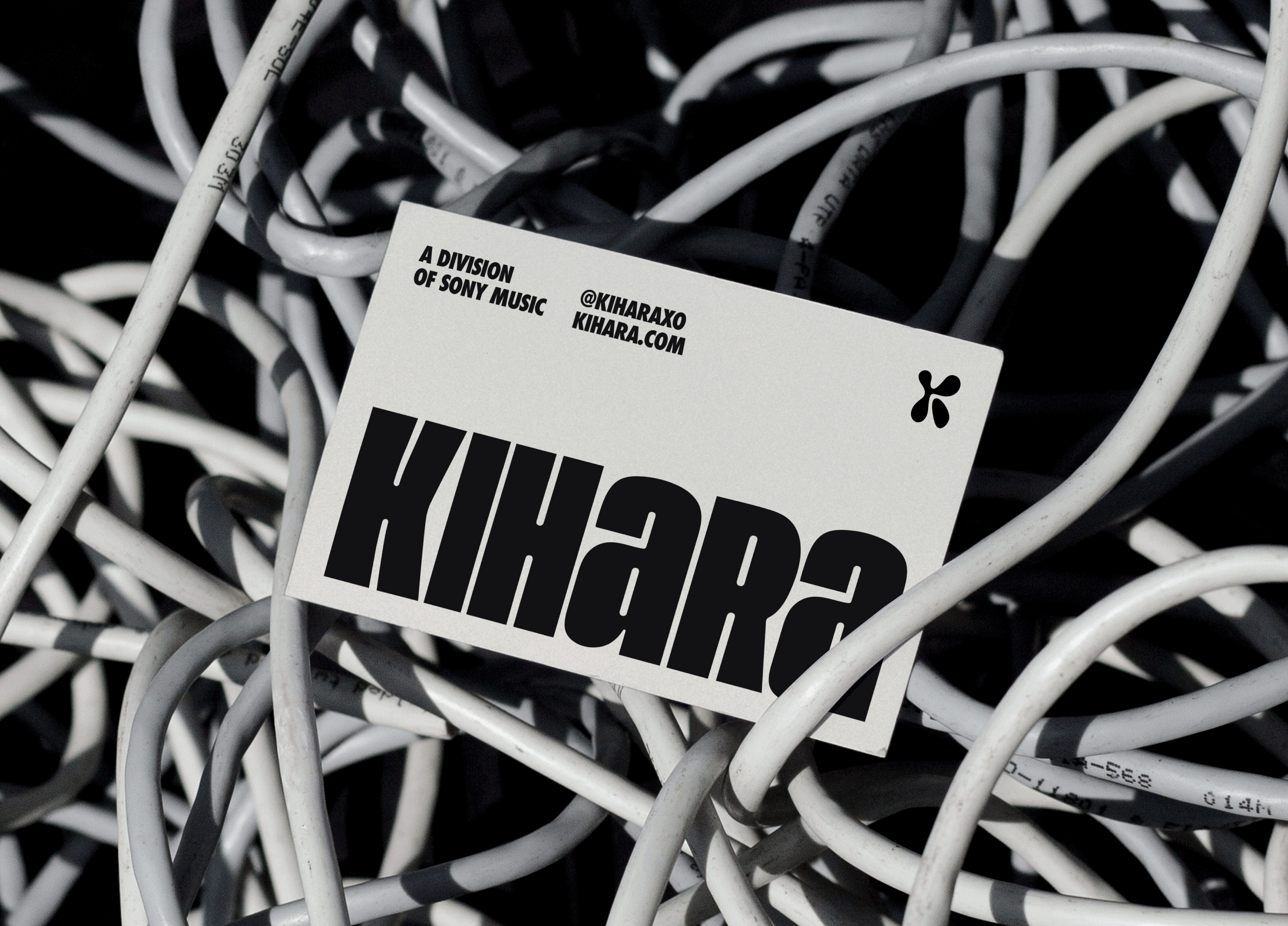
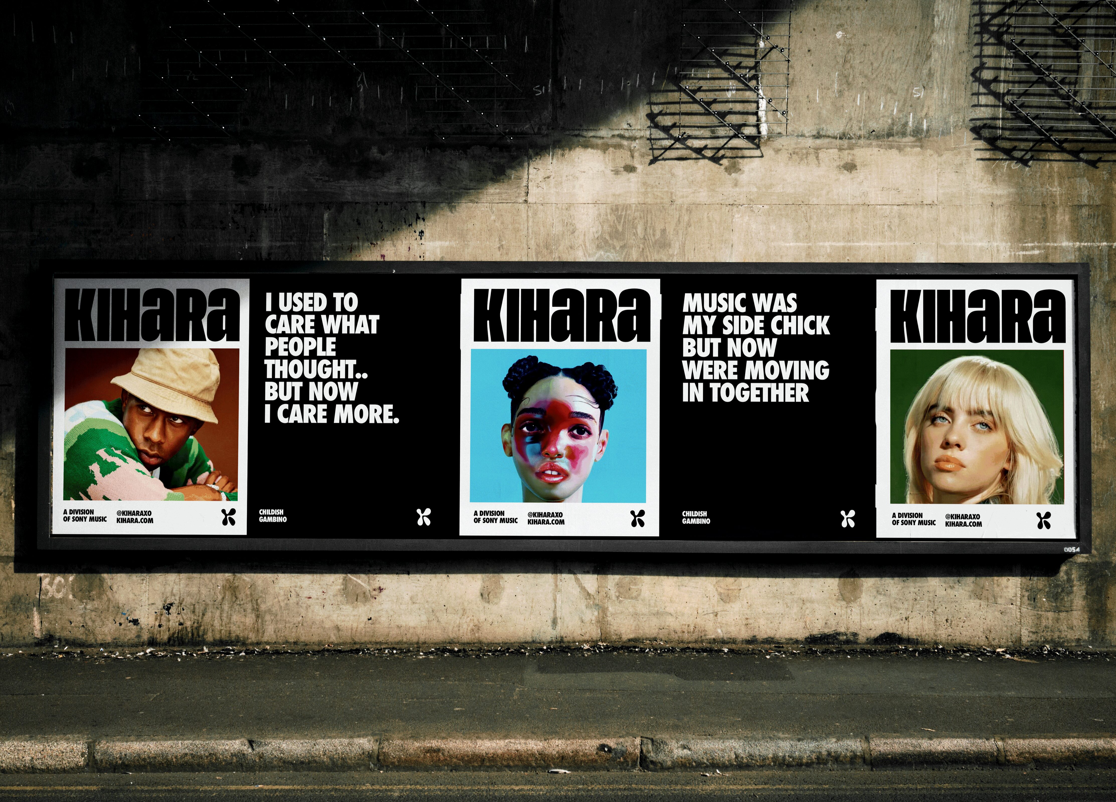
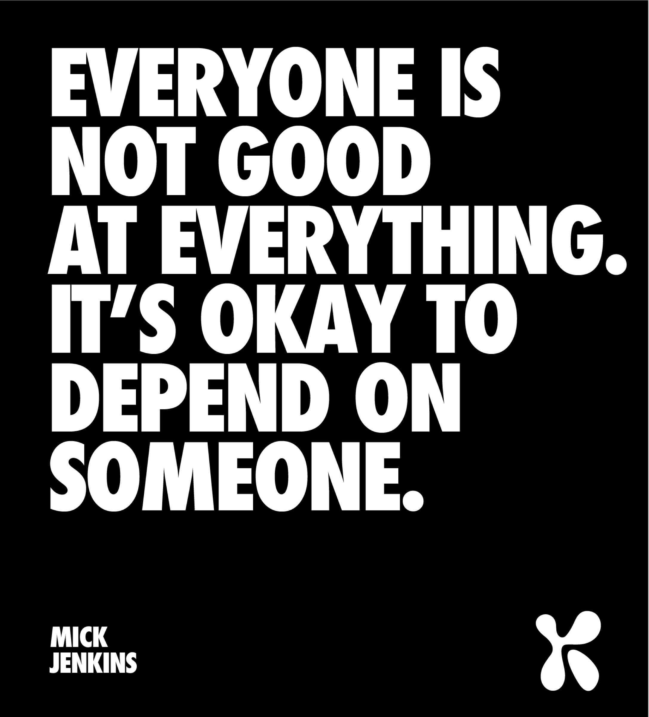
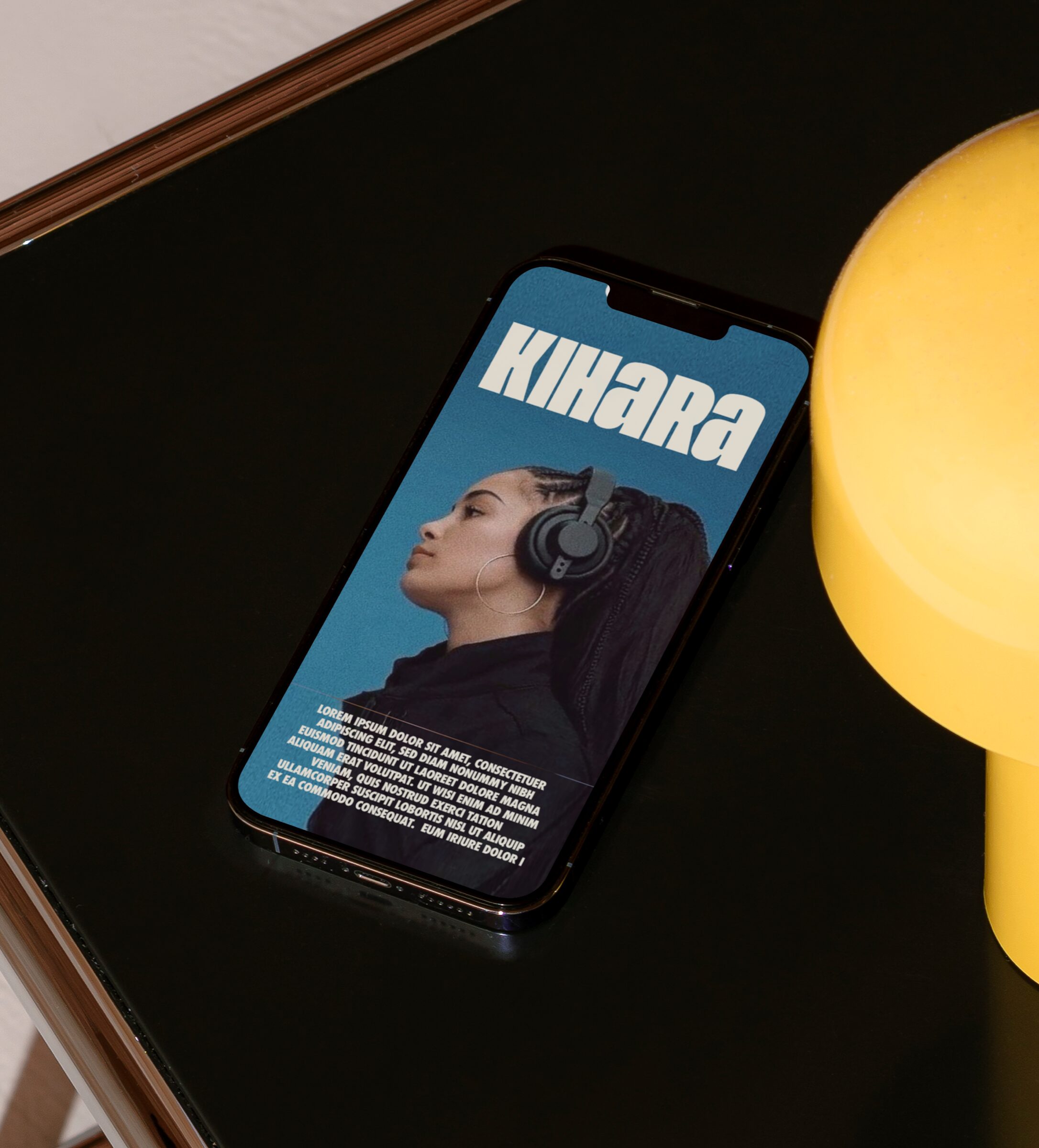
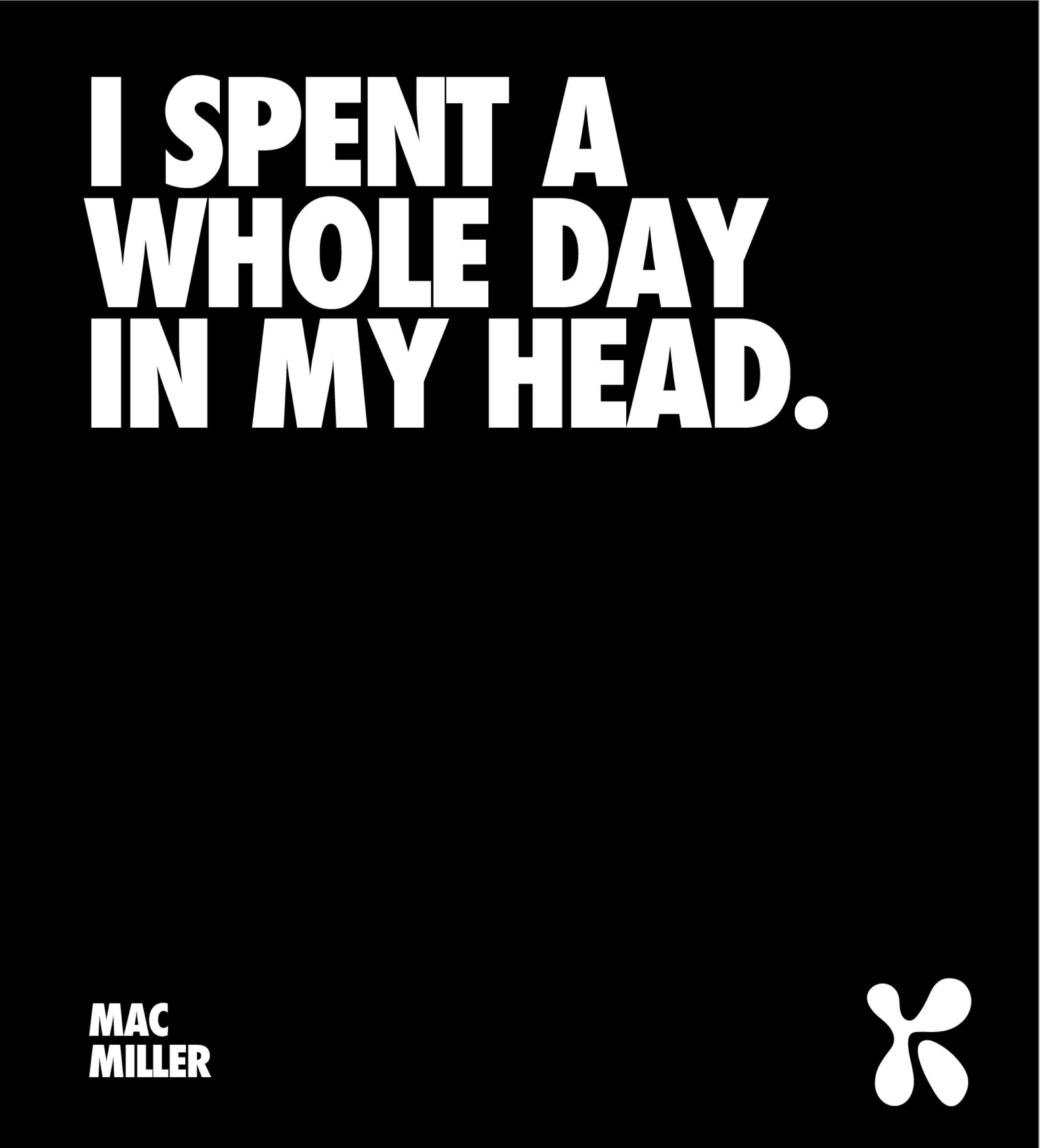
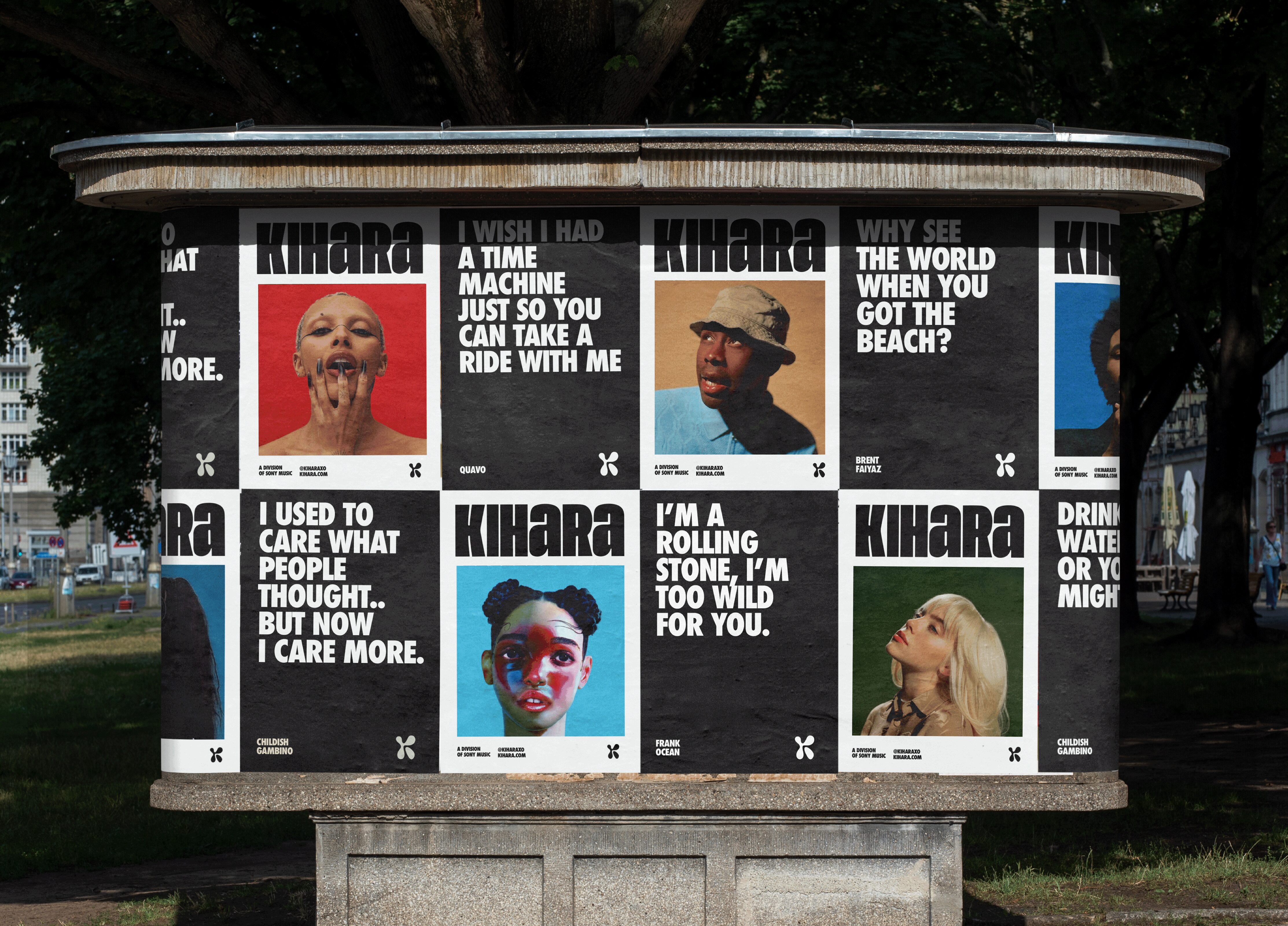
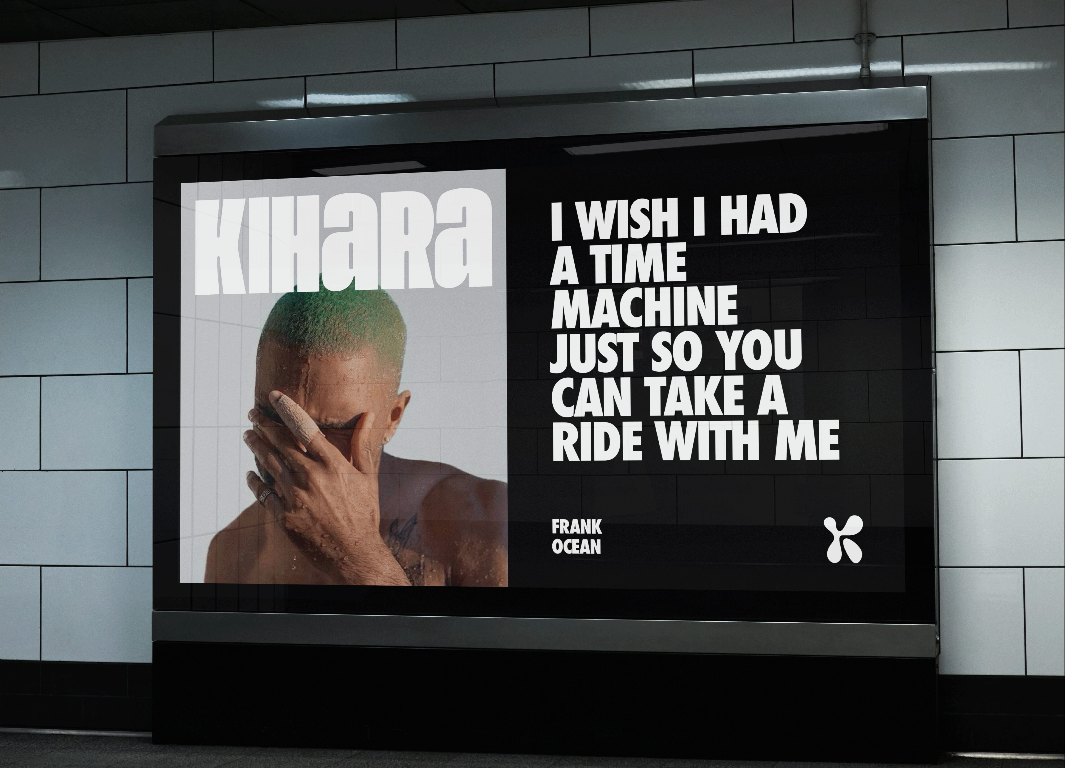
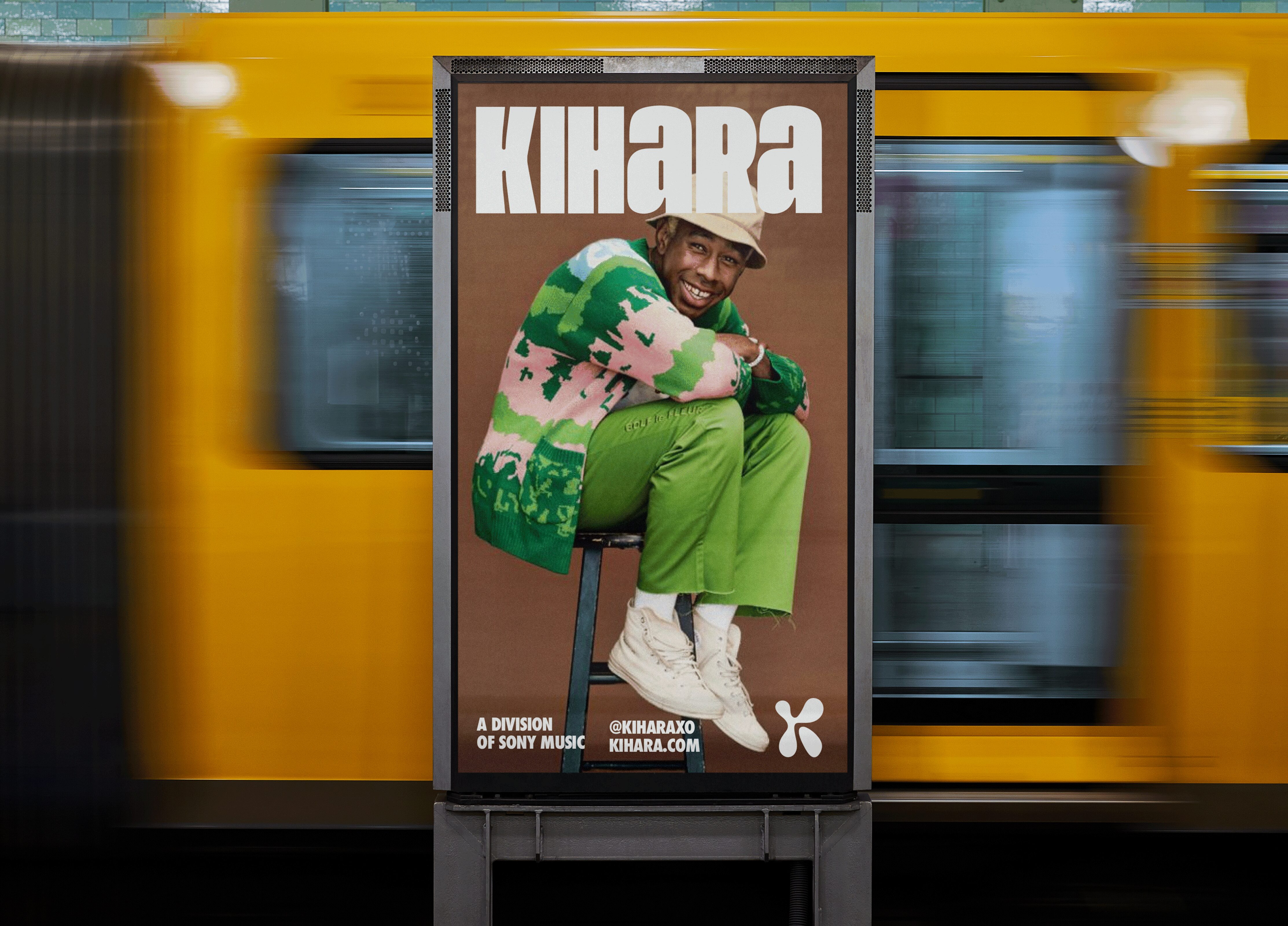
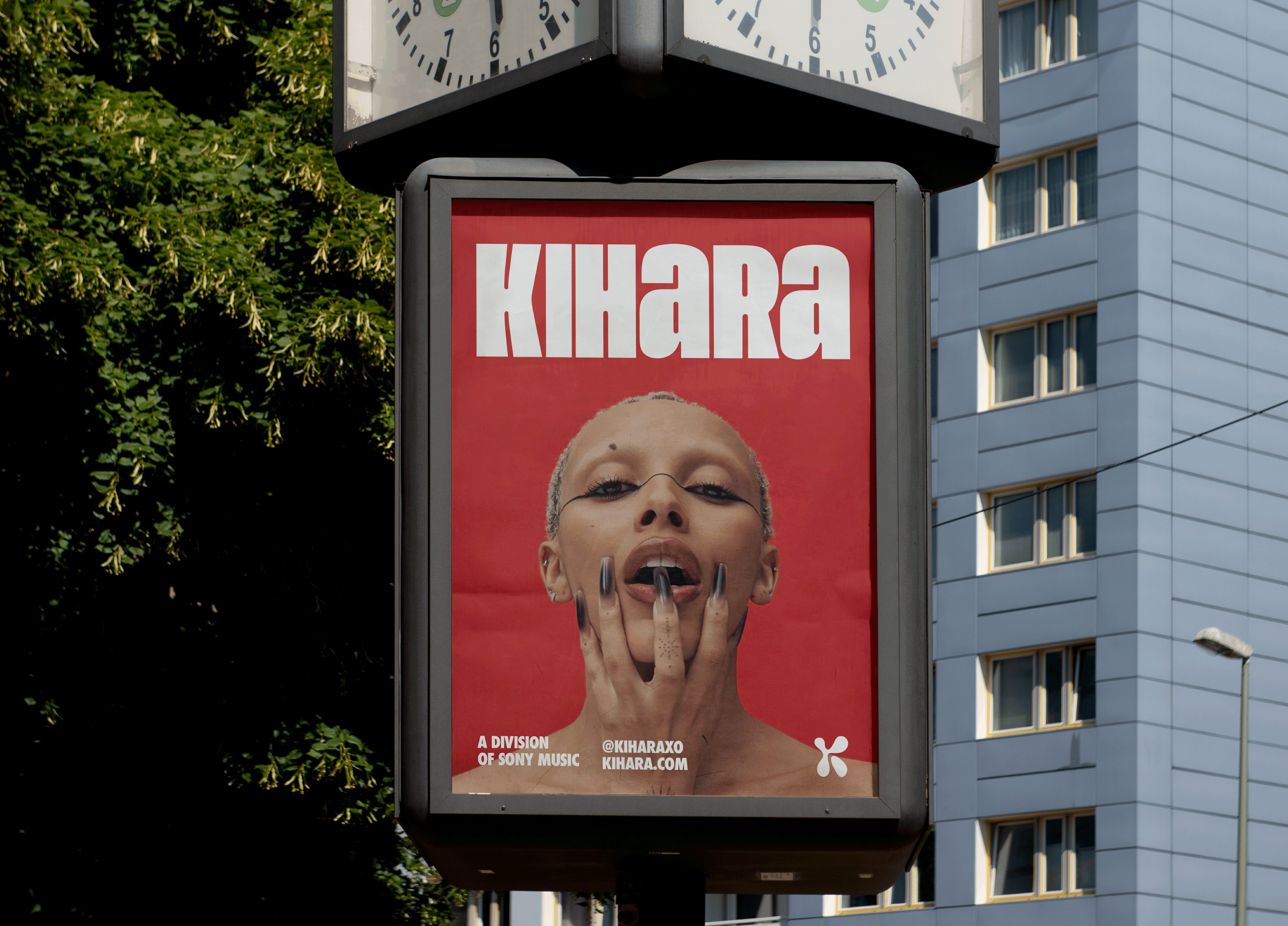
Paying homage to the walkman logo, the brand identity takes a bold yet versatile approach using a strong and flexible design & framing system, that combines a sense of understatement and whilst nodding to the fashion & magazine world; creating a strong, timeless design system to caters to all styles of content. Starting with the, the primary logomark, taking bold & unapologetic approach whilst creating a sense of neutrality through clean, simple and timeless letterforms that communicate and represent each musician's unique character, using blocky letterforms that avoid typical typographic trends seen in the music industry.
The primary logo mark is constructed through a mixture of upper and lowercase customised typography, representing a range of different style of artists coming together in a community as one, making sure not to make any reference to any era or style of music, catering to all music styles and representing a visual intersection between music & cinema. The primary logo mark logo mark is made up of multiple customised typefaces stitched together to create a ownable wordmark for primary logo mark, holistically customised to harmonise the various letter forms together together as one - as well as to adding some subtle curvature and movement within the letterforms, representing flow & movement within the music style that KIHARA offers.
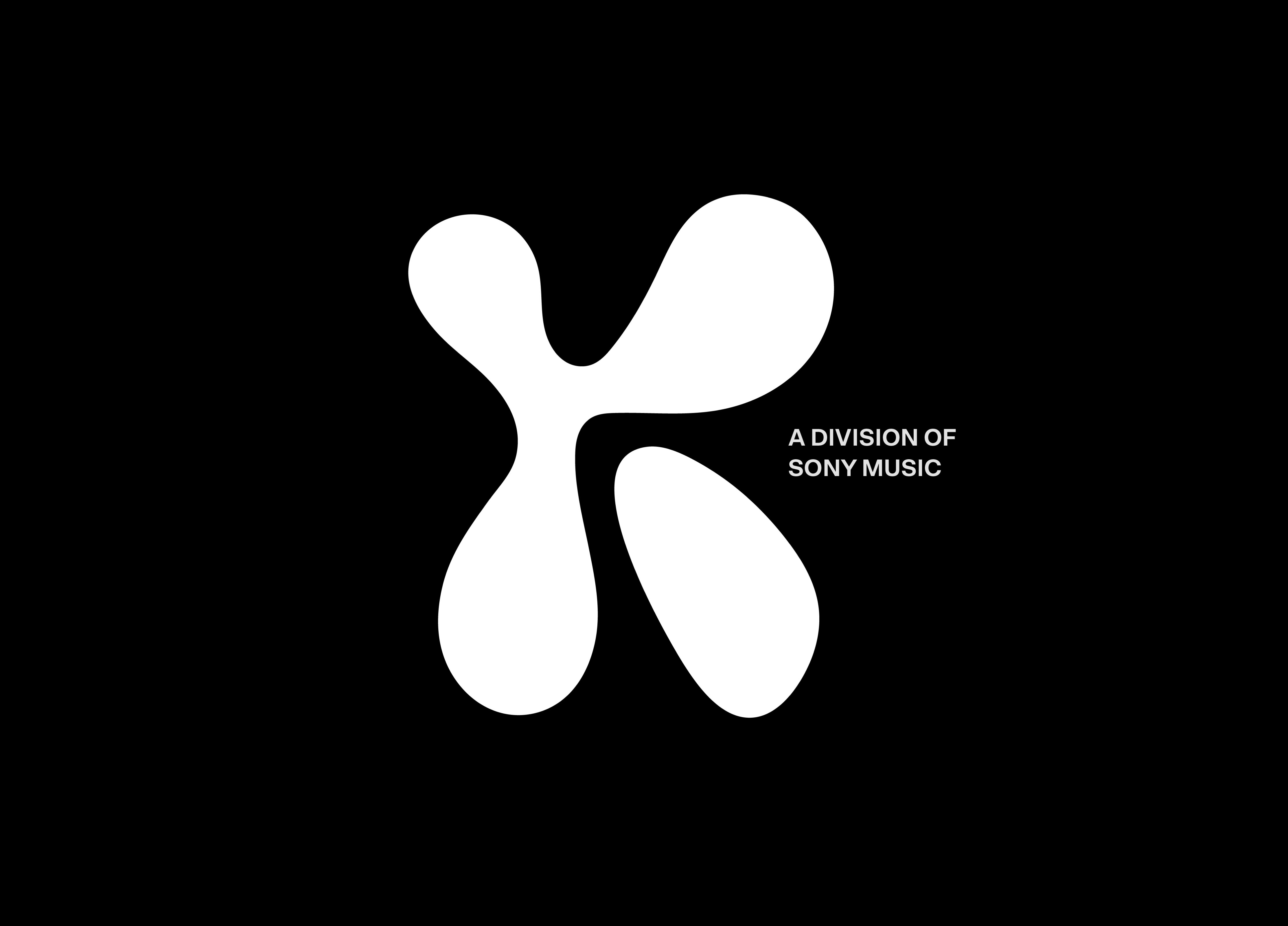
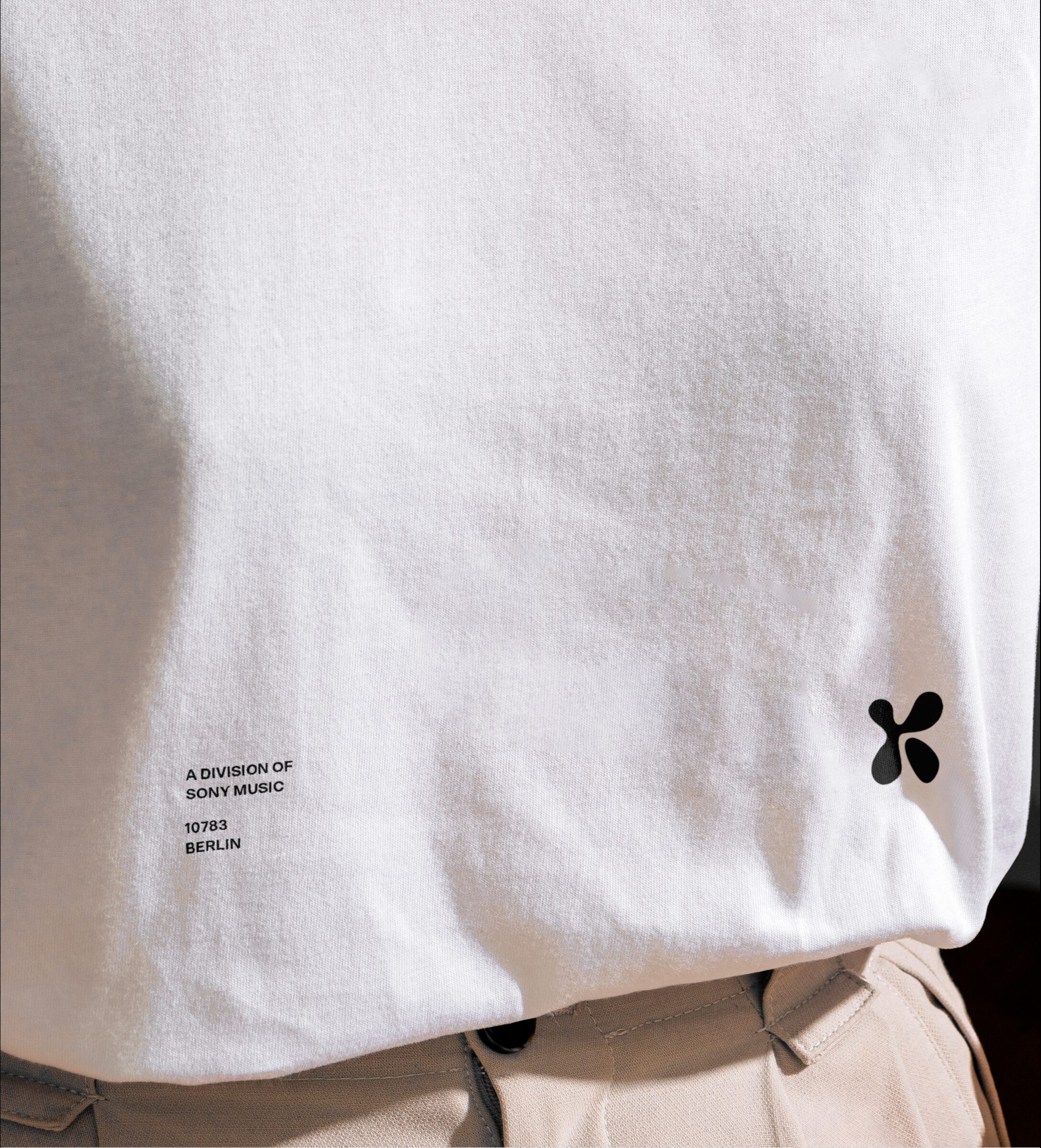
The symbolic seondary brand symbol pays homage to the original walkman logo, exploring an organic, abstract and fluidic shape, carefully structured to represent the letter ‘k’ in an abstract way that isn’t too obvious at first glance. Whilst making reference to the 2000’s walkman logo, this concept injects an extra sense of organic character and a feeling of bravery and fluidity through it’s form and thickness, representing the idea of ‘music to grow to’ - with a dense and concentrated structure that represents flow within music and remains impactful & legible across touch-points.
The typography surrounding the primary logomark stays within the confines on the sony music branding, using a combinatio of sony music sans, applied in a new & fresh way with modern approach to it’s application across the brand. The brand typography is paired with a neutral brand palette of black and white to create design system that allows the artists to be the hero of the brand, creating a brand identity. A brand identity that acts as a canvas for music to grow to.
Creative Direction: Robert Jahn
Mockups:
@Format.mockups
@bentito.mockup
@showcase.mockups
@mockup.maison
@urbanpostermockup