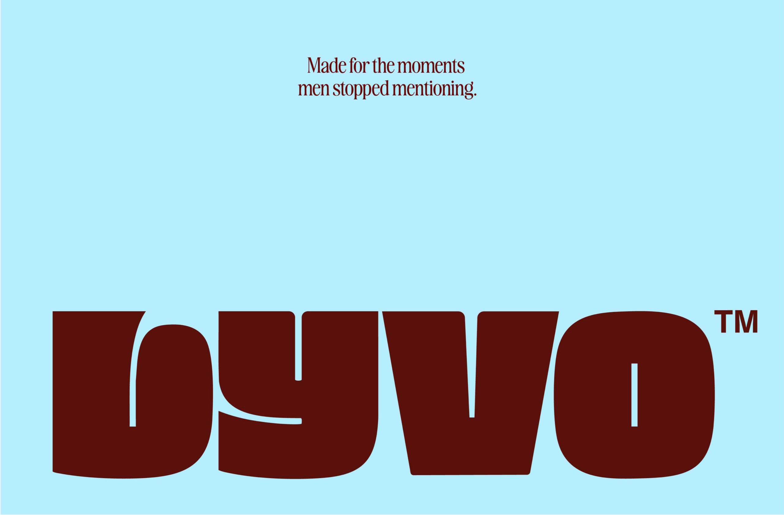
LYVO
Brand Identity design, art direction, UI design and copywriting
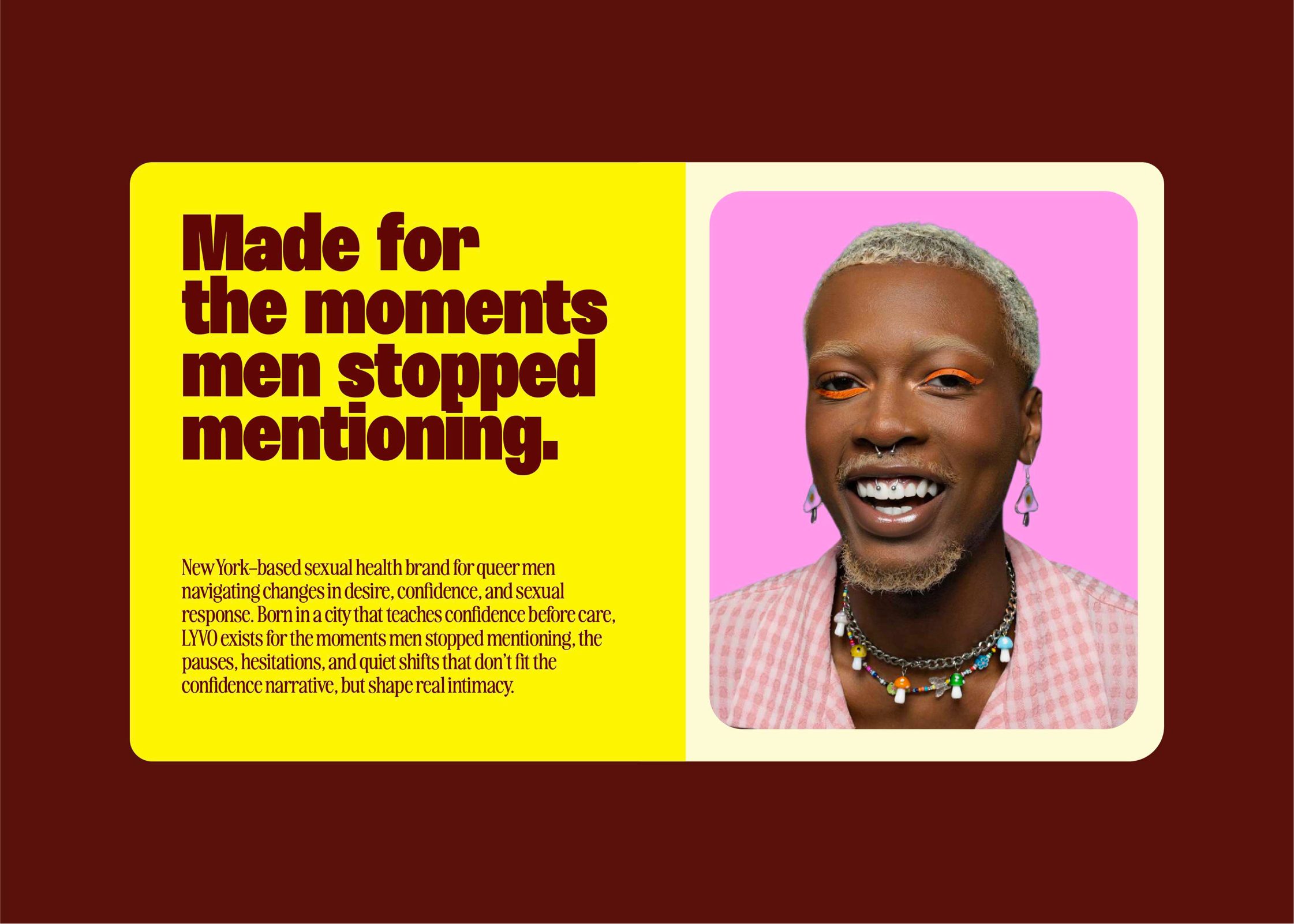
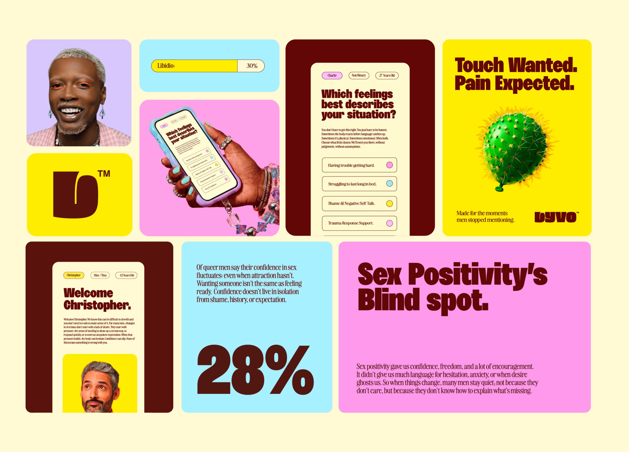
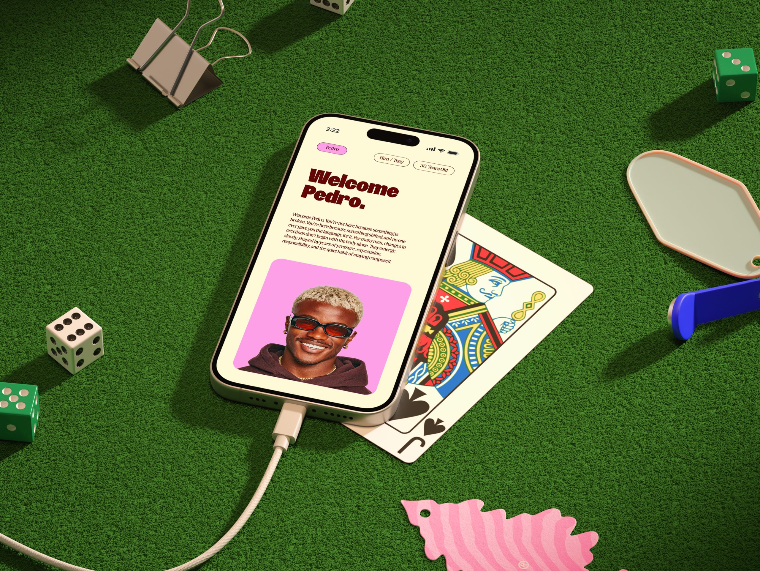
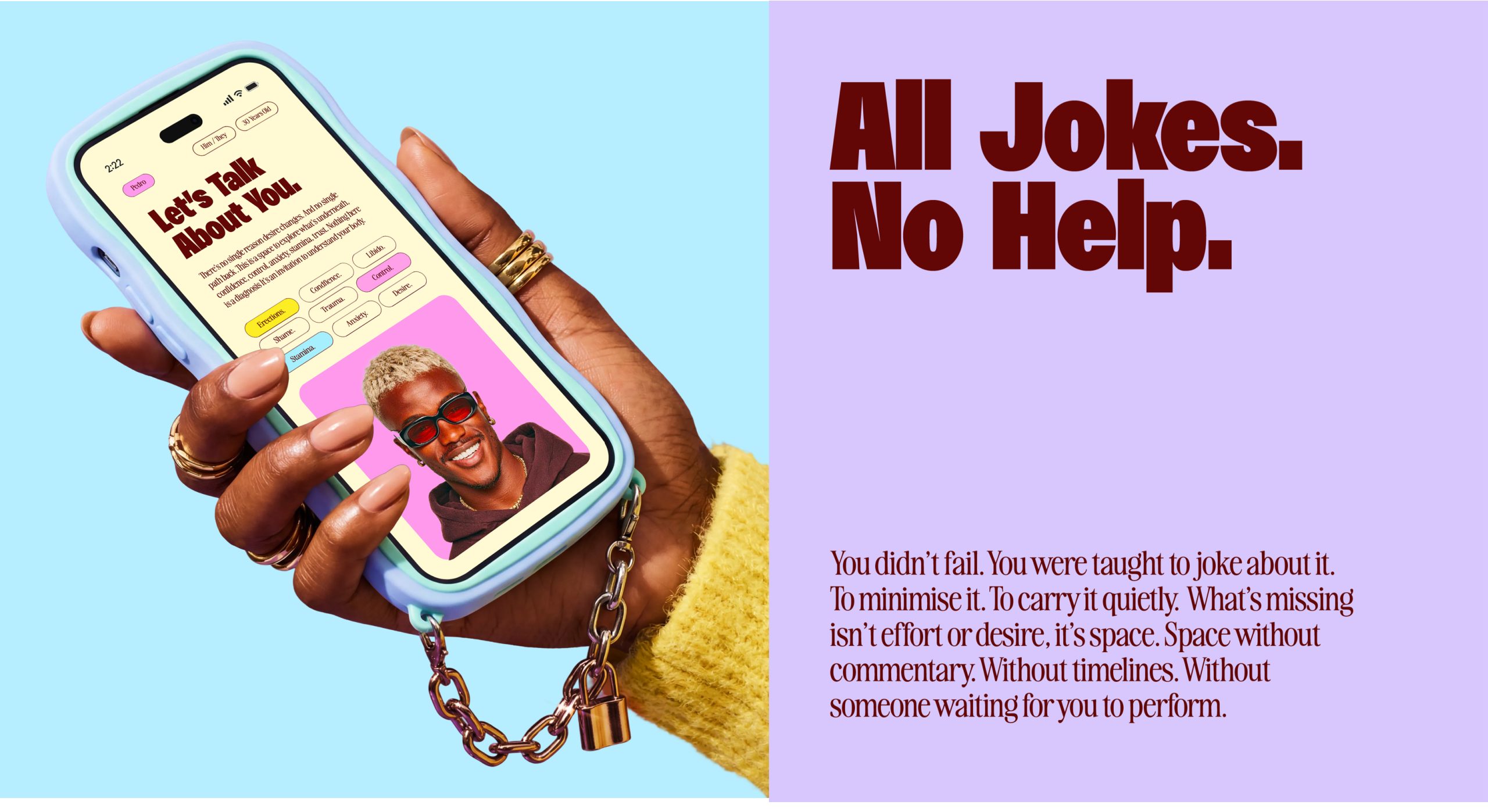
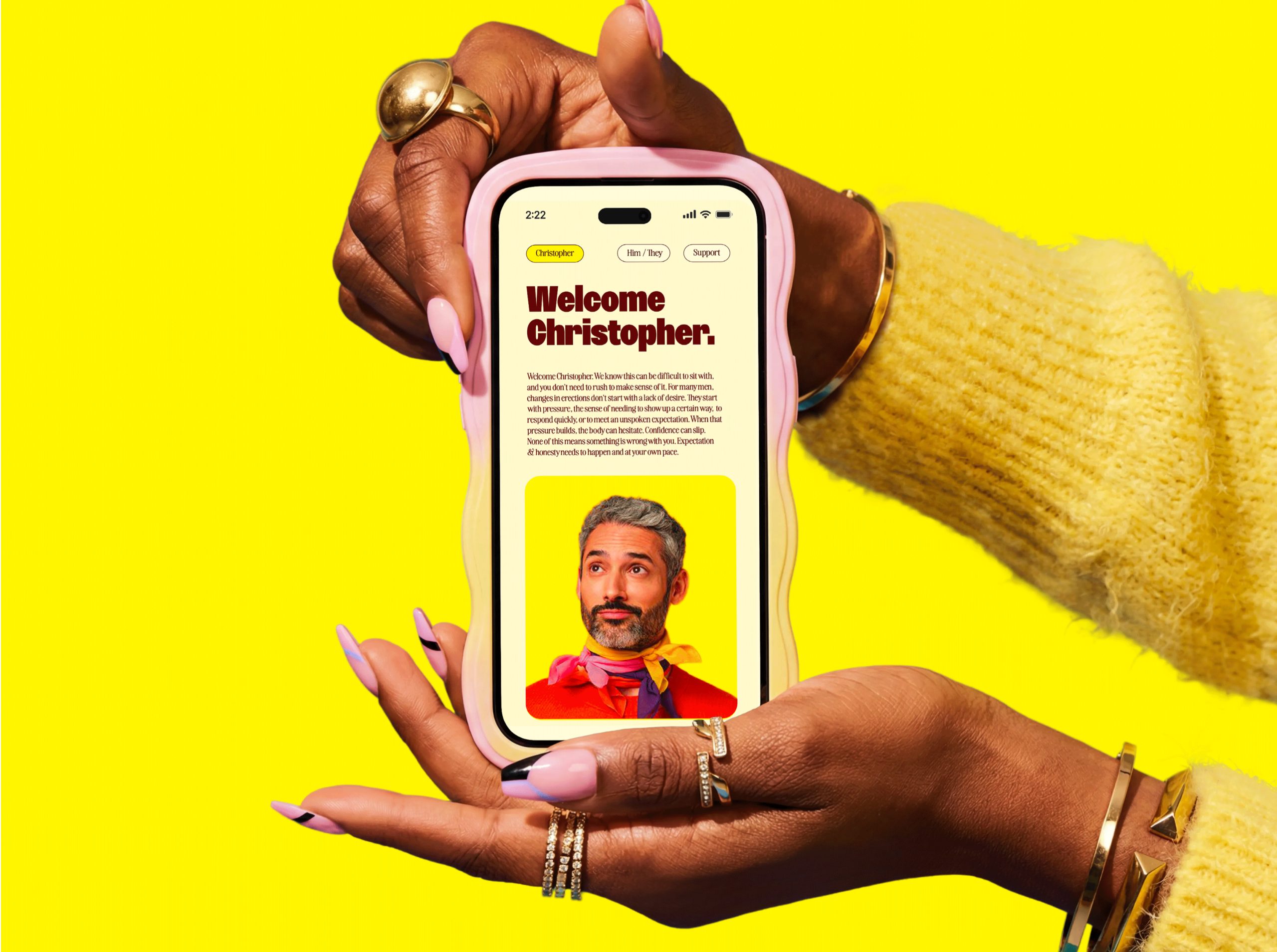
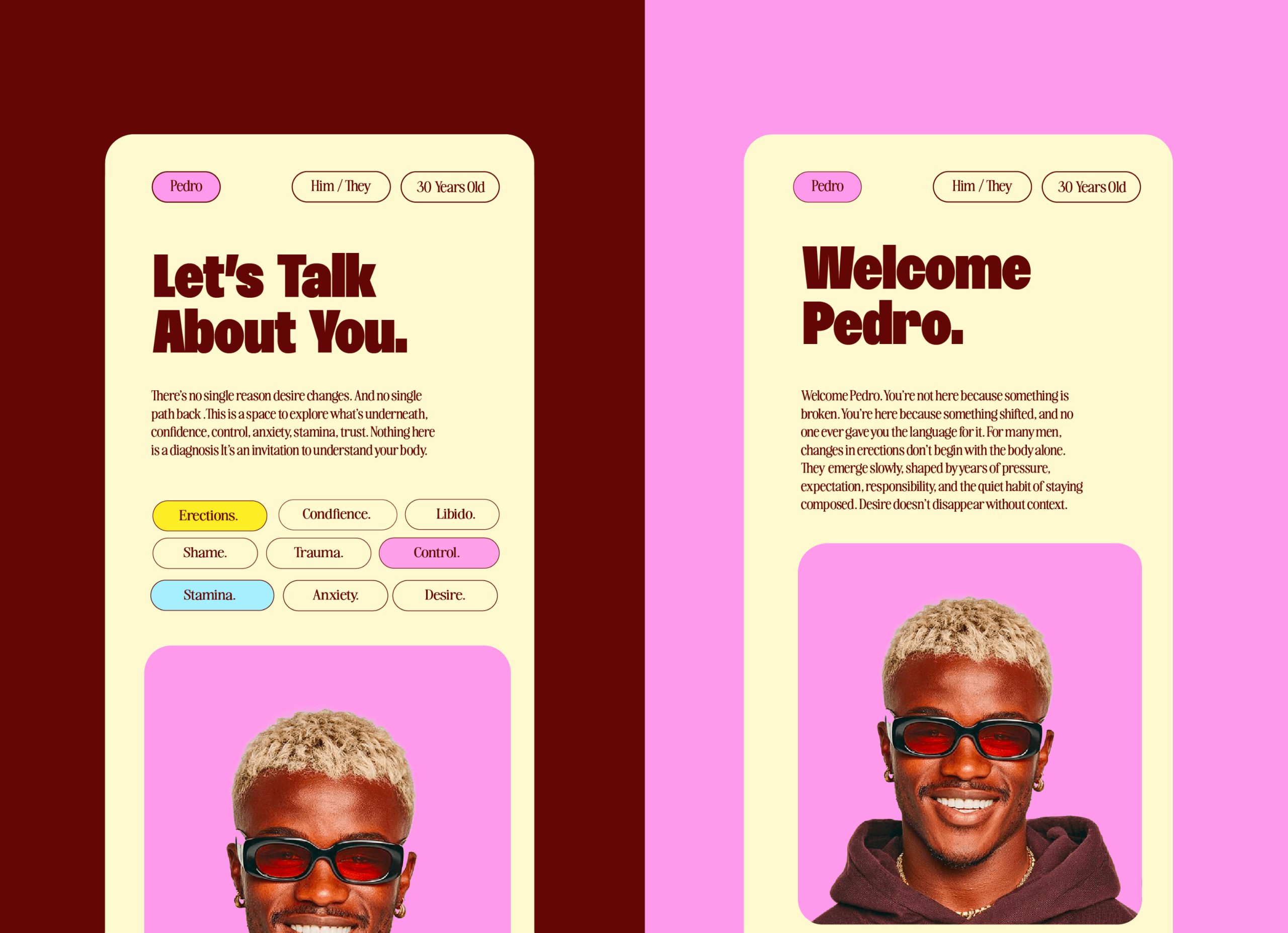
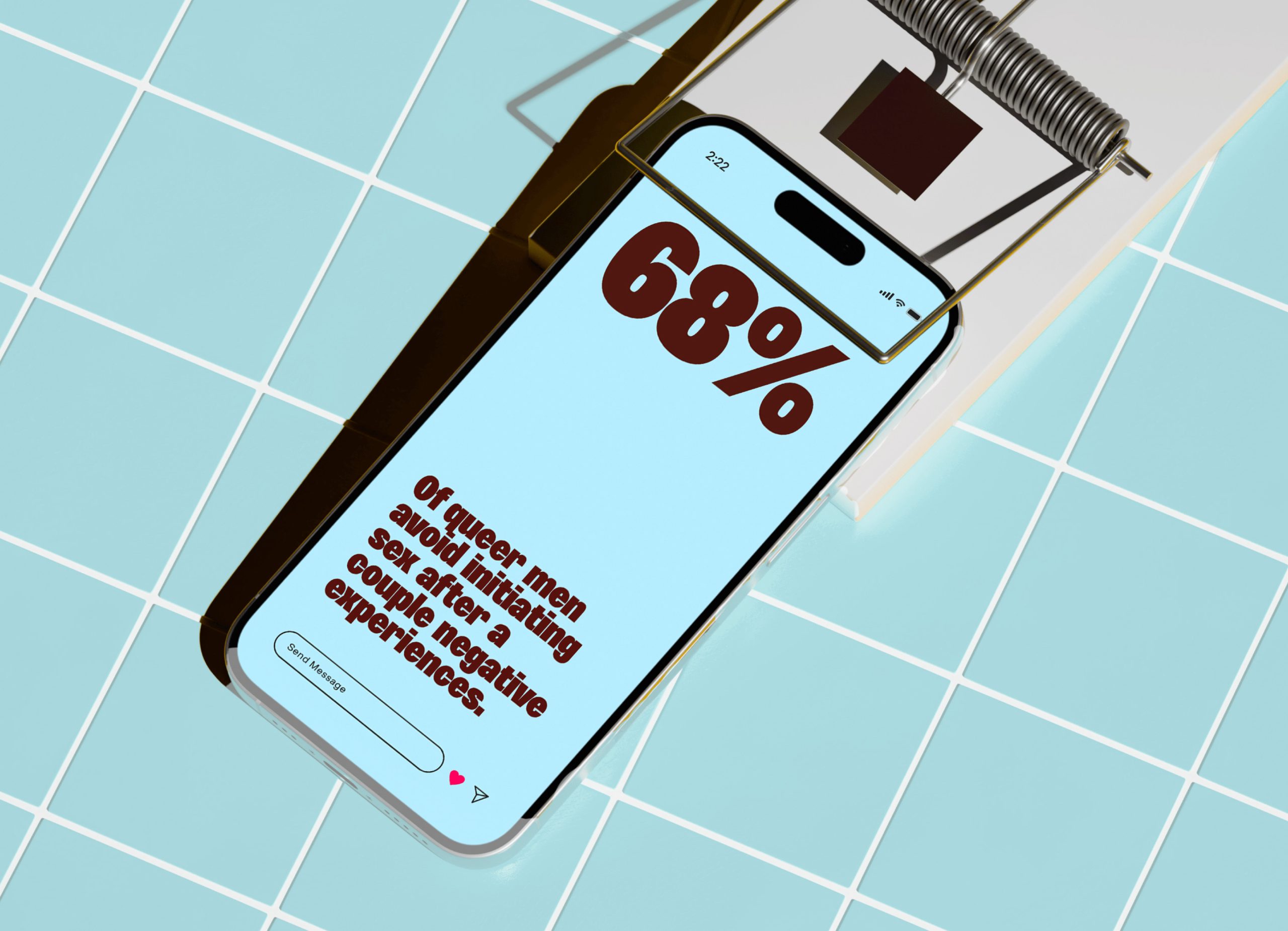
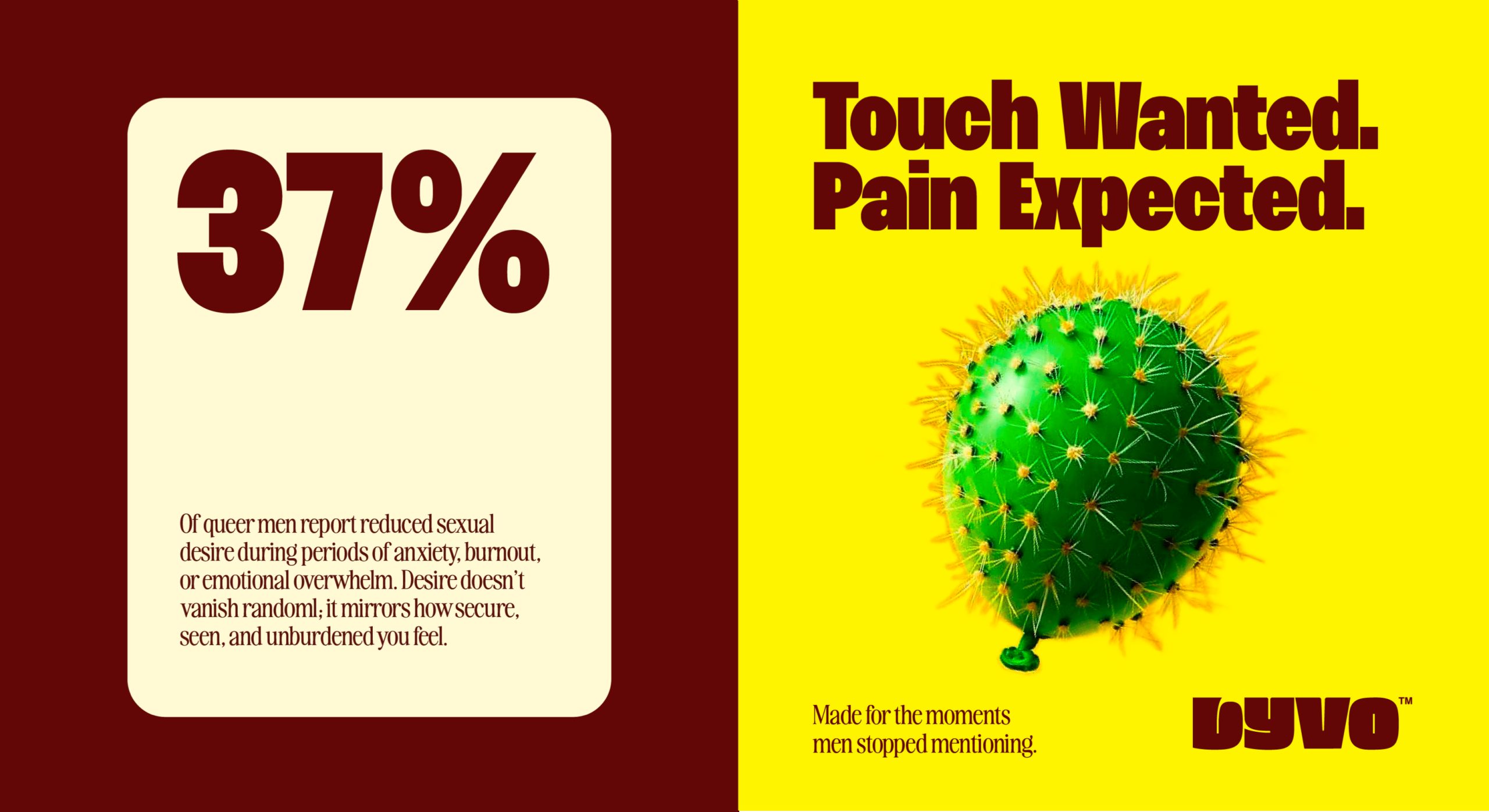
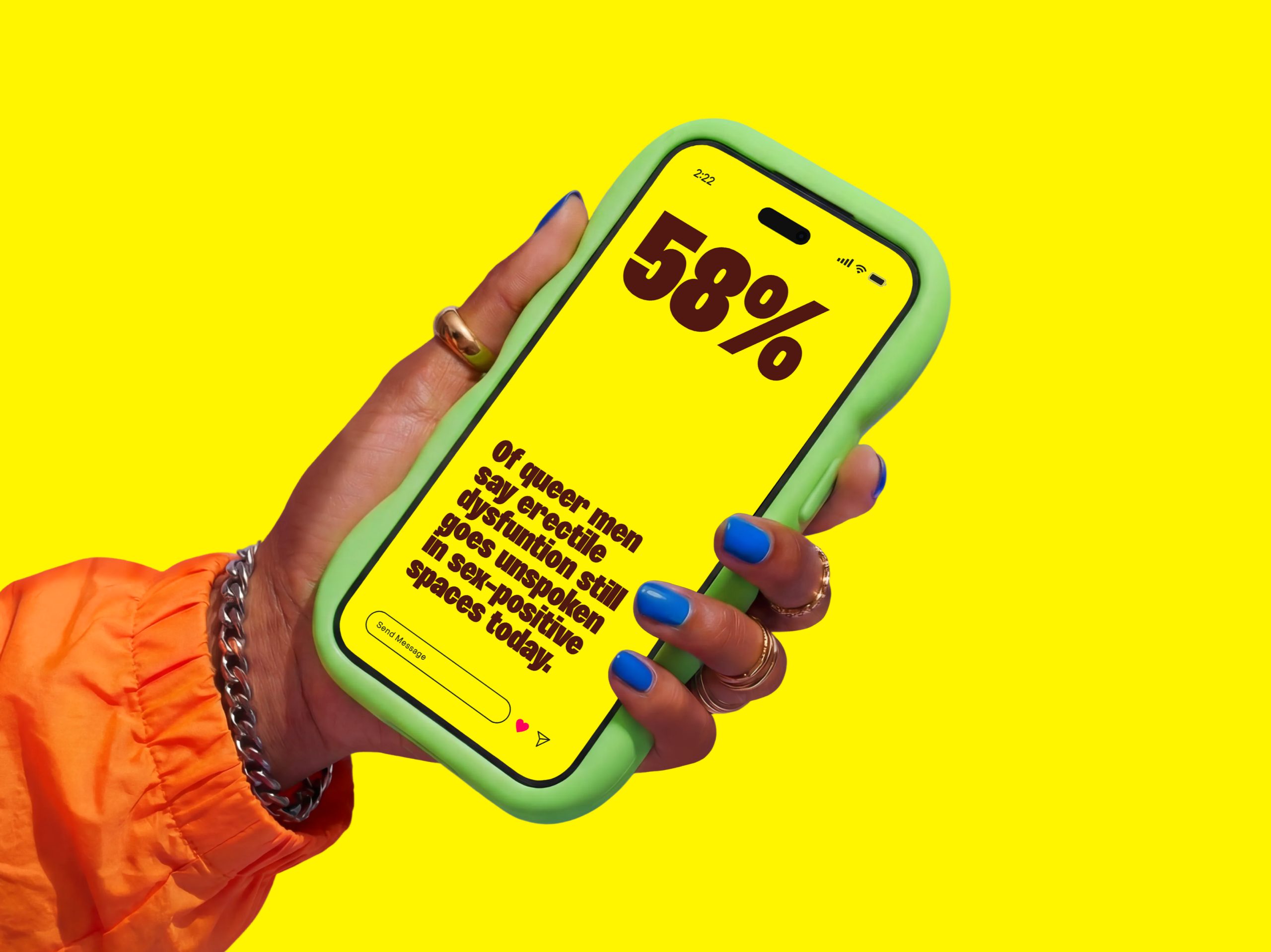
LYVO is a sexual health brand built specifically for queer men of all ages. It started in New York, but the intention was always broader - to create something that speaks to queer men globally. Erectile dysfunction is rarely addressed in a way that feels relevant within queer spaces. It’s either wrapped in clinical language or framed through straight, hyper-masculine narratives. LYVO was created to approach it differently, acknowledging the awkwardness, pressure and emotional weight that can come with it, without over-dramatising or sugarcoating the experience.
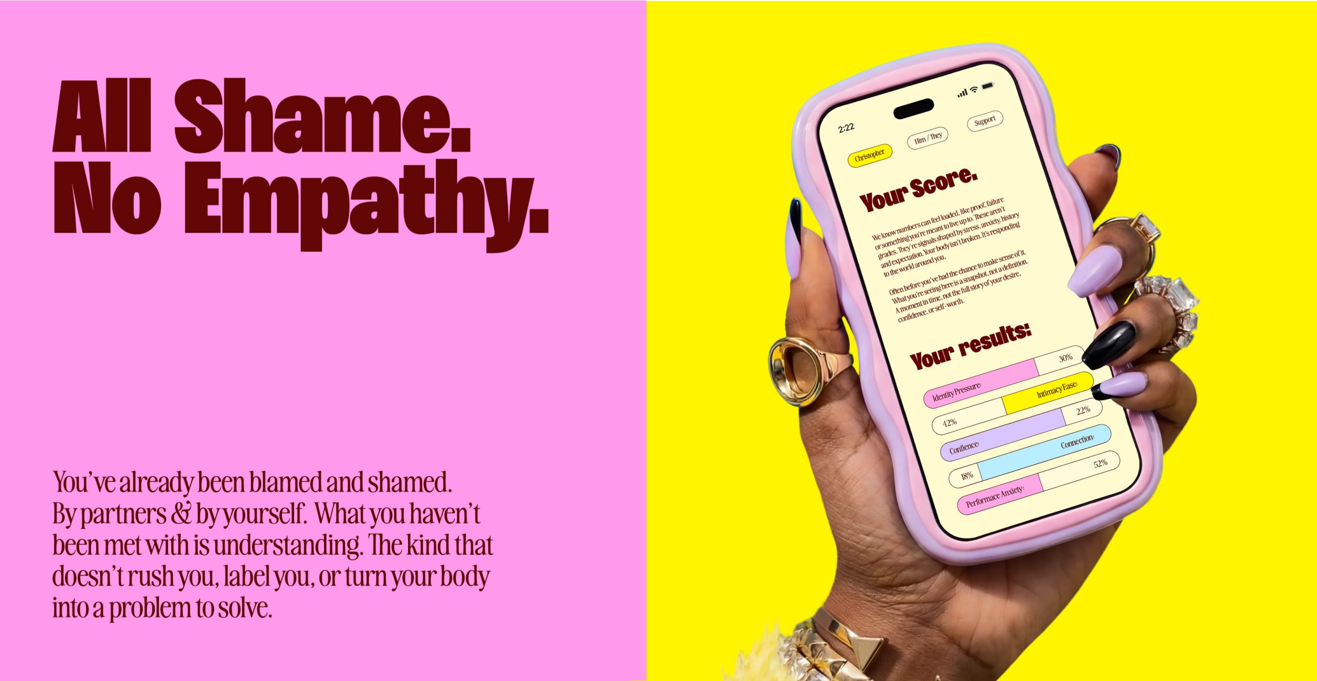
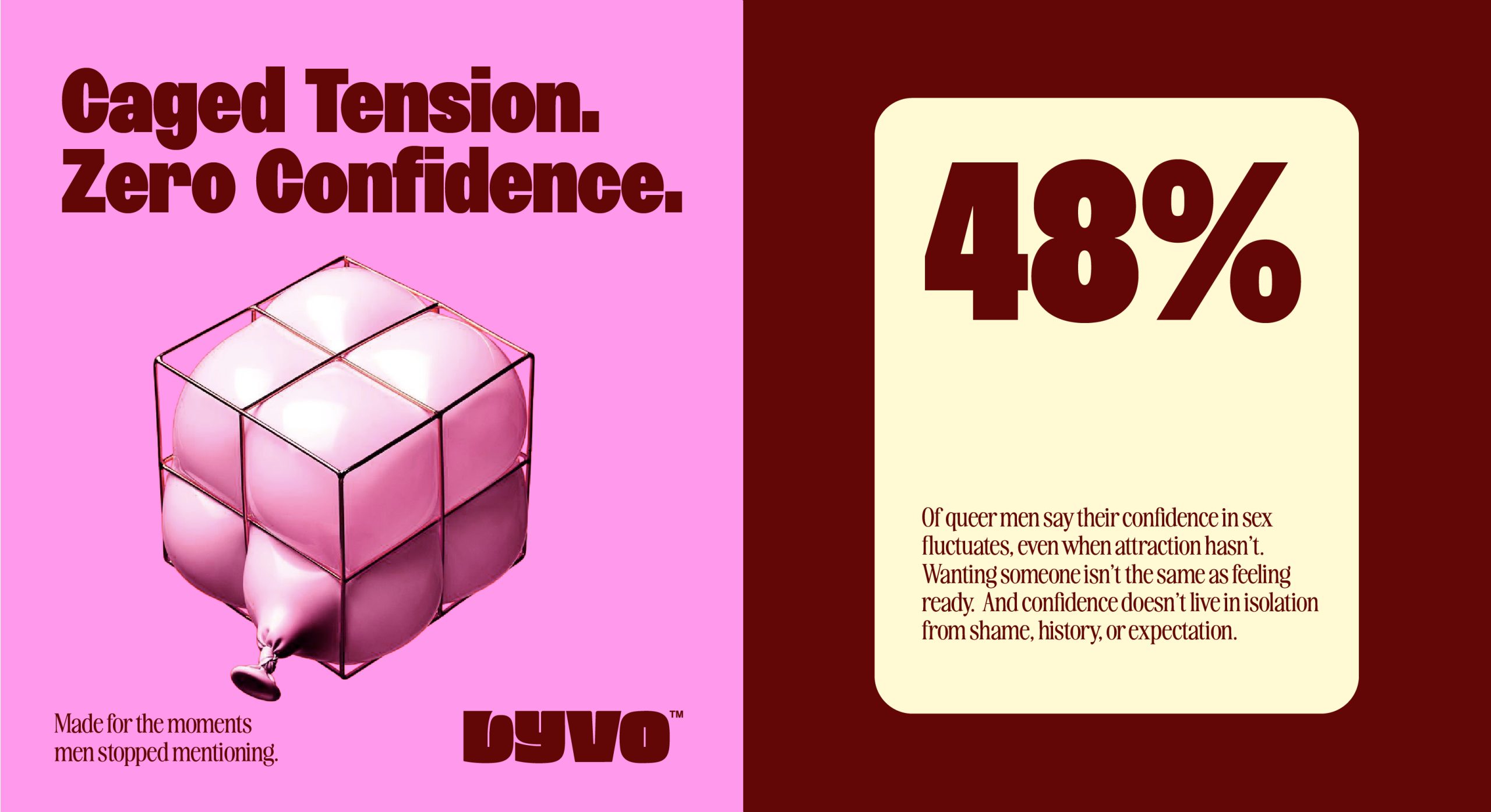
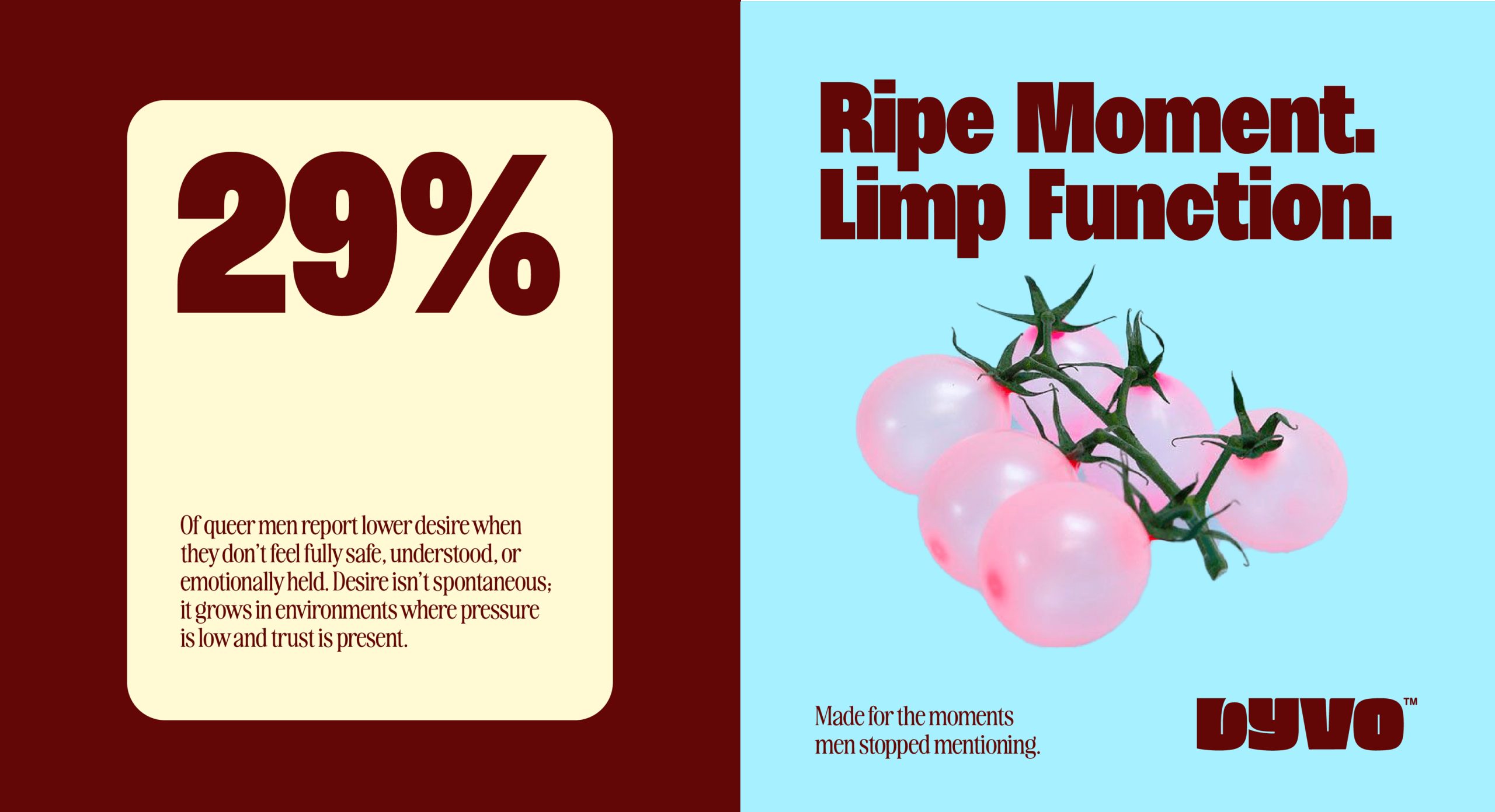
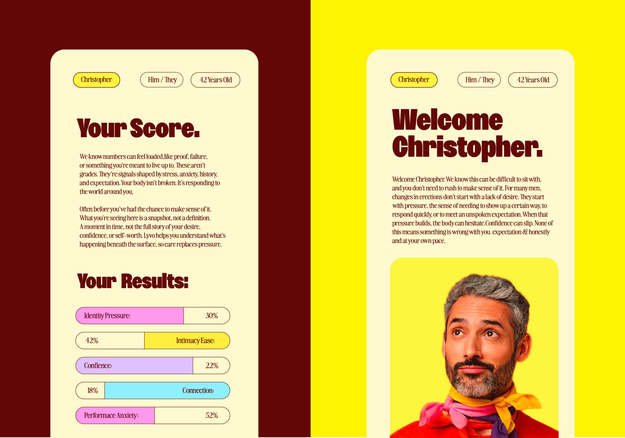
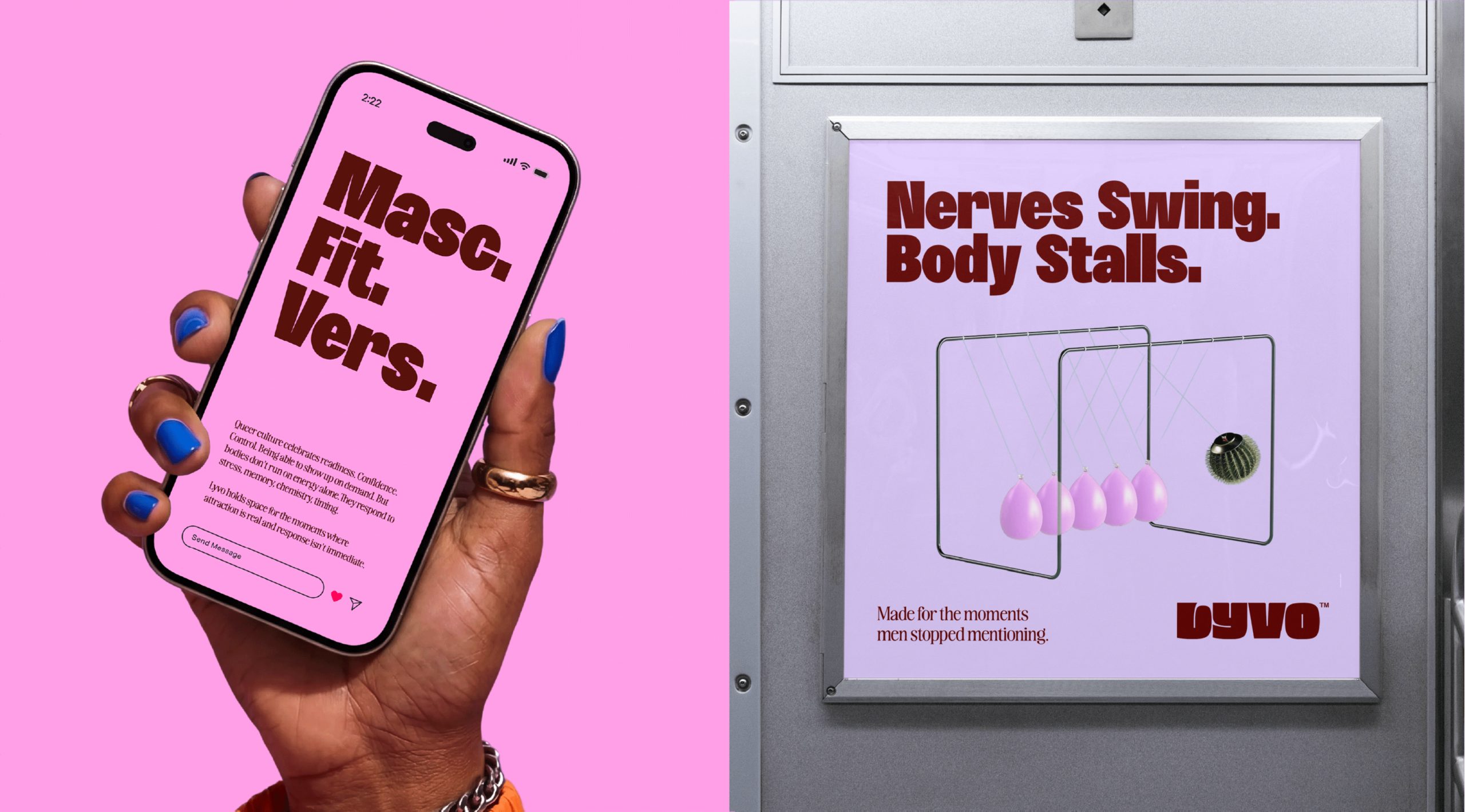
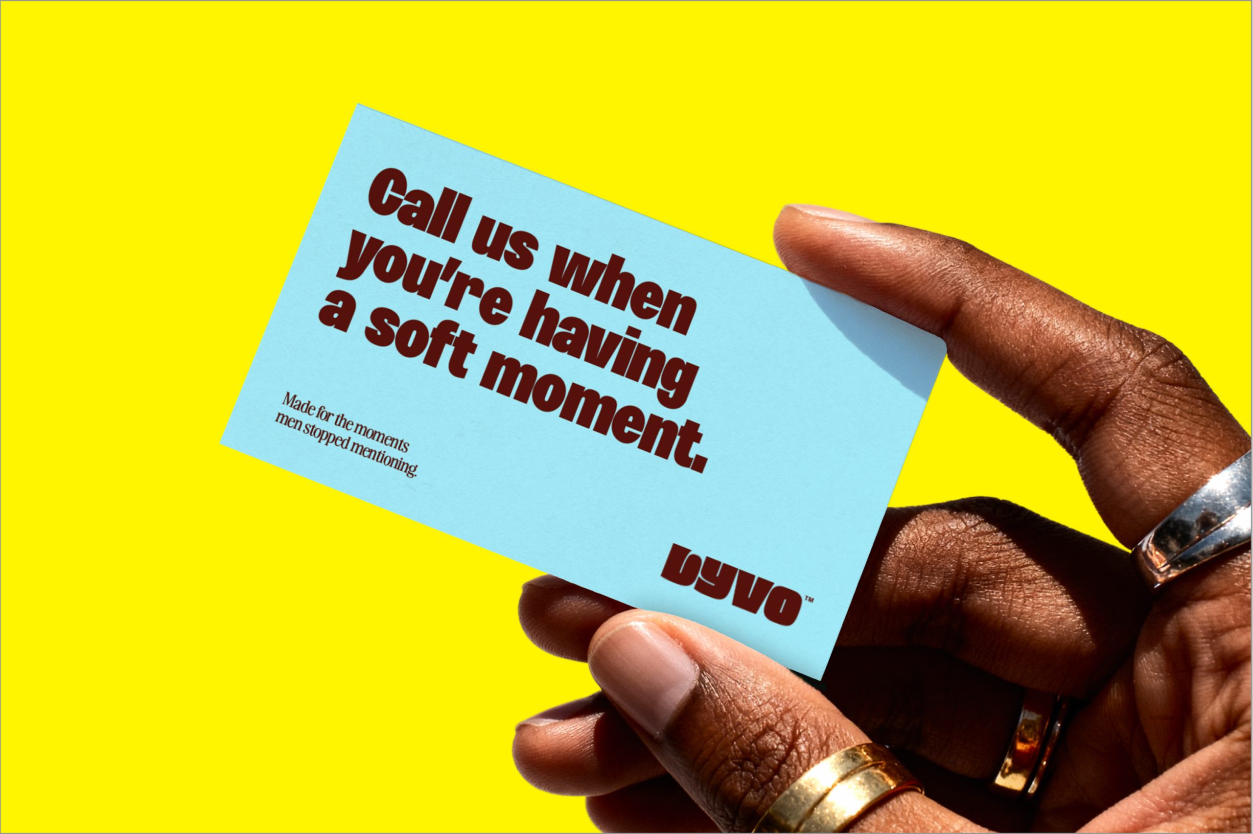
The strategic insight came from recognising how performance-driven queer spaces can feel. There’s often an unspoken expectation of confidence and sexual readiness. When that doesn’t align with reality, it can create isolation. LYVO responds to that gap. The tone avoids pharmaceutical clichés and exaggerated virility, instead opting for something direct, culturally aware and quietly empathetic. It doesn’t try to sensationalise the issue, it simply reflects it back in a way that feels honest.
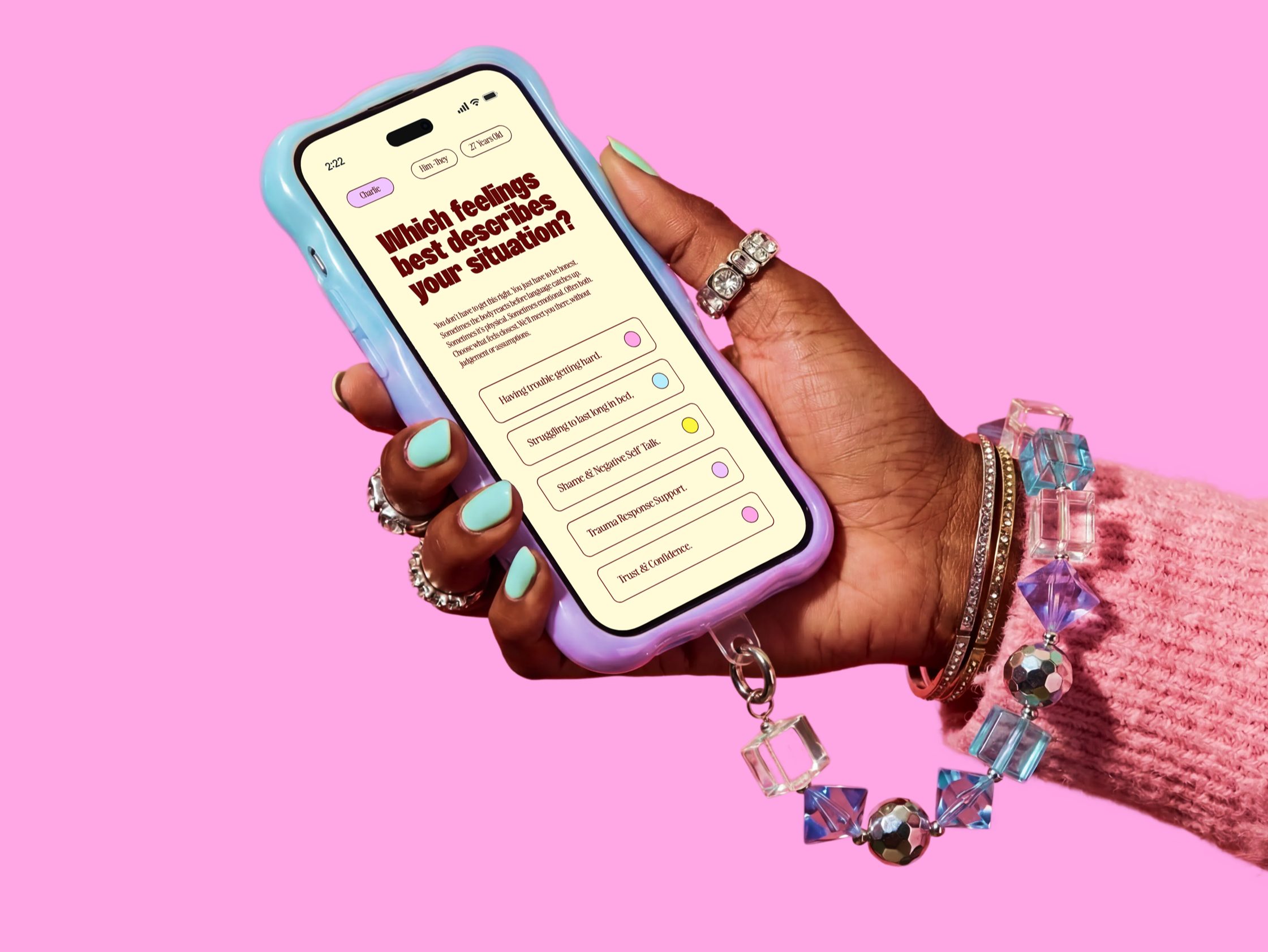
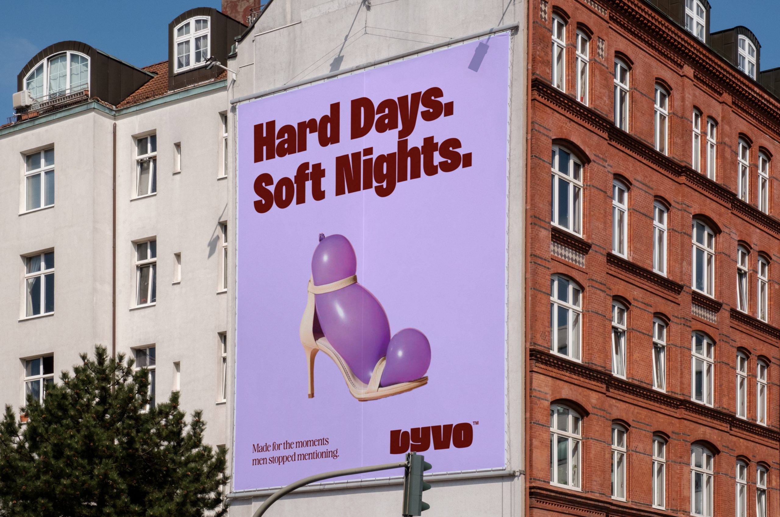
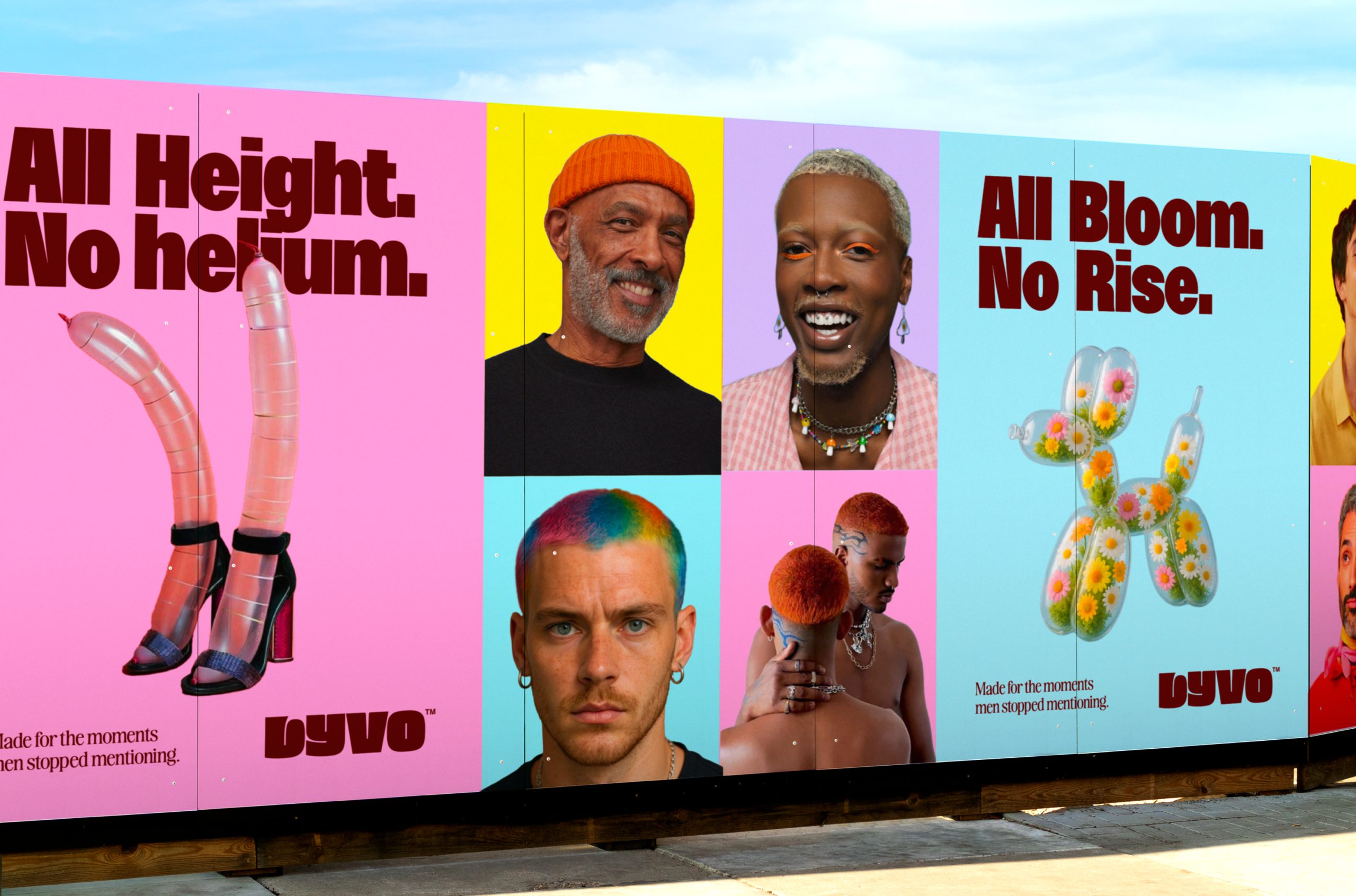
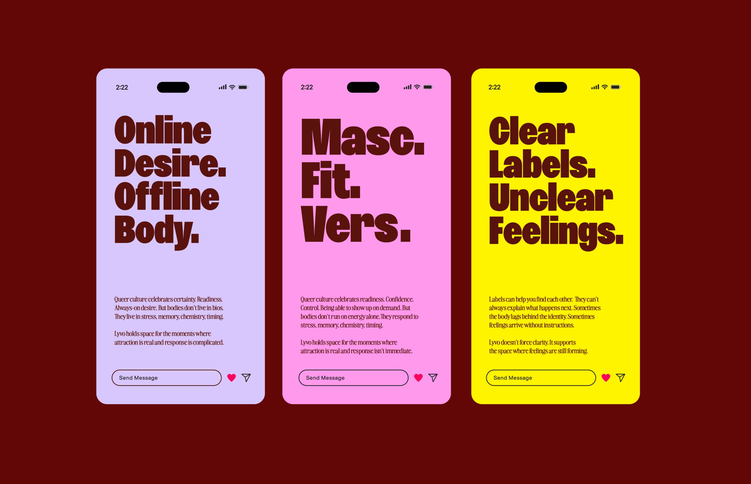
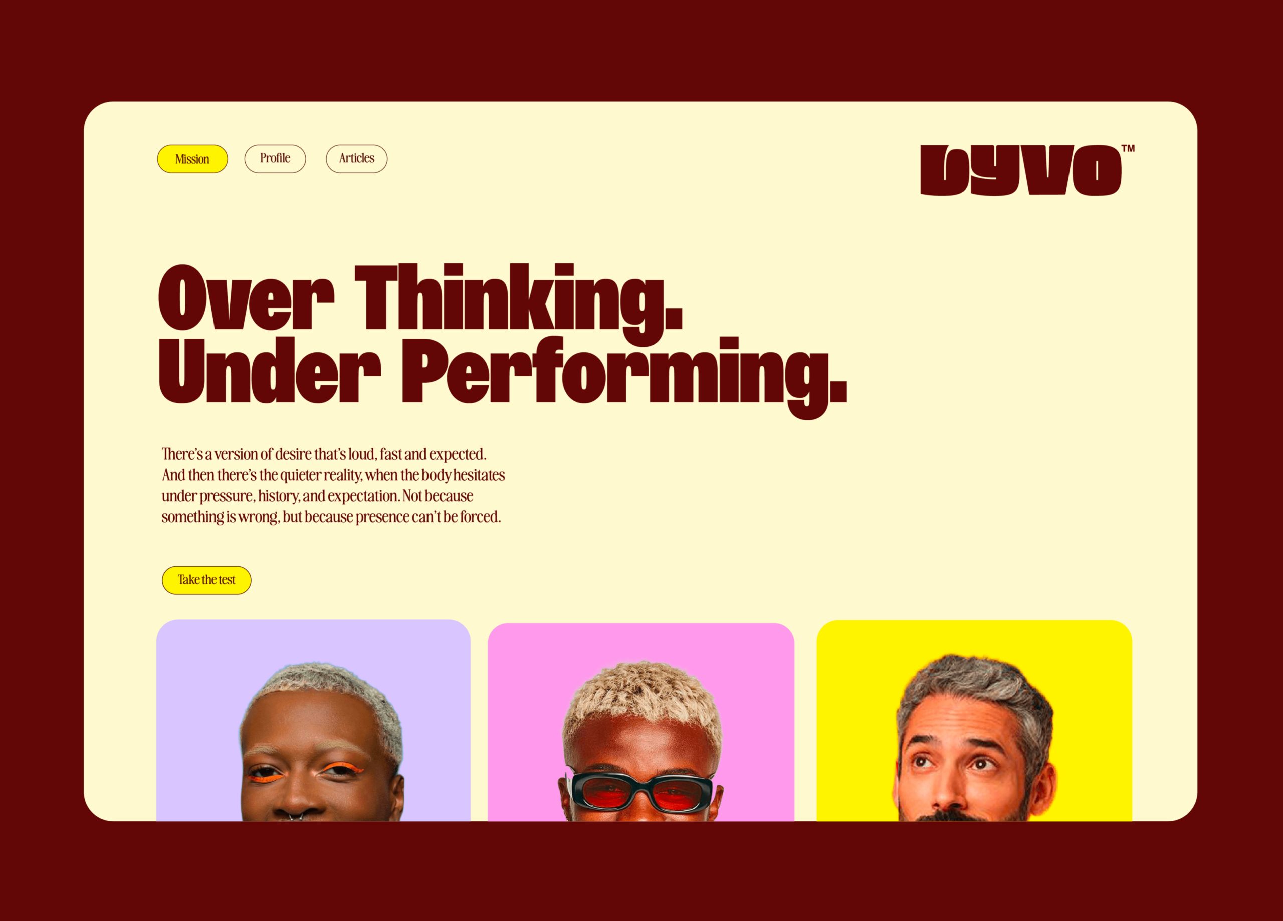
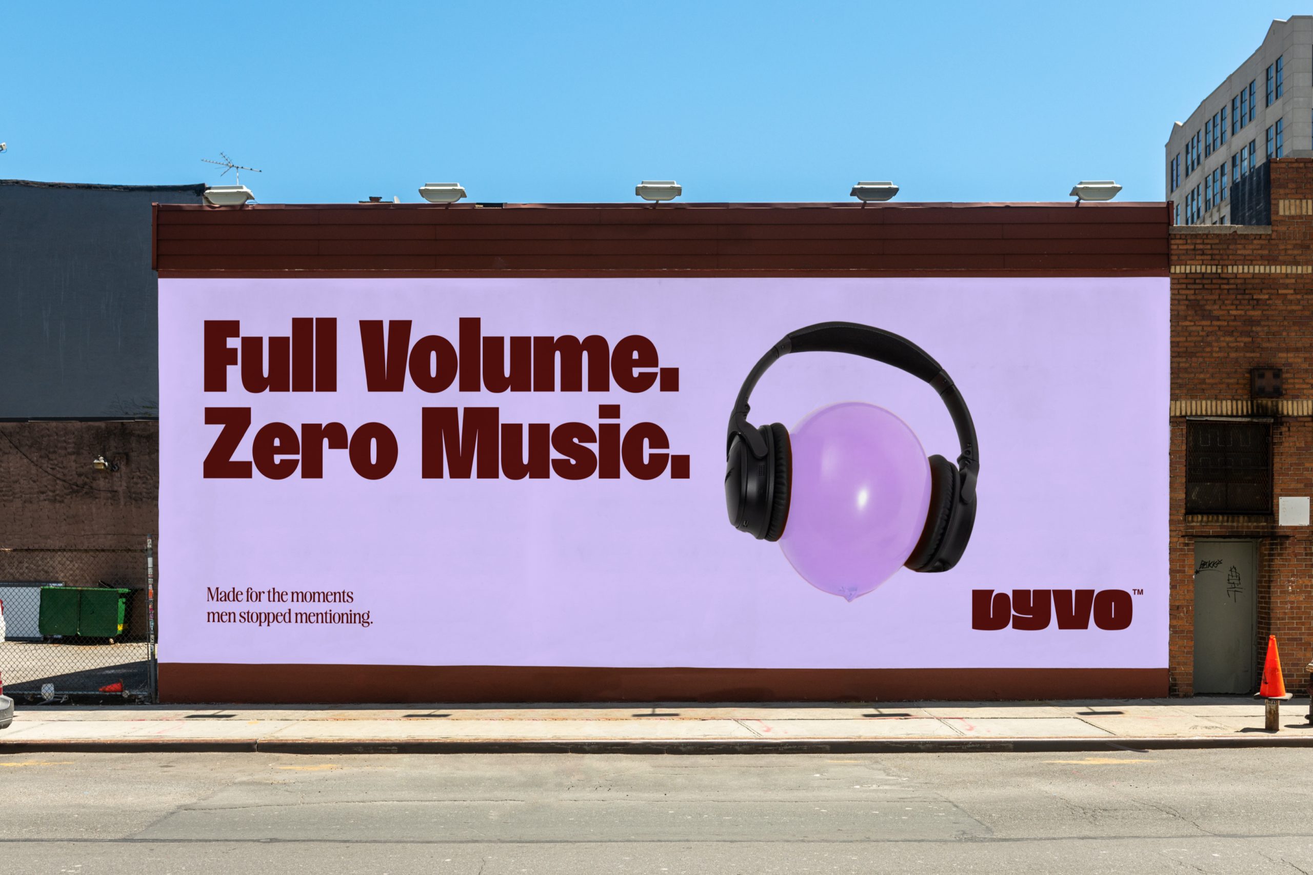
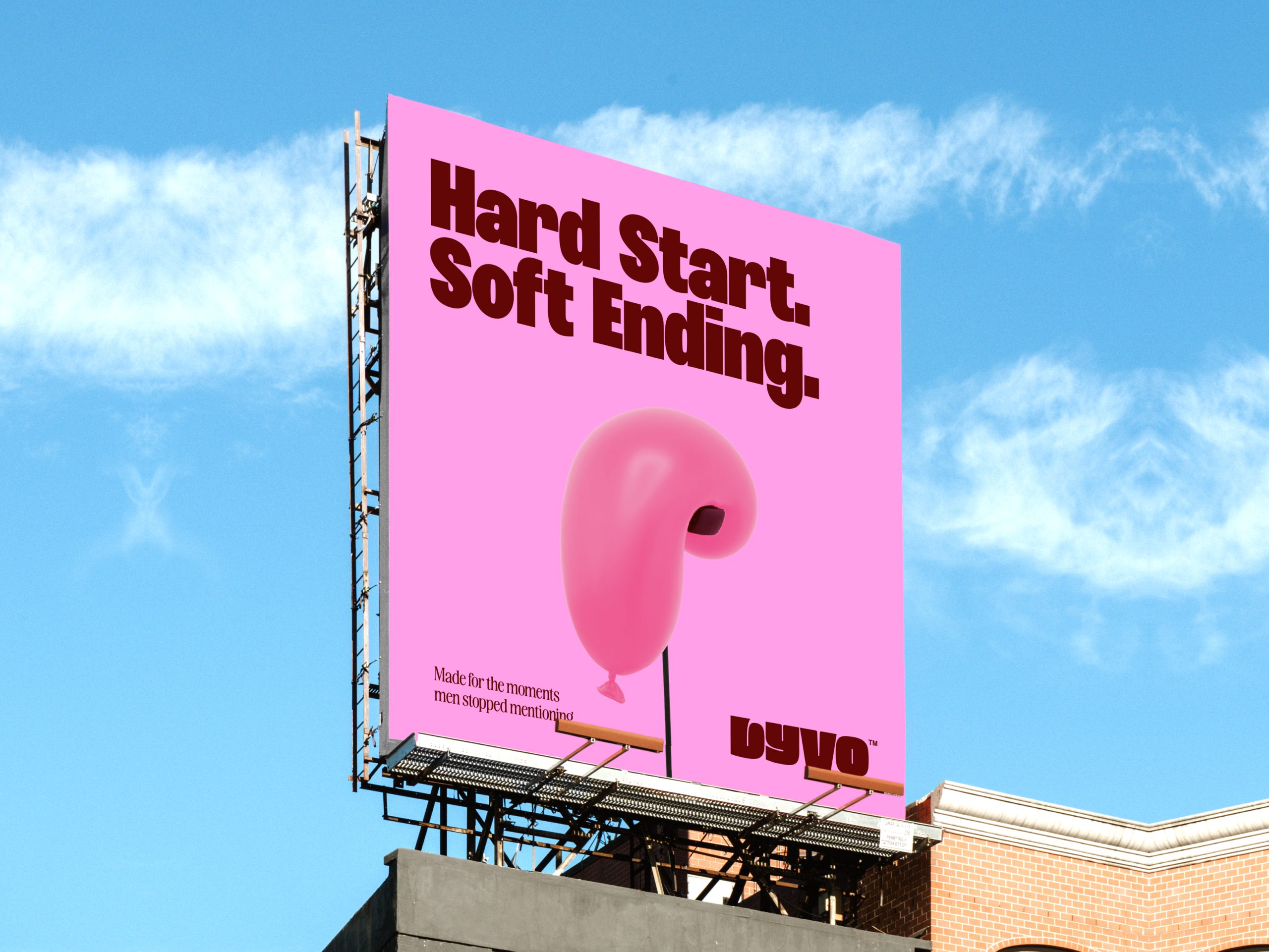
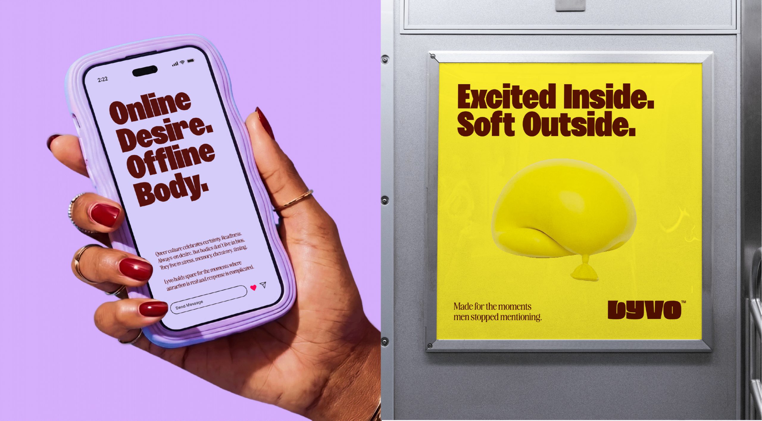
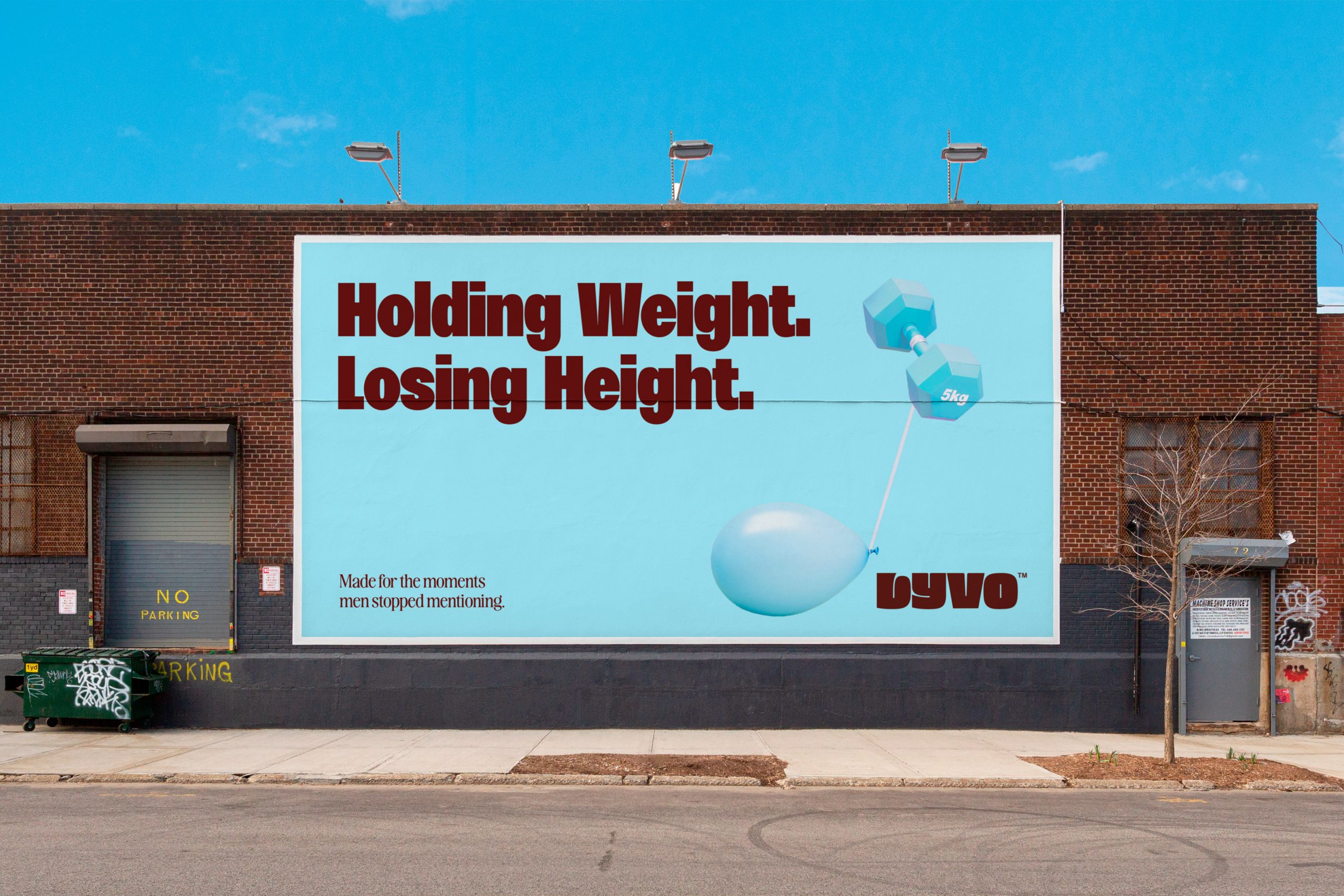
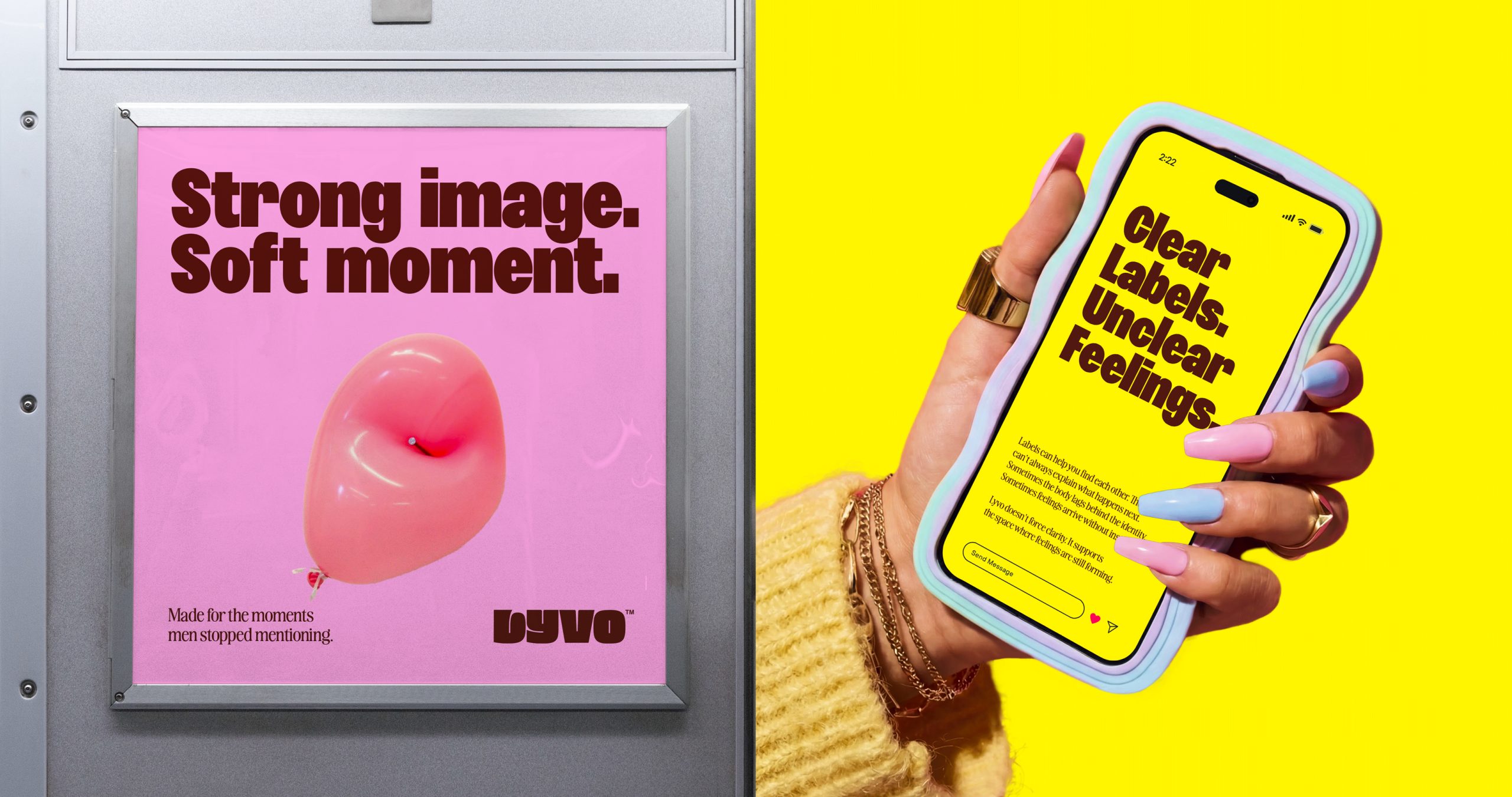
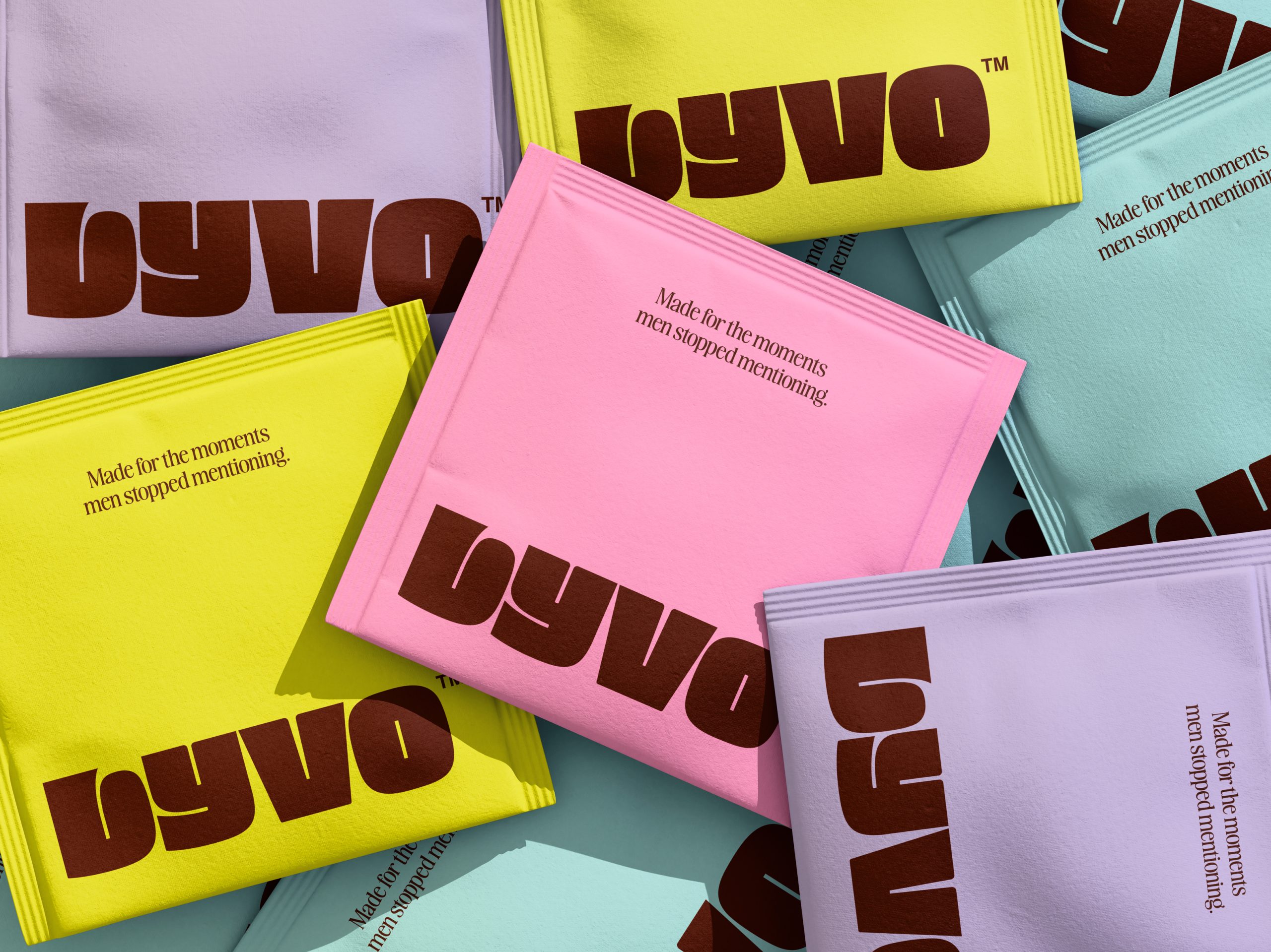
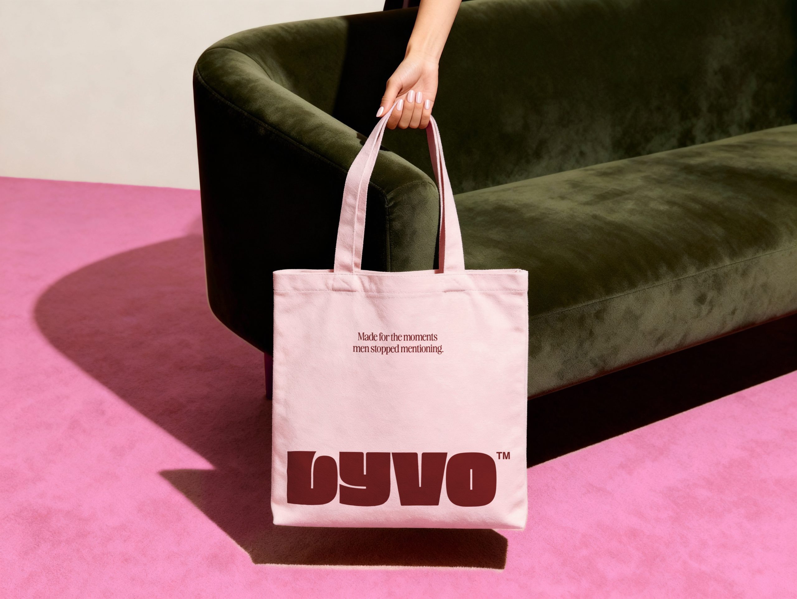
The typography is bold, consistent and unapologetic - much like the voice itself. Rather than distorting or overstylising it, the strength comes from clarity and presence. It holds its ground, allowing the concepts and metaphors to carry the emotional nuance while the type remains confident and steady. The colour palette is intentionally rooted in coded gender language; blue for “boy,” pink for “girl,” and purple sitting in between - subtly referencing identity, spectrum and fluidity. These cues feel familiar but are reframed within a queer context, reinforcing that this is a brand speaking to identity as much as health.
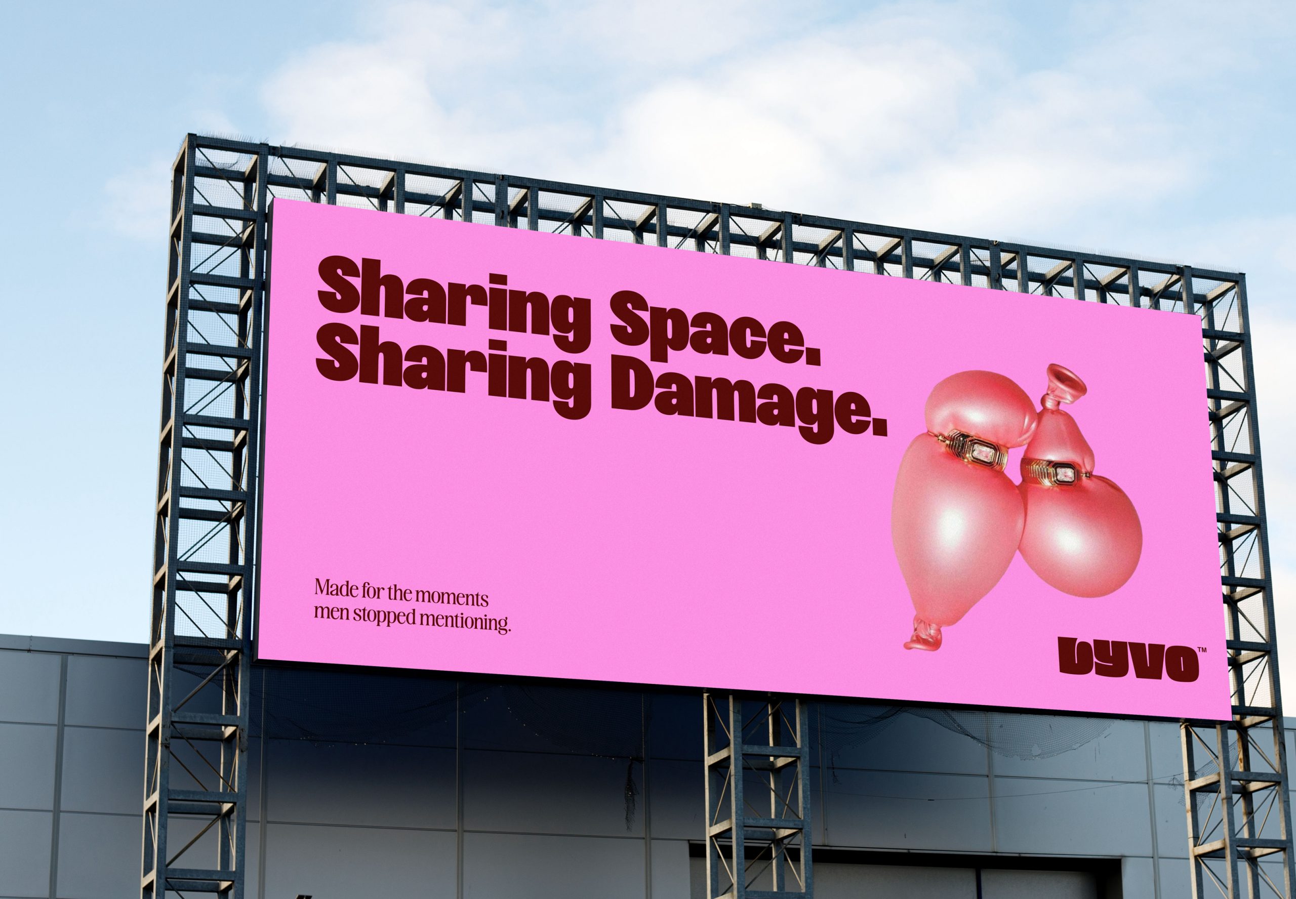
The art direction is built around metaphor rather than explicit imagery. Visual cues like tension, deflation and weight are used to communicate emotional states without being literal. This creates space for interpretation while keeping the work restrained and intelligent. Overall, LYVO uses strategy and design to reposition queer male sexual health as something that can be addressed with clarity and cultural relevance. It shifts the conversation away from stigma and toward visibility, without losing nuance.