Simple Sandwiches
Brand Identity, packaging design, custom logomark and art direction
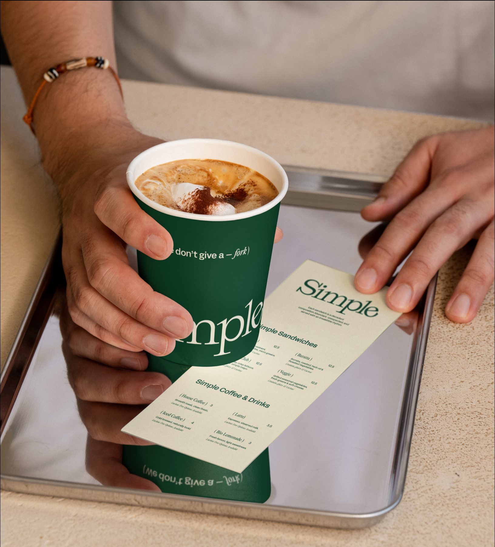
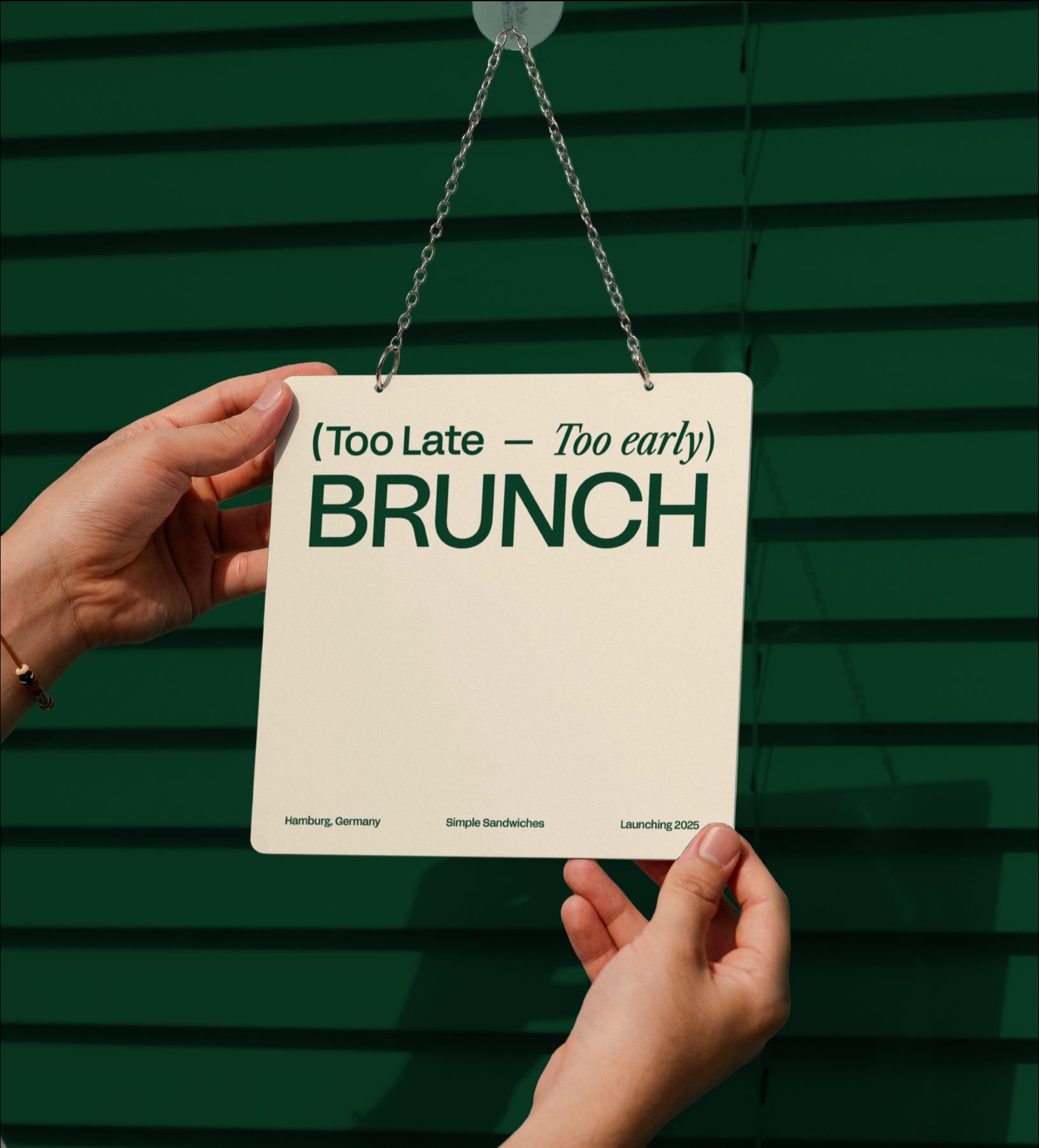
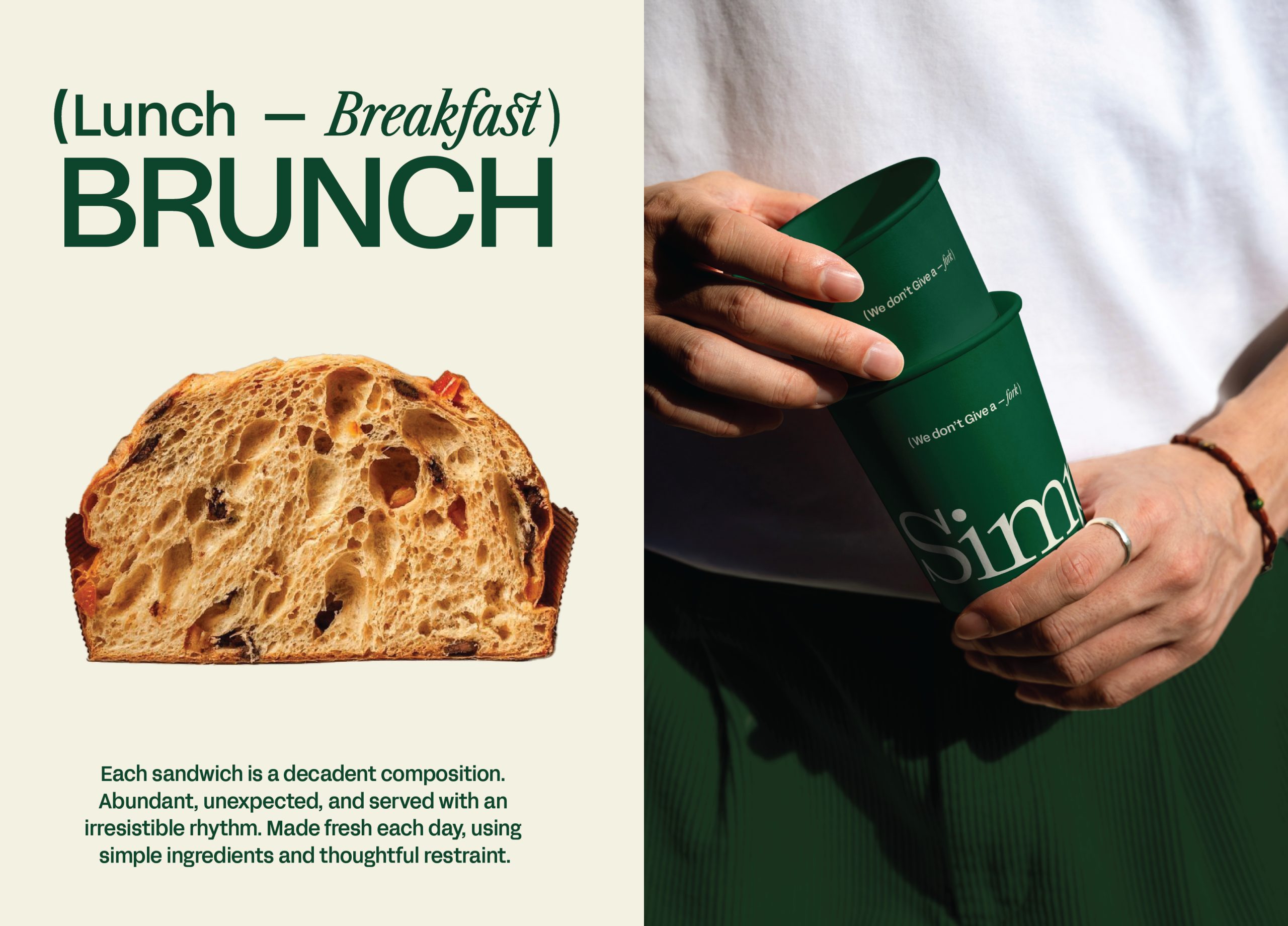
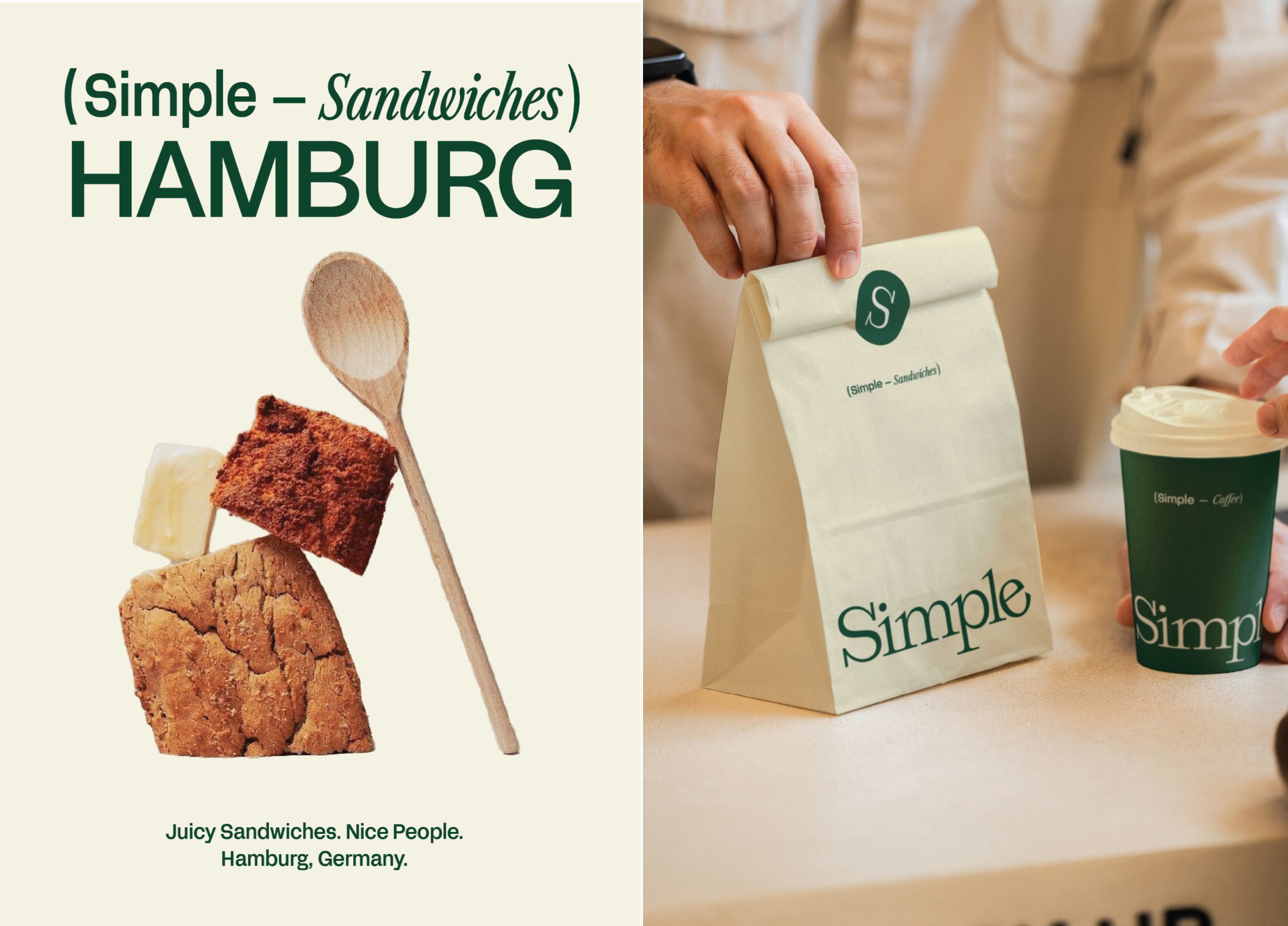
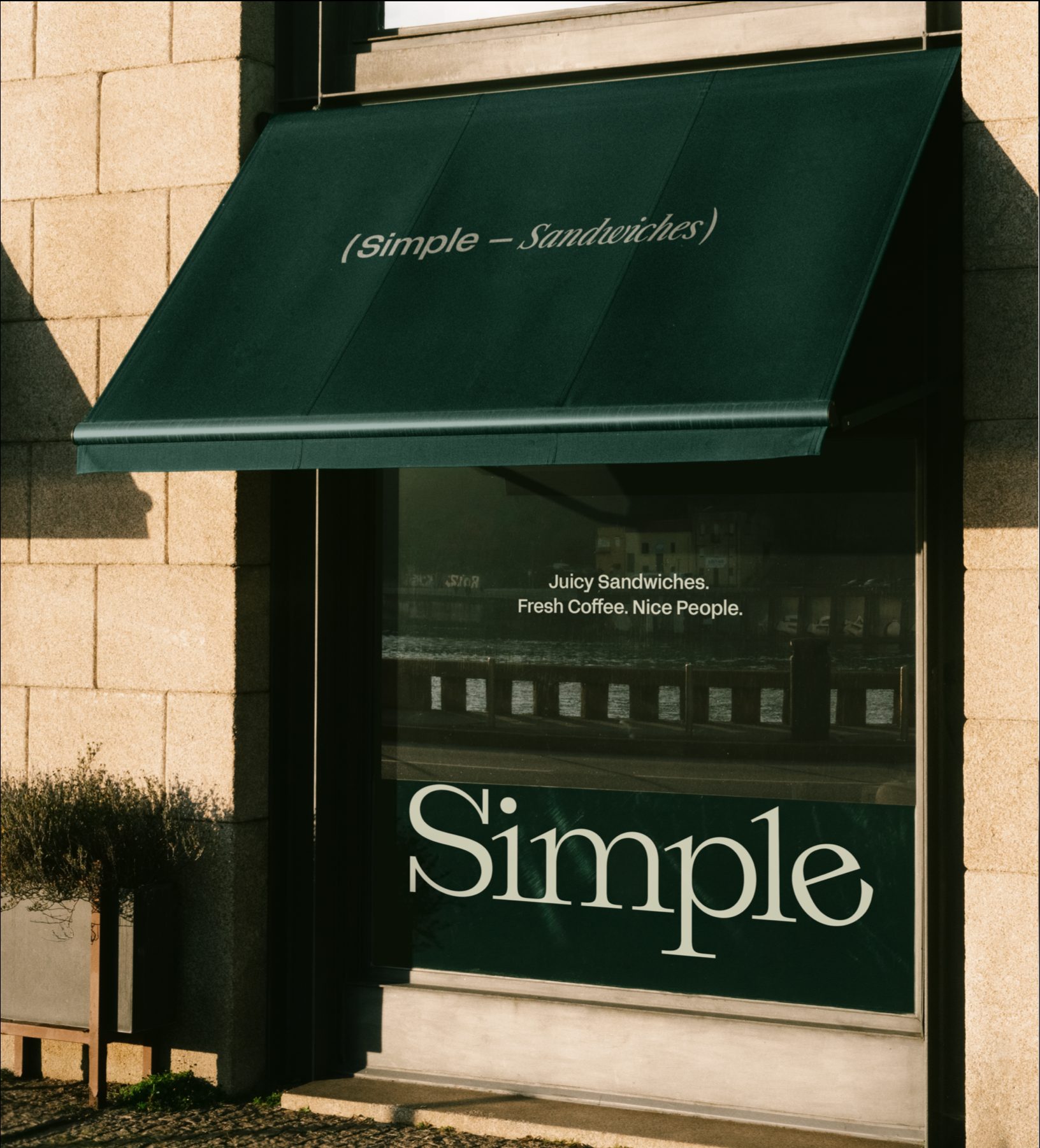
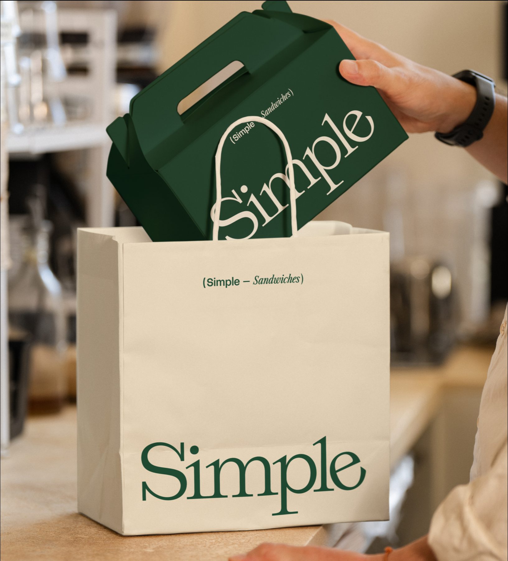
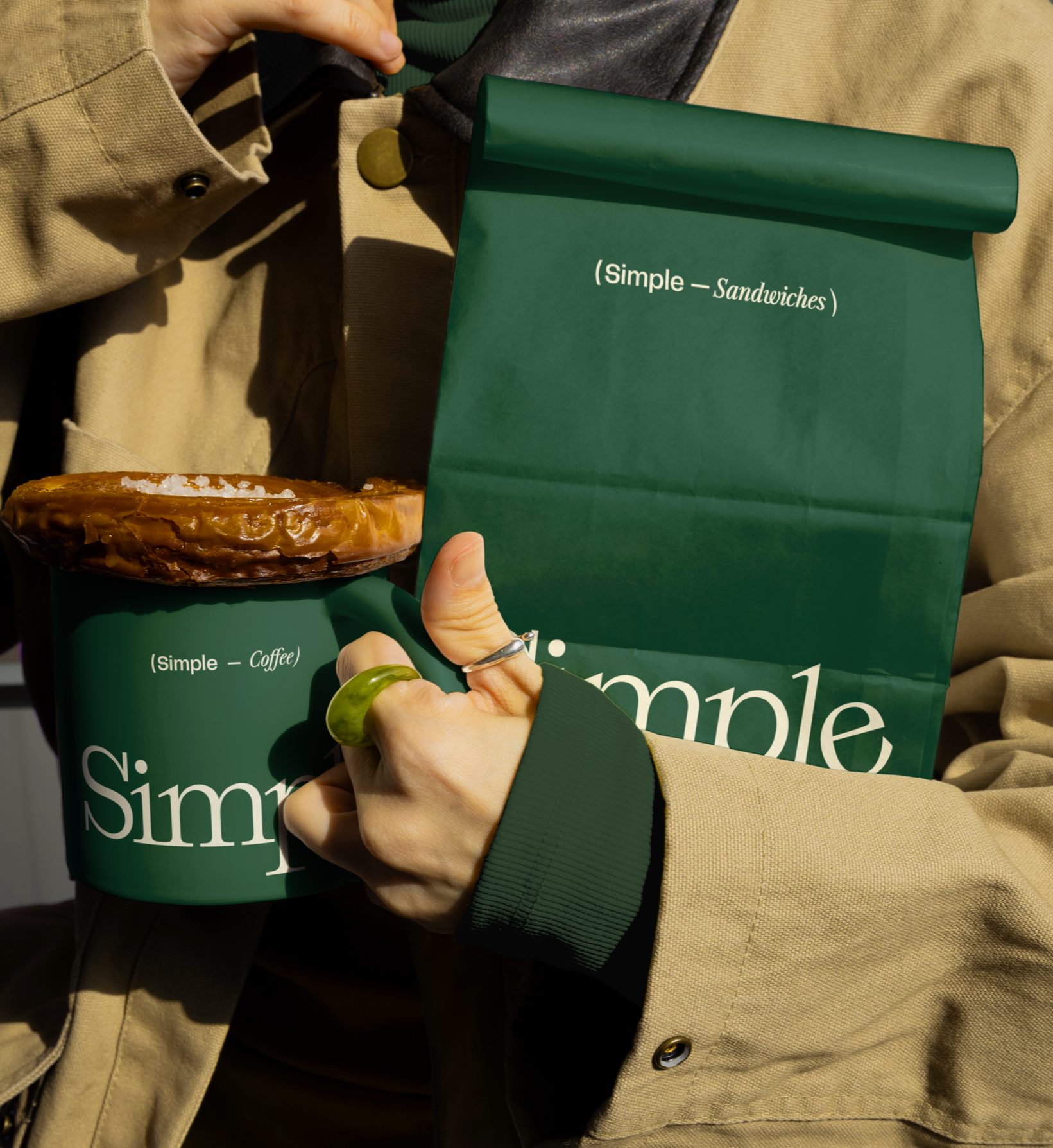
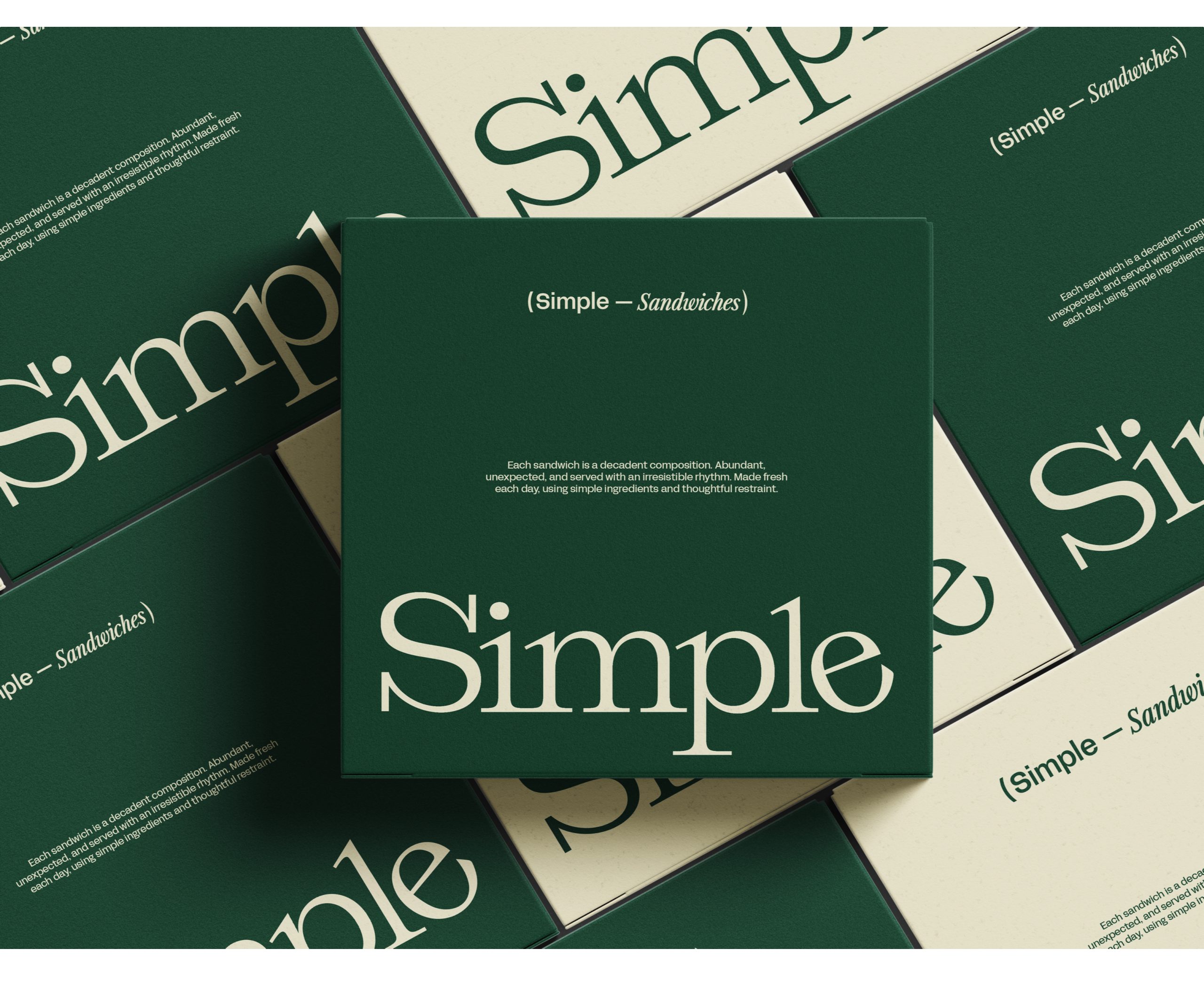
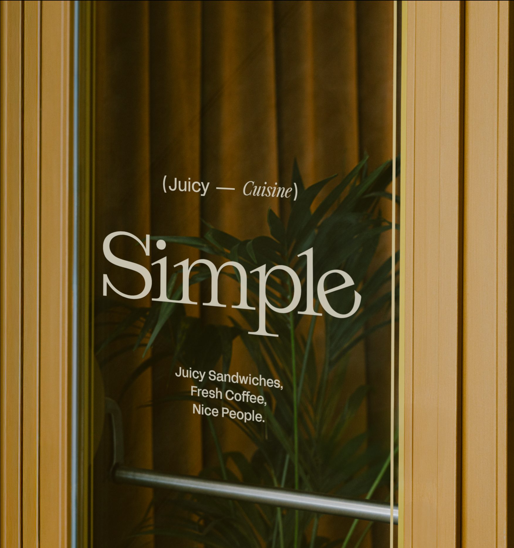
Simple started with a straightforward belief: everyday food deserves better design. I wanted to take something familiar- the sandwich - and treat it with the same level of intention you’d normally reserve for fashion, skincare, or hospitality. I worked closely with interior designer Michael Burman to make sure the brand and the space felt like one idea, not two separate layers. The goal was immersion. When you walk in, pick up the packaging, read the menu, it should all feel considered and cohesive.
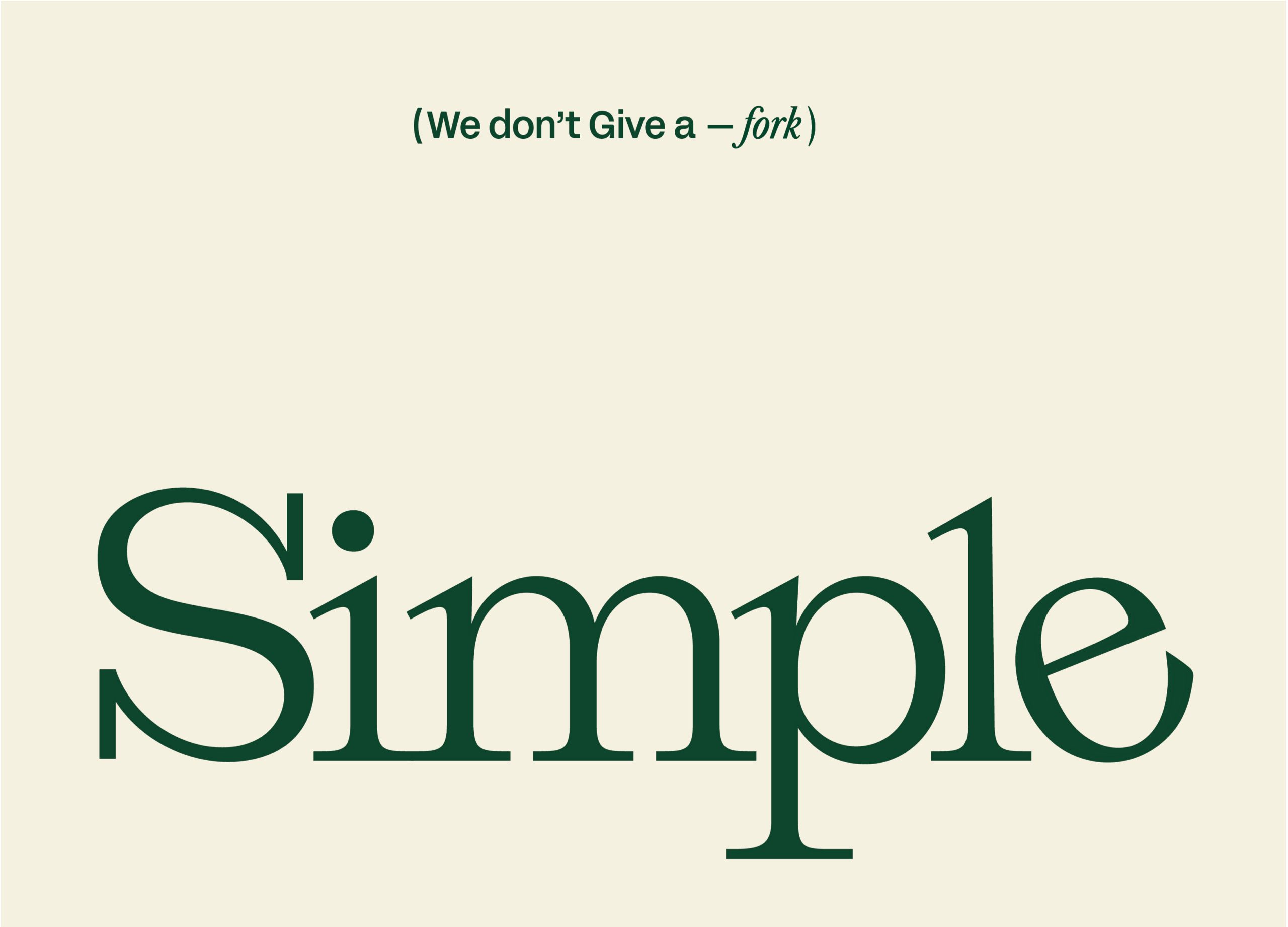
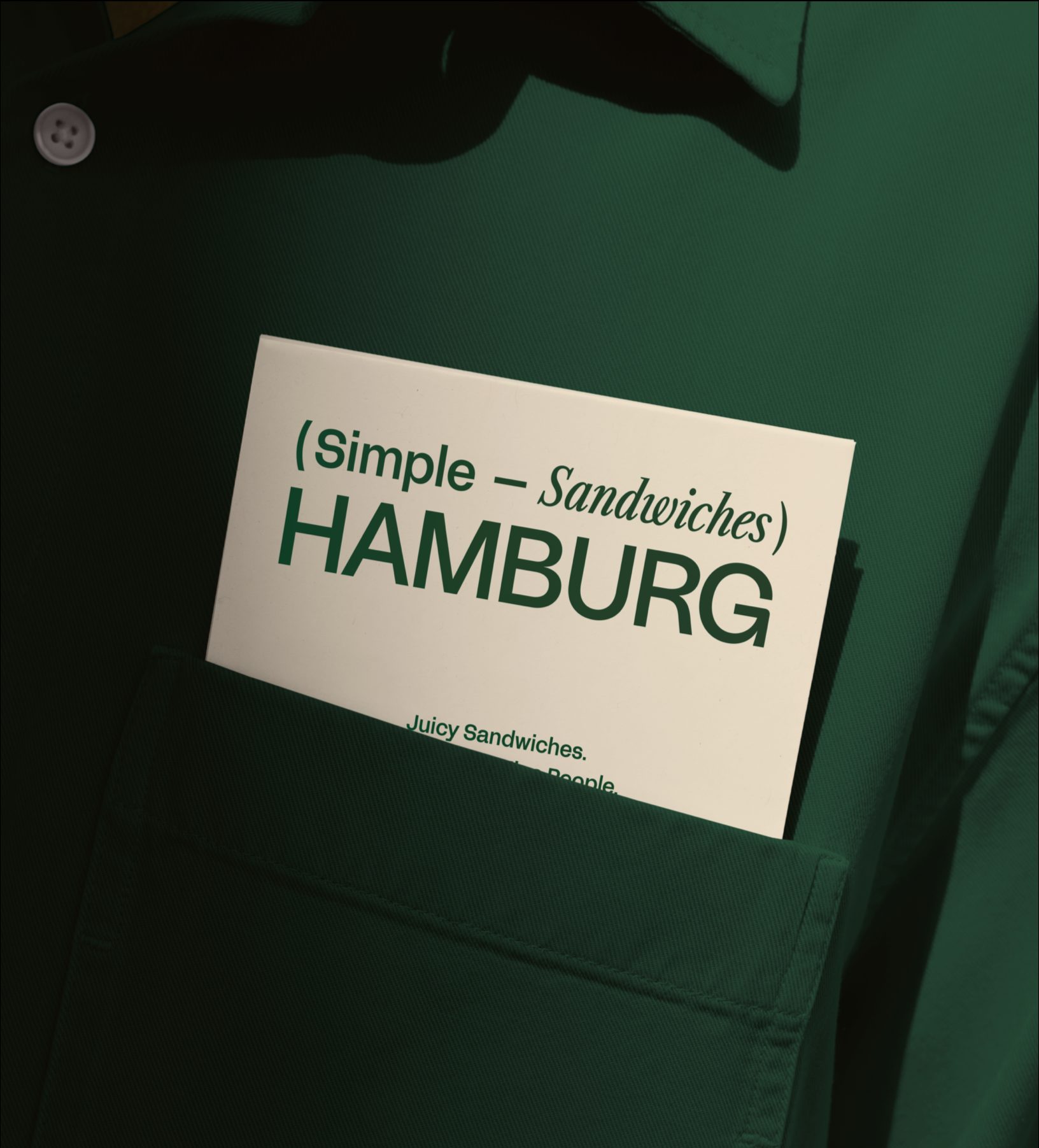
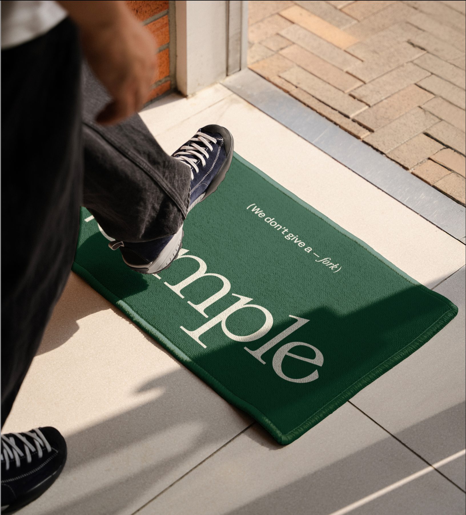
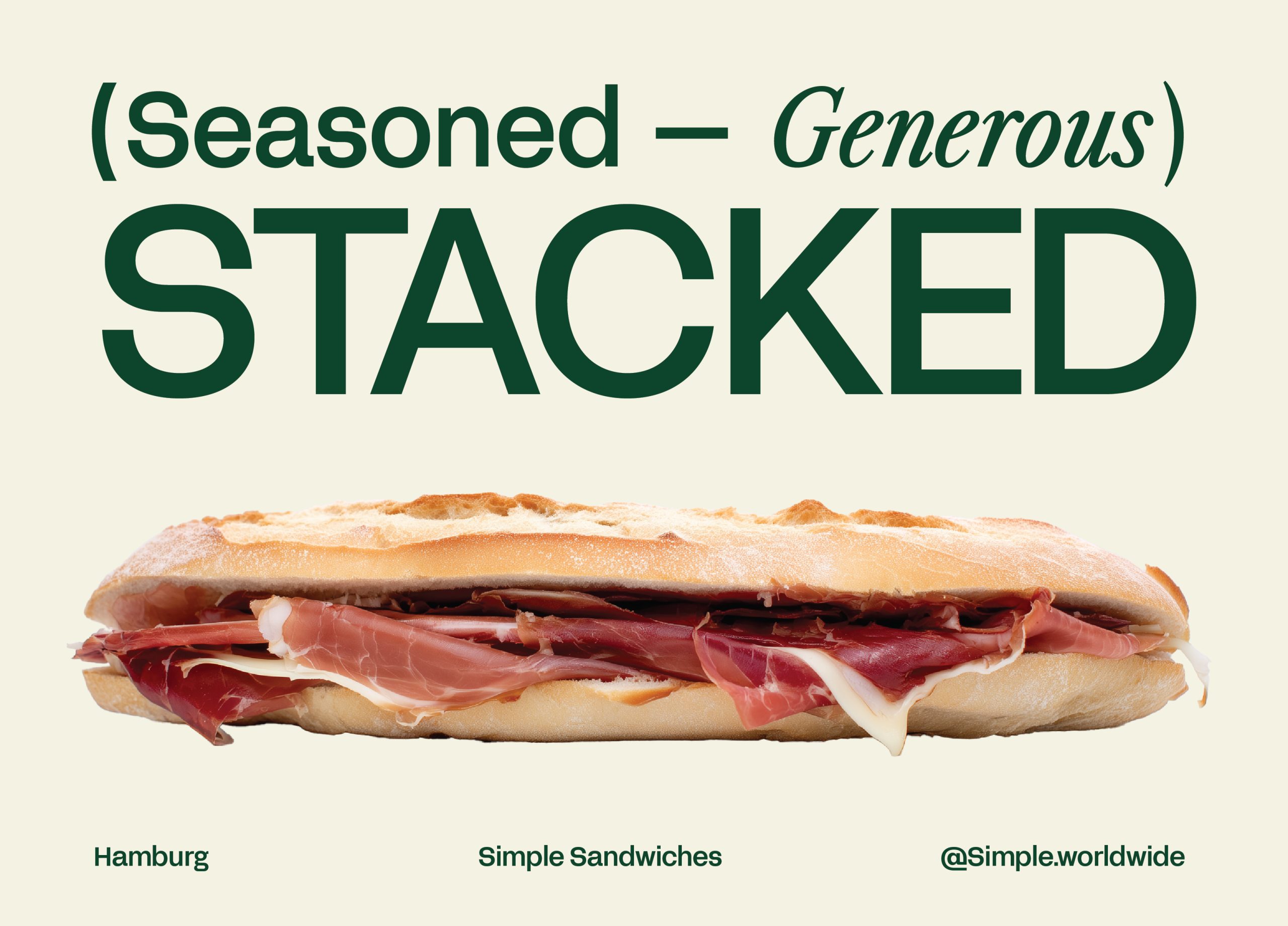
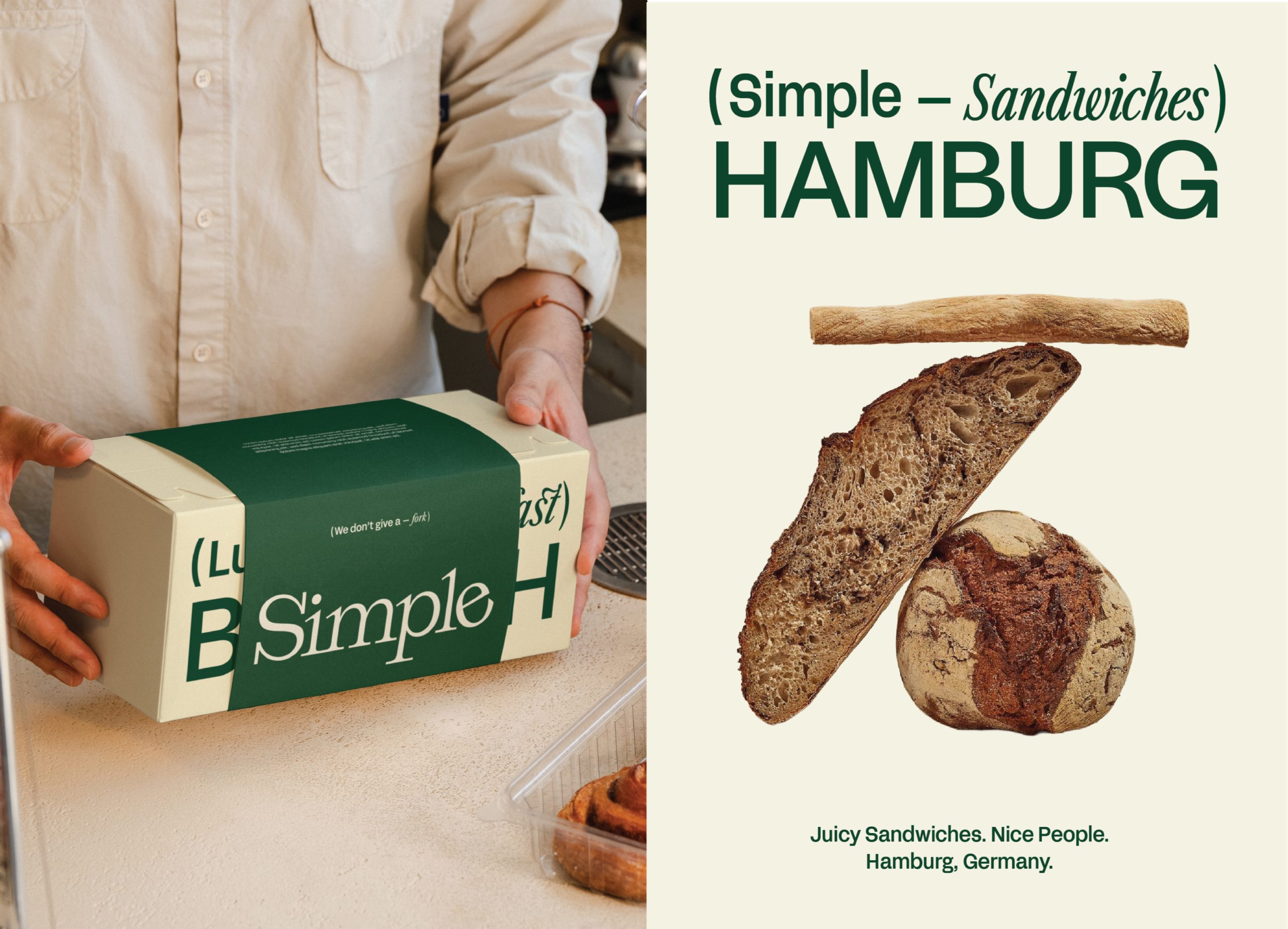
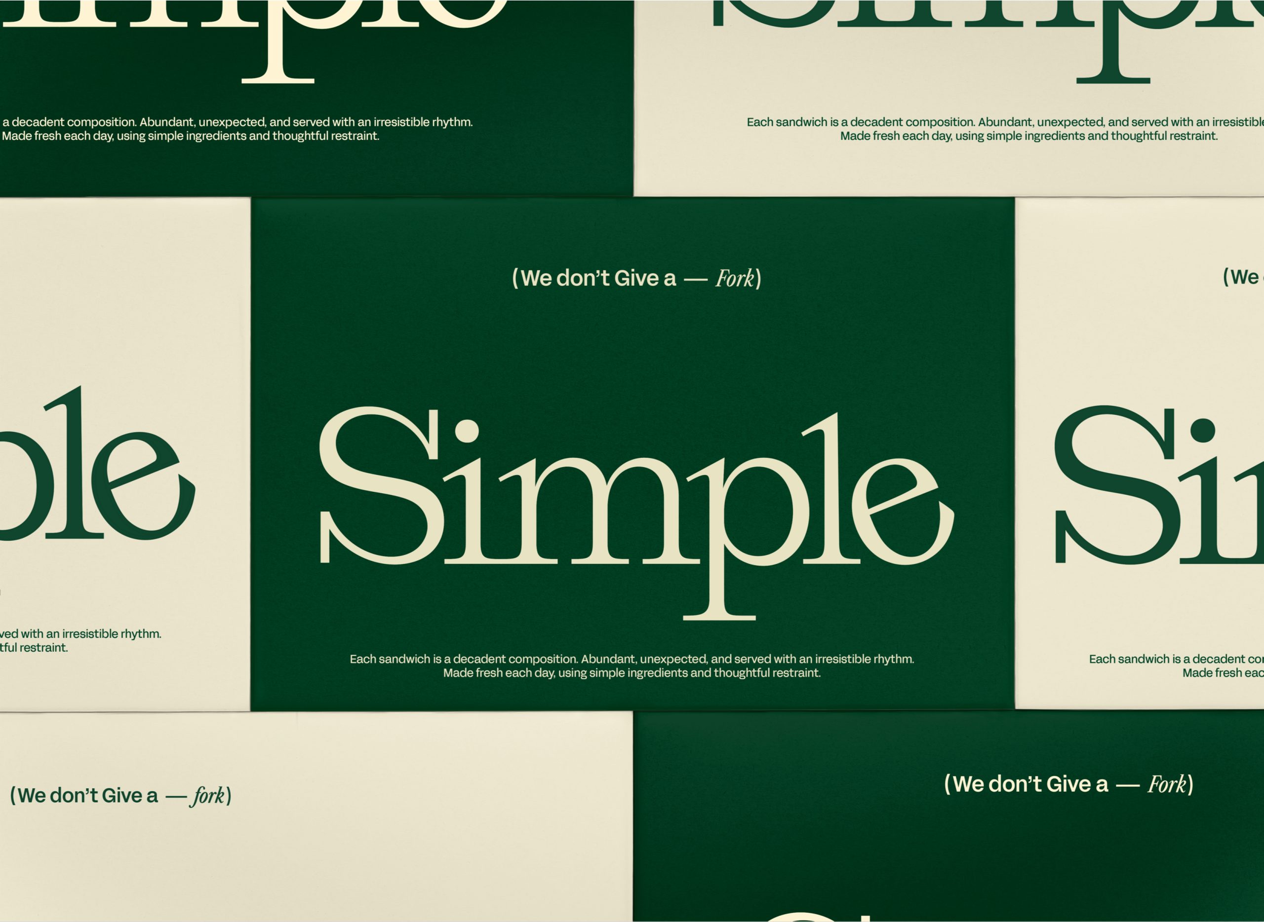
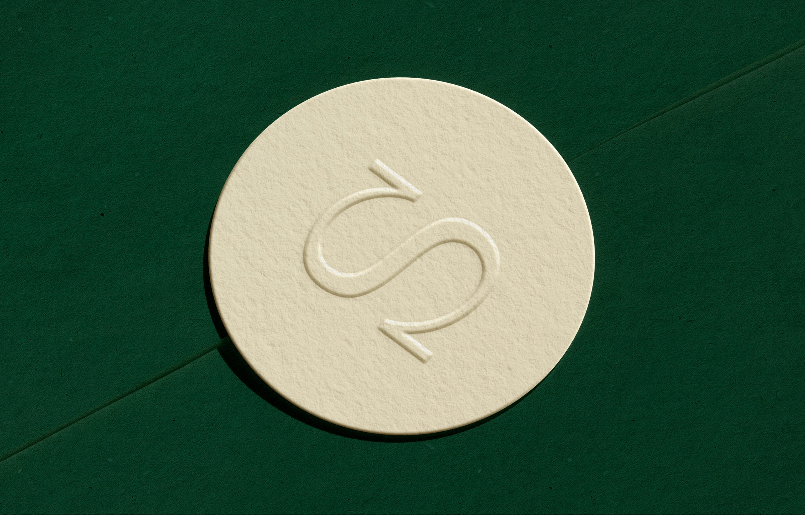
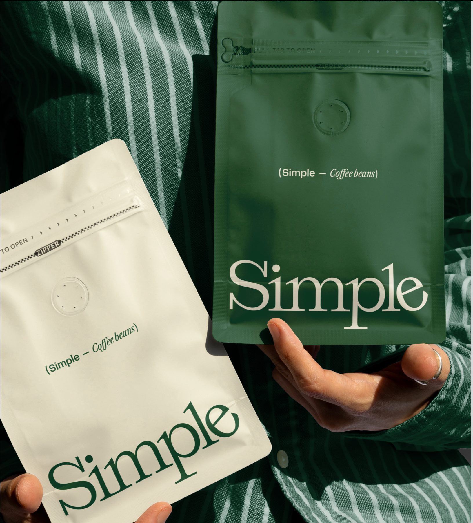
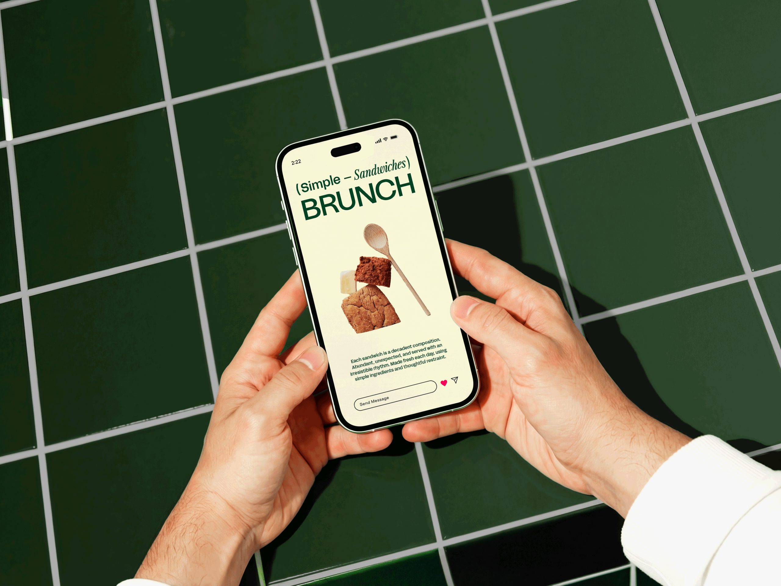
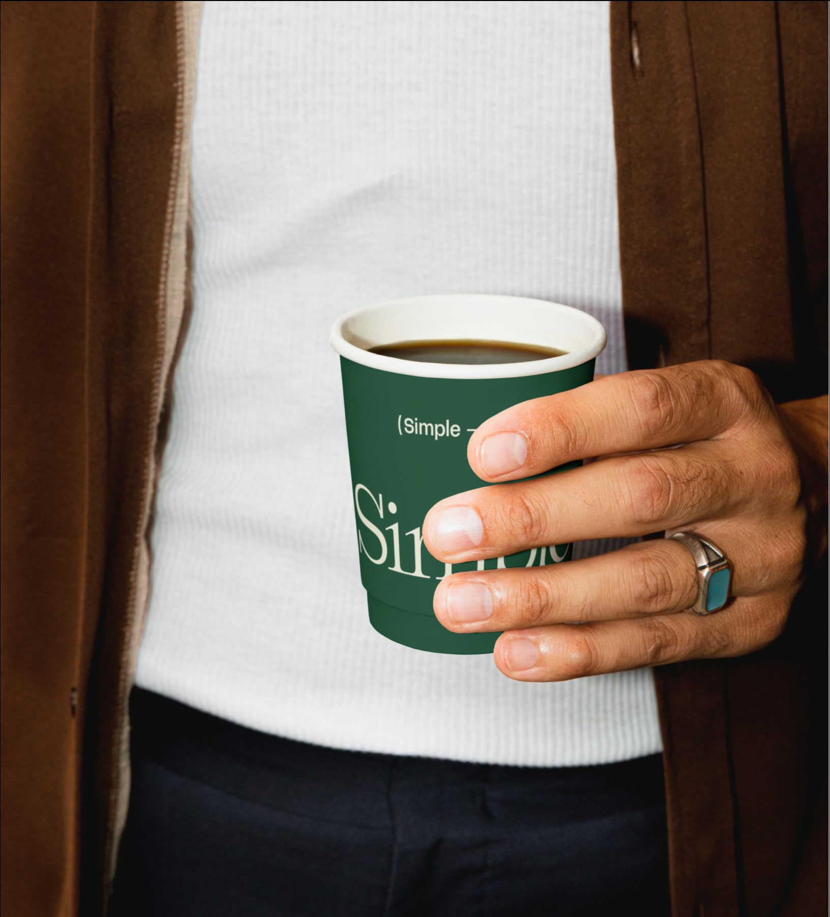
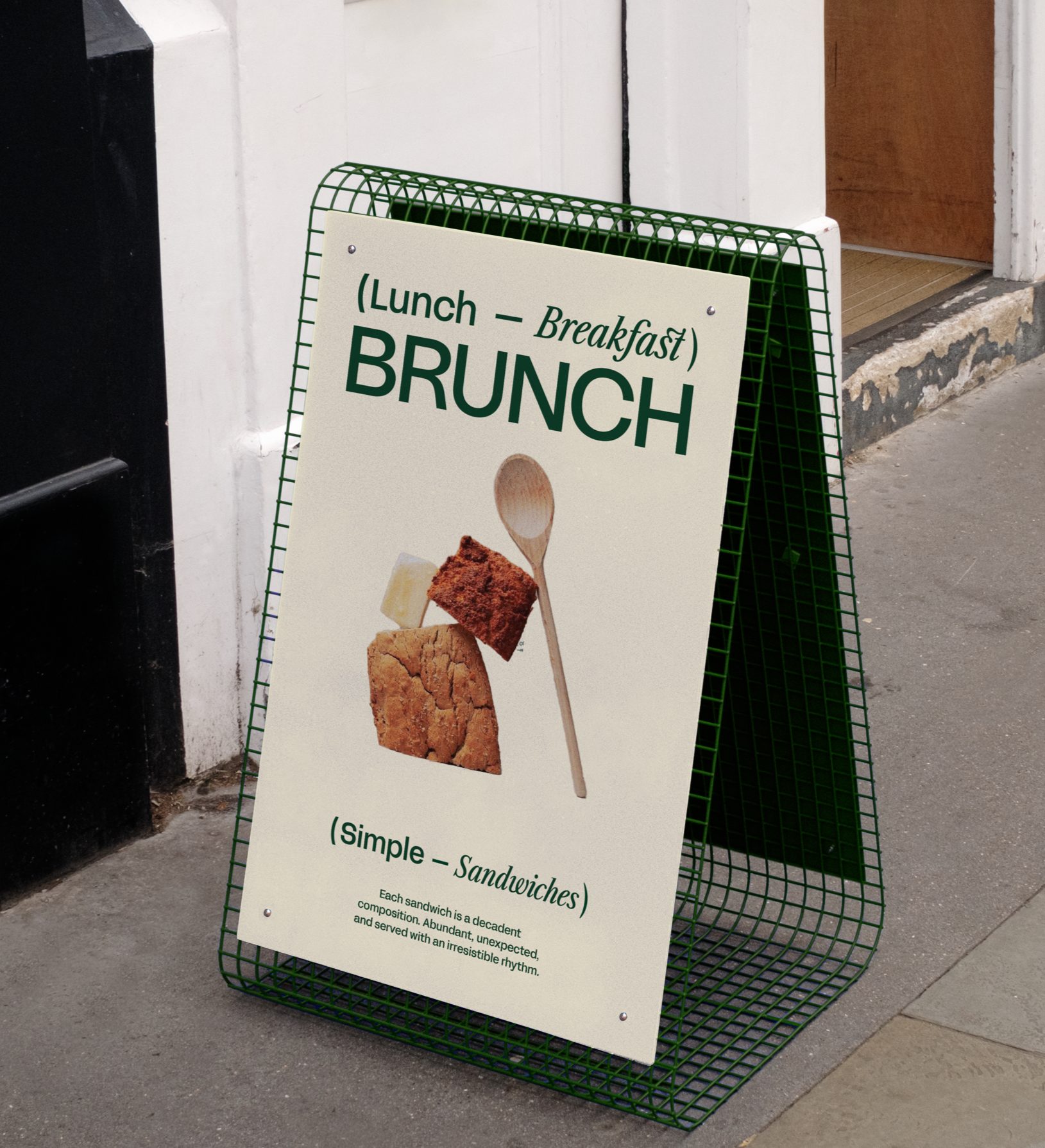
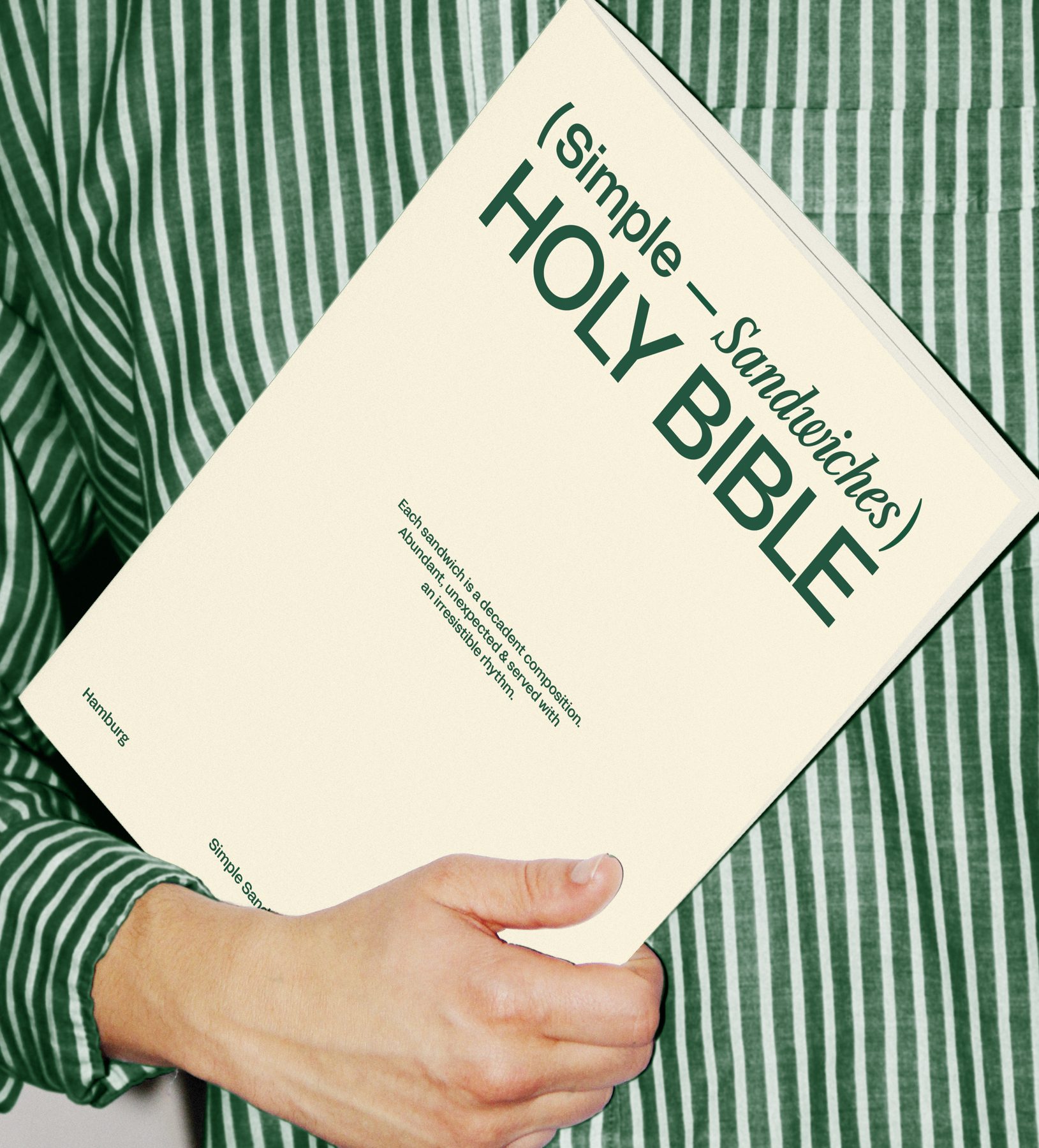
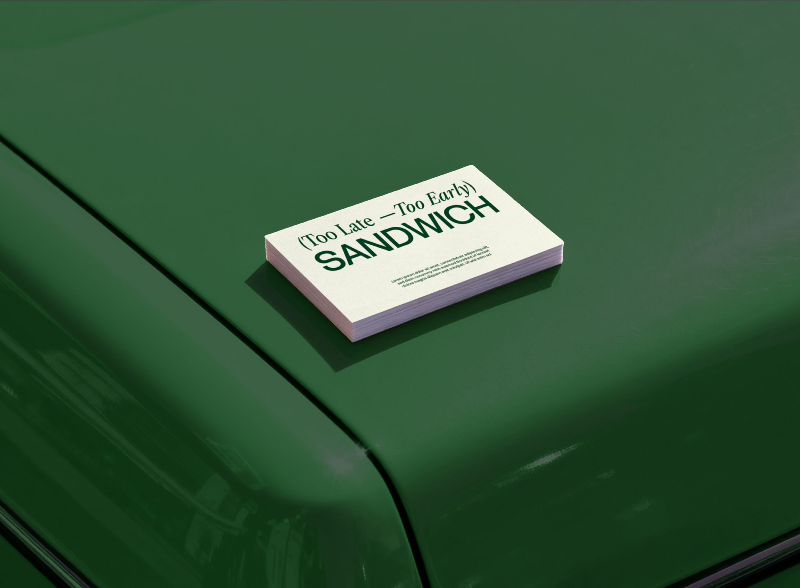
The logomark is fully customised. I drew the letterforms to feel solid and stacked, almost like layers in a sandwich - generous, grounded, confident. It’s minimal, but there’s weight and structure behind it. Nothing accidental. The green became a defining move. I wanted something that felt functional and kitchen-led, but elevated, almost like the Aesop of sandwiches, just with more personality. It’s recognisable from distance and carries the entire system. At the end of the day, Simple isn’t about overcomplicating things. It’s about taking something ordinary and designing it properly.
Mockups by:
Bendito Mockup
Scene Number Mockup
Createoom Mockups
Parallel Mockups
I wanna this mockups