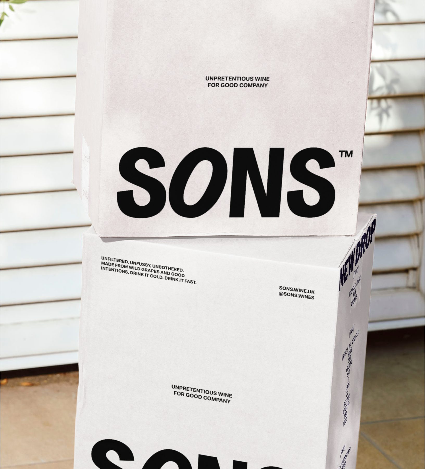
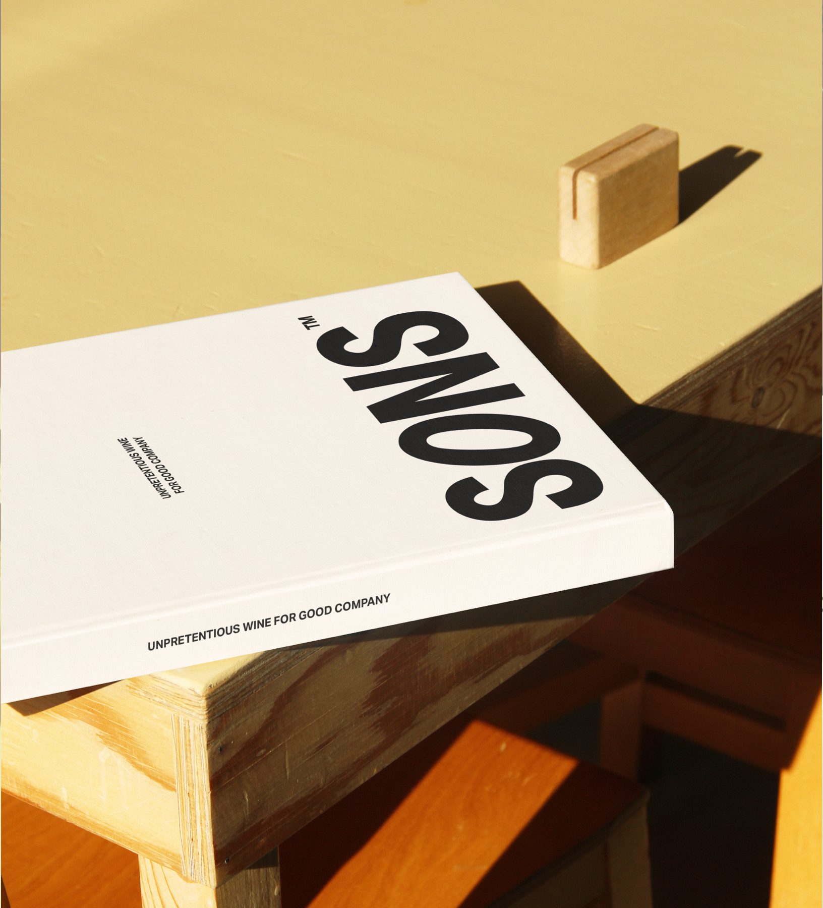
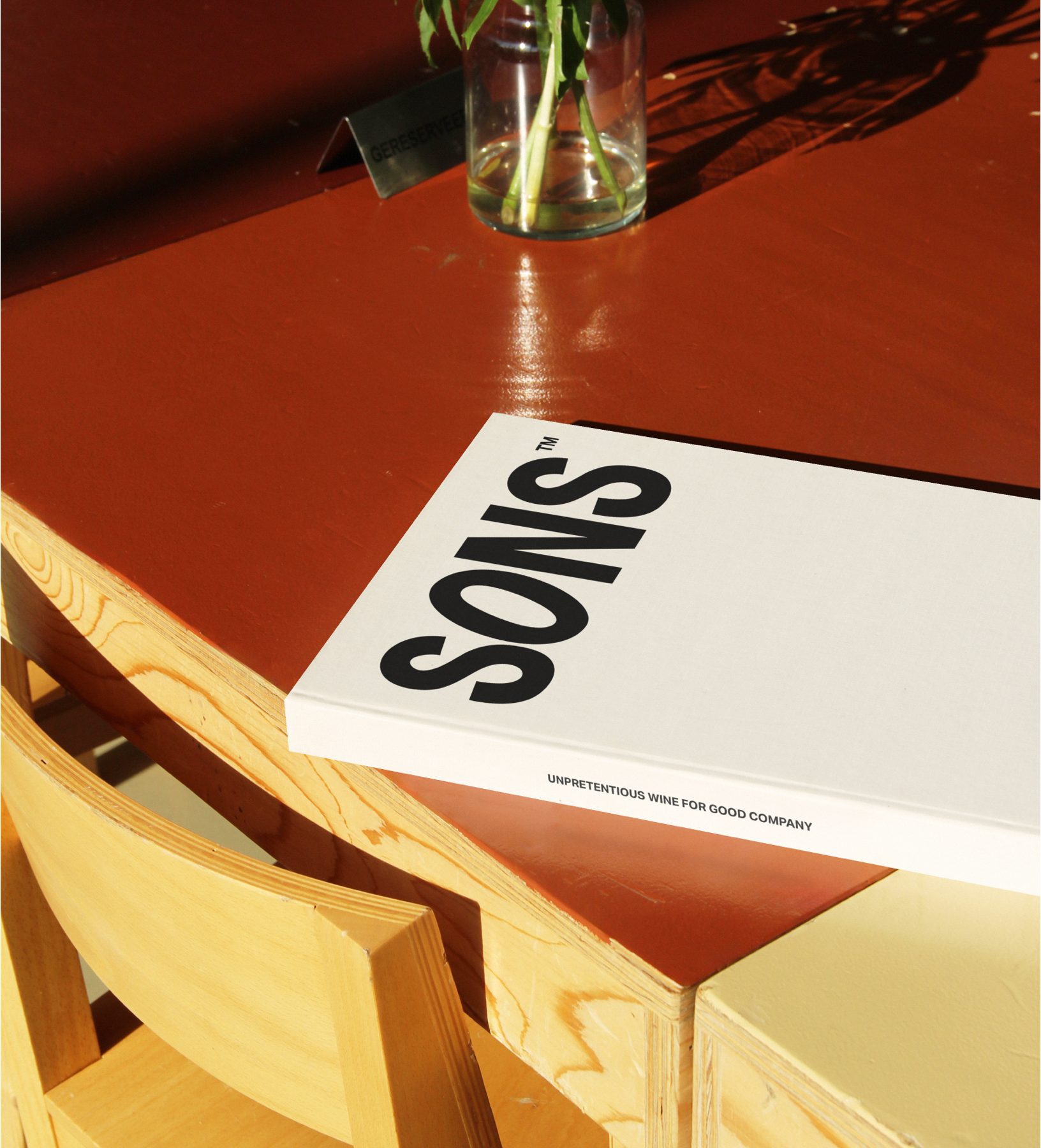
SONS
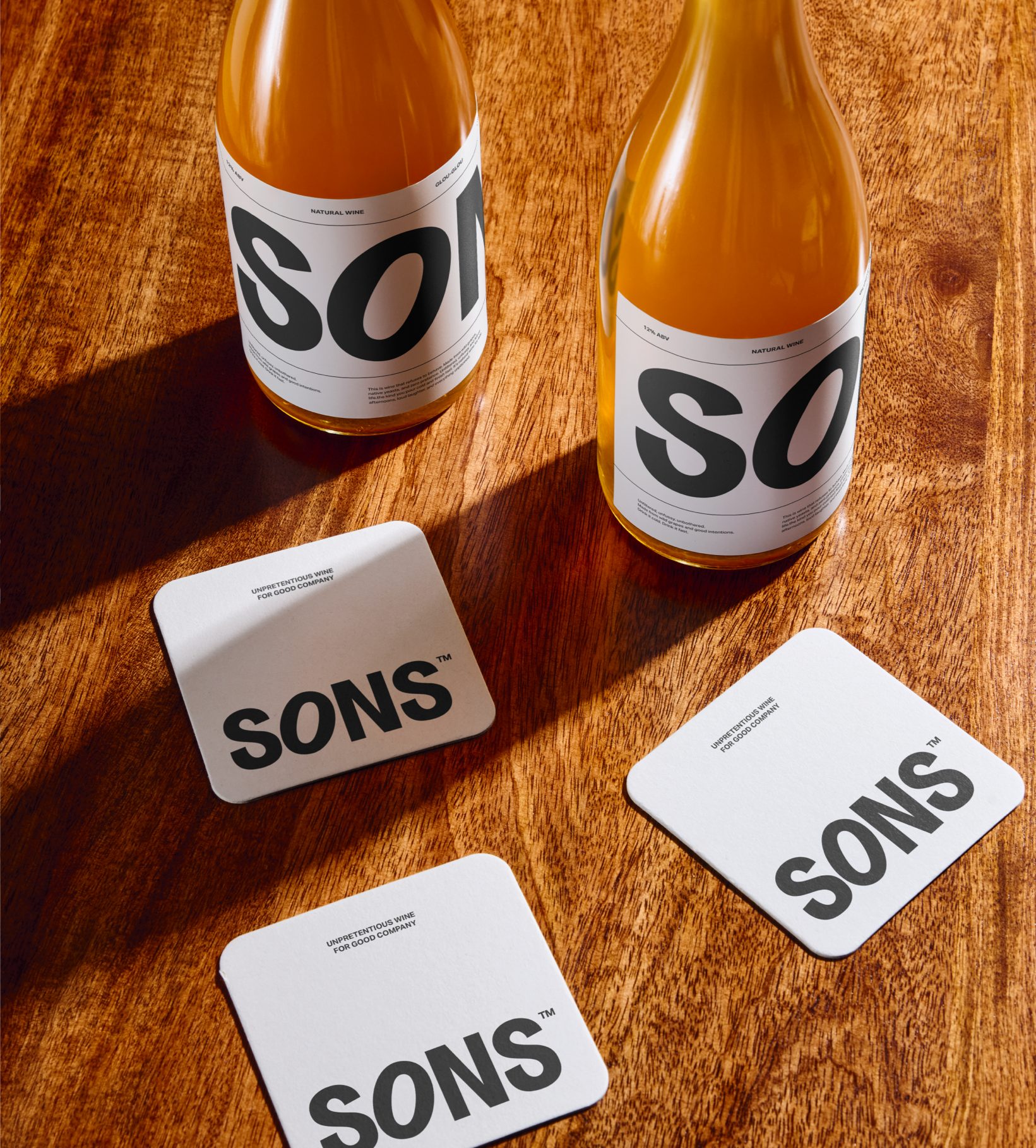
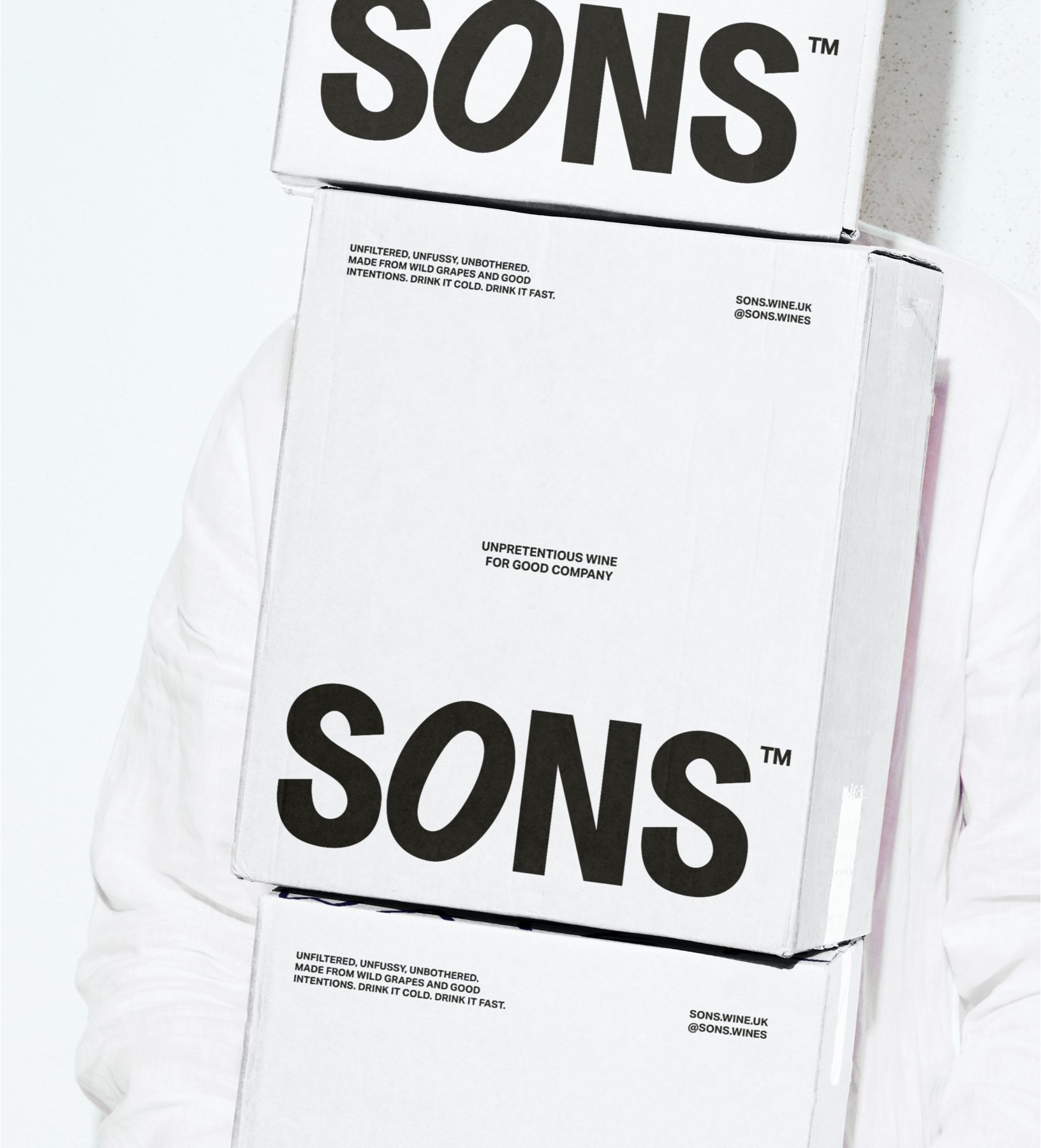
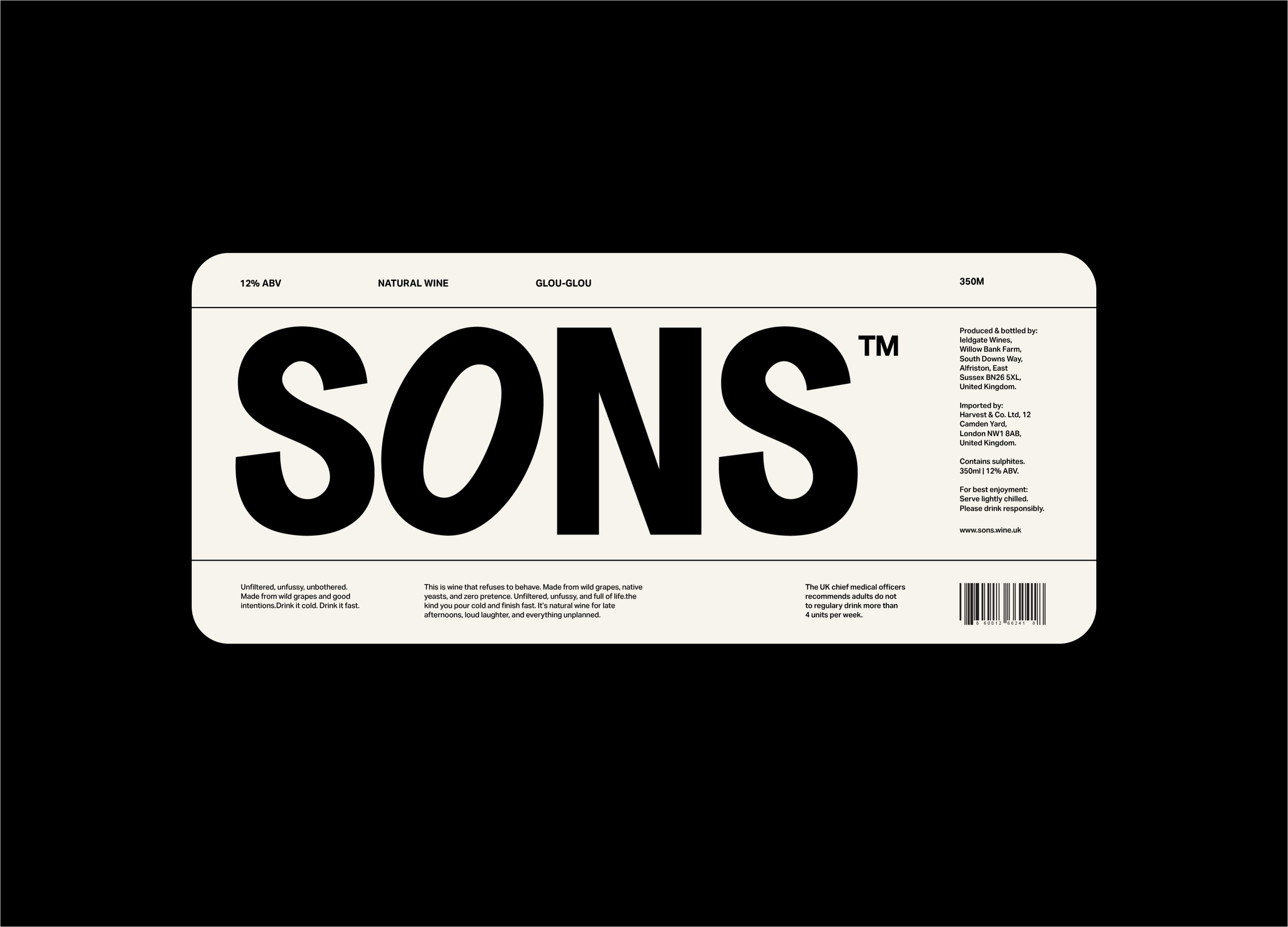
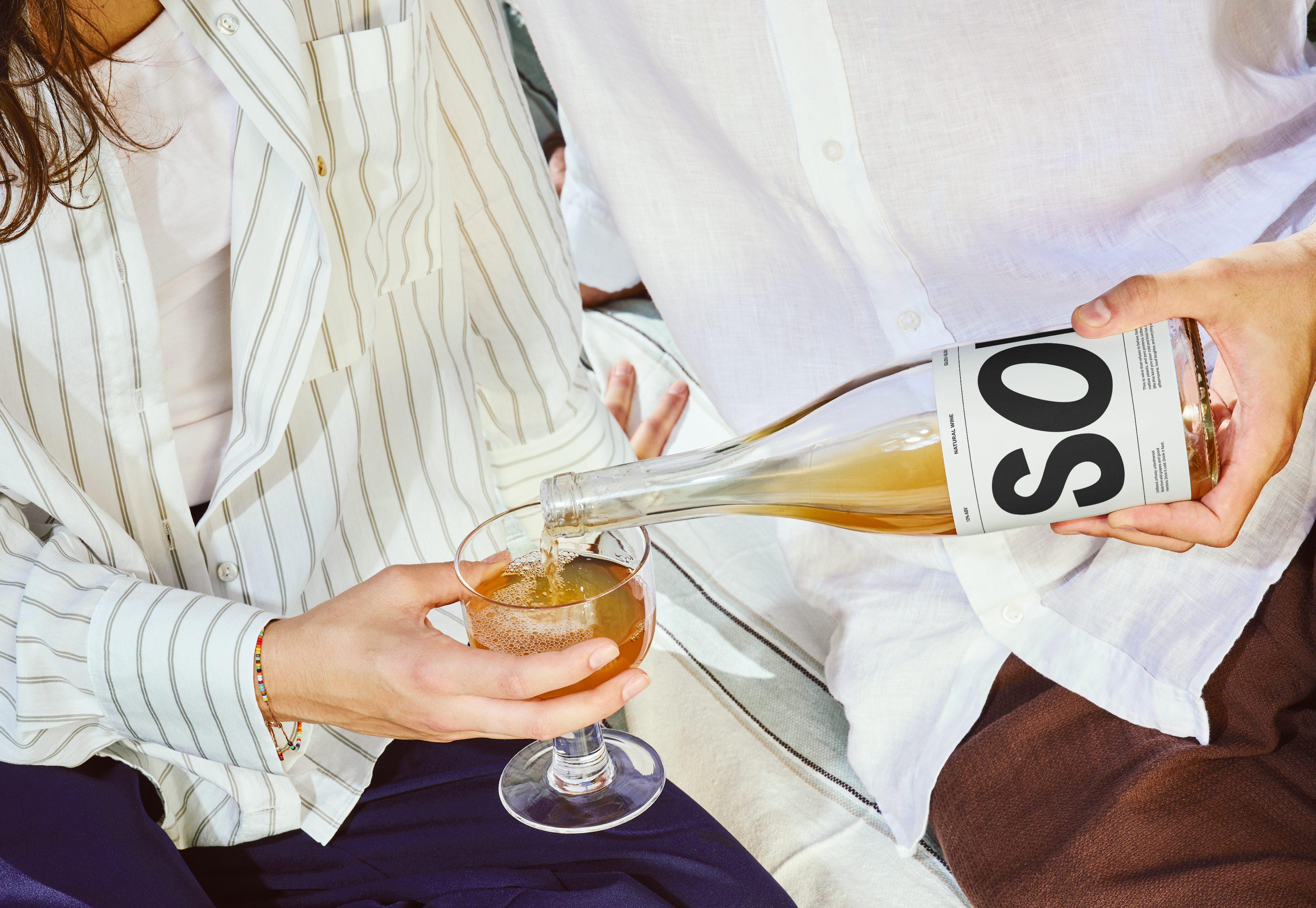
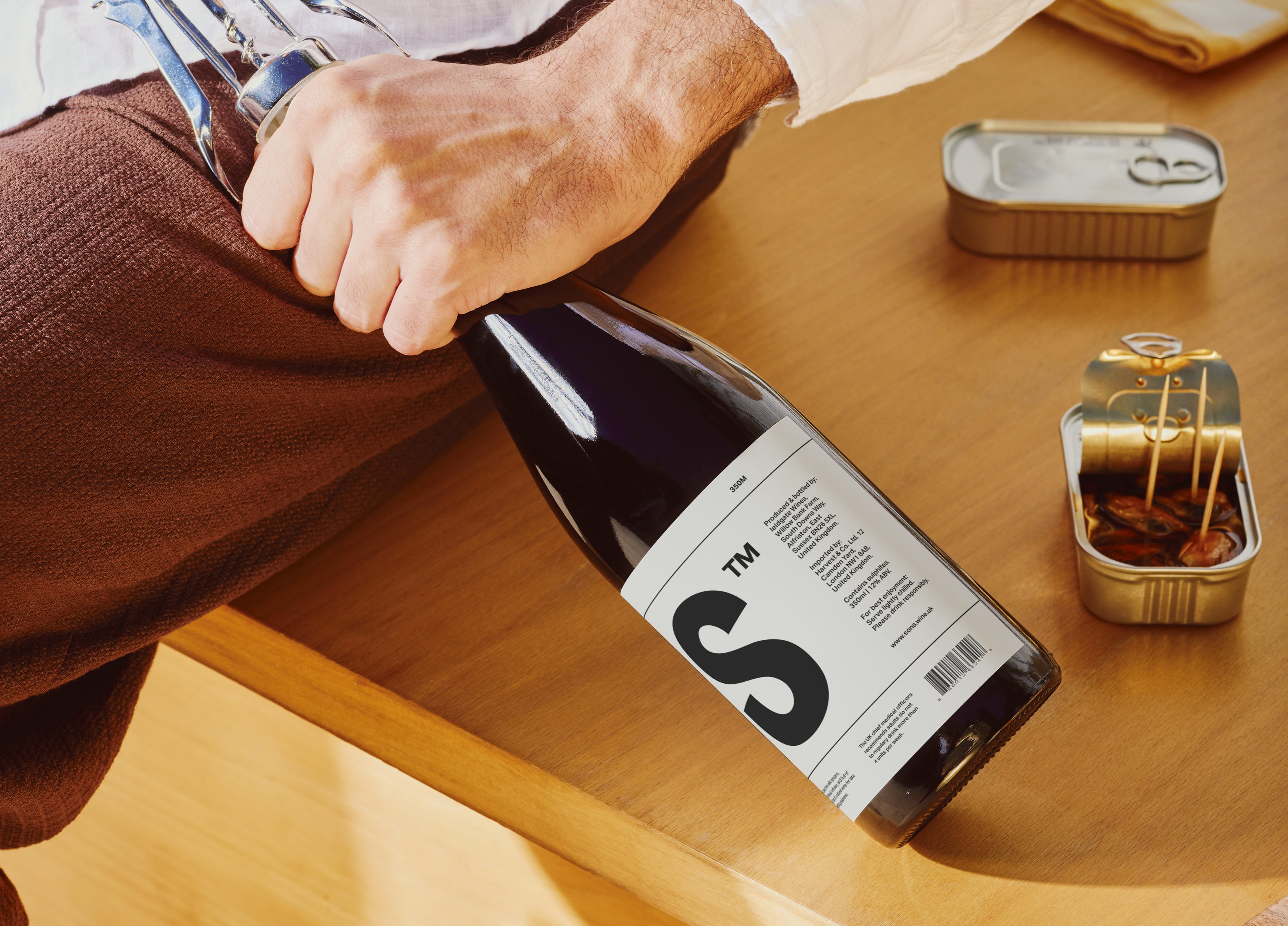
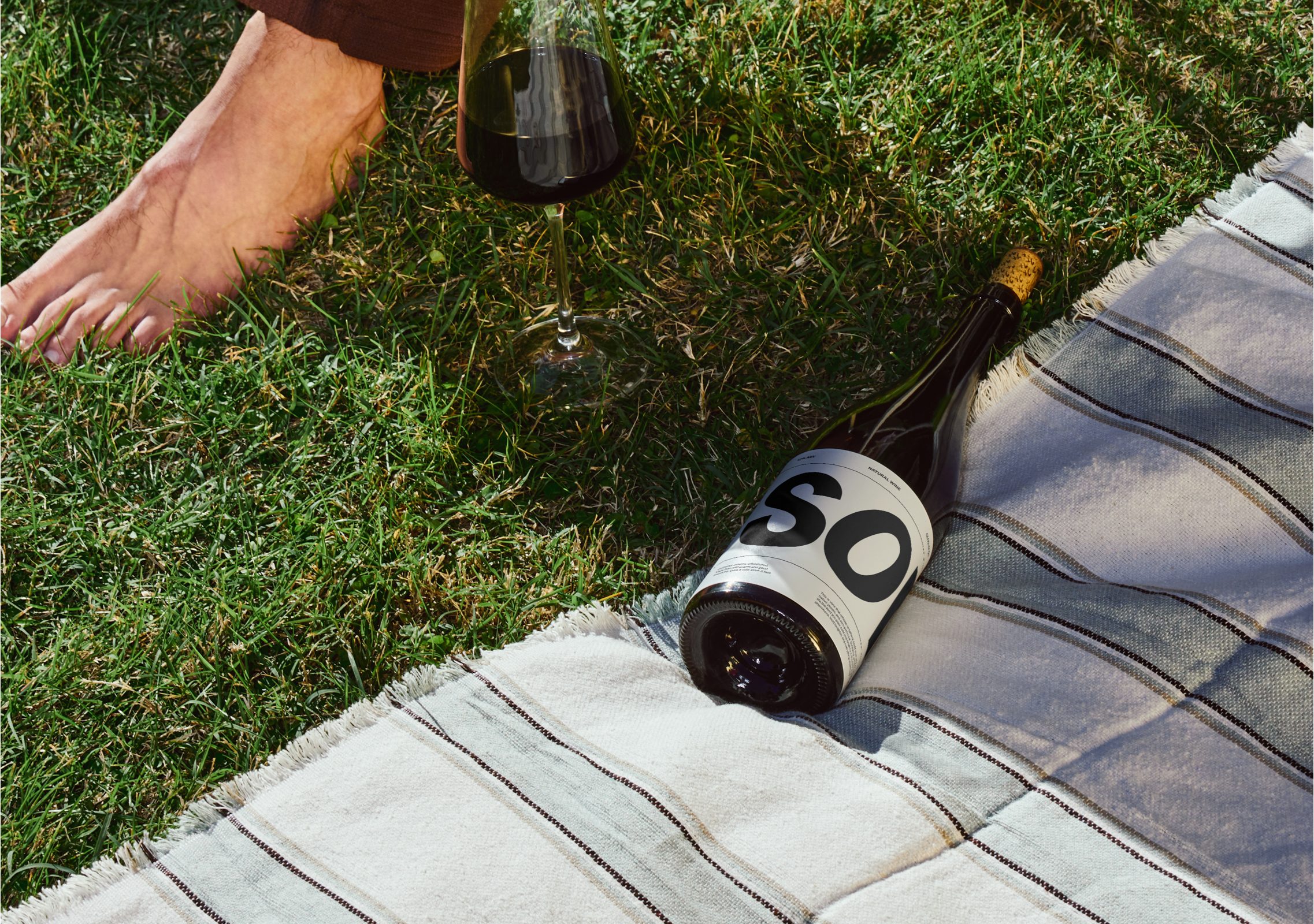
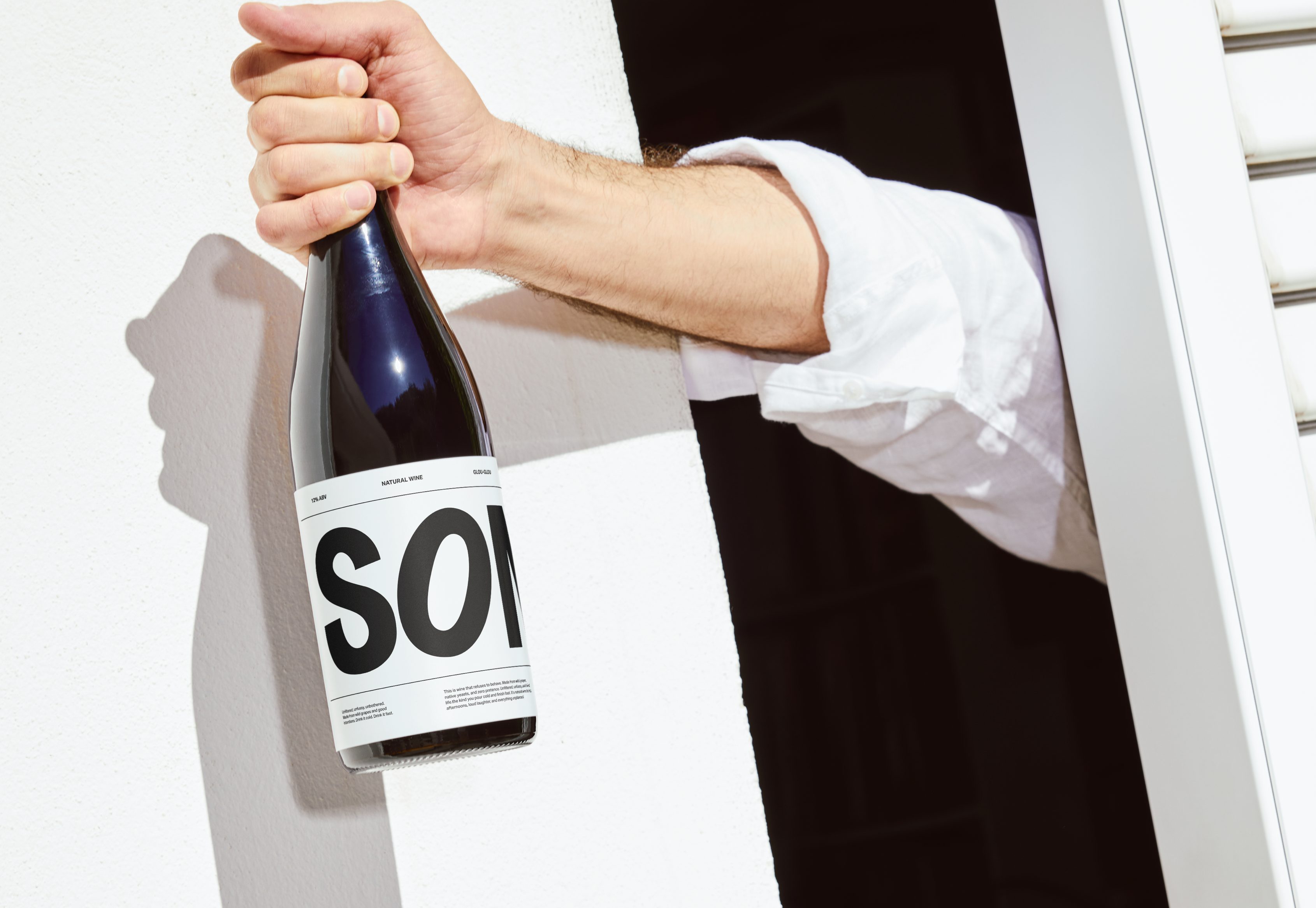
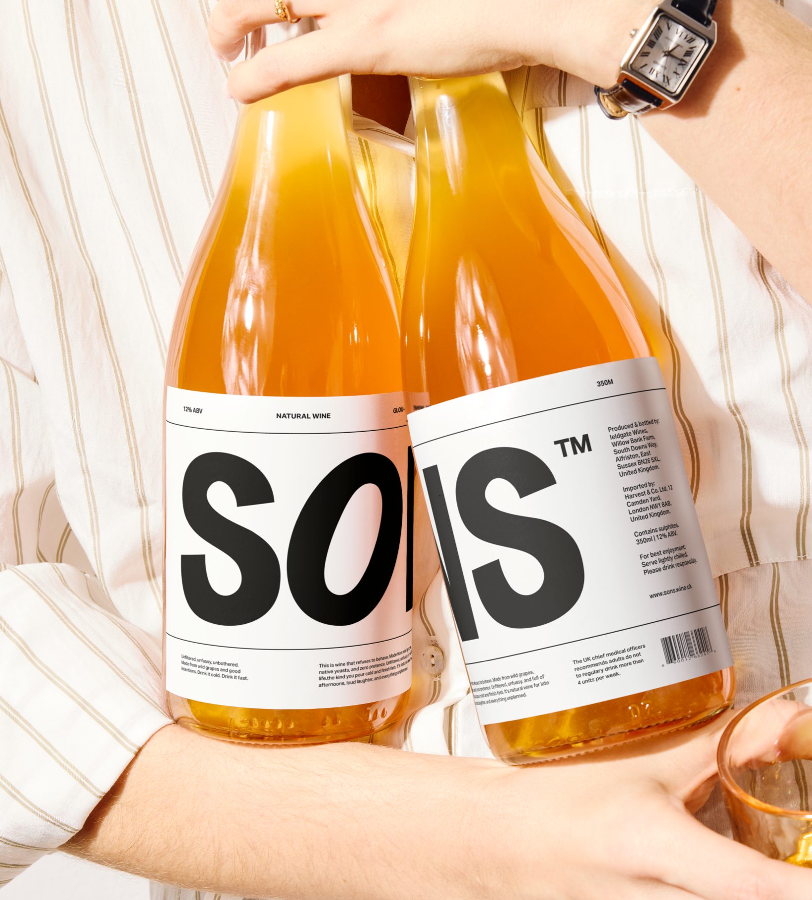
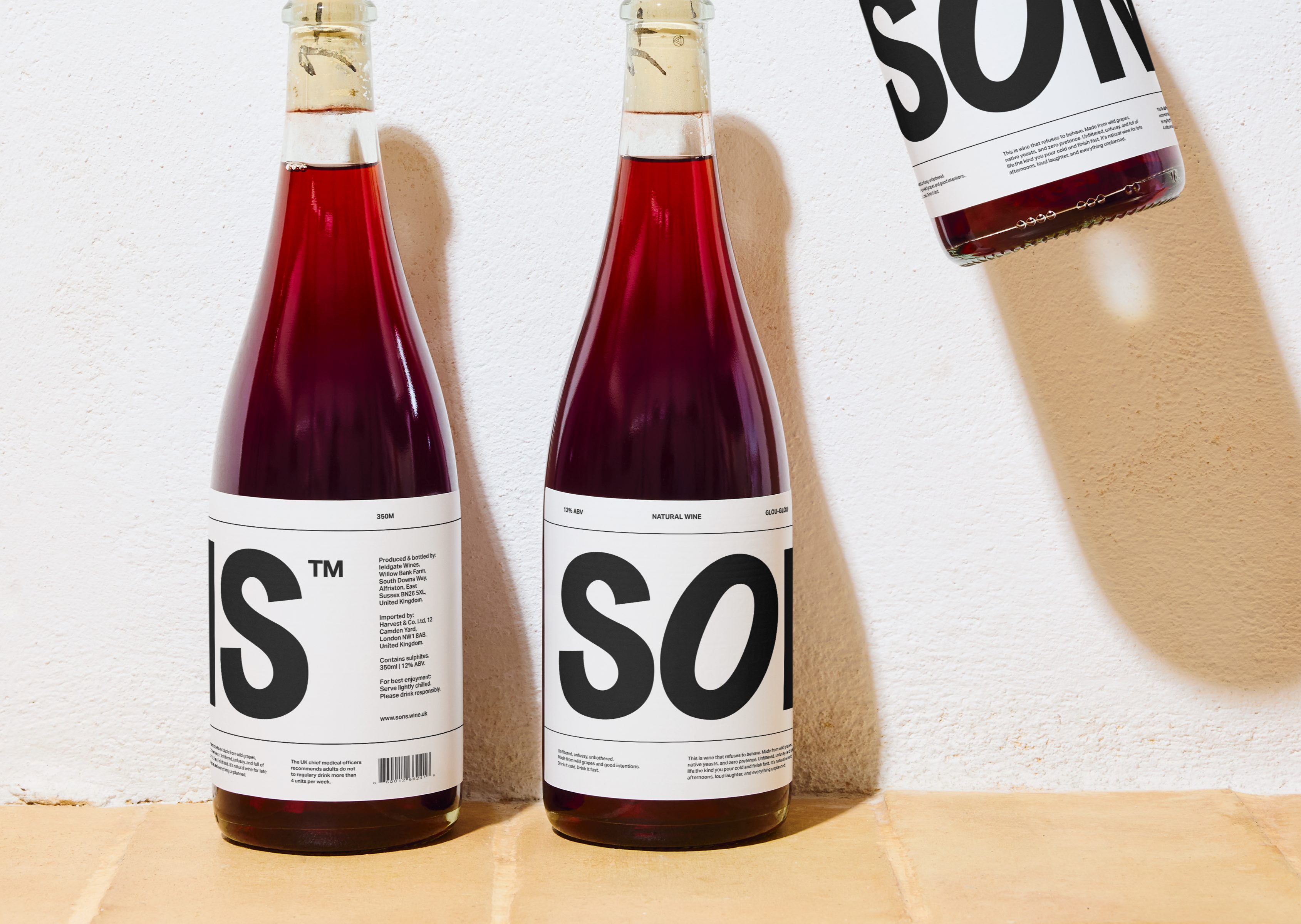
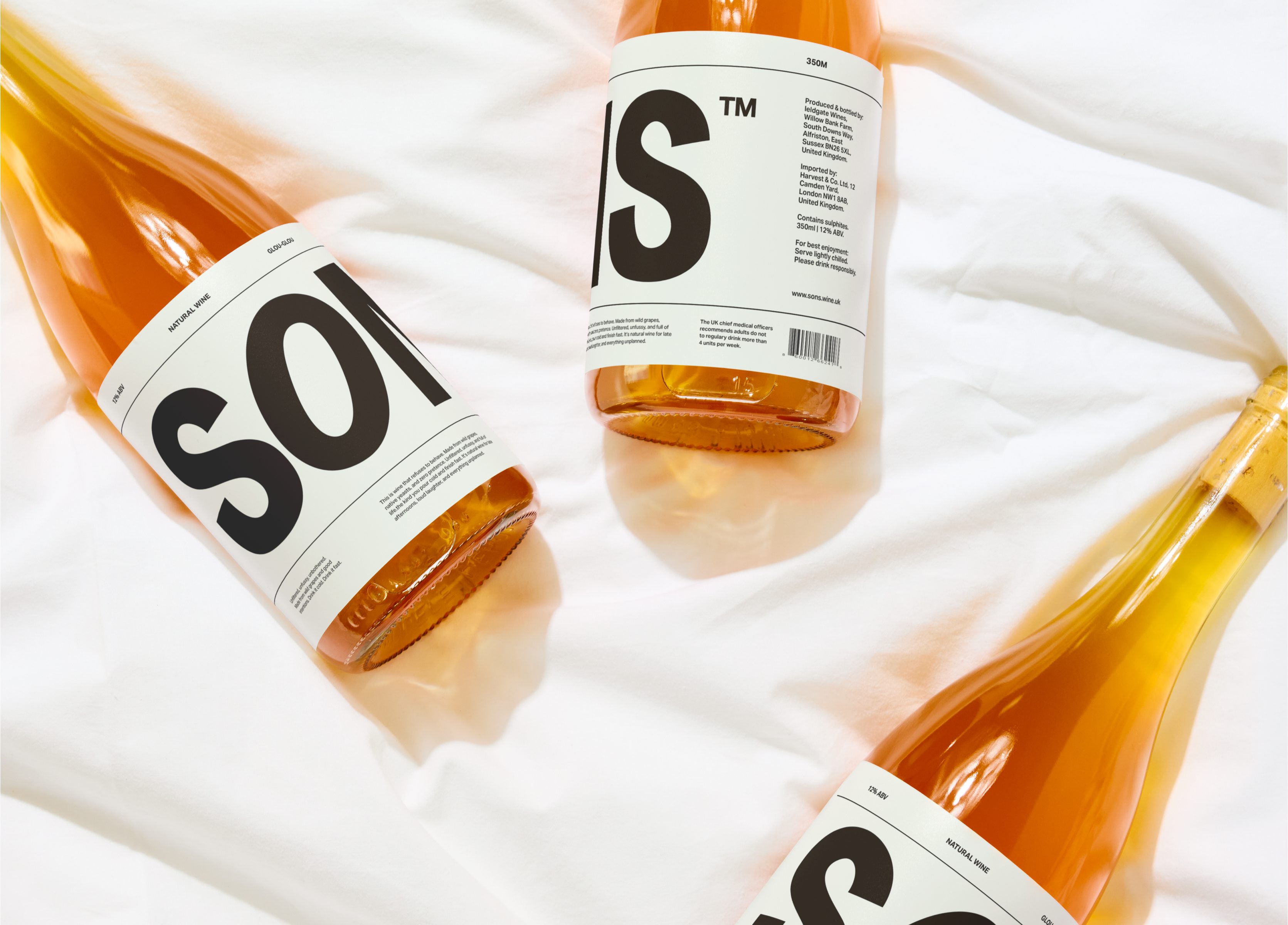
SONS is a UK-based wine brand built around the idea of “unpretentious wine for good company.” The identity strips away the excess often found in wine branding, replacing it with bold simplicity and confident restraint. The logomark, set in a heavy sans serif, anchors the brand with clarity and presence — direct, modern, and unapologetically straightforward. The typography system follows suit: clean, utilitarian, and highly legible, allowing tone and layout to do the expressive work.
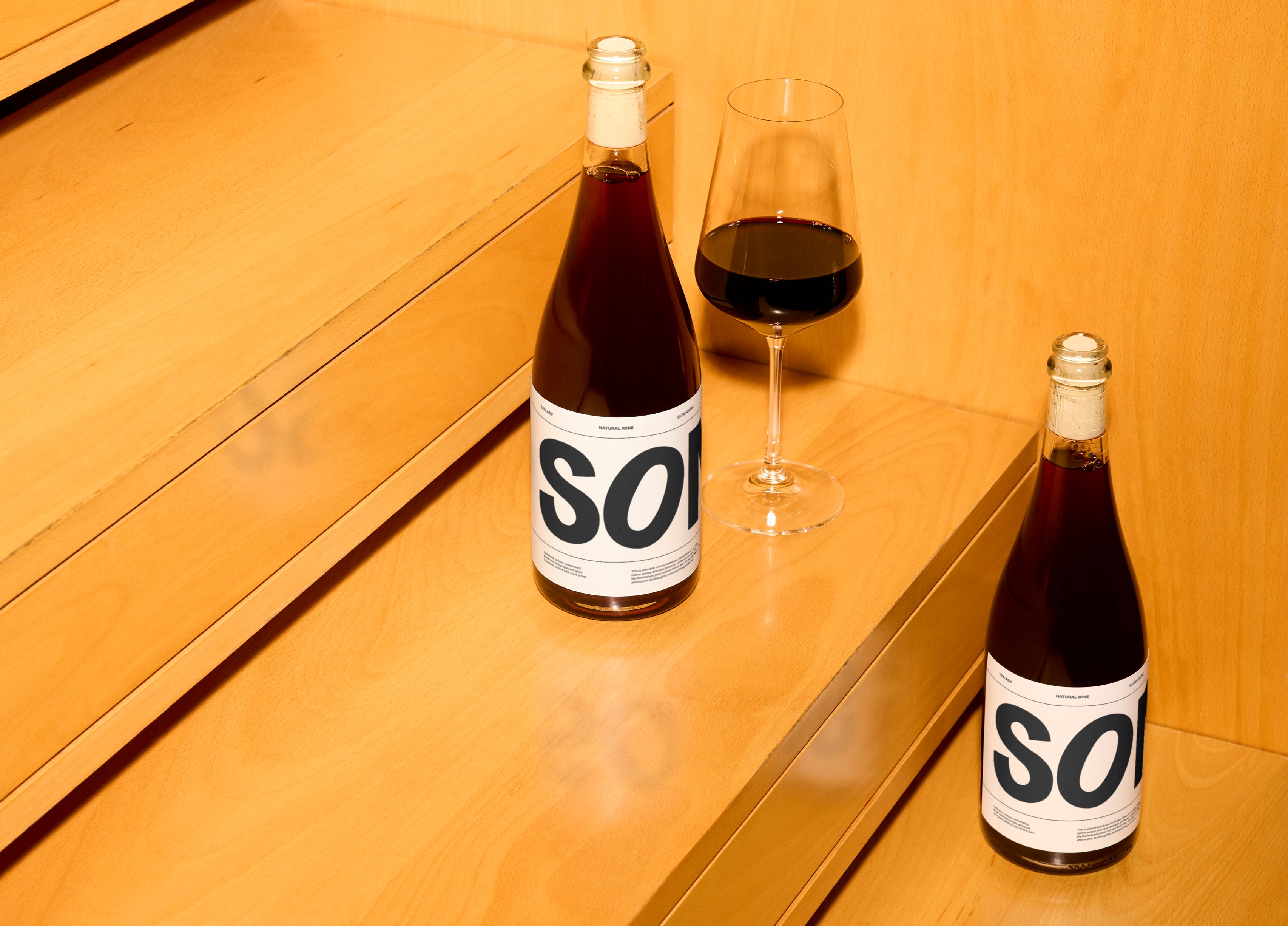
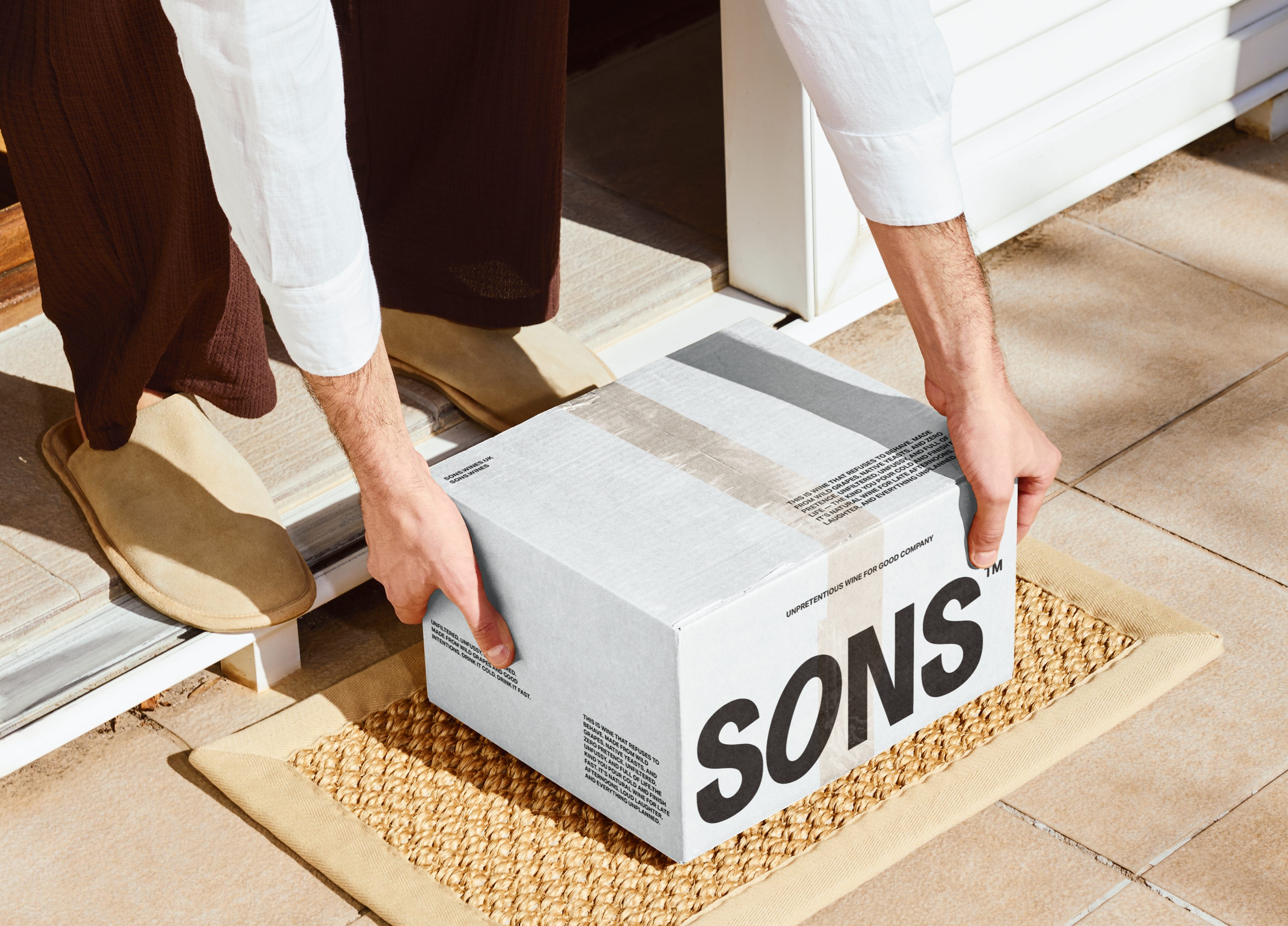
Packaging continues this ethos of honesty and ease — minimal labels, generous white space, and strong typographic hierarchy that mirrors the brand’s modern British sensibility. The art direction embraces natural textures, real light, and casual compositions, positioning SONS as a brand that feels as effortless and genuine as the moments it’s made to accompany.
Amazing mockups by:
Bendito Mockup