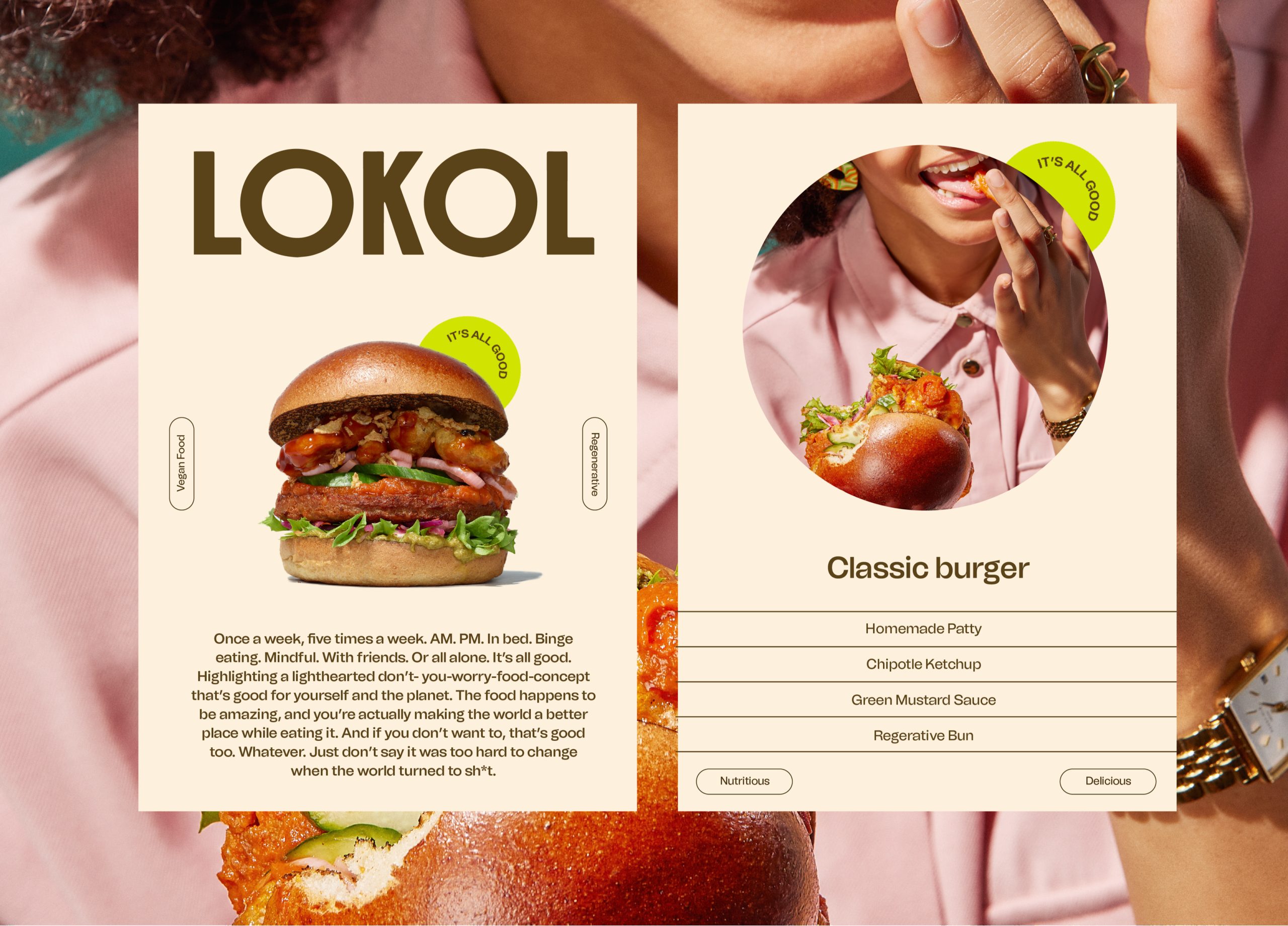
LOKOL
Brand Identity Design And Art direction.
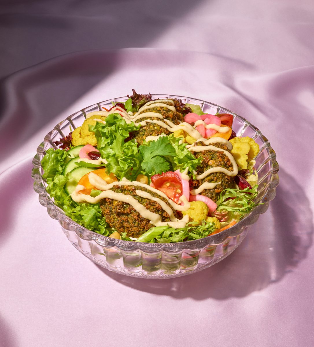
We’re in the middle of a historical market shift, one that is reshaping the status quo of food culture globally. LOKOL, an Amsterdam-based regenerative vegan food restaurant, took this opportunity by the balls to educate consumers to understand the role of the regenerative good food movement by removing the unnecessary noise and distractions that surround it. LOKOL are positioned to be the most relaxed and enjoyable good-for-the-world-food approach the world has yet seen. People’s everyday counter for good food and better living. The on-the-spot fix for zero-guilt-cravings. With this in mind, our goal was to create an identity for the new LOKOL brand that does this in a way that stands out. Quirky, even a bit weird. But with the primary goal of gently pushing consumers to reflect on their food choices in a bold and reflective way without being preachy.
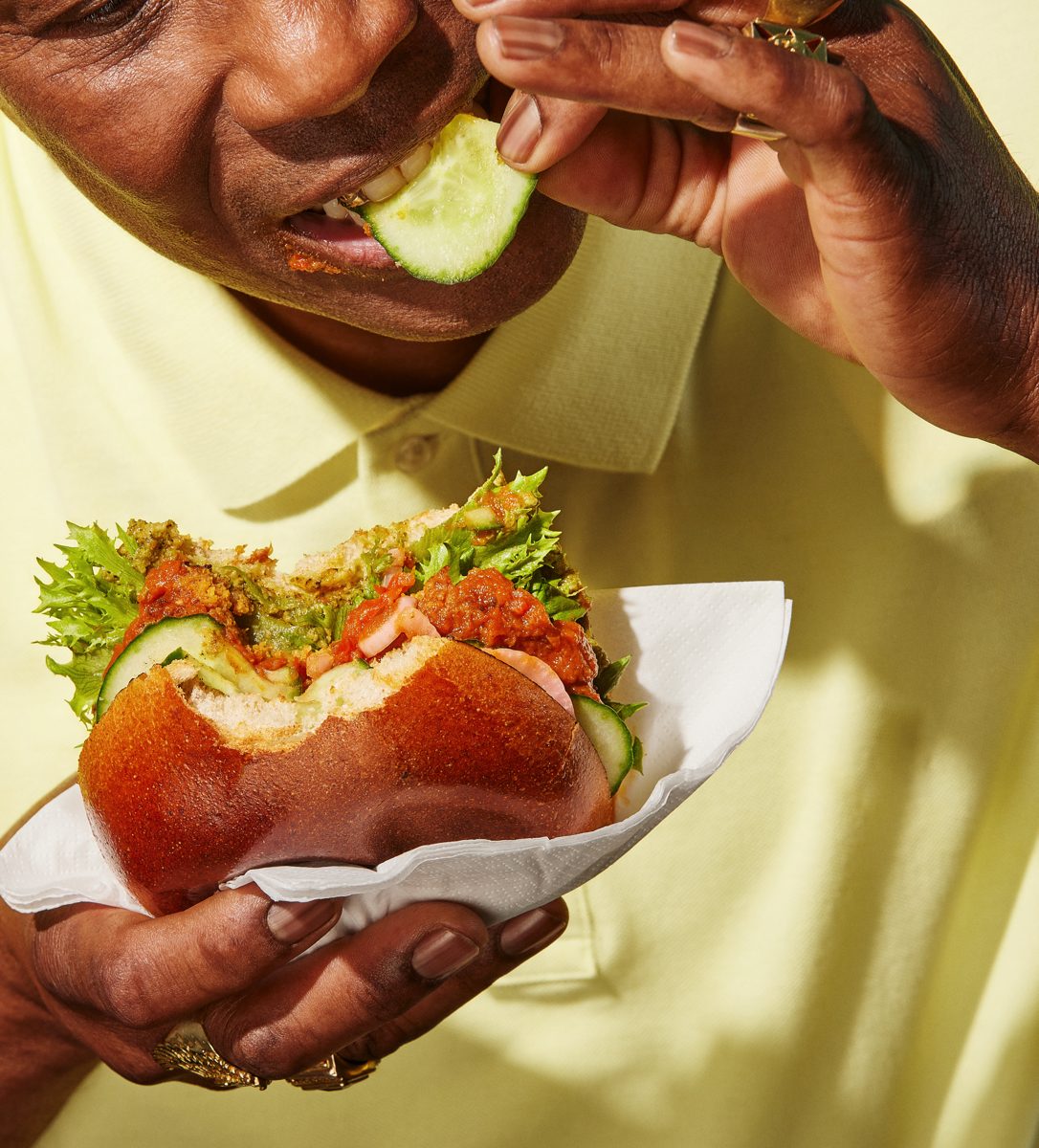
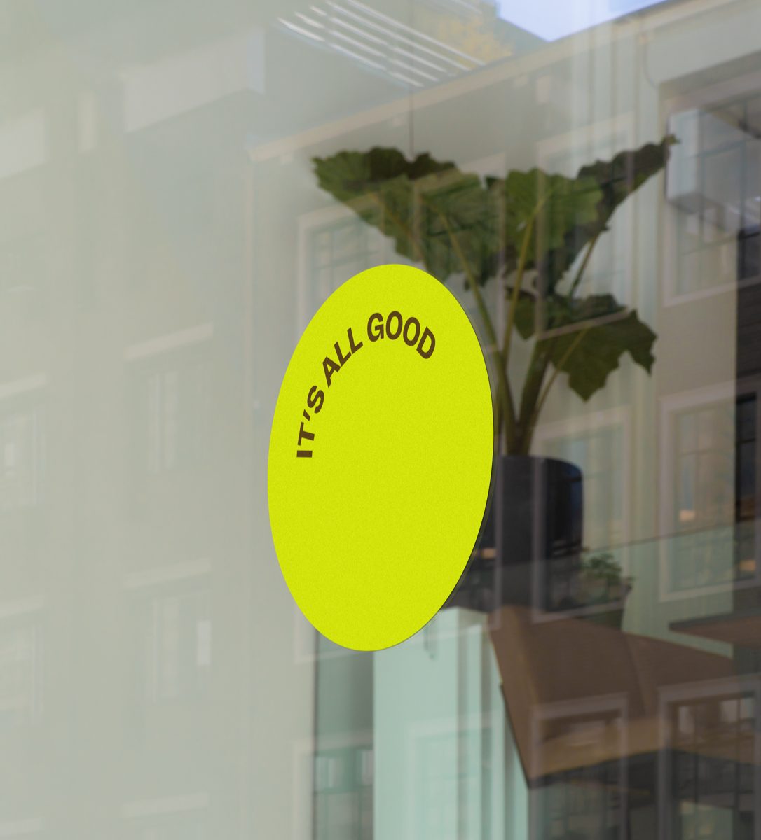
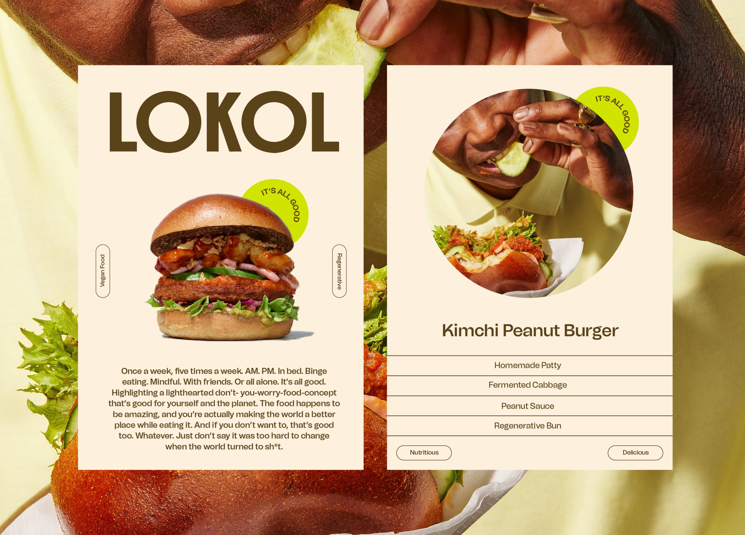
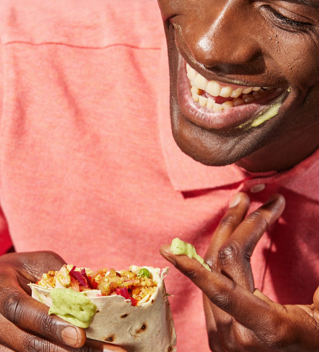
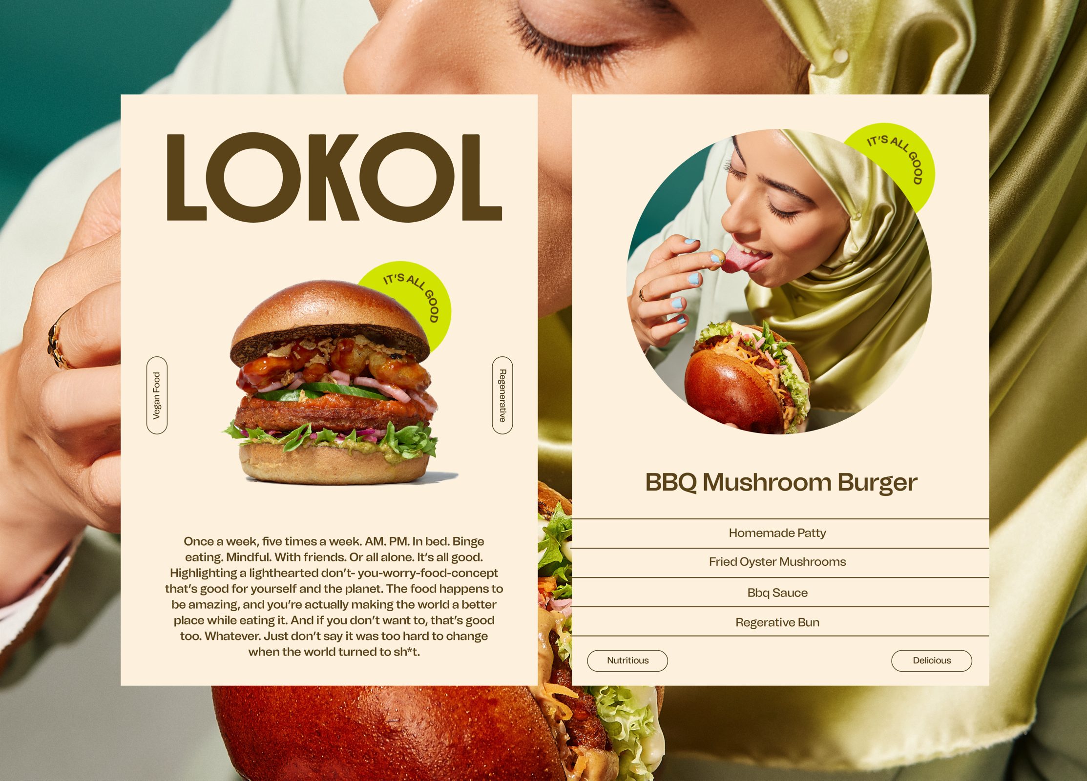
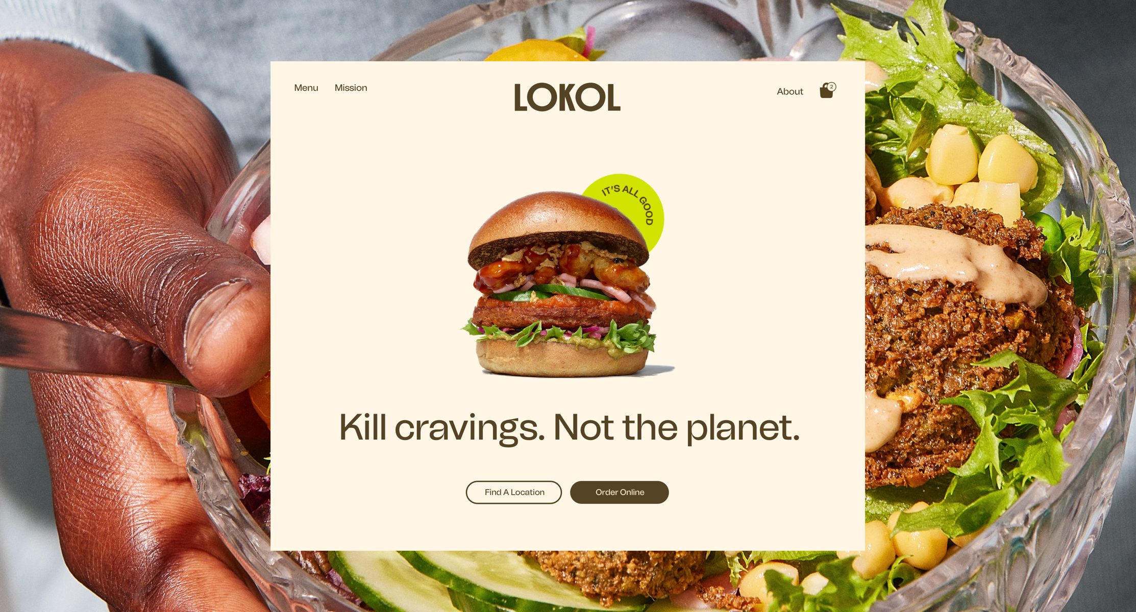
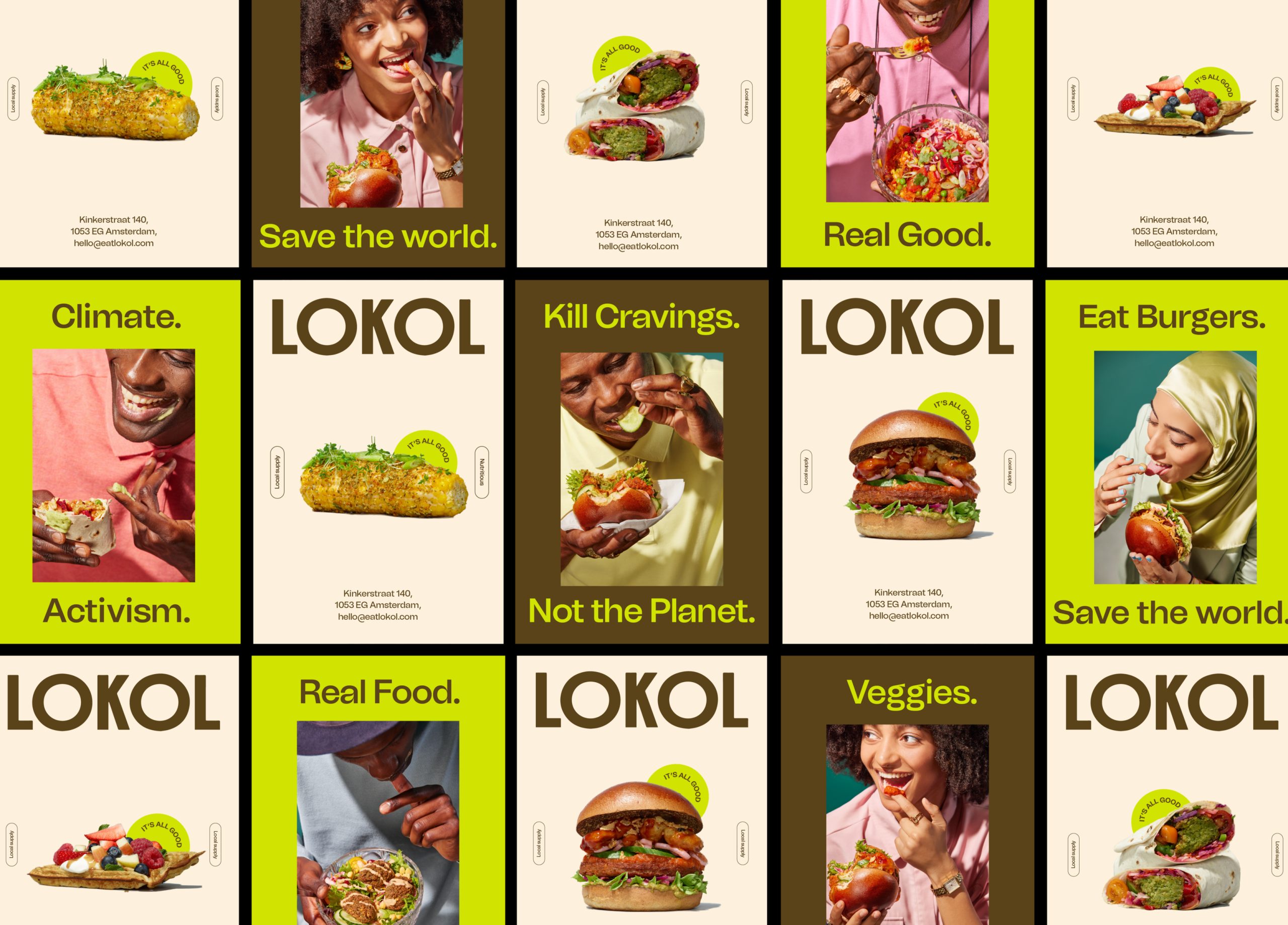
Once a week, five times a week. AM. PM. In bed. Binge eating. Mindful. With friends. Or all alone. It’s all good. The LOKOL brand ethos is designed to highlight a lighthearted don’t you worry-food-concept that’s both good for yourself and the planet. Even more, 'it’s all good' encourages consumers to eat LOKOL’s food as much as they may like to without guilt, because the regenerative process is all good, the ingredients are all good and the way LOKOL treat’s their people is all good.
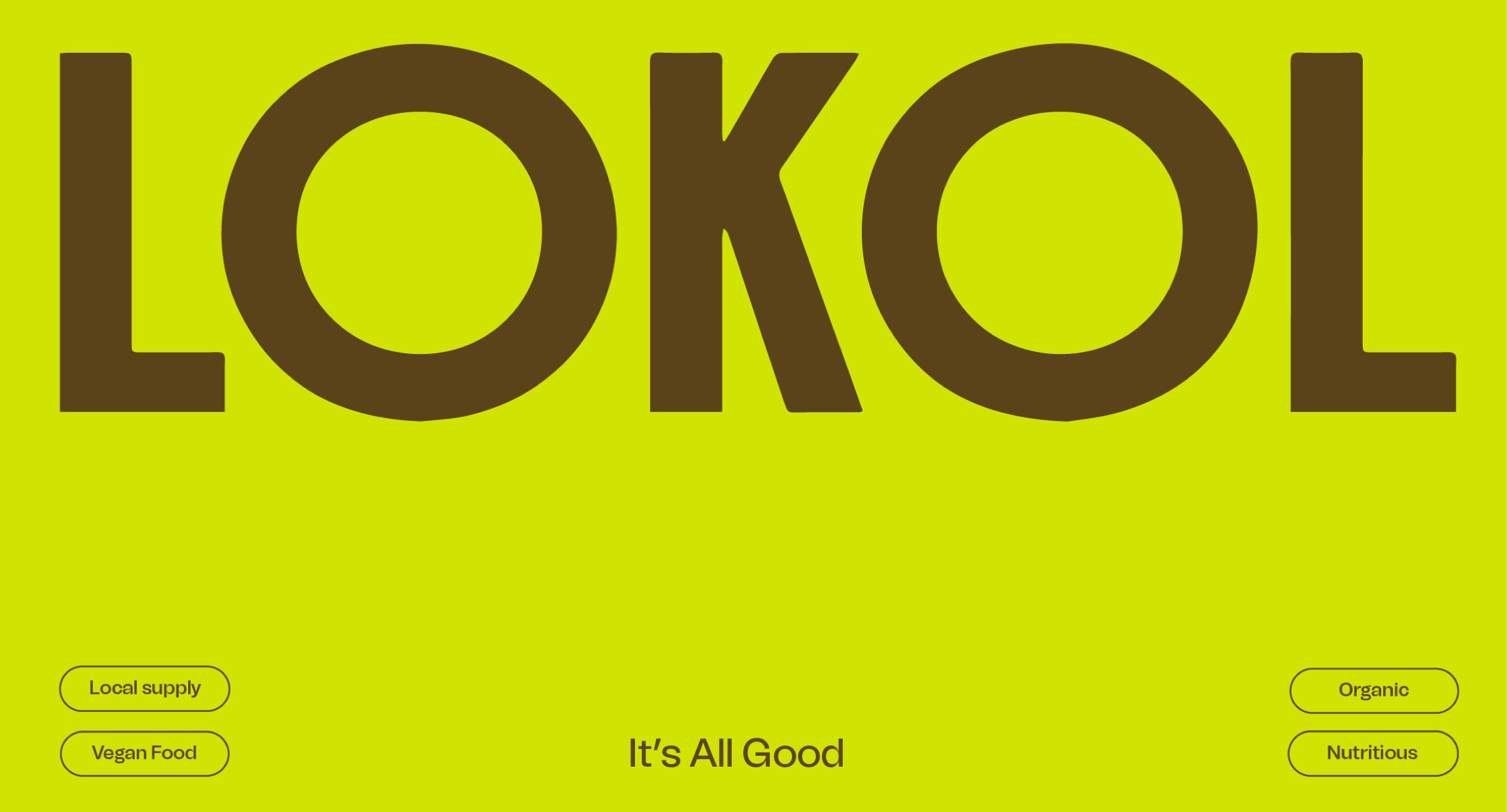
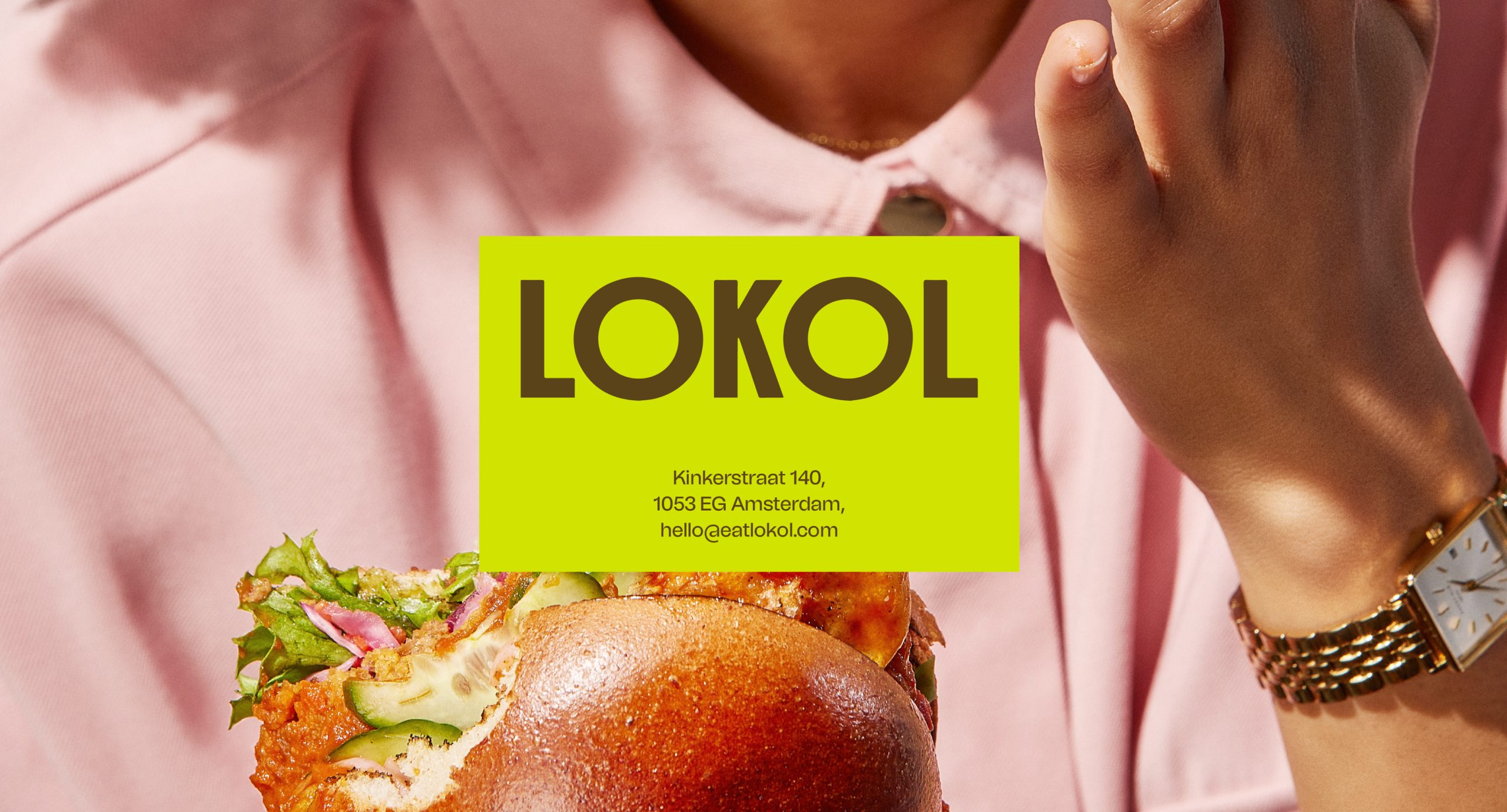
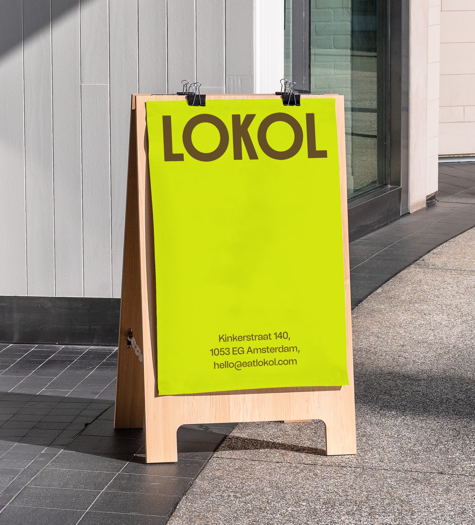
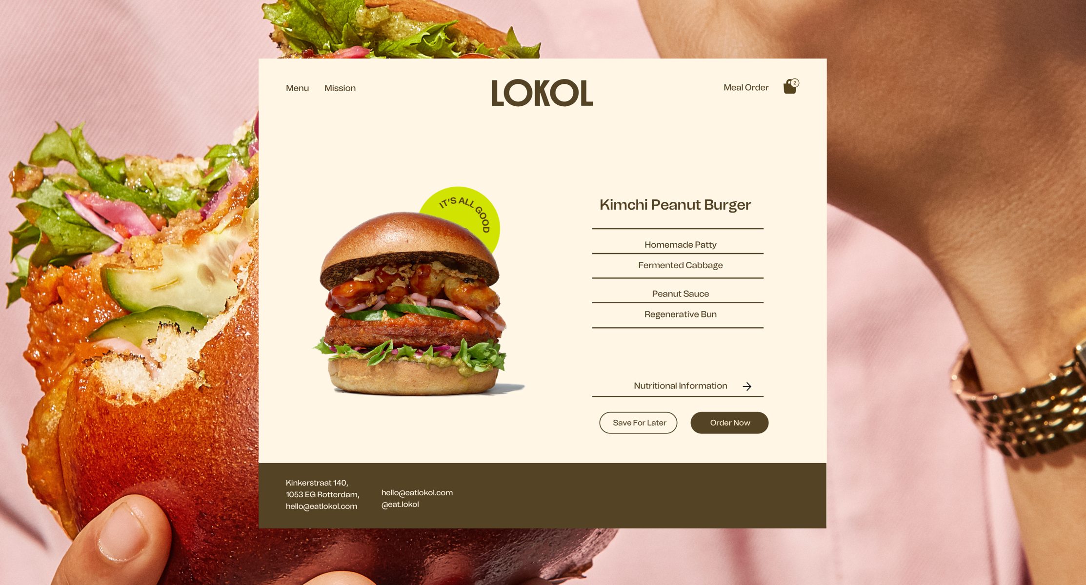
At the core of the brand, the logomark is bold, simple and eye-catching taking a back seat to the outspoken surrounding brand language, giving a sense of balance, practicality and elevation to the new brand identity. The logotype allowed us to position LOKOL as a lifestyle brand that is both playful and practical, whilst taking incredible care with the earth we live on.
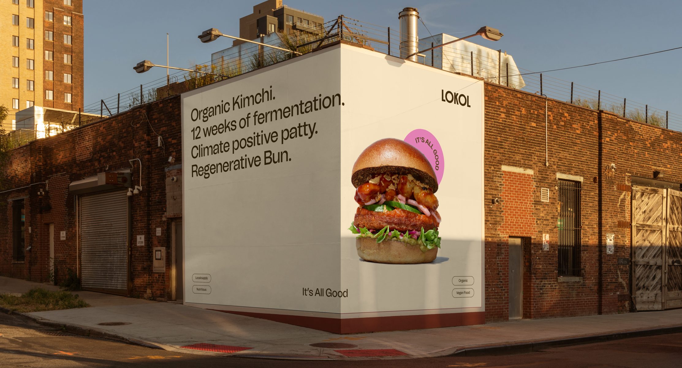
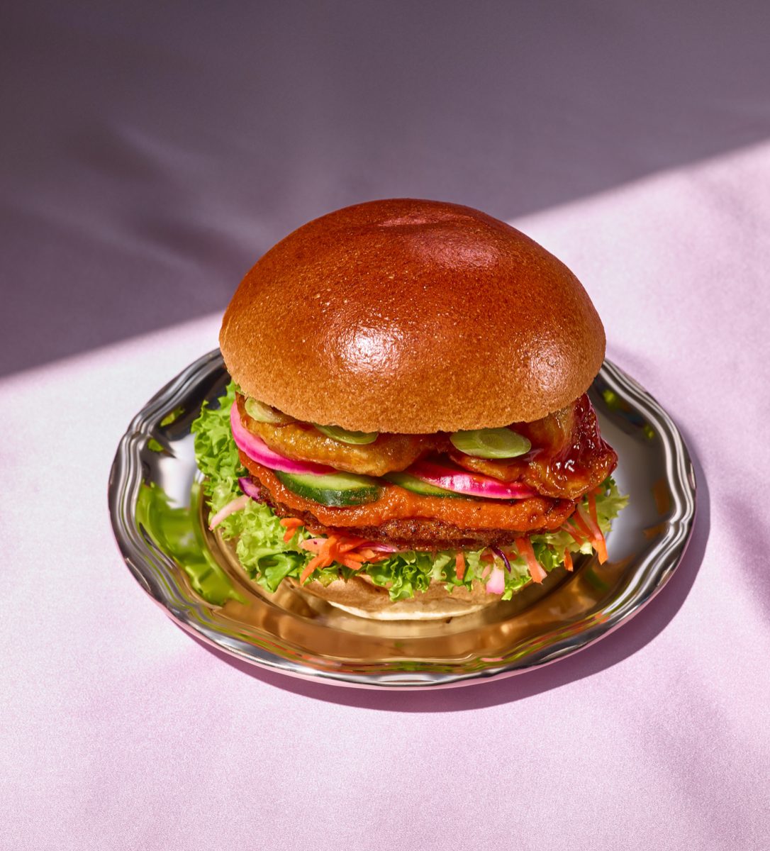
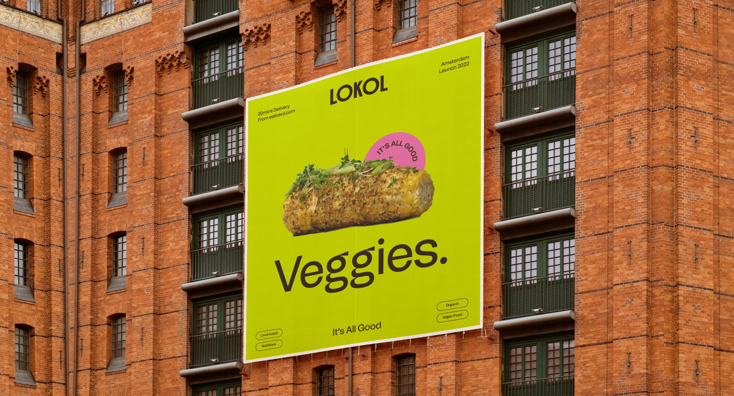
With the theme of trust in mind, a ‘stamp of approval’ was introduced in a circular formation that is seen with the products themselves, to act as a symbol of trust that consumers can learn and recognise over time. This creates a sense of credibility and transparency around the new revamped brand that will with time create a trademarked ‘It’s All Good’ movement and a new standard for vegan food for the industry to compete with.
We also introduced the use of simple filter tags as a graphic device for easily recognisable and understandable keywords giving viewers immediate context around the brand. This style is based on the filtering system typically used in interfaces/website design and reflects the active choices made by consumers when looking for keywords; healthy, regenerative vegan food that they can trust.
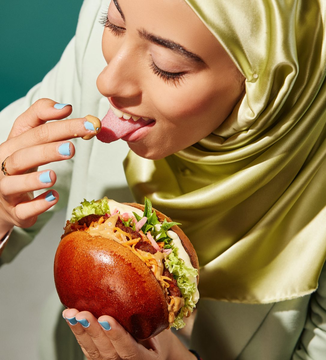
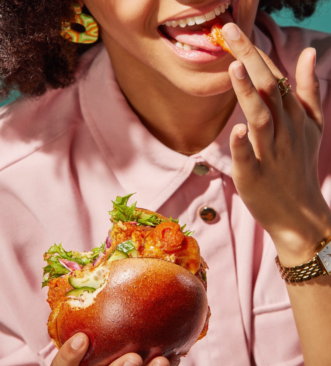
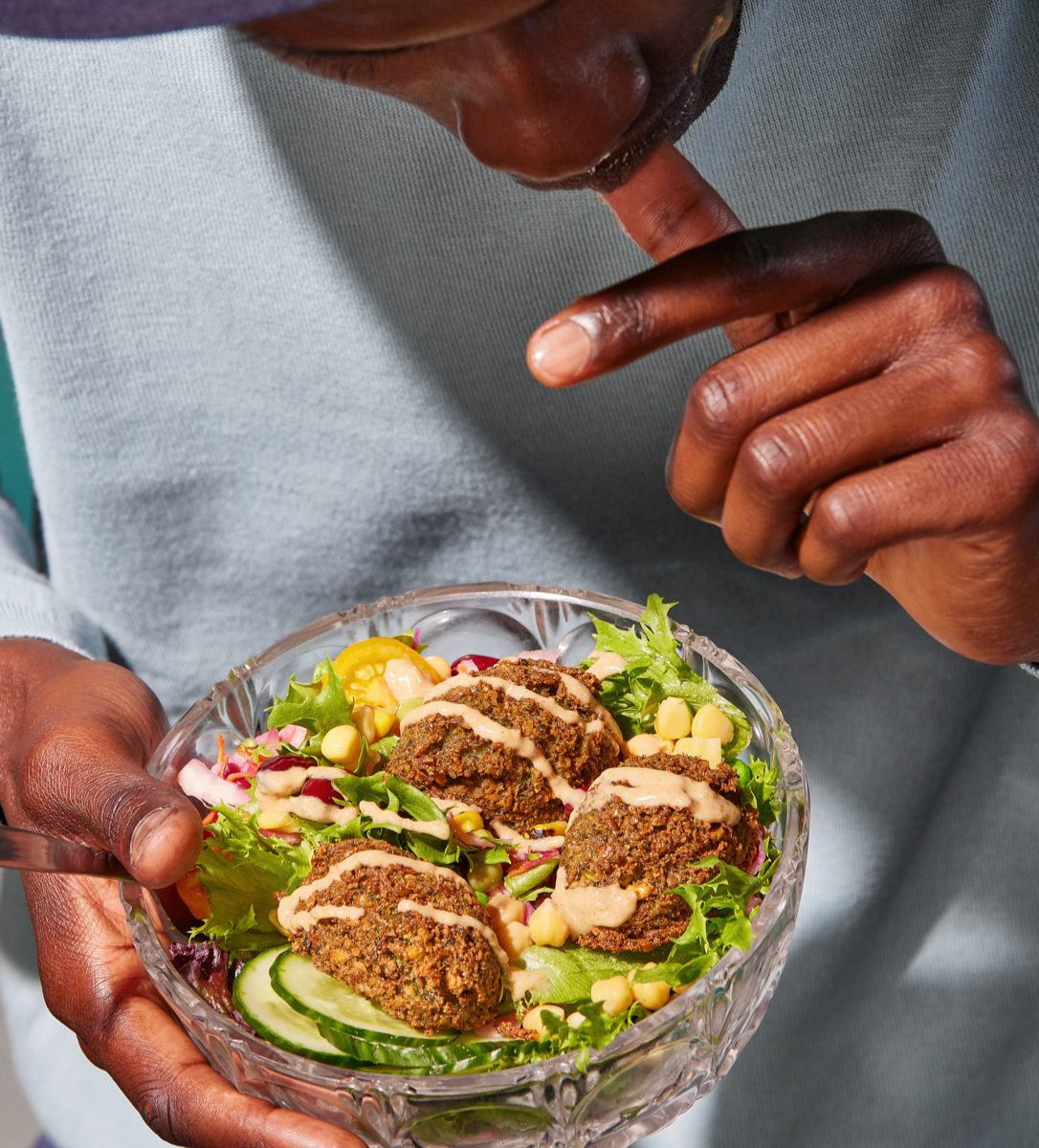
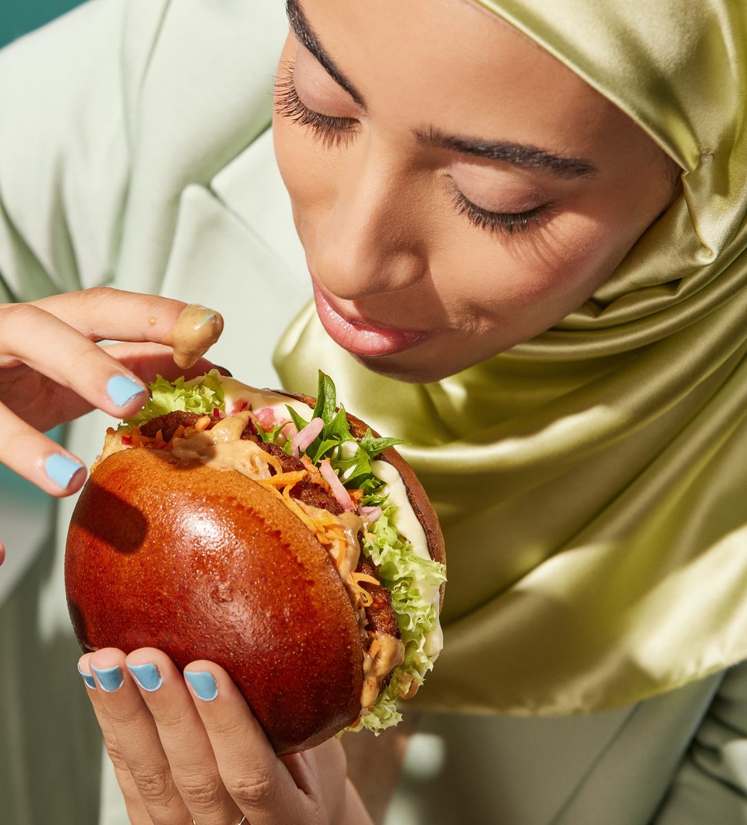
At the core of the brand language, the brand identity uses uplifting, bright colours rooted within nature, referencing both the natural ingredients within the food itself as well as the core of LOKOL’s compassionate regard for the planet we live on. The concept of ma is explored through the large surface area of colour, allowing the viewer to take a moment to focus on the photography and copy. The vibrant colour palette is paired with a practical and understated Grotesk typography, that allows the tone of voice to do the talking and take a back seat to the bold colours and photography. With the combination of the negative space and bold colours, the typography brings a sense of calm, encouraging viewers to take a moment to pause and reflect on their food choices and promote a shift in consumer behaviour.
Location: Amsterdam, Netherlands.
Creative Direction, Strategy And Copywriting: @_ruben_smit_ from @wearephenomenons
Photography: The team at @studio500watt
Food Stylist: Liza De Vries @lizadevries_com