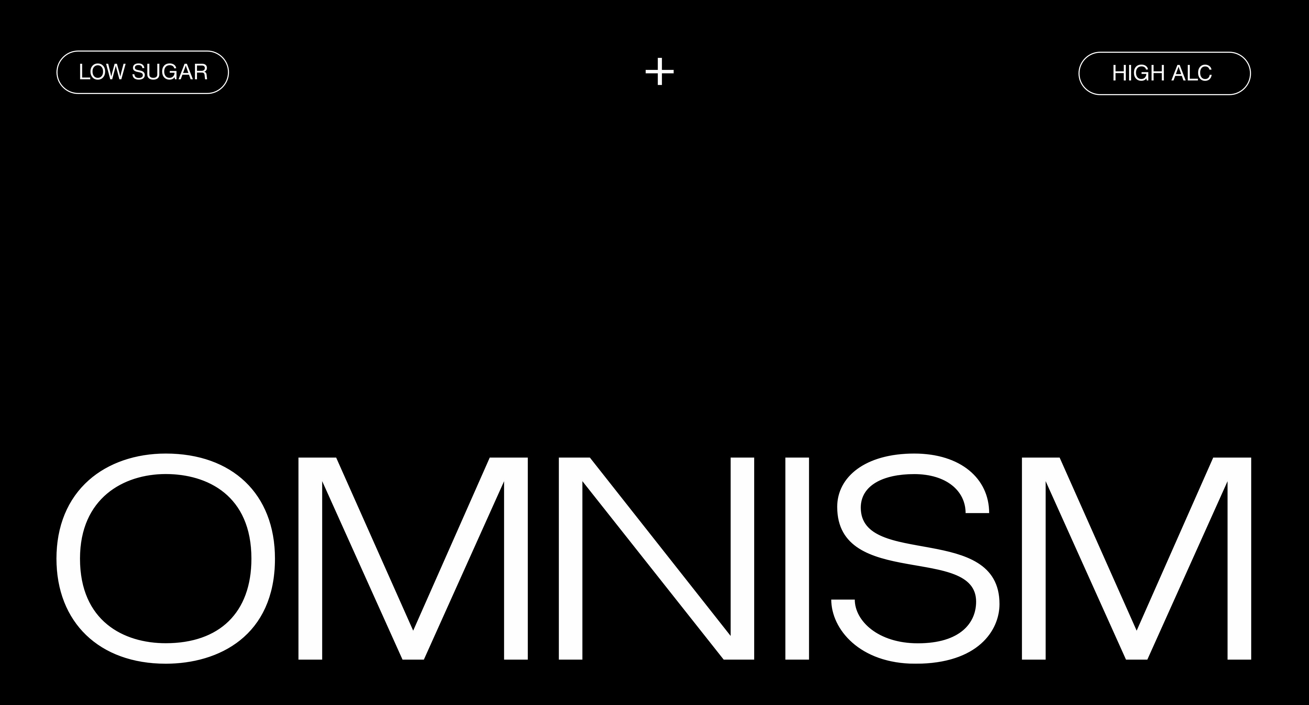
OMNISM
Brand Identity Design, Packaging Design and Art Direction
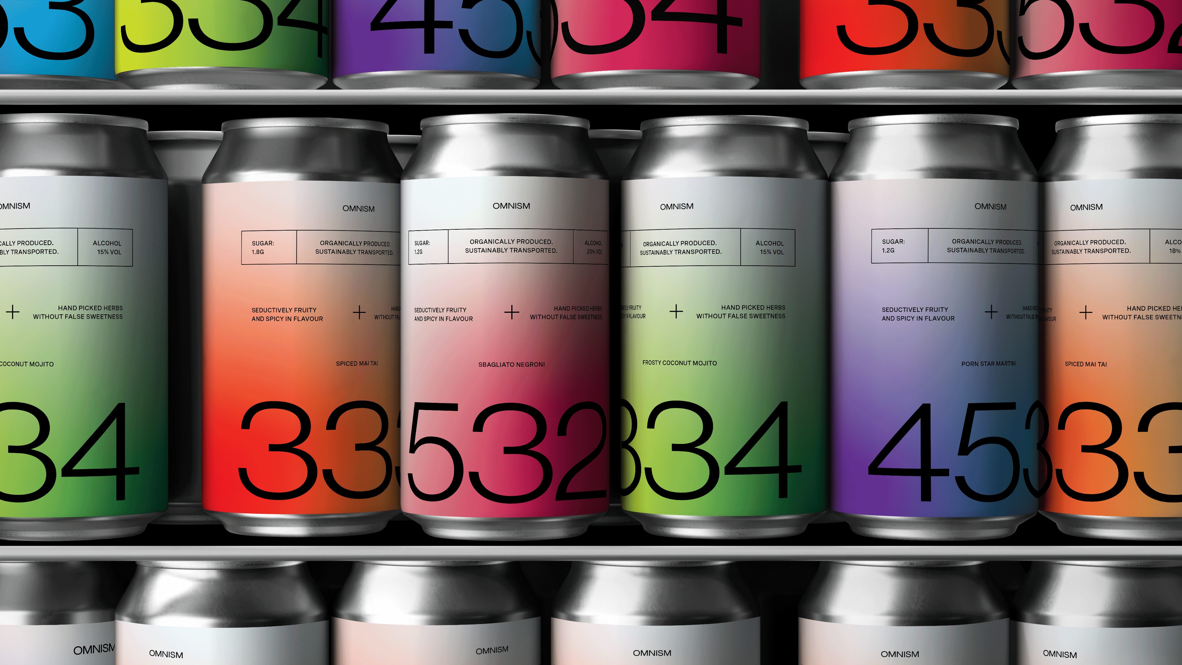
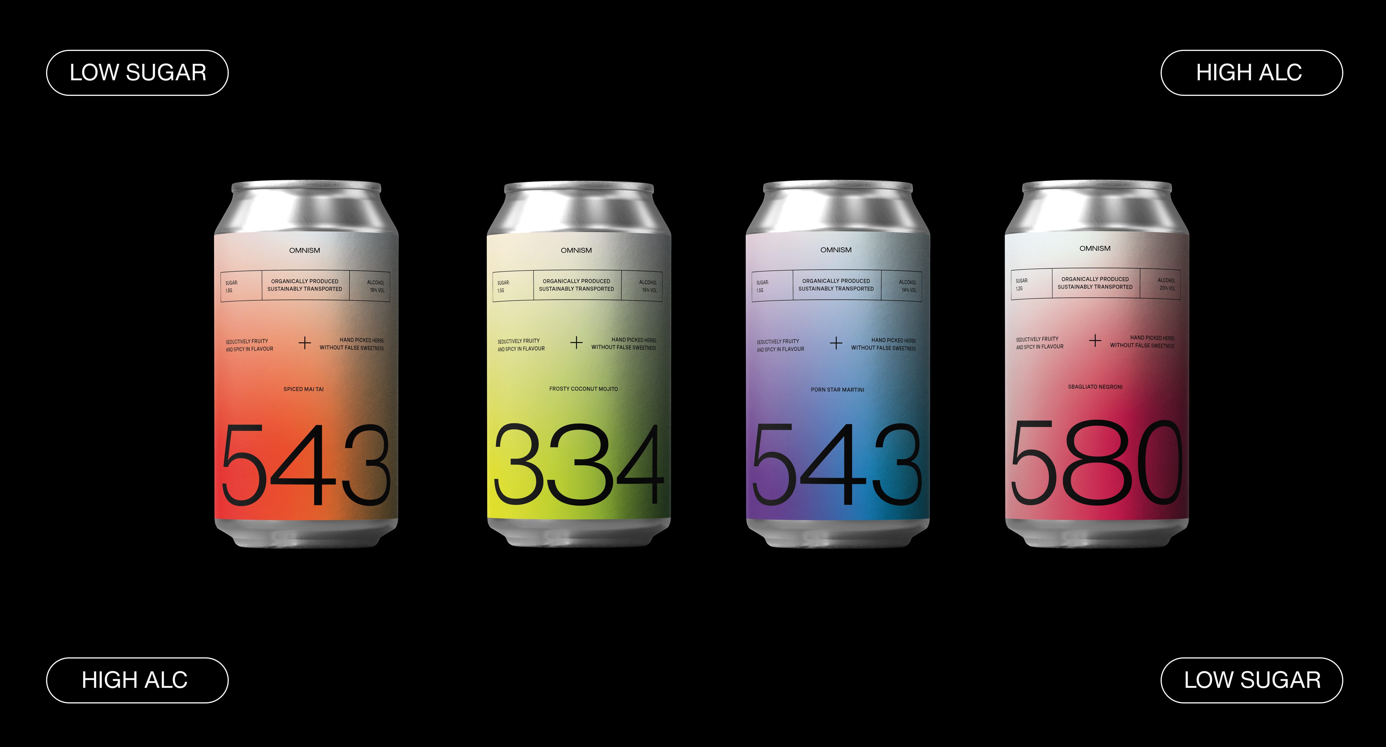
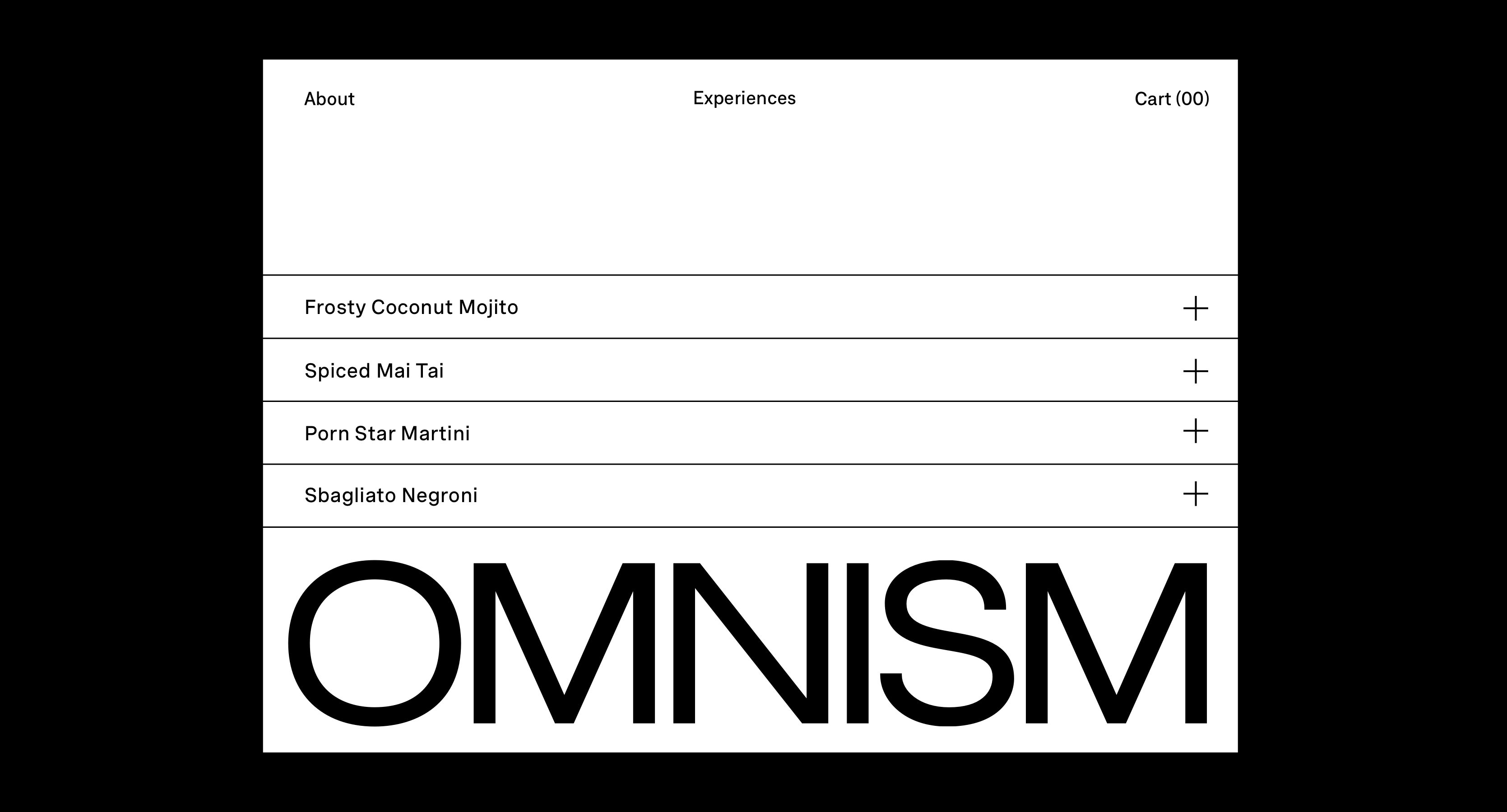
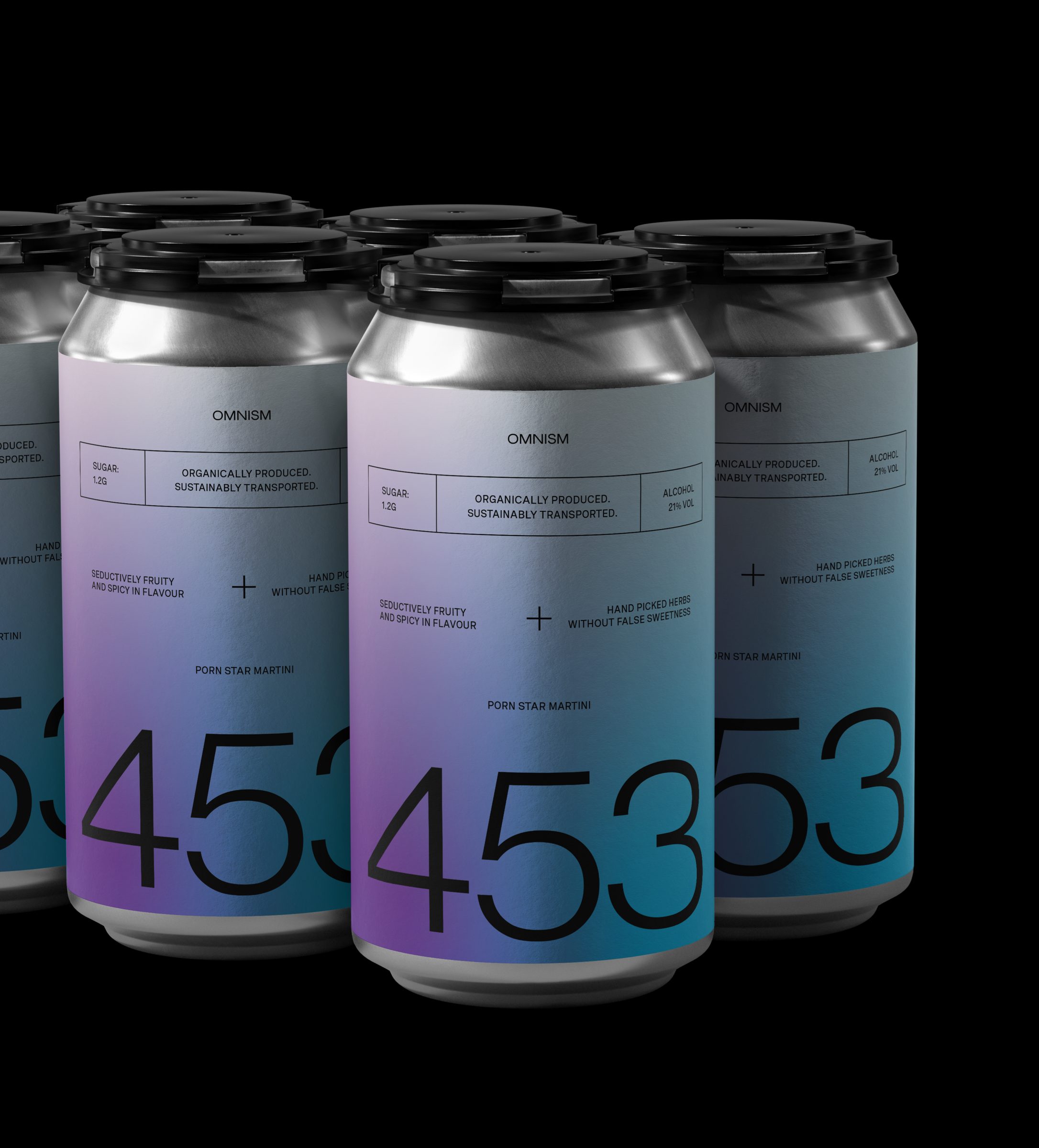
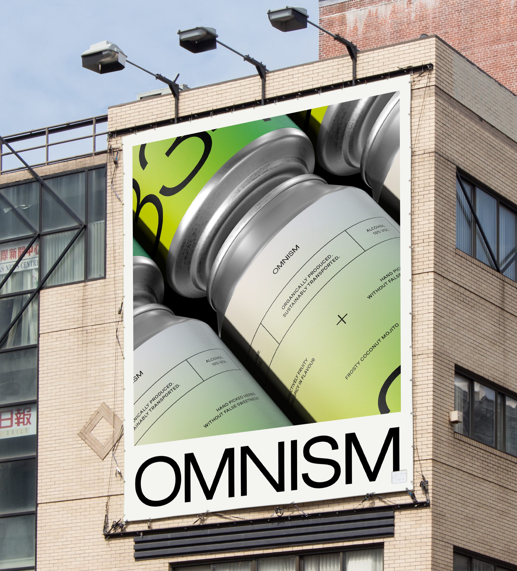
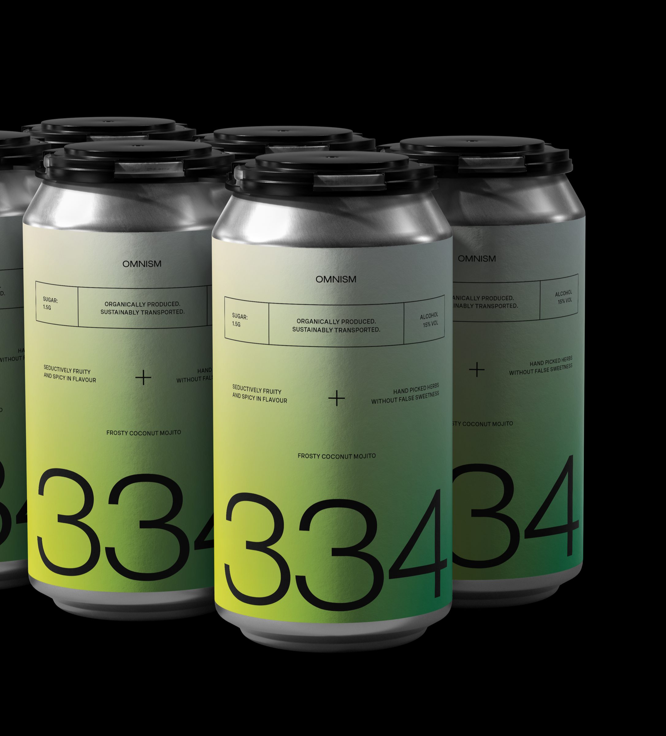
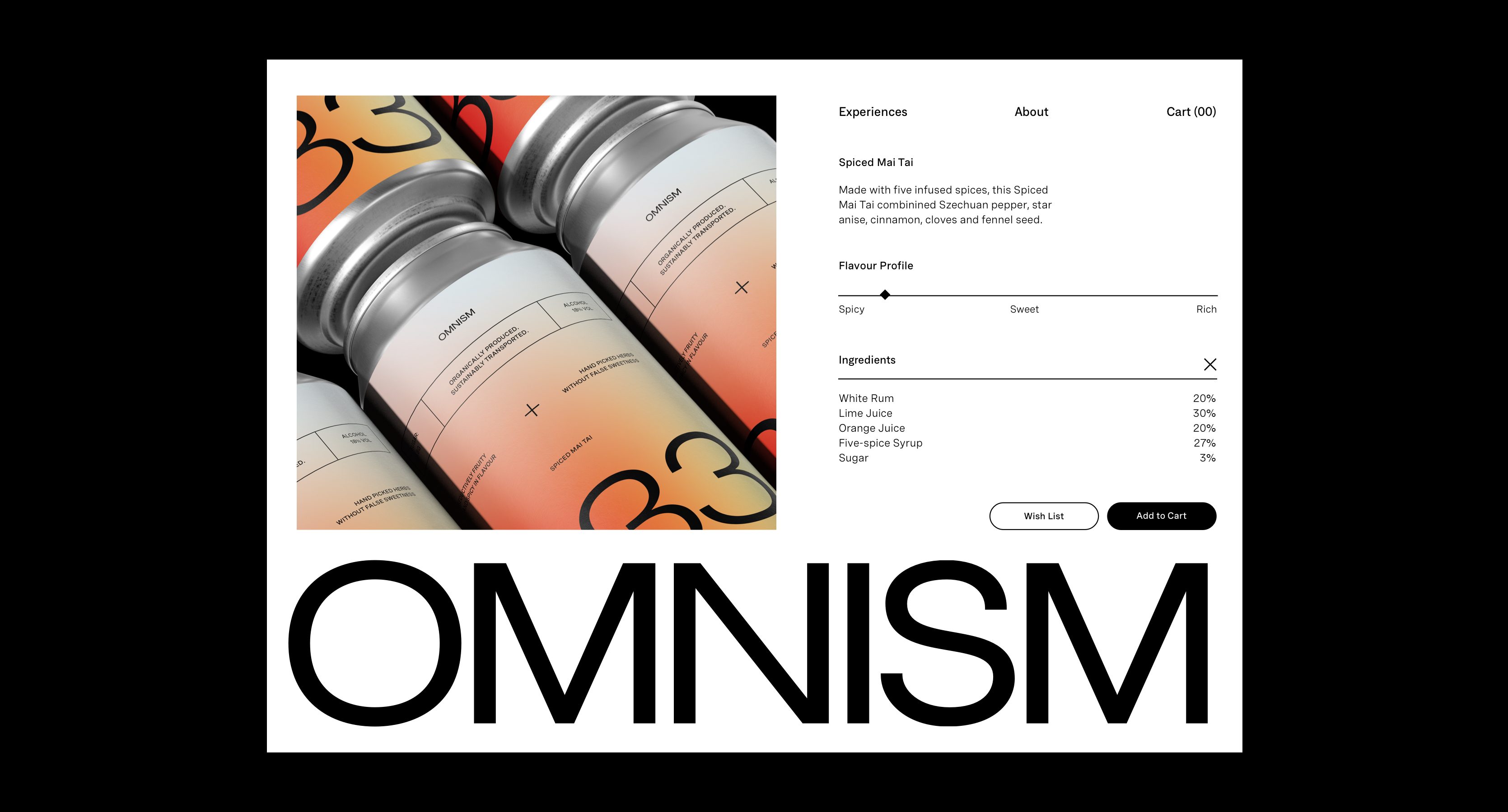
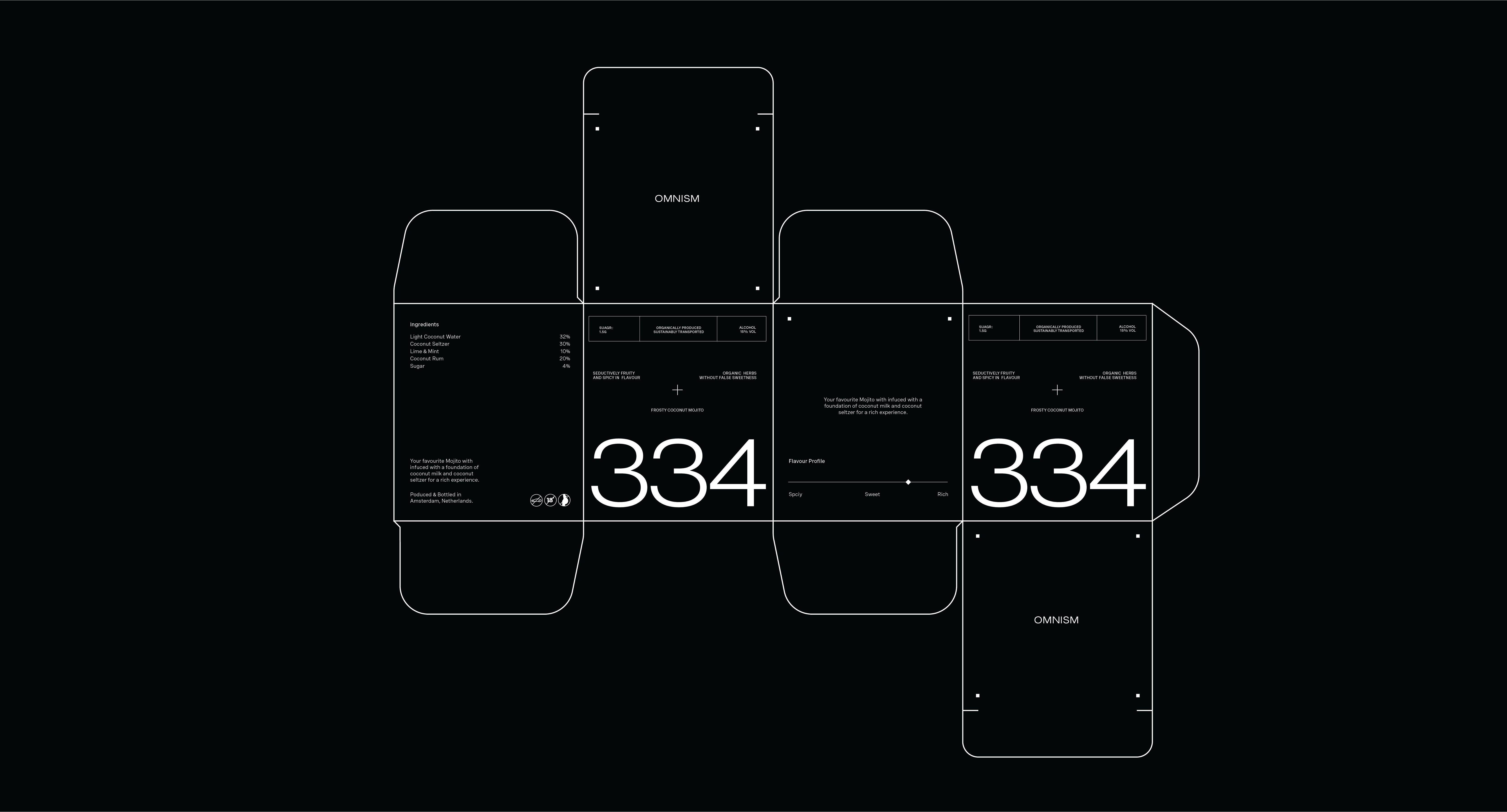
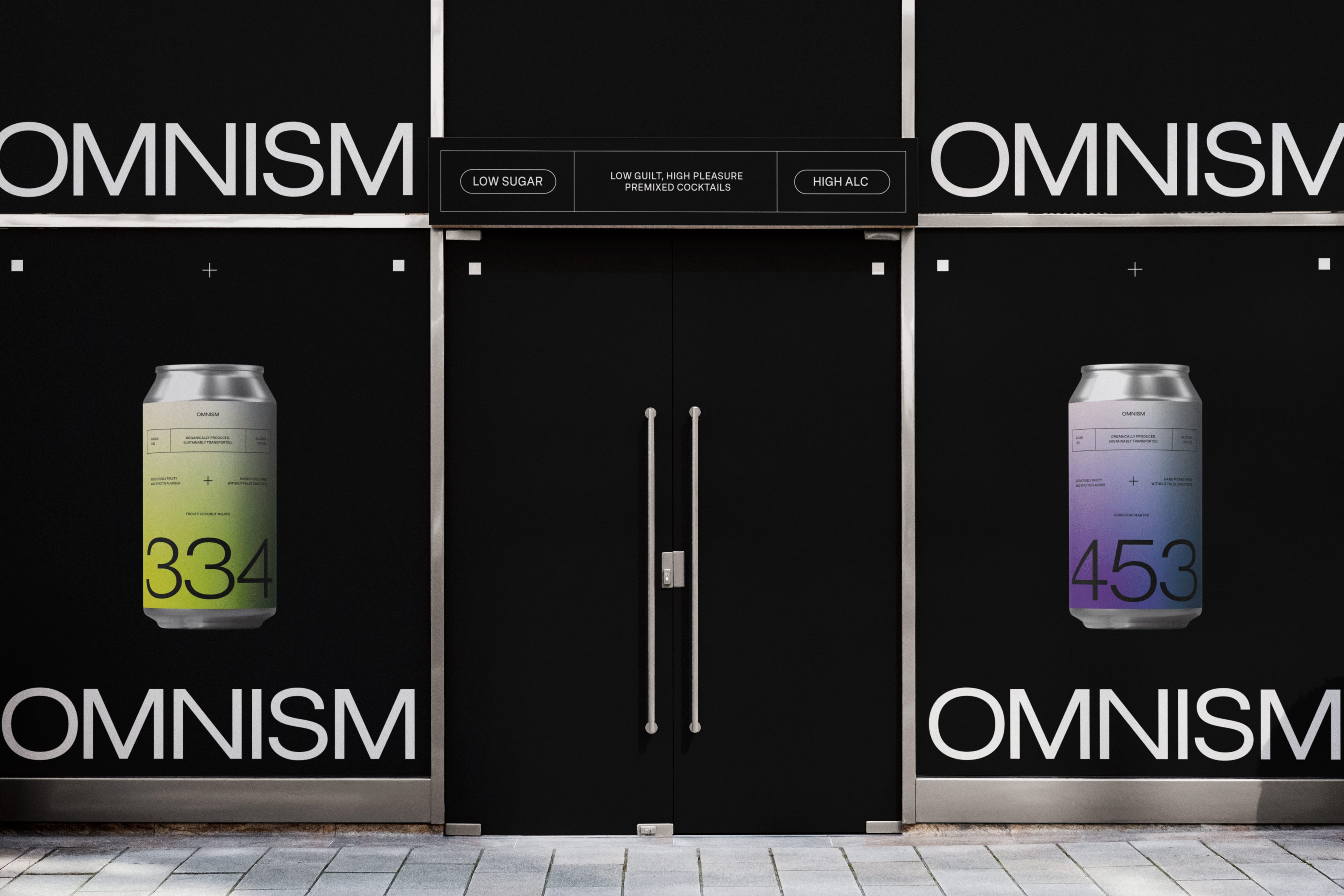
It’s no secret that cocktails are packed with Sugar. Some are so packed to the brim, that you may as well drink liquefied cotton candy. Targeted at a gen-z audience with a focus on their health, OMNISM is a boutique Amsterdam-based pre-mixed cocktail brand that sets out to pull back the vale on what is really inside the cocktail you're drinking - shedding light on the amount of sugar we are actually consuming whilst having an innocent drink, which is information that is often swept under the rug by the alcohol market. Unlike competitors, OMNISM positions the brand identity and packaging design around the sugar you’re not consuming, rather than the sugar that you are consuming - promoting a healthier drinking culture and awareness around sugar consumption.
Our goal was to create a brand identity and packaging system that clearly sheds a light on the sugar we consume whilst drinking alcohol, whilst communicating this brand story and positioning in a simple and contemporary way.
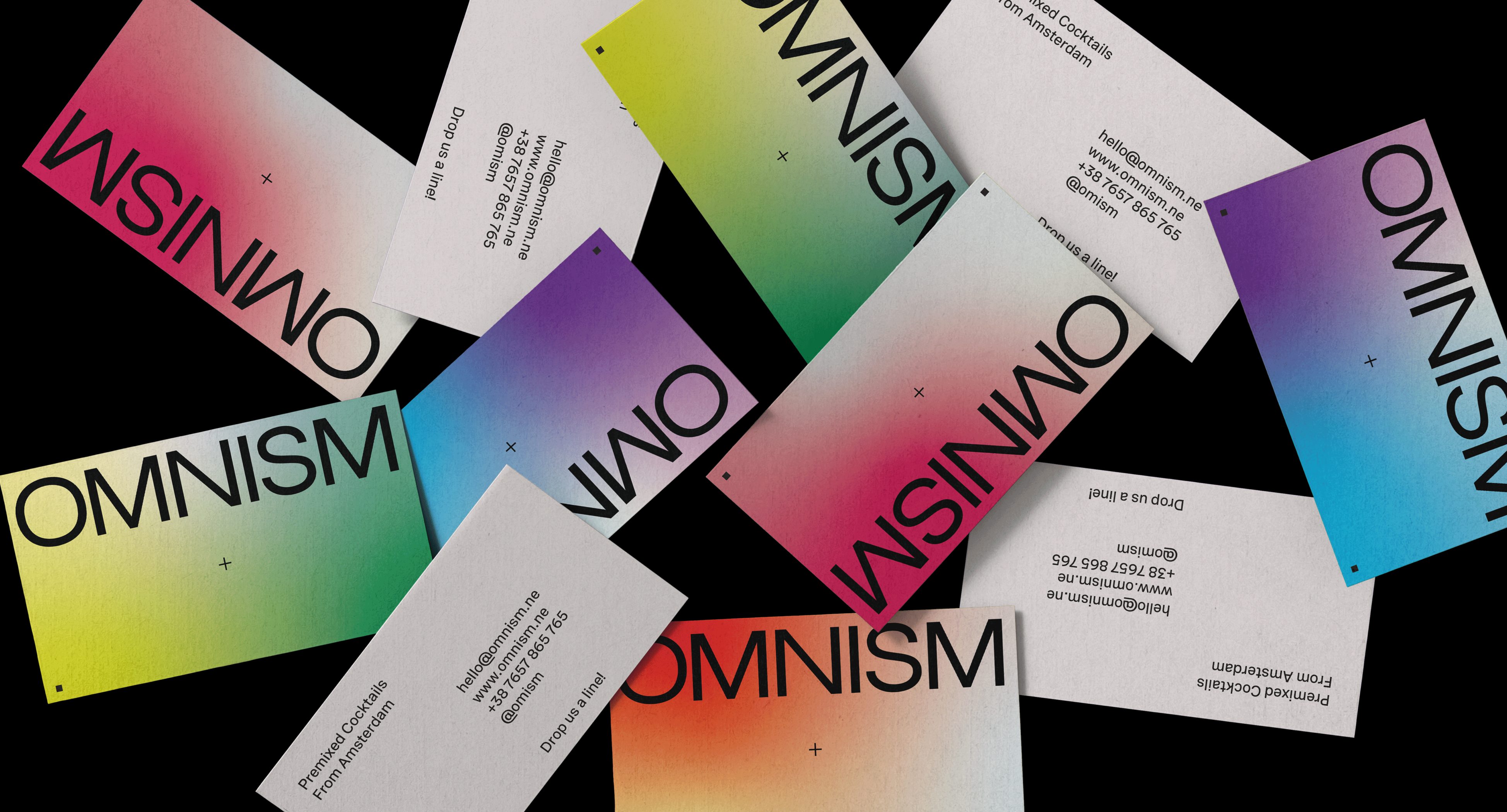
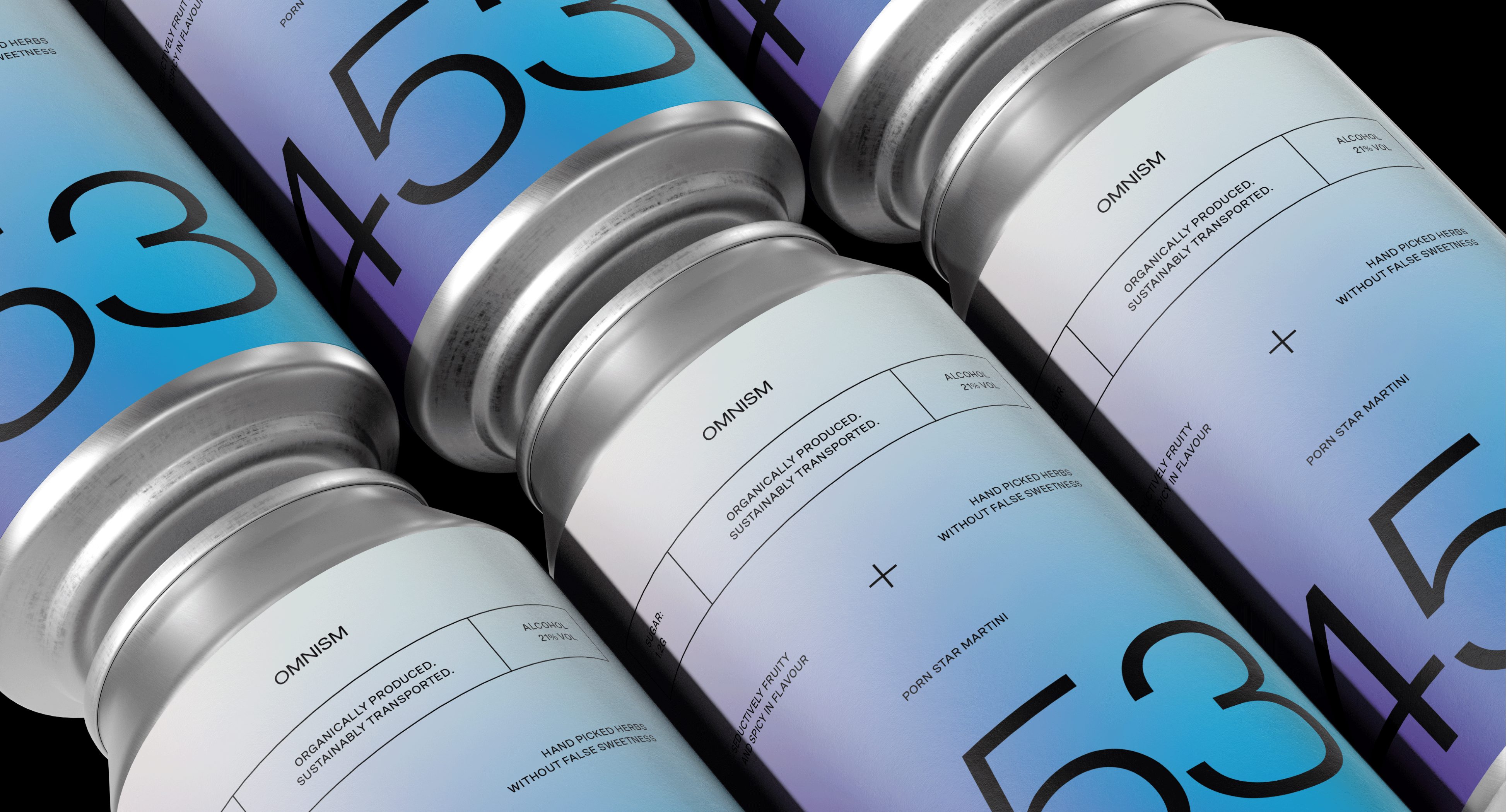
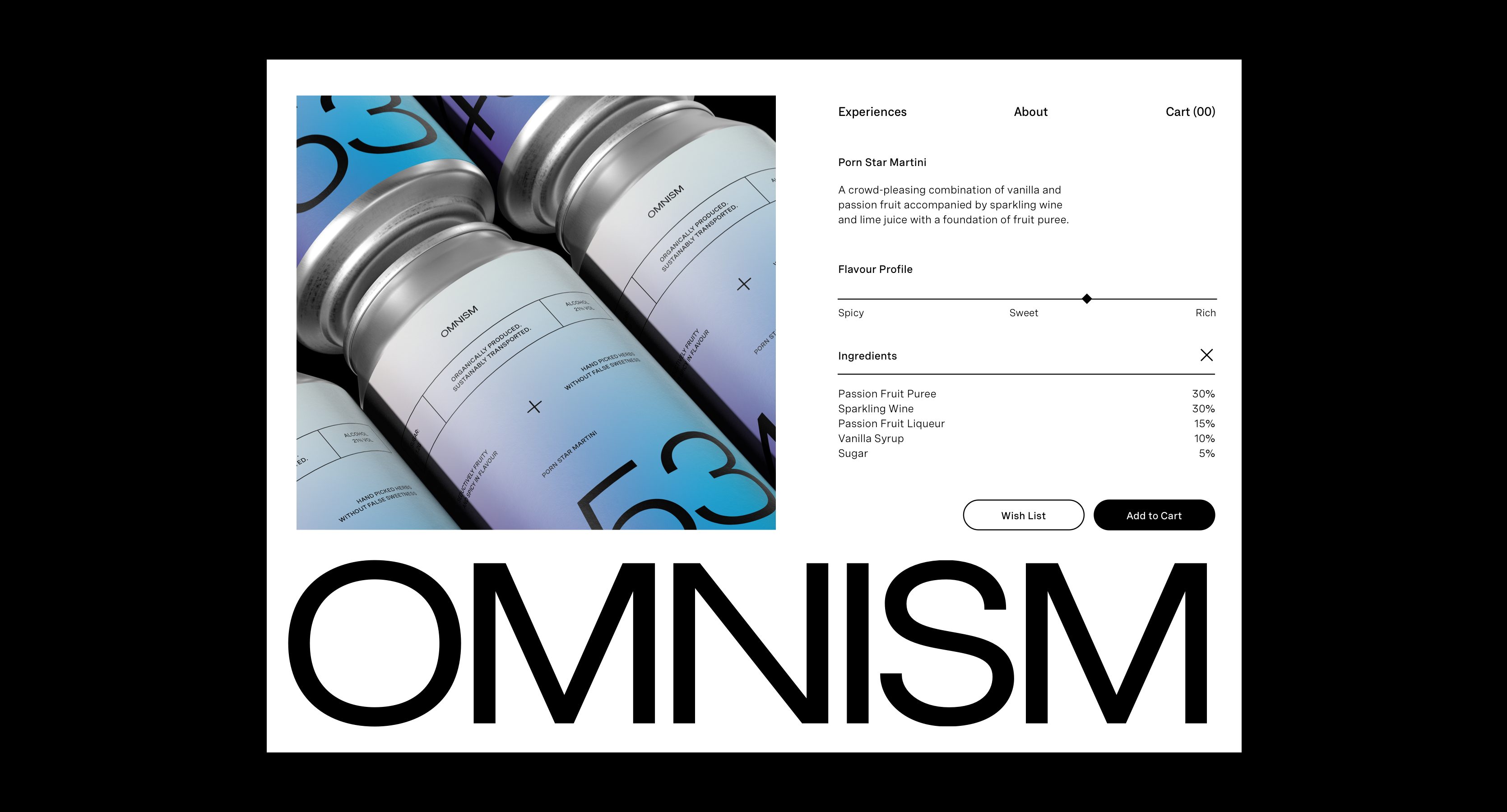
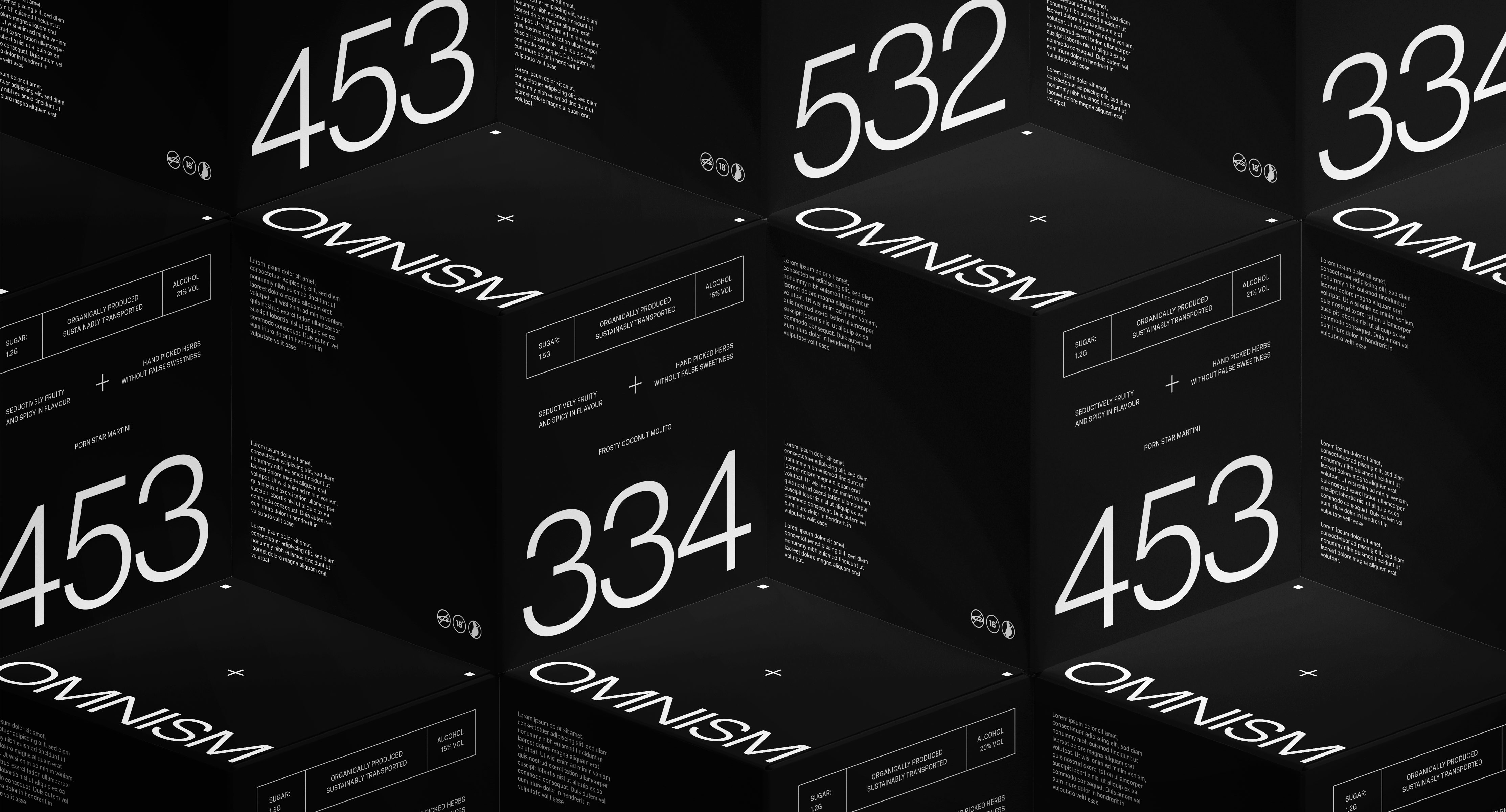
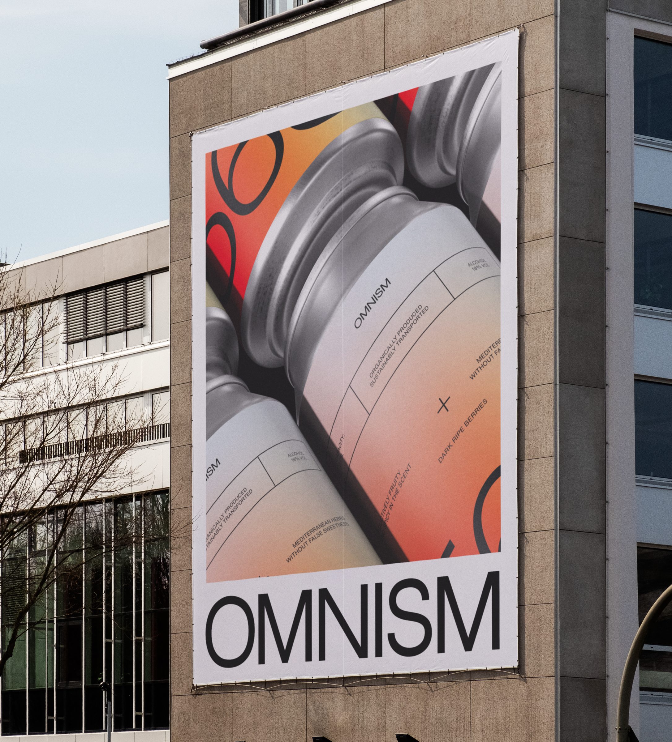
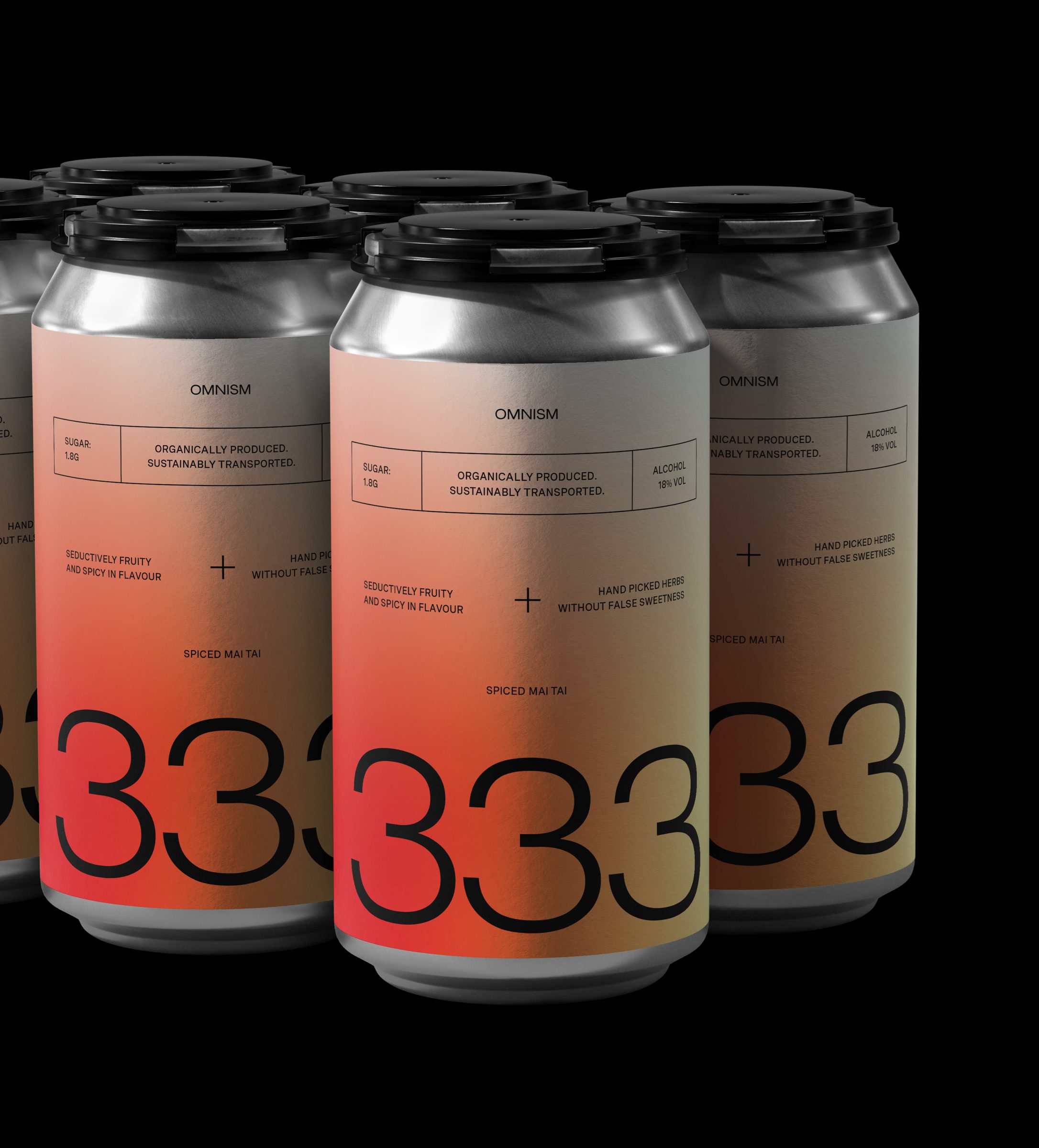
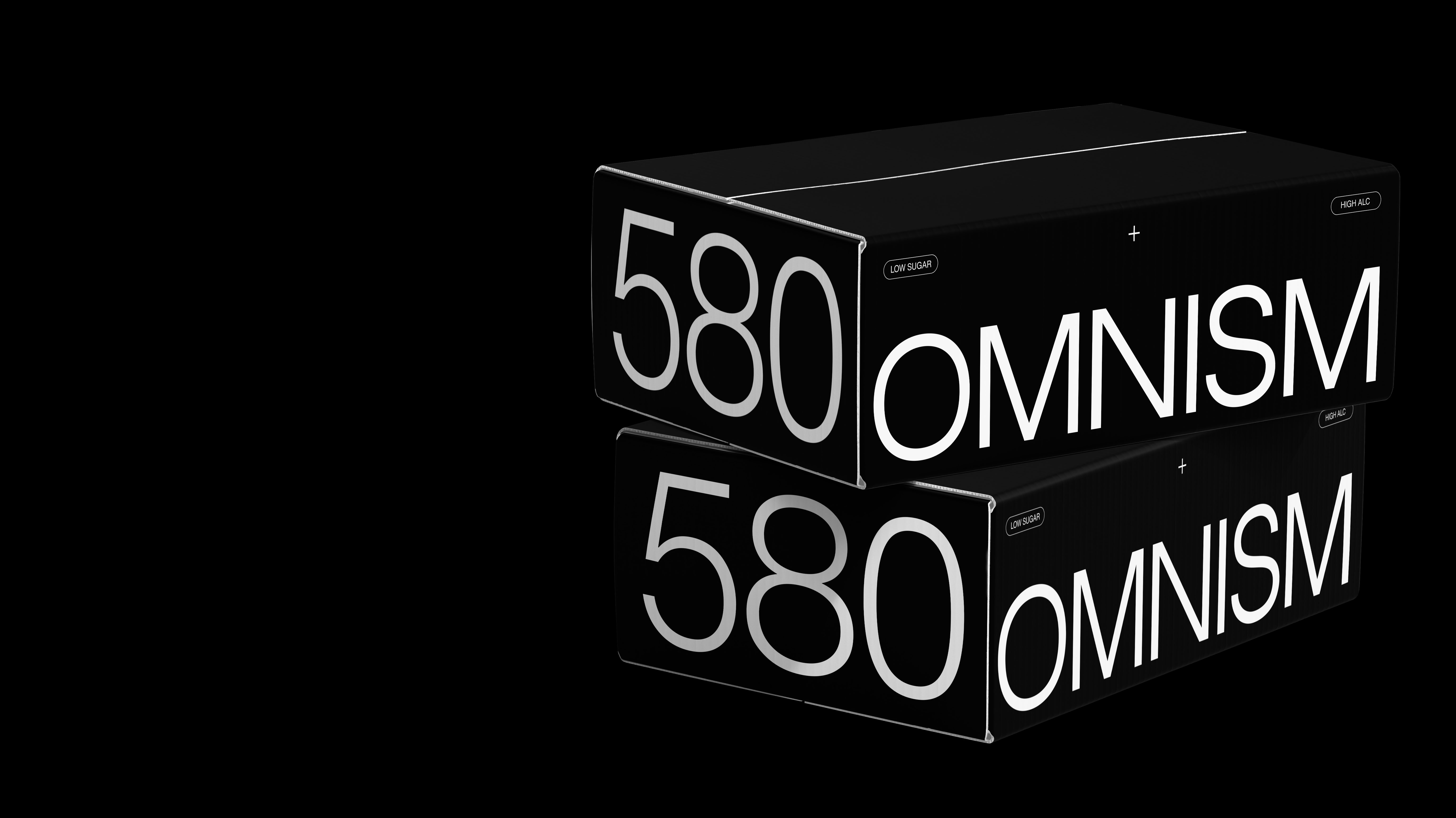
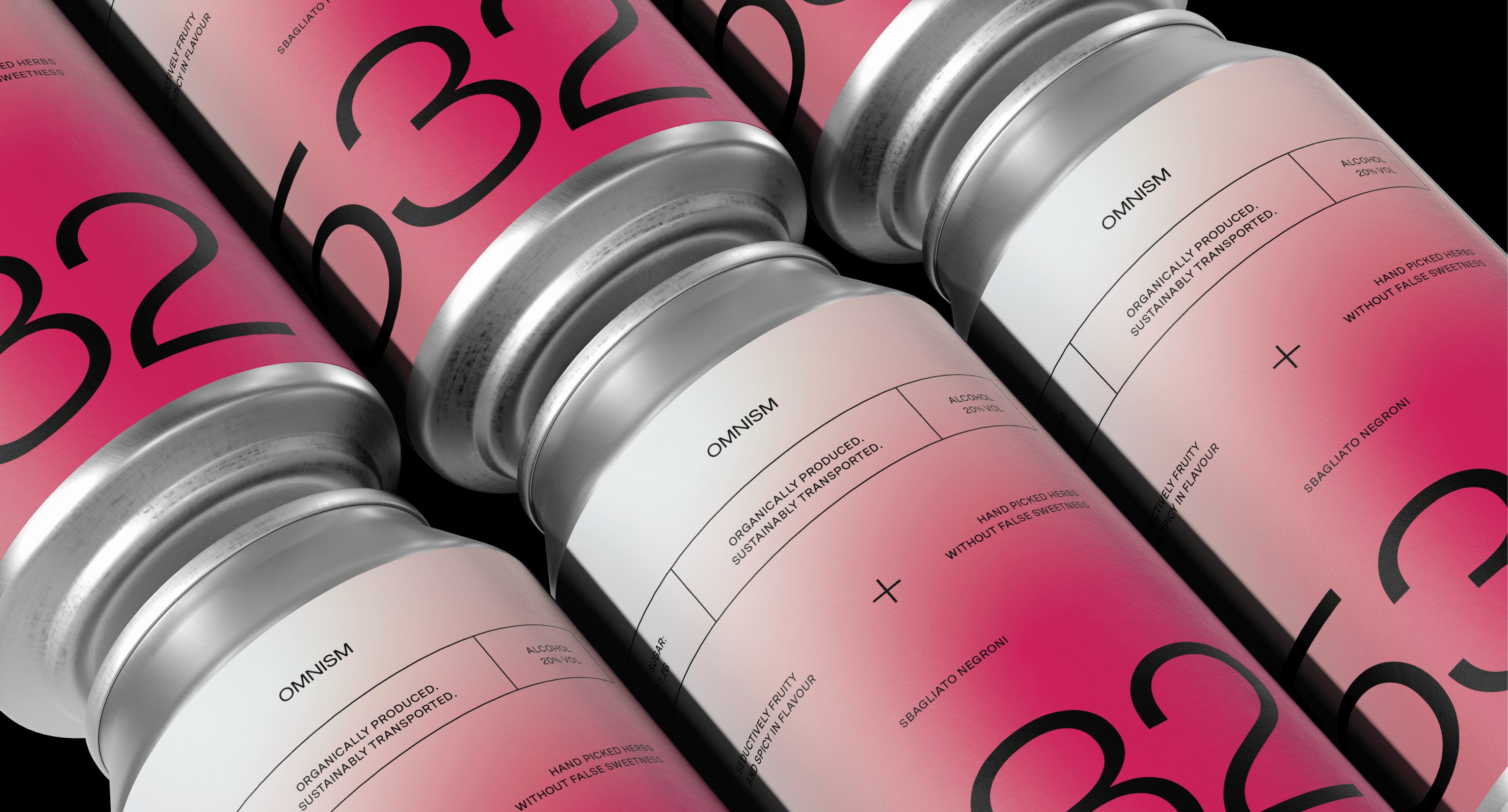
From the brand identity through to the packaging design, we needed to create something that felt clear, educational yet elegant, putting the function of the informative packaging design at the forefront of the brand. At the core of the brand identity, the logo mark and core brand colour is completely stripped back and understated, taking a back seat to the striking use of gradients and informative packaging system intended to be the primary pillar of the brand.
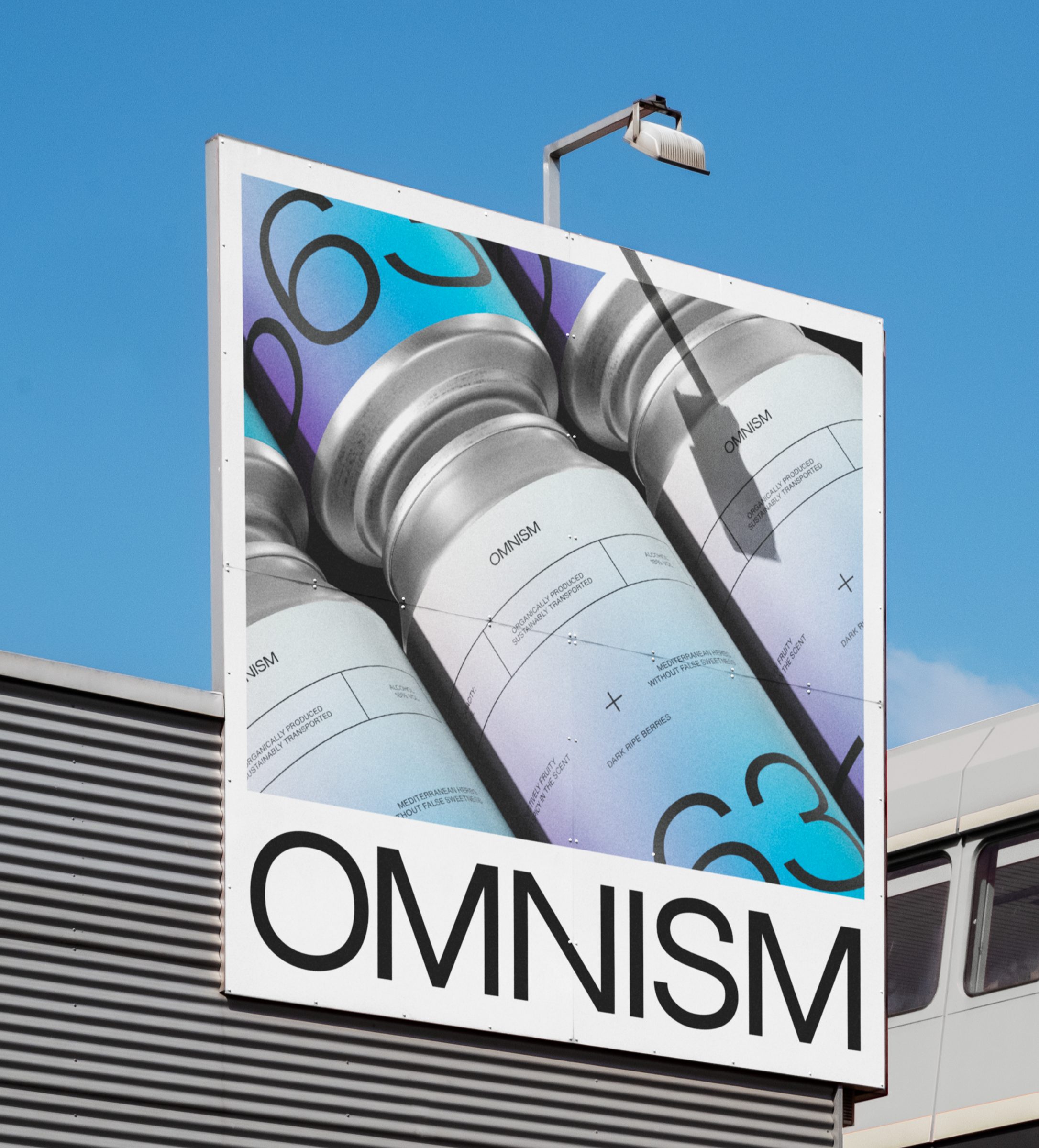
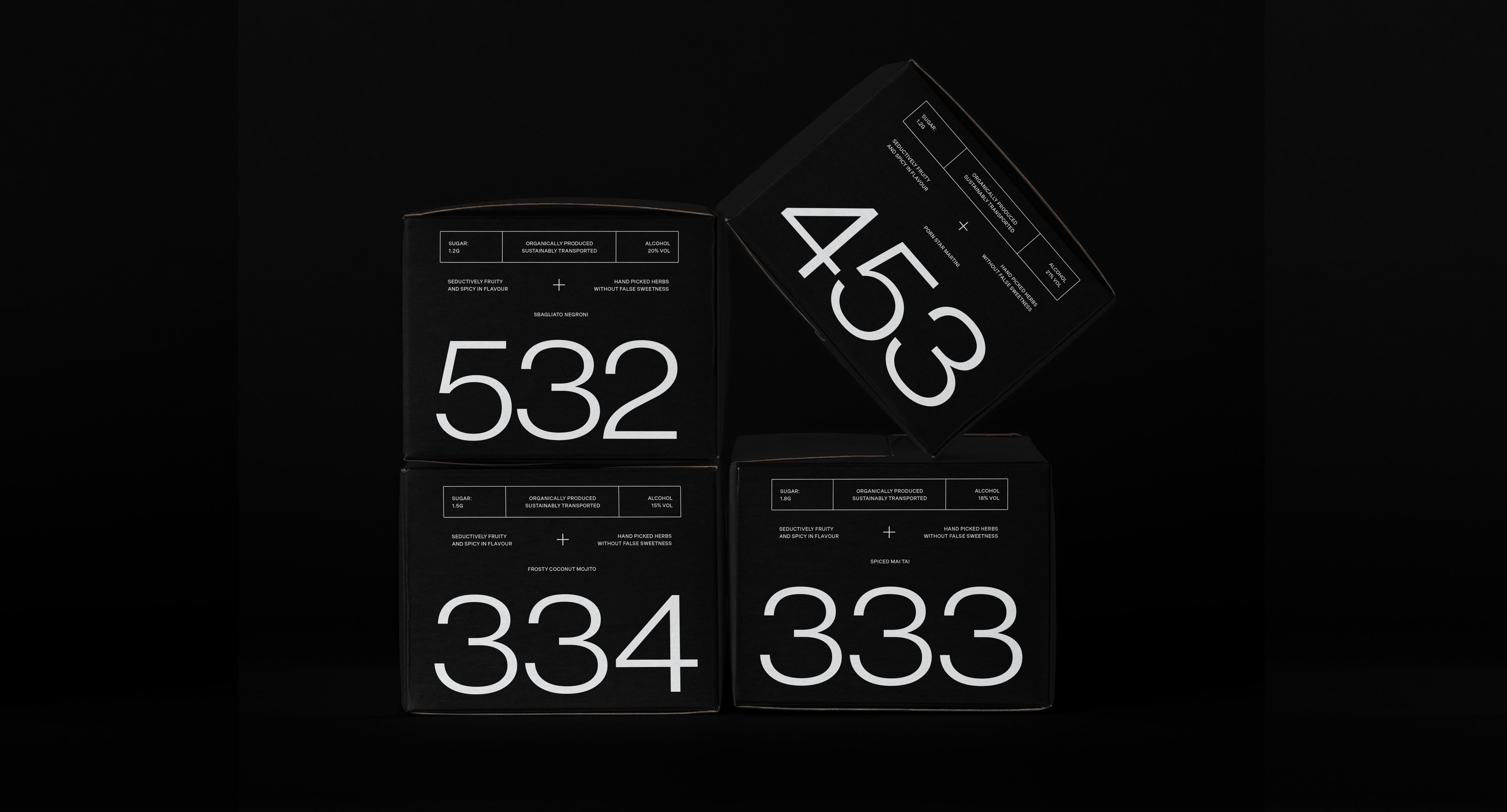
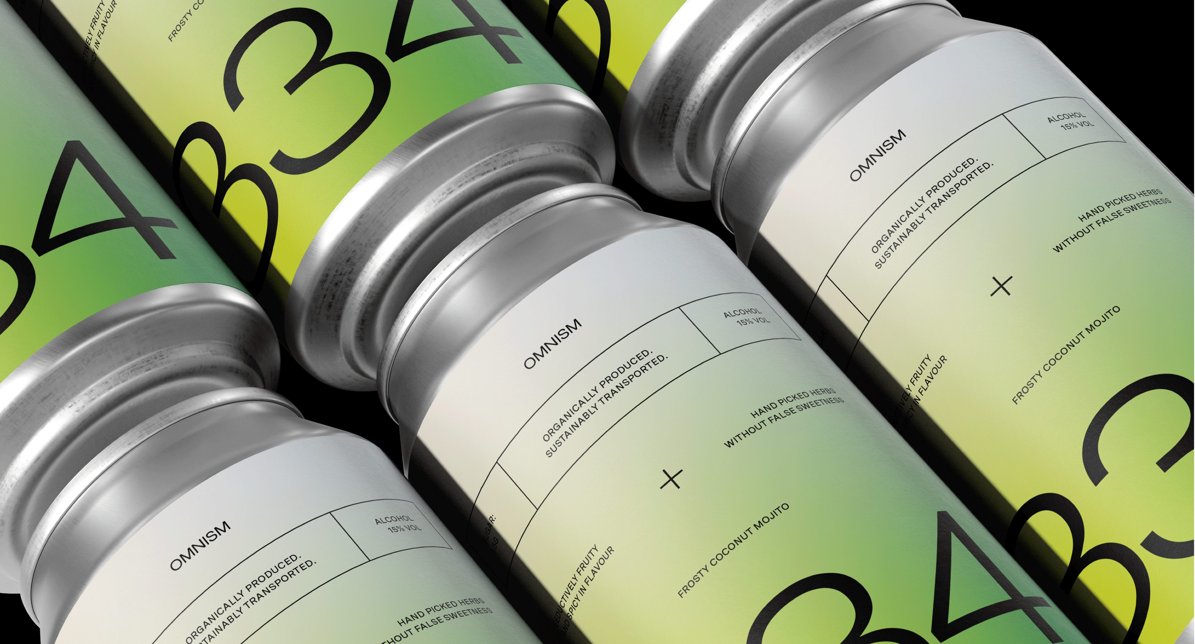
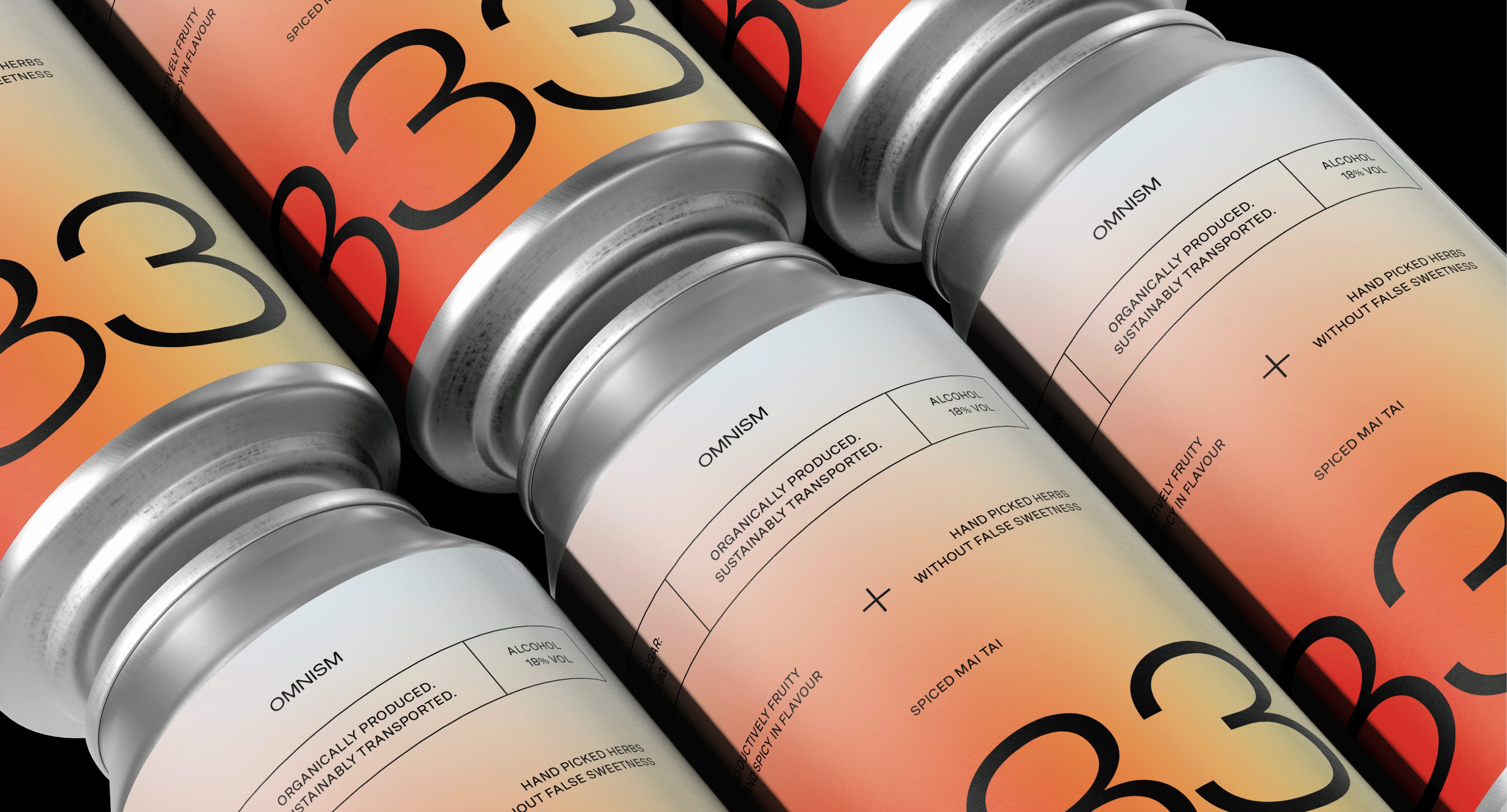
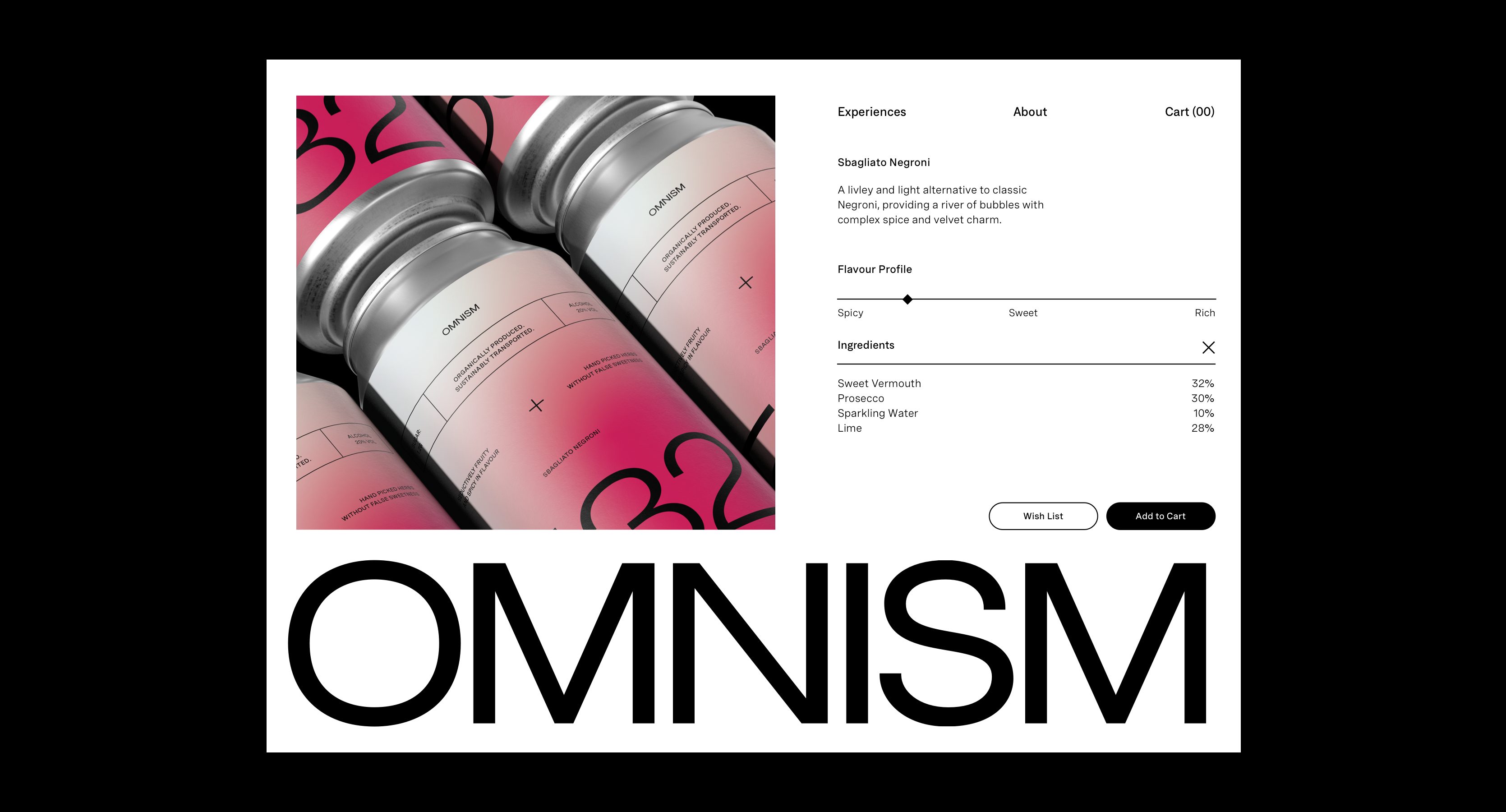
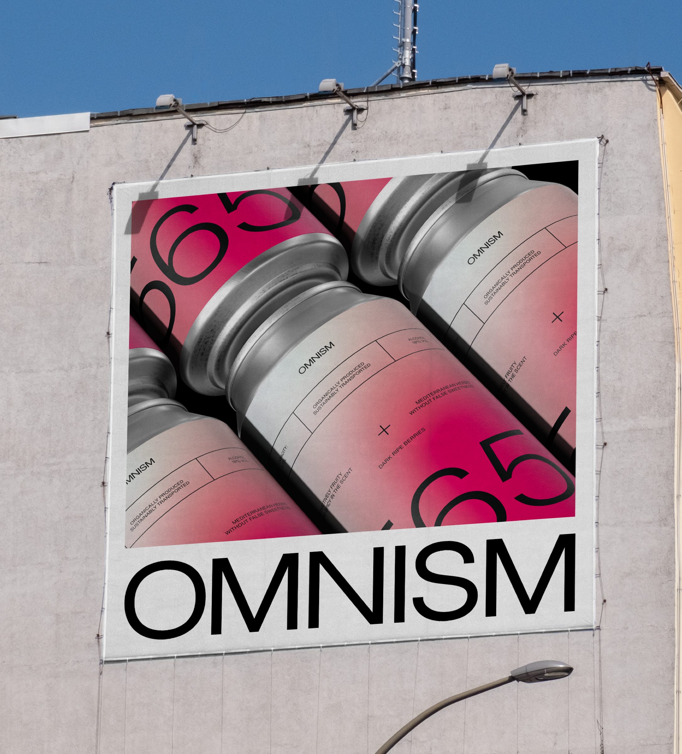
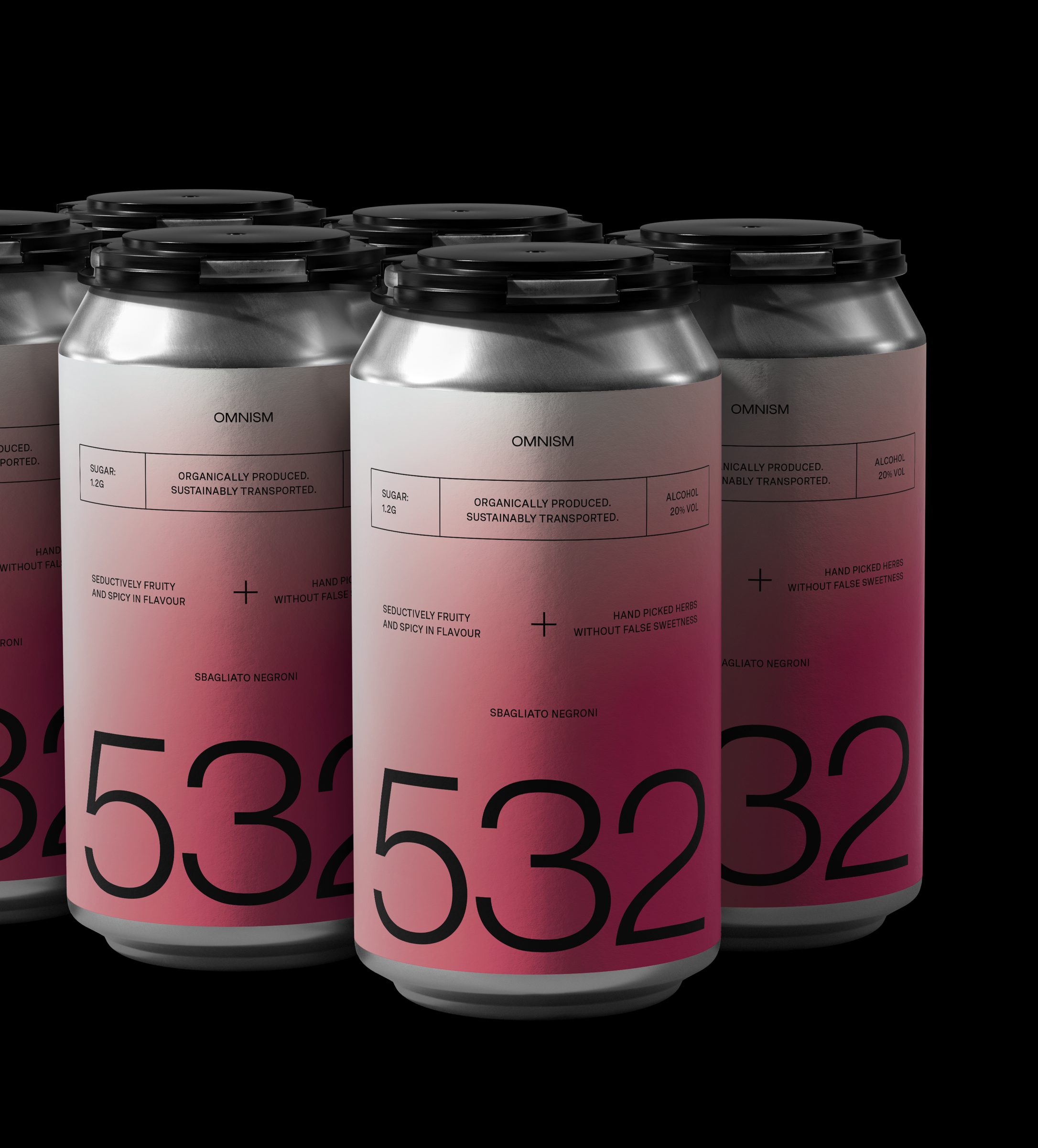
With four different flavour variants within the range, the packaging design is highly focused on communicating the Kilojoules of sugar you save, rather than the Kilojules you consume - resulting in developing an unmissable design system that informs consumers at first glance of the packaging. The use of striking fluid gradients were incorporated as a graphic device to represent various flavours within the range, whilst creating an eye-catching addition to the shelves of boutique alcohol retailers. The bold use of colour and typography is balanced out through the use of black as a primary brand colour, whilst the typography uses scale as a tool to create visual noise that is striking and easy to read from a distance.
Location: Amsterdam, Netherlands.