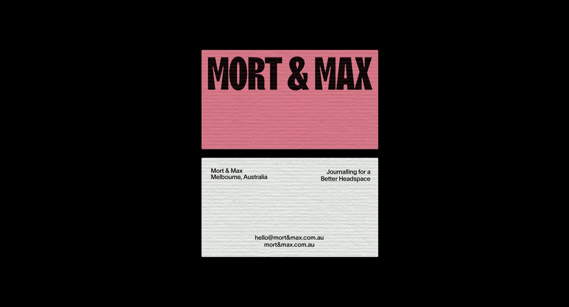
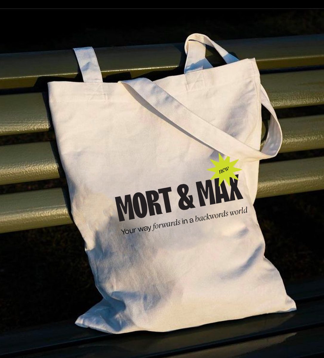
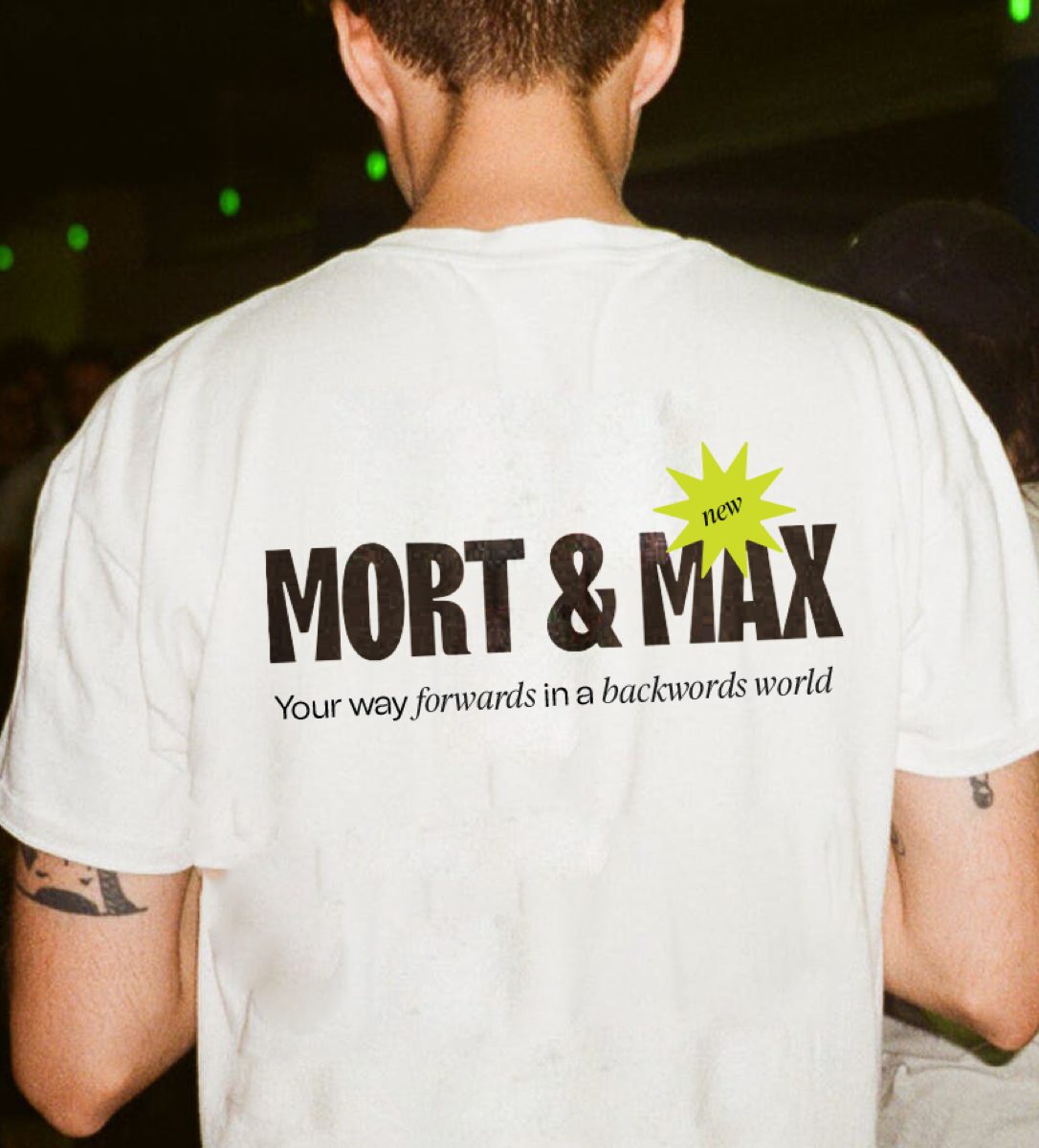
Mort And Max
Brand Identity Design, Packaging Design And Art Direction
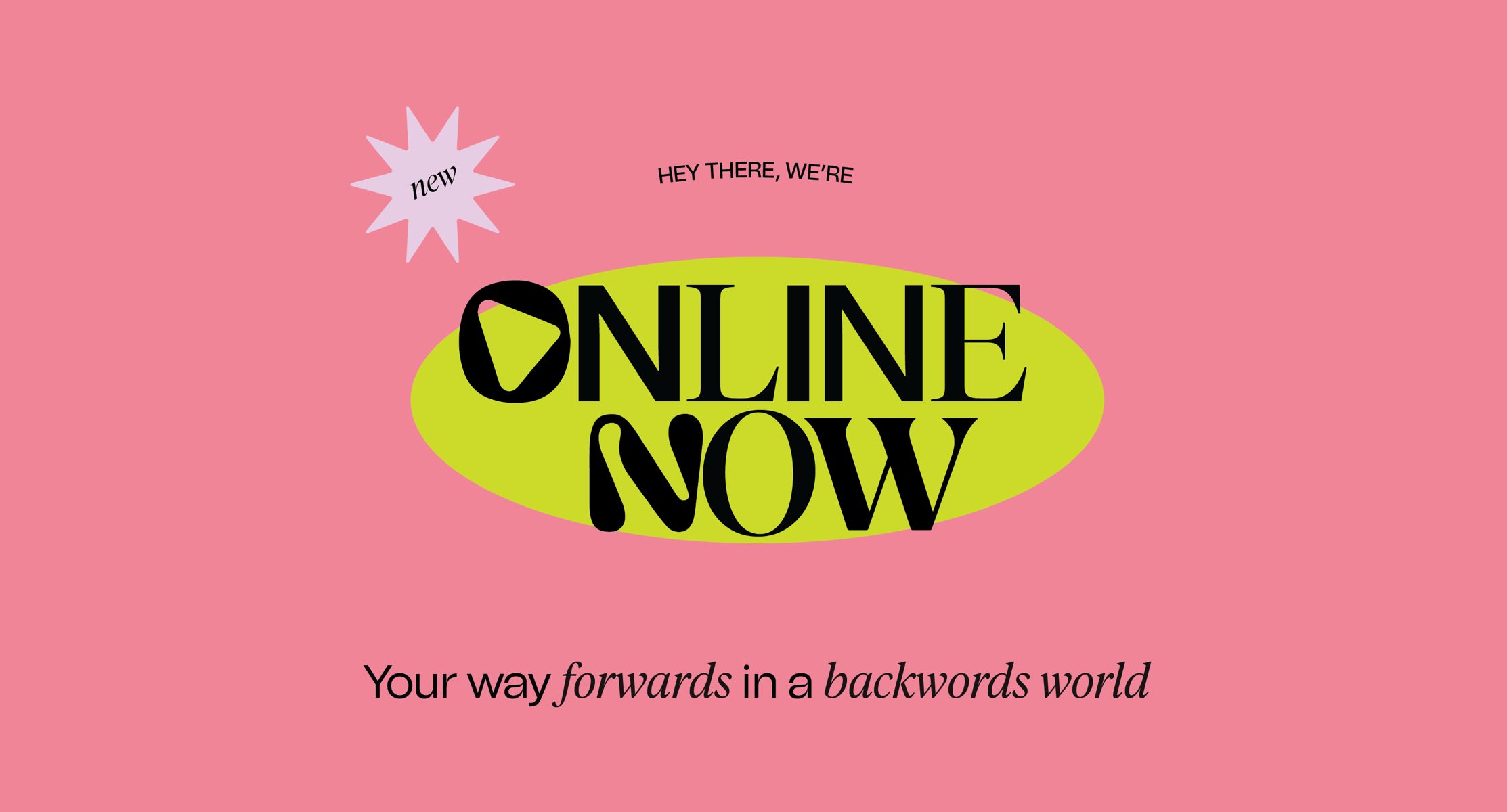
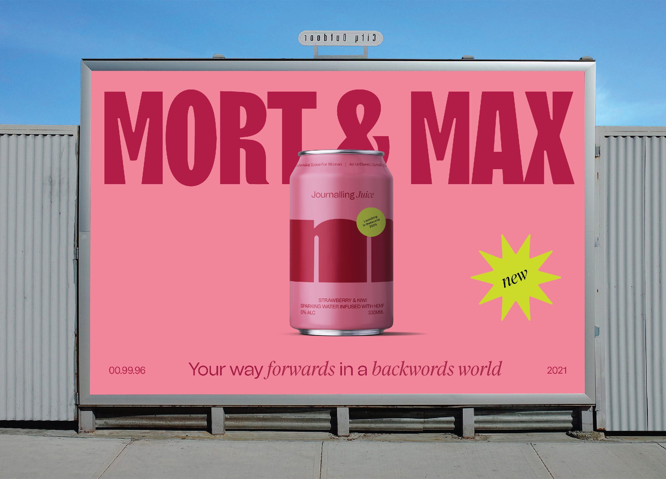
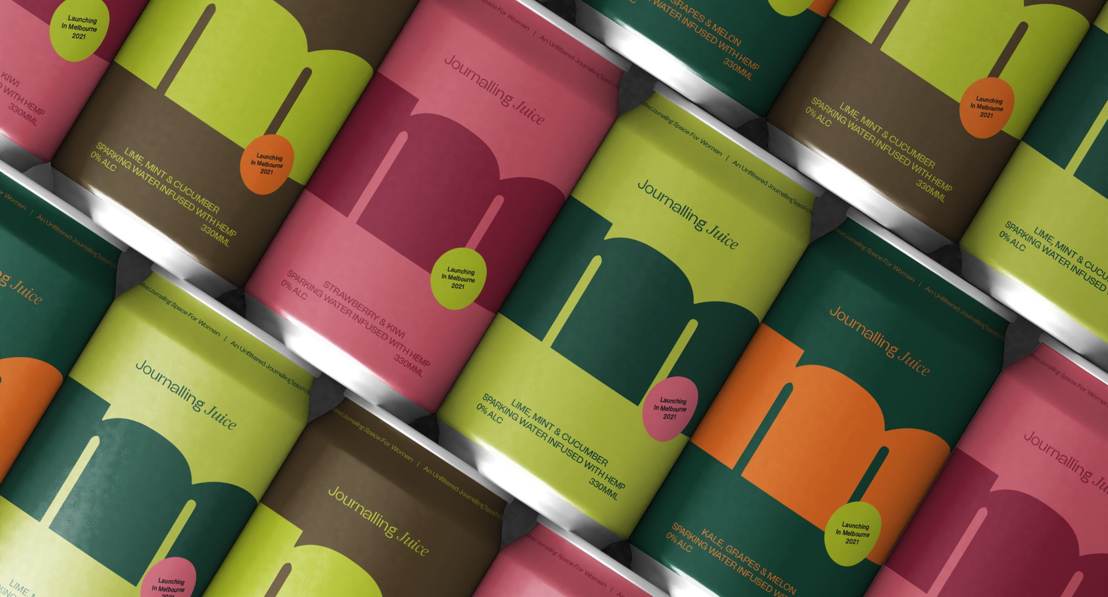
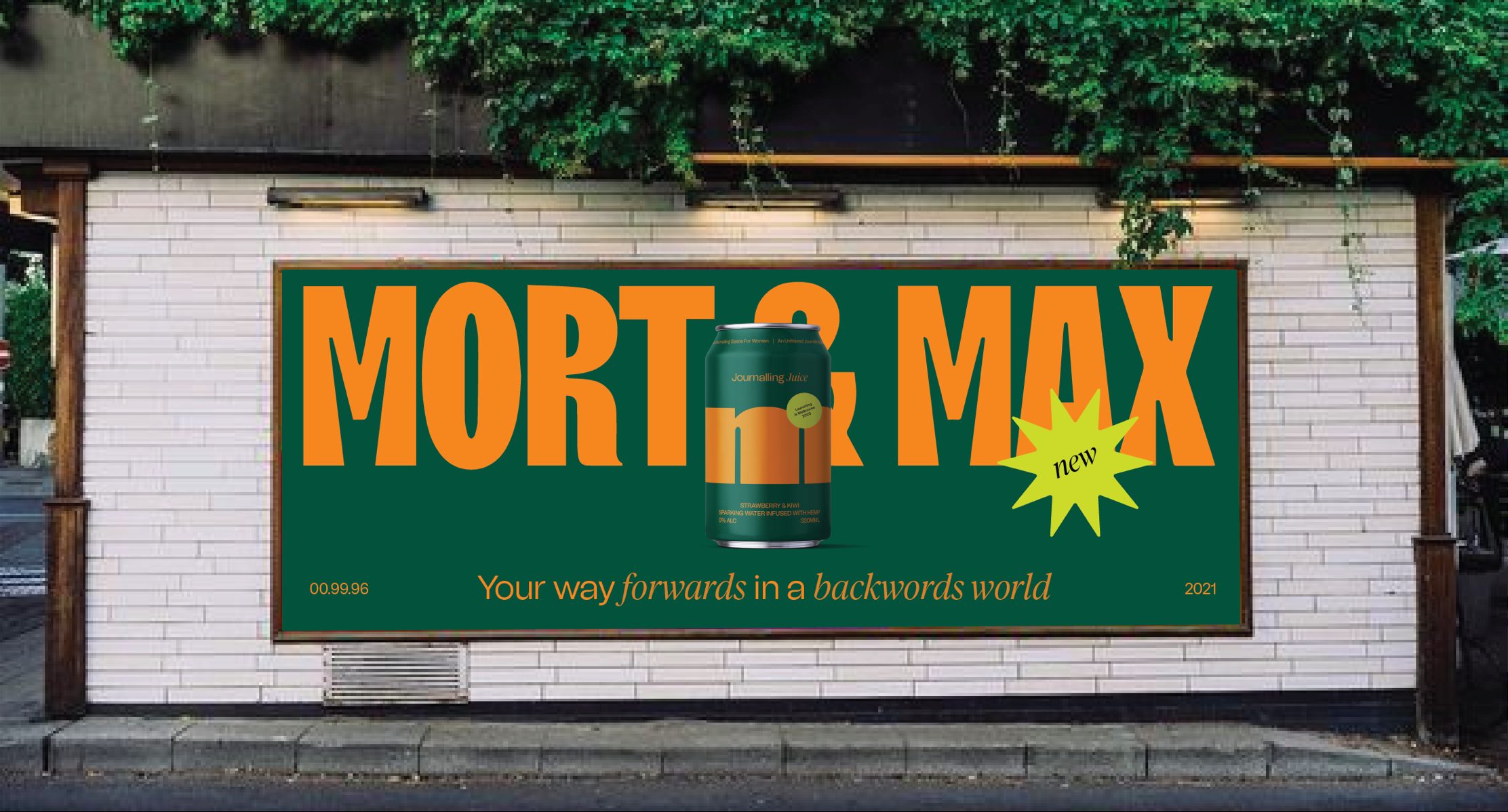
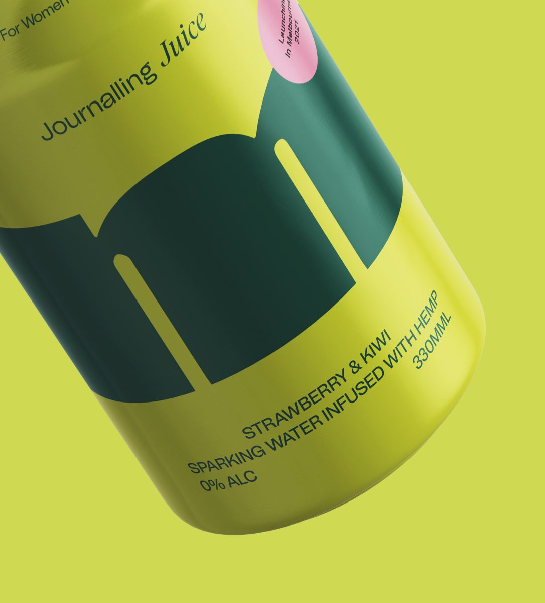
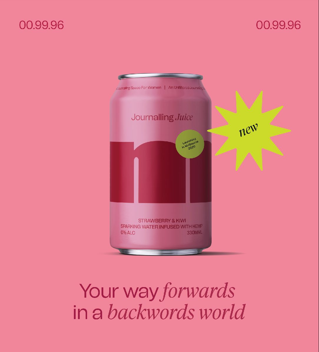
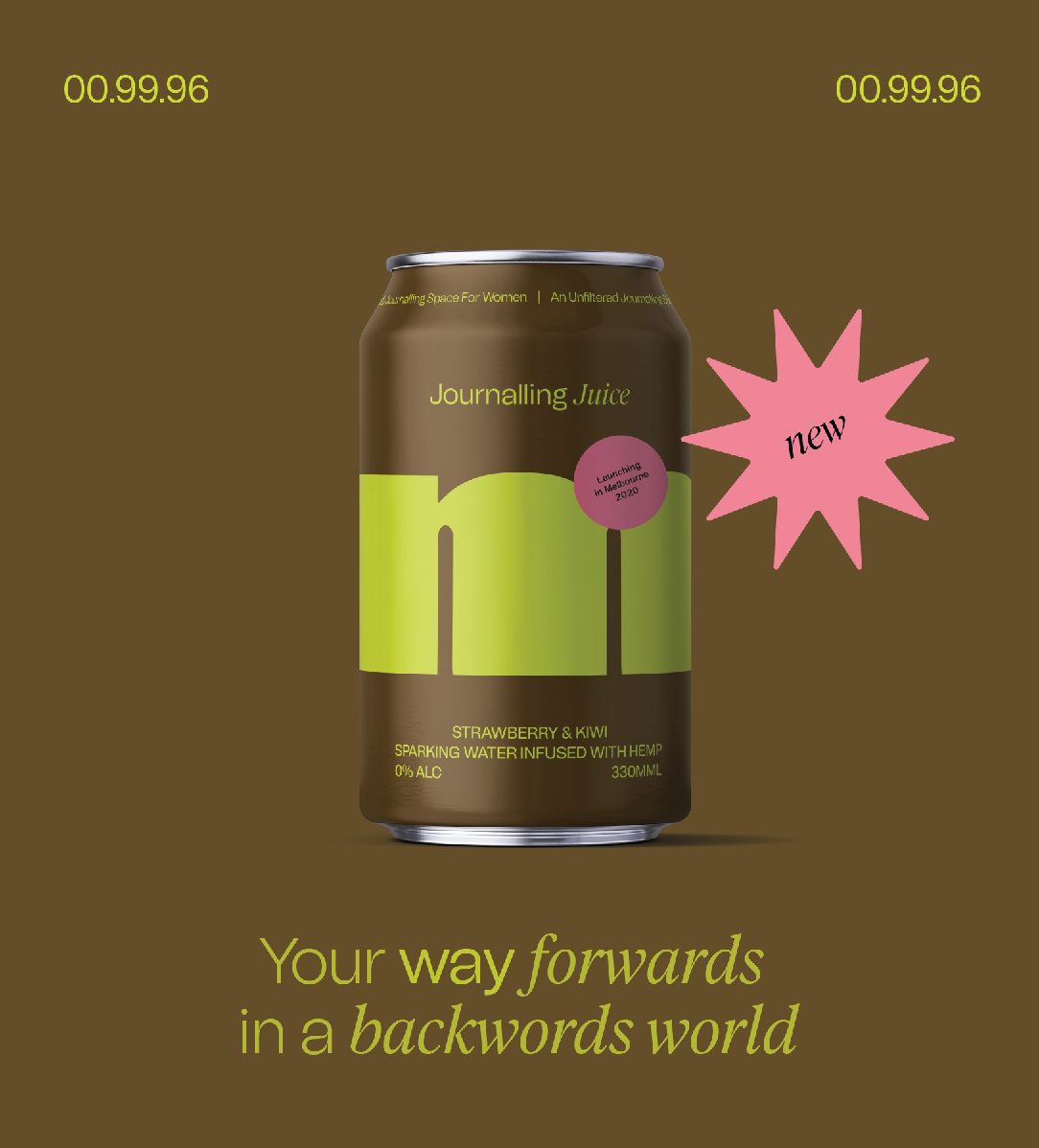
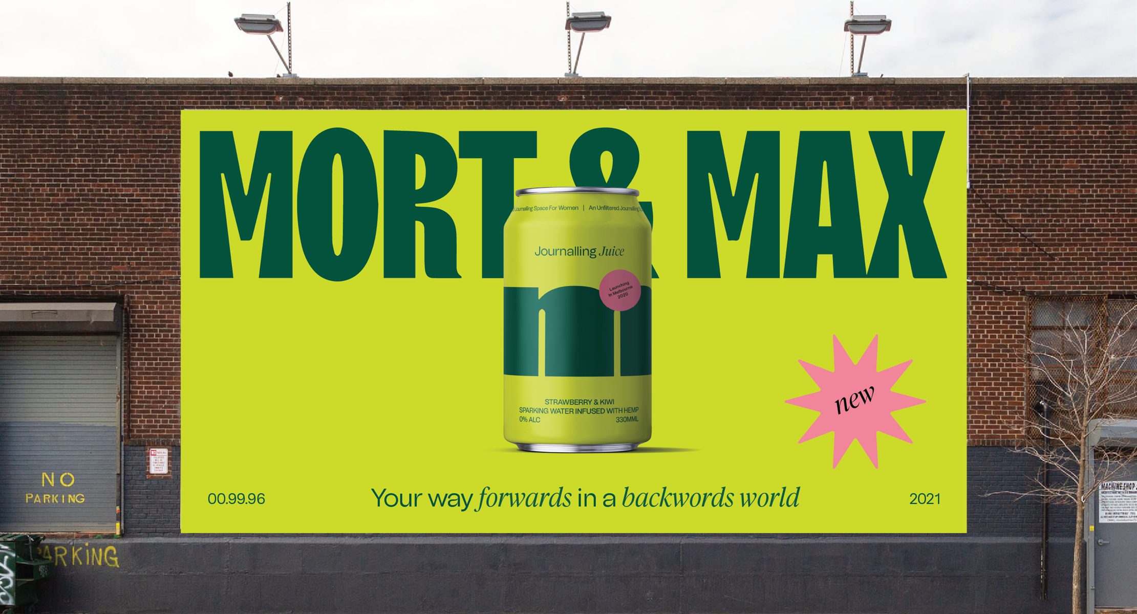
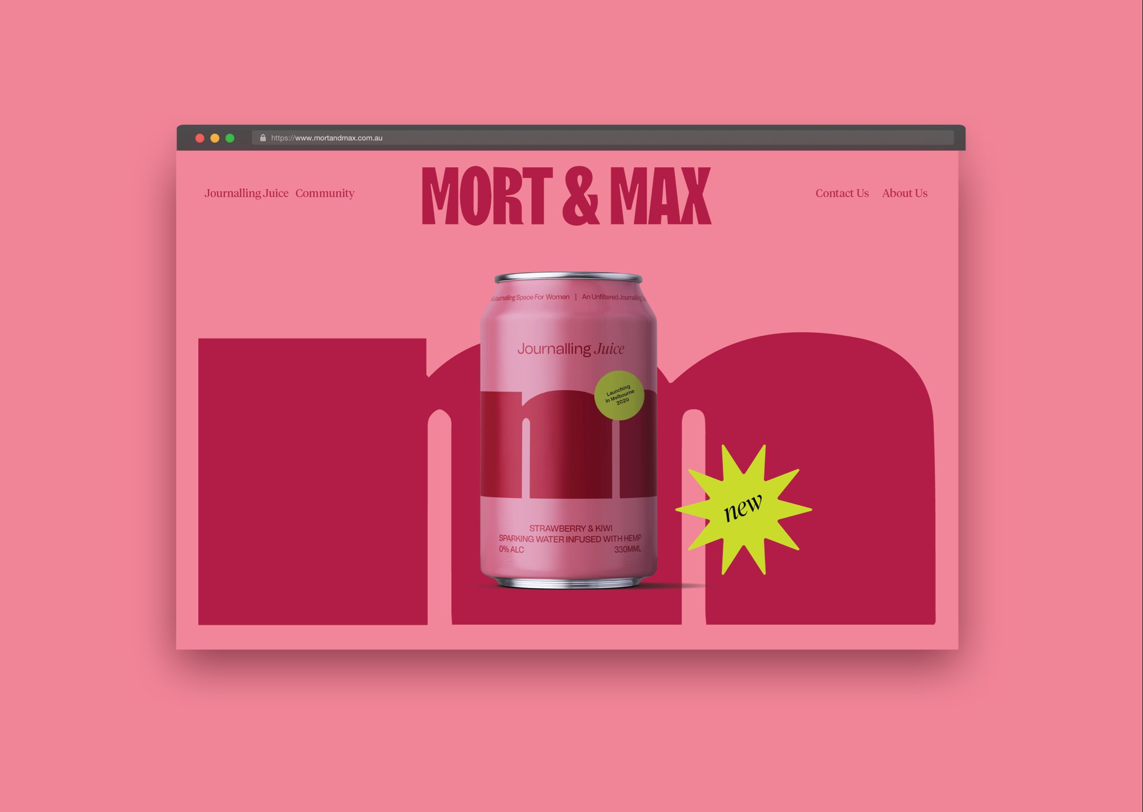
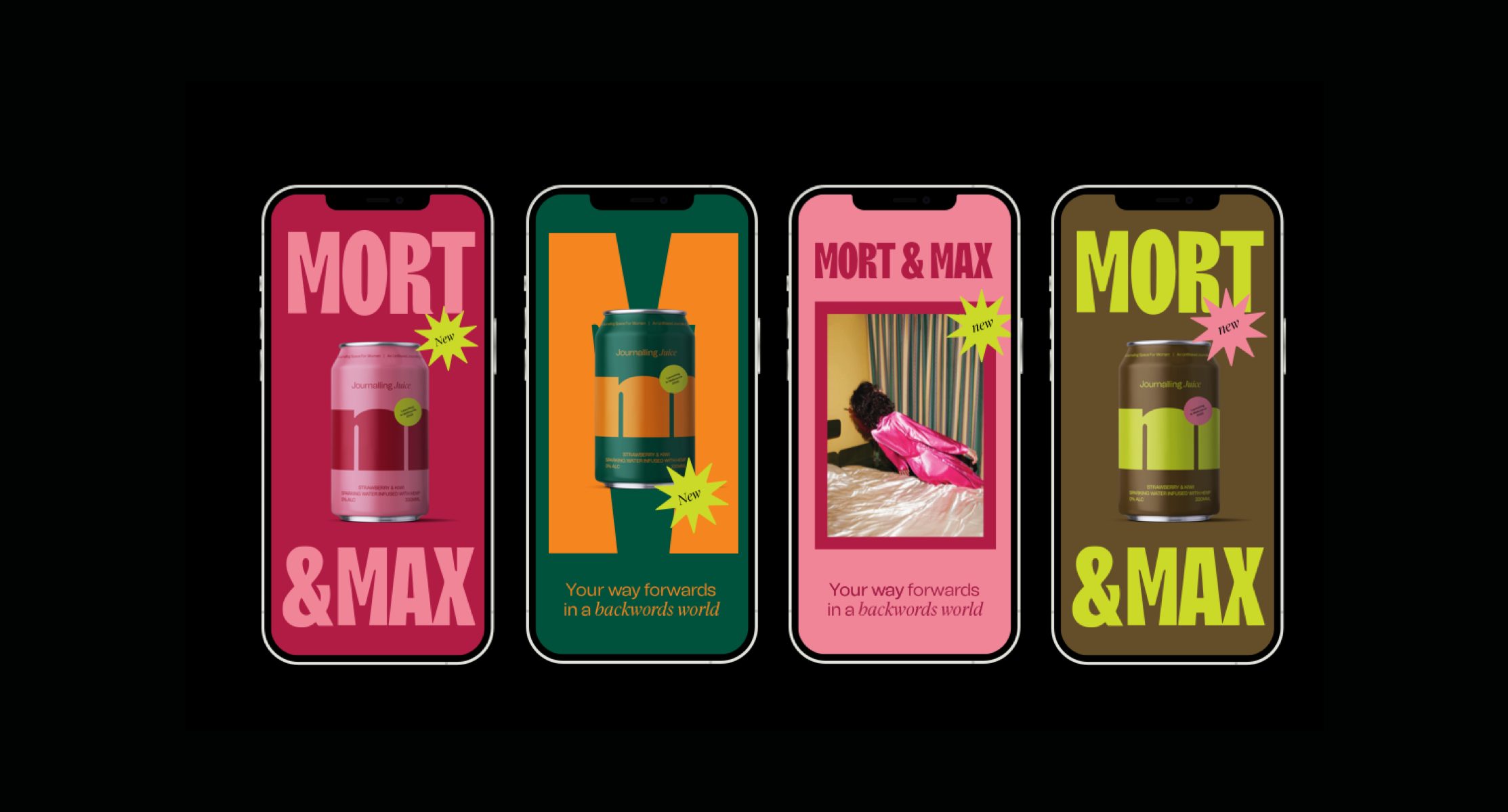
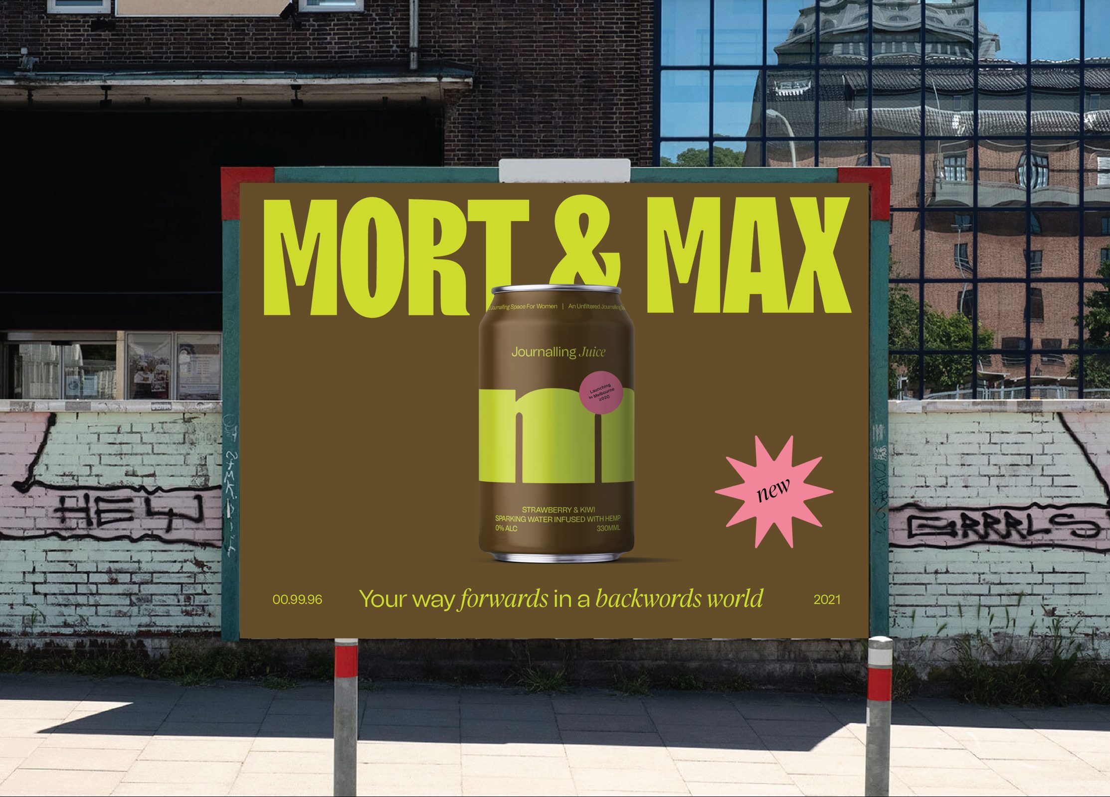
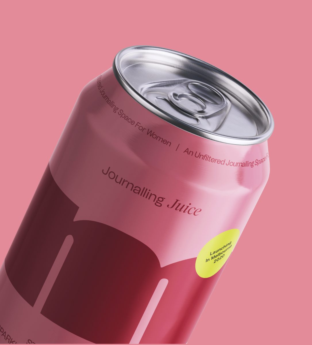
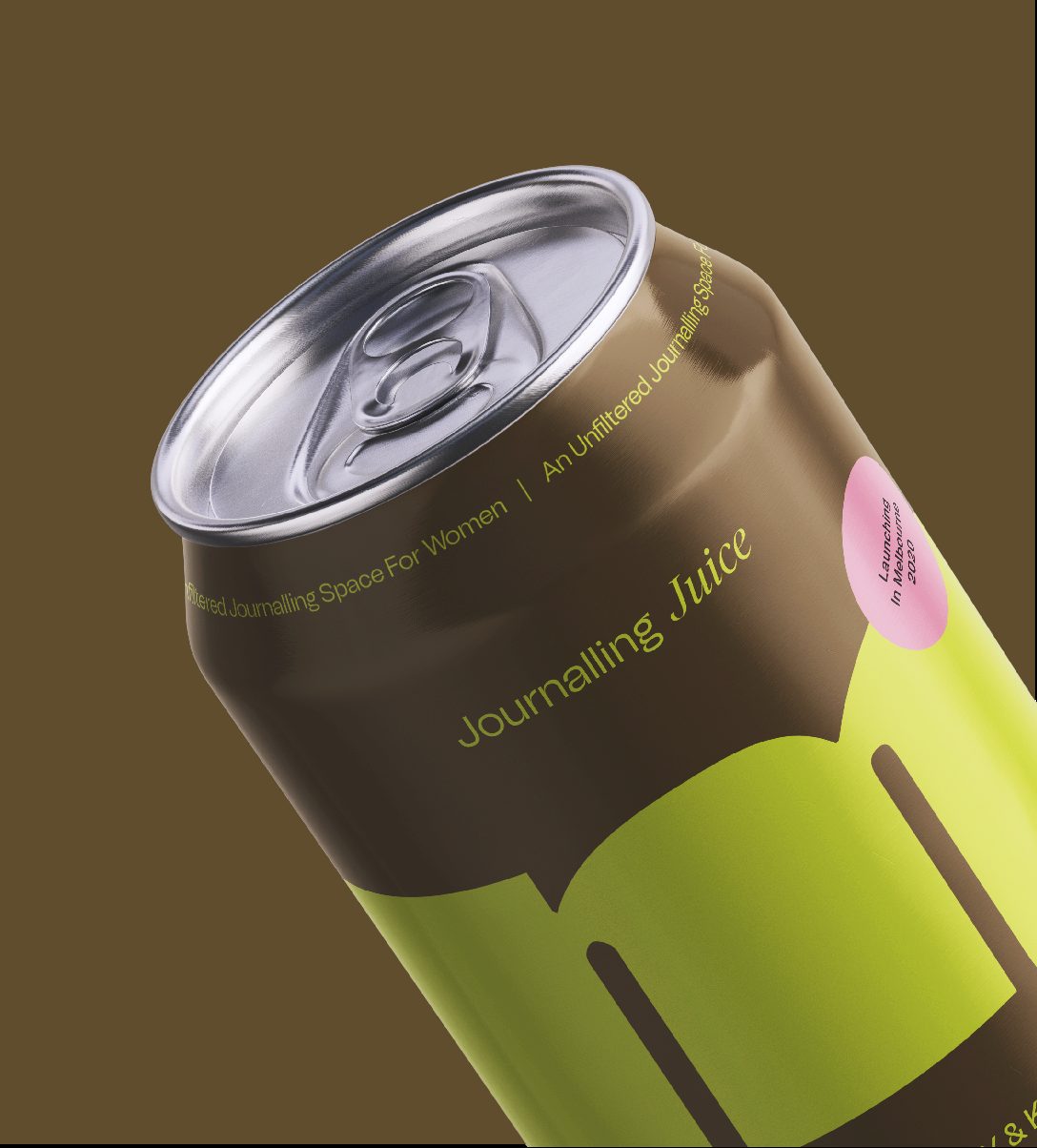
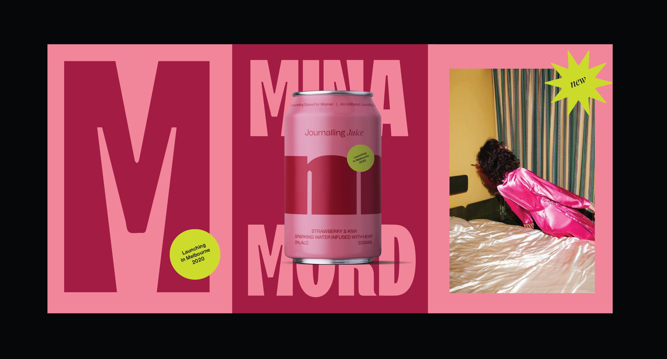
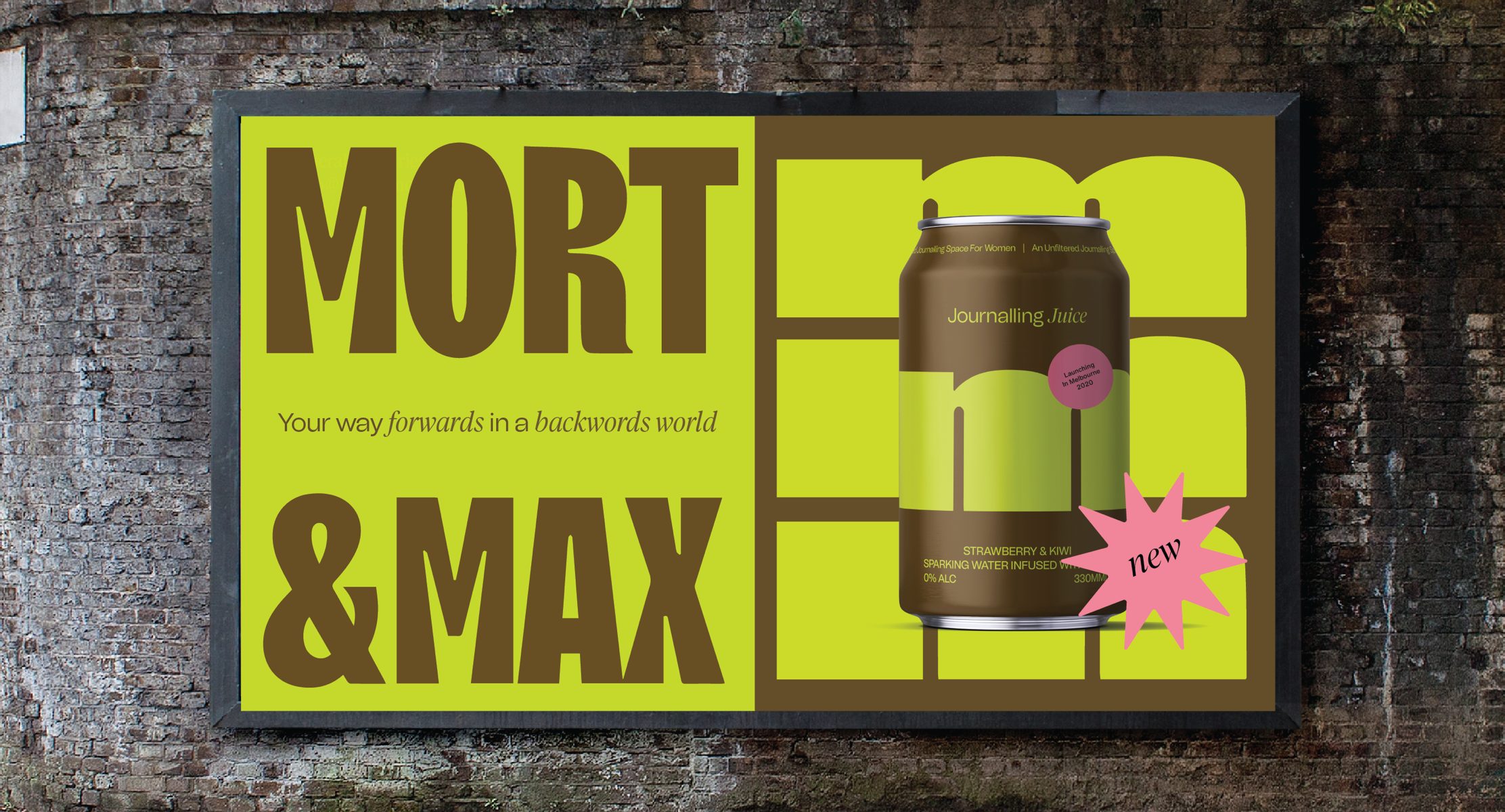
We all have too many tabs open in our browsers and in our brains. In an increasingly overstimulated world overwhelmed with mental noise and constant online bombardment, Mort & Max is a CBD sparkling water beverage created by two brothers targeted at busy creative professionals who are over-stimulated and over-caffeinated. Mort & Max’s mission is to help creatives make space for journalling and pave their way forwards in an increasingly backwards world.
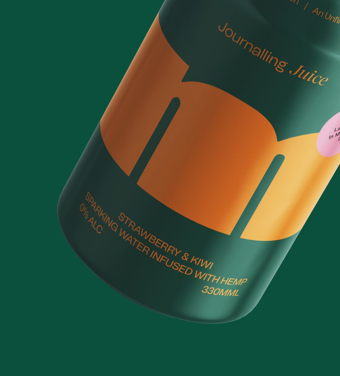
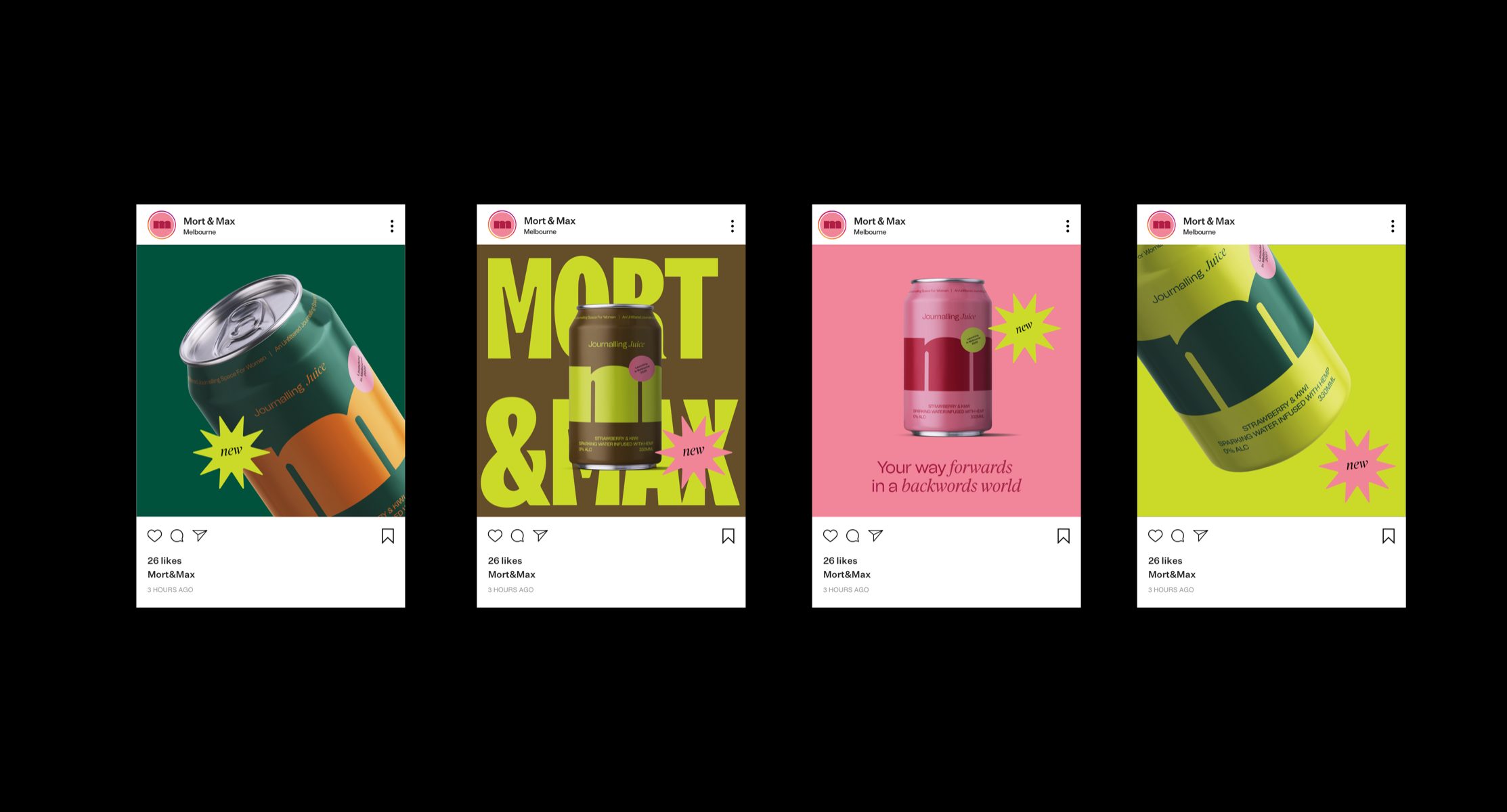
From the brand language through to packaging and campaign design, we needed to create something unapologetic, audacious and forward-thinking to stand out from the increasing number of CBD products in the drink aisle. The brand needed an identity that would speak to people immediately and entice a unique and tailored brand experience through outspoken and unmissable typography and color.
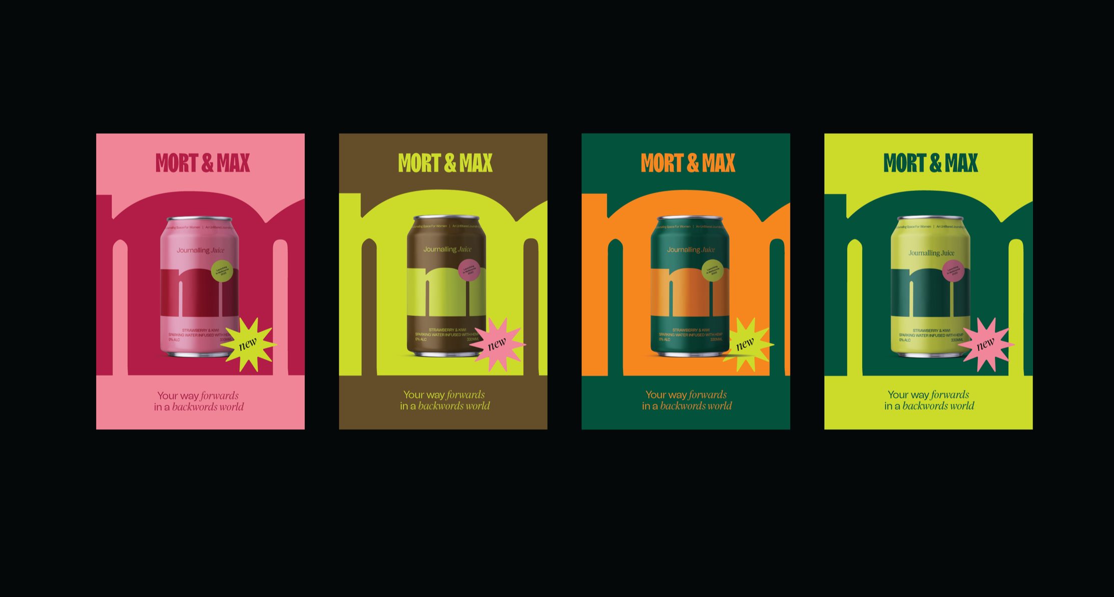
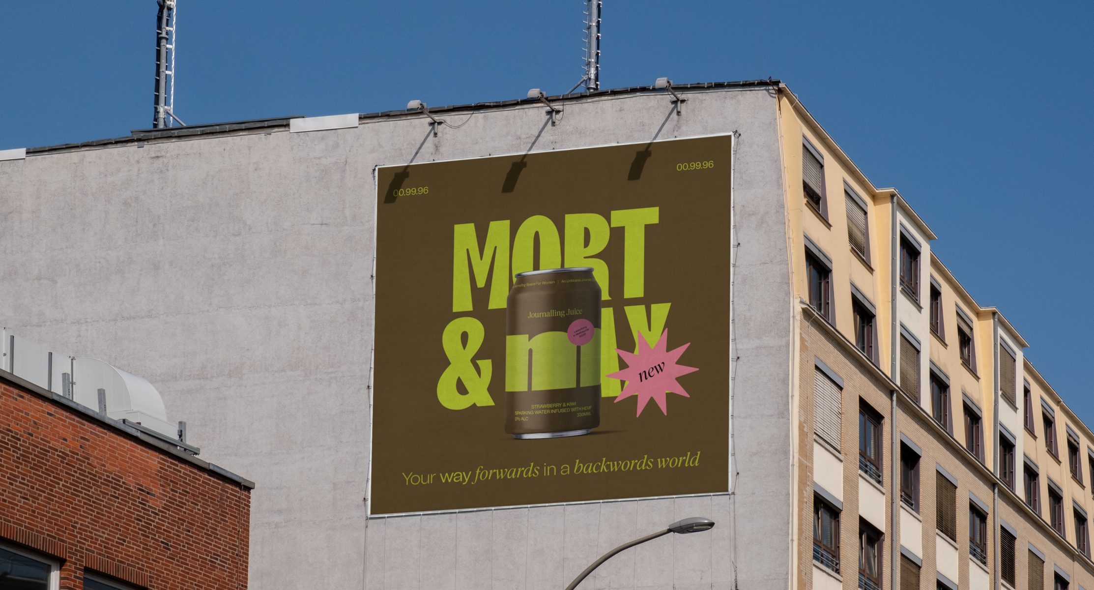
Centering the logo mark as the hero of the brand, the brand identity uses forthright and loud typography combined with a mixture of san serif and serif typefaces for secondary typography, visually communicating motion and a positive shift forward for consumers within their working and personal lives. The brand typography is paired with a bright color palette that boasts confidence, clarity and empowerment to the masses of overwhelmed creatives with the masses of wrong products available to them.
Location: Melbourne, Australia