Ruhi
Brand Identity Design, Packaging Design And Art Direction
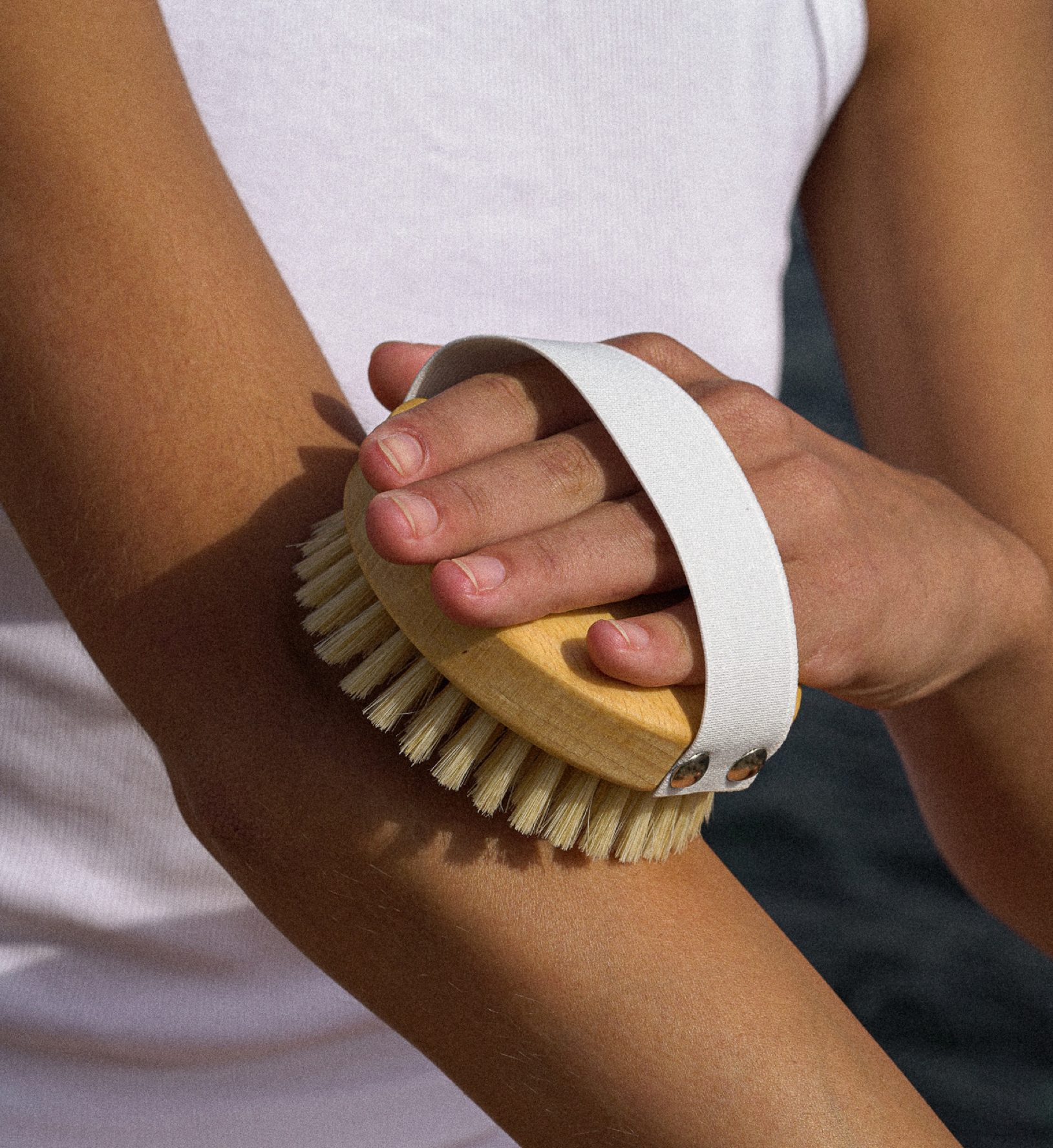
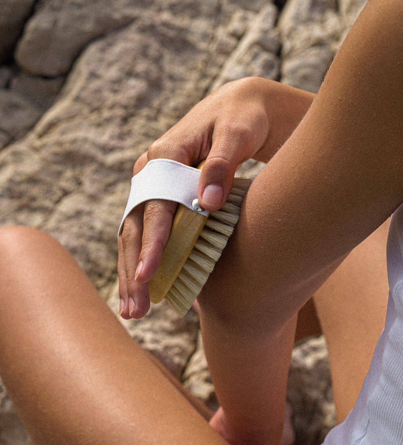
Ruhi is a Berlin-based natural skincare brand with the intrinsic belief that the health of your skin and your mind are deeply connected. Featured in global publications such as Vogue, Harpers Bizarre and Grazia, the foundations of the brand have been inspired by holistic rituals dating back centuries that stimulate your body’s self-healing abilities, increase your well-being and promote the health of your skin. With organic skincare products and sustainably crafted tools made from natural sustainable materials, consumers can create a mindful self-care ritual that restores your soul from body to mind and leaves your skin healthy and glowing.
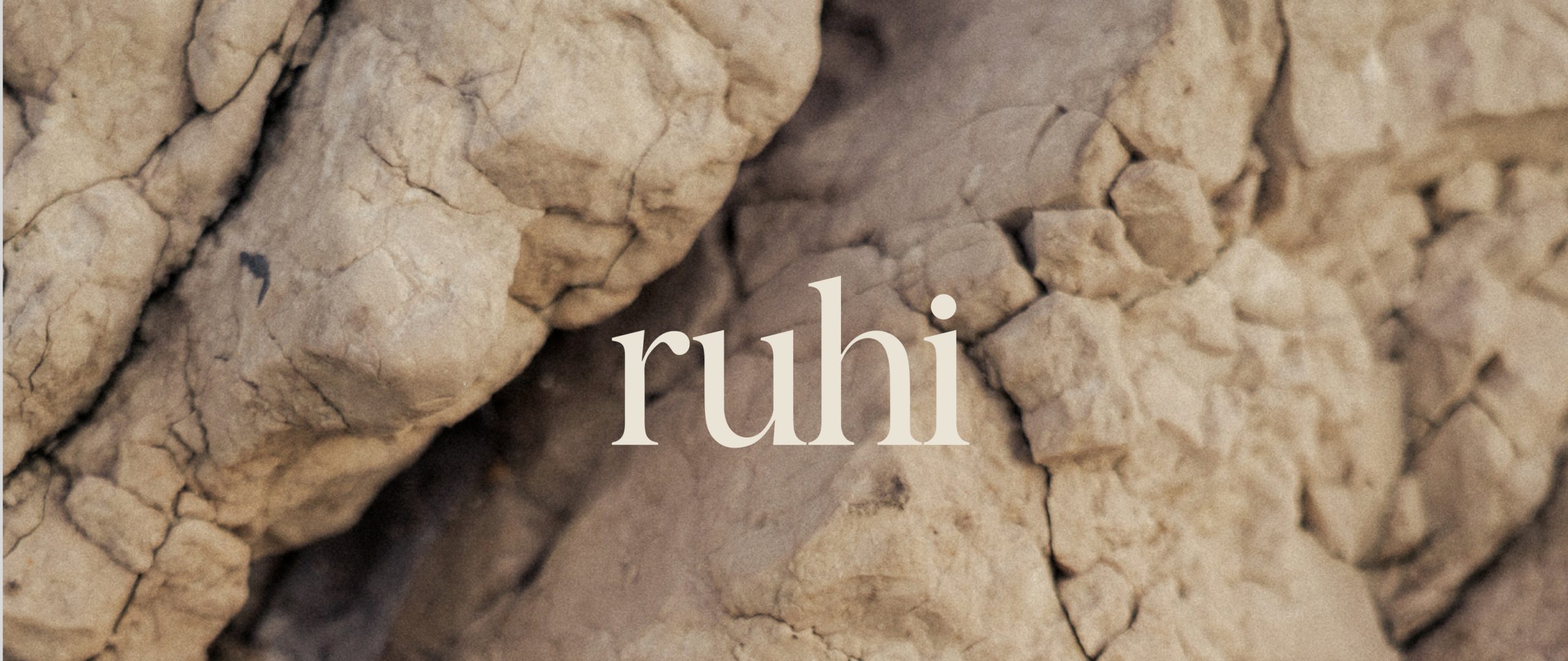
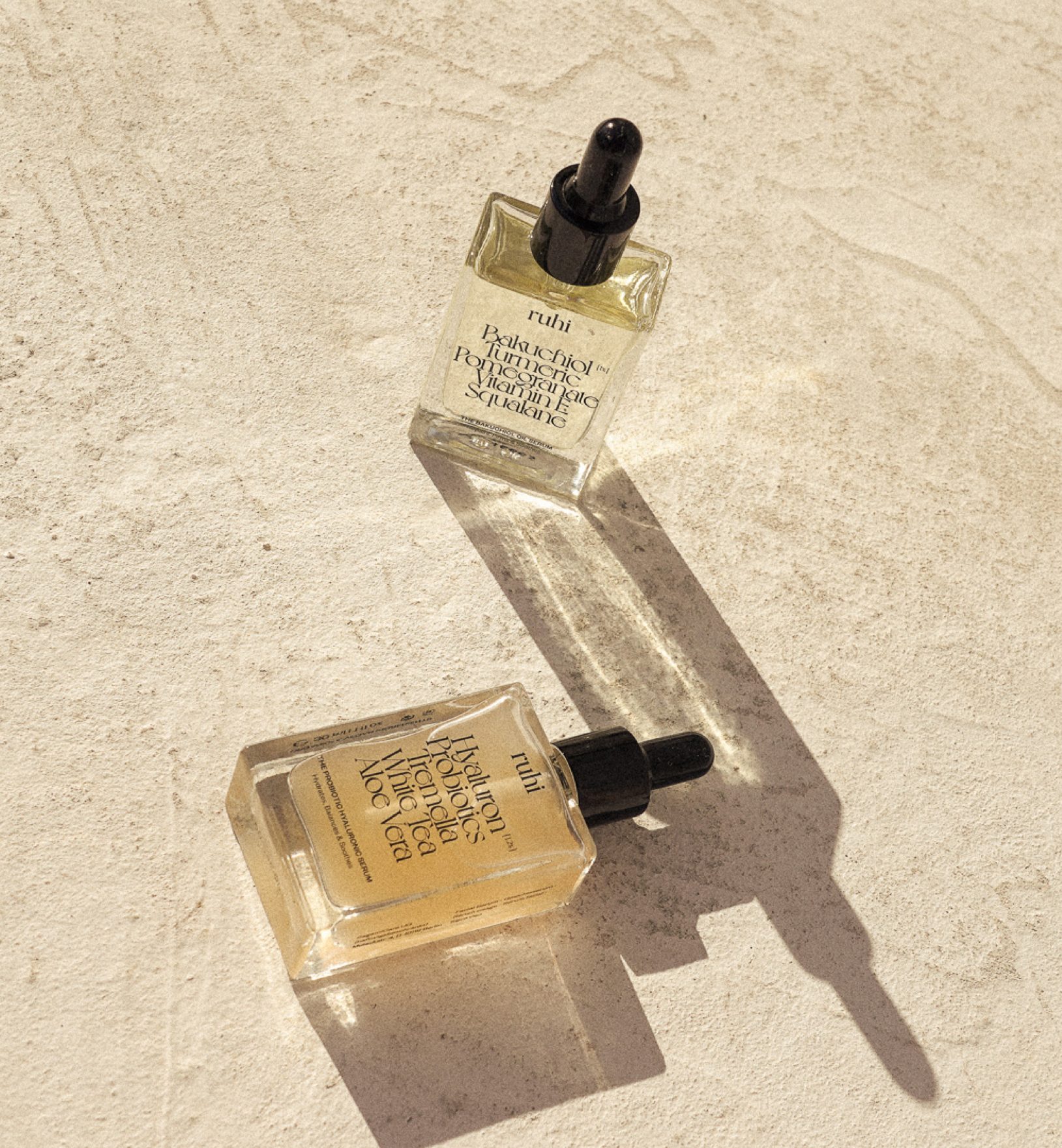
Mature, reliable and classy, the wordmark embodies a mature brand with a wealth of education and reliability to offer it's consumers. Steering away from traditional logos with a literal reference to the natural world, this logo mark concentrates on embodying a brand of ritualistic skincare gurus with a wealth of knowledge. The heavier weight of the letterforms represents a sense of strength and confidence and positions the brand as an innovative ritualistic skincare experience that consumers can rely on and trust. The flow of the shapes within the 'u' and the 'h' creates a smooth motion and movement, communicating a sense of balance, calm and harmony.
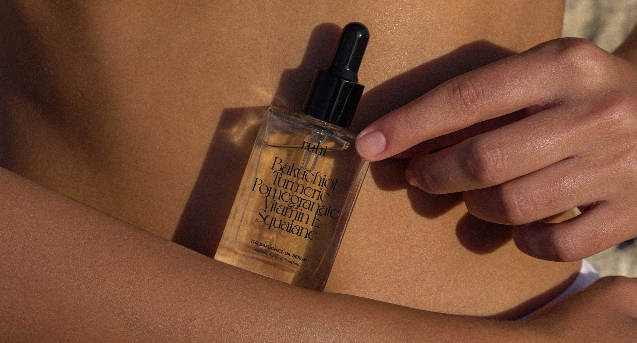
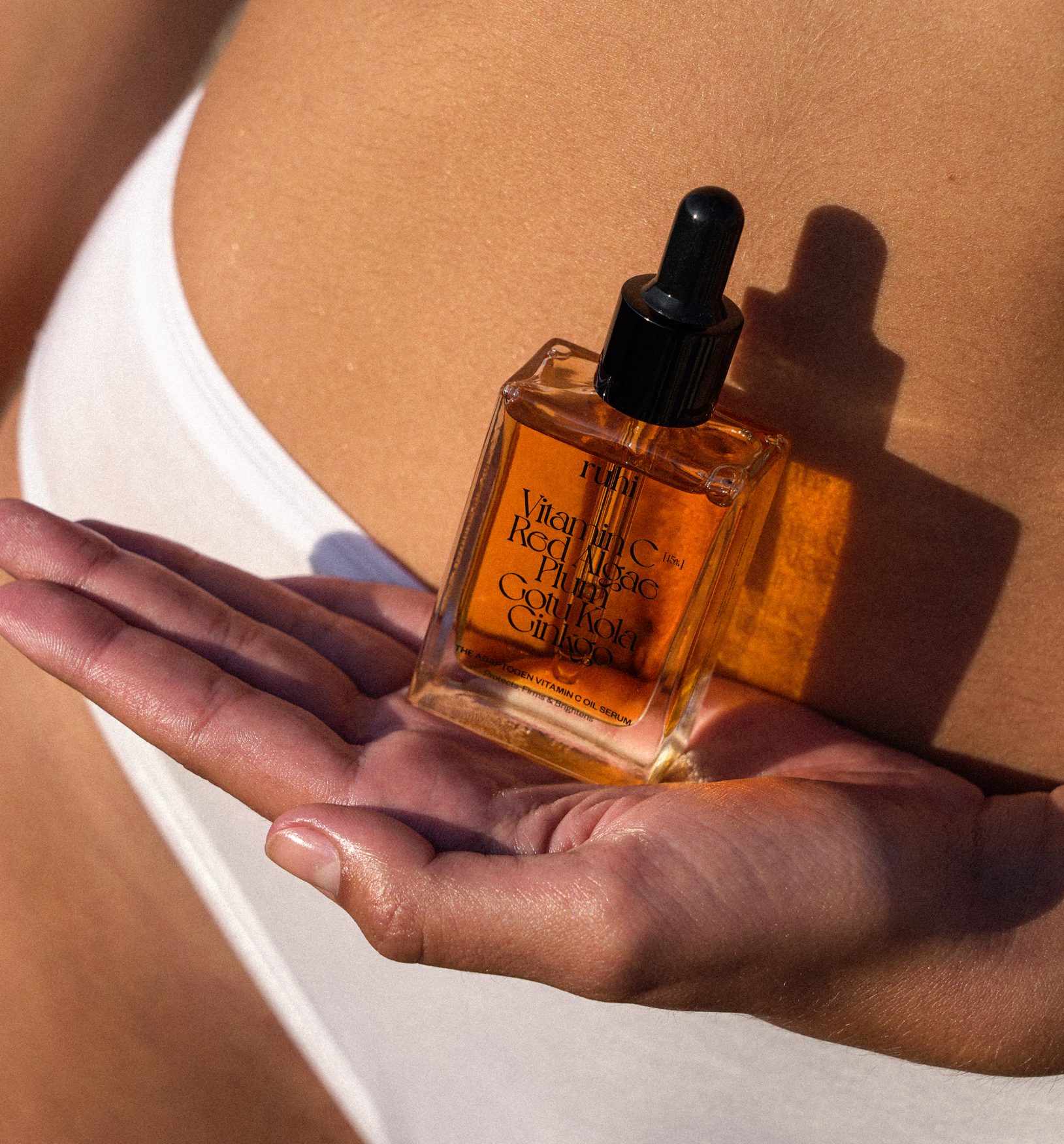
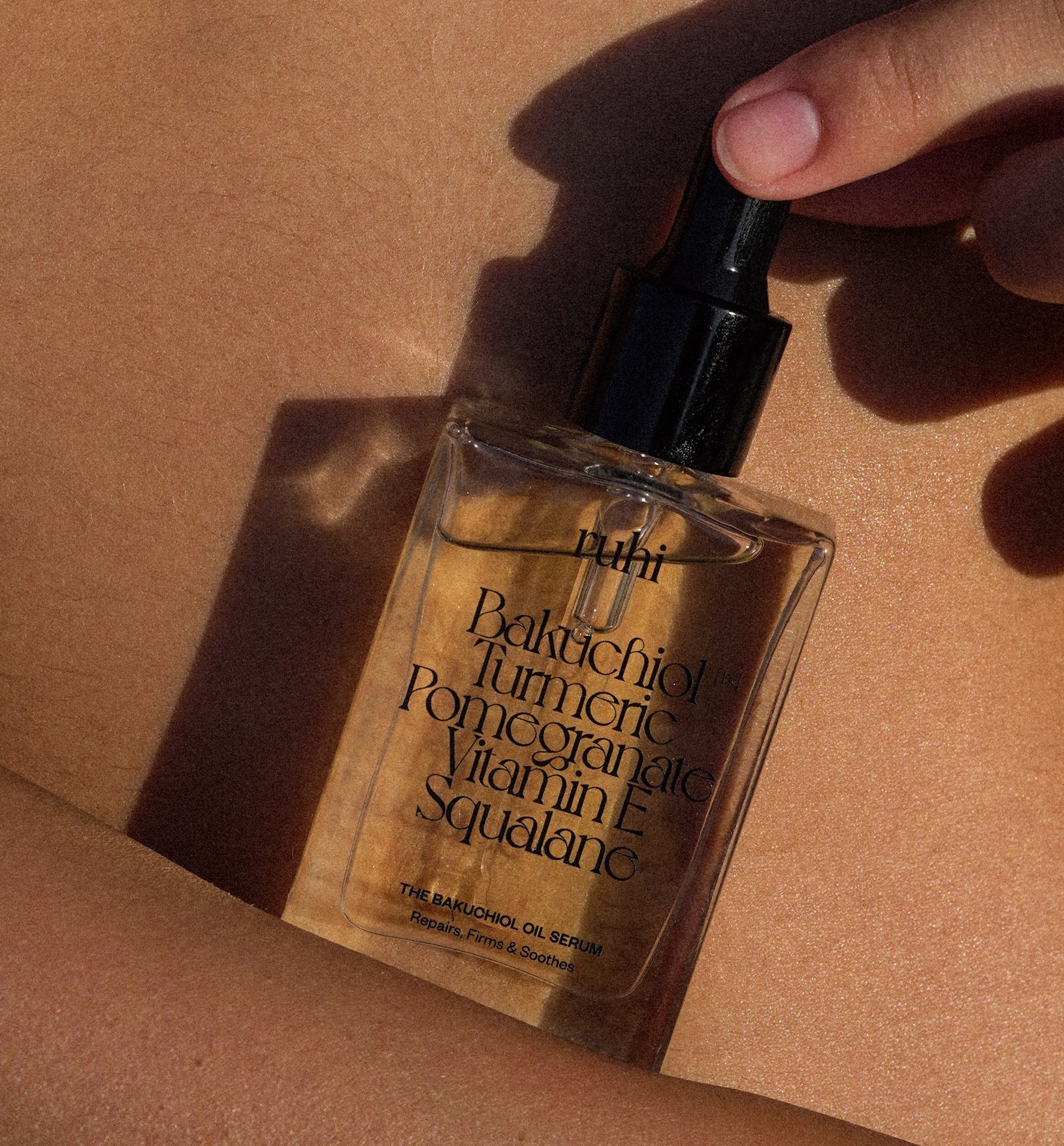
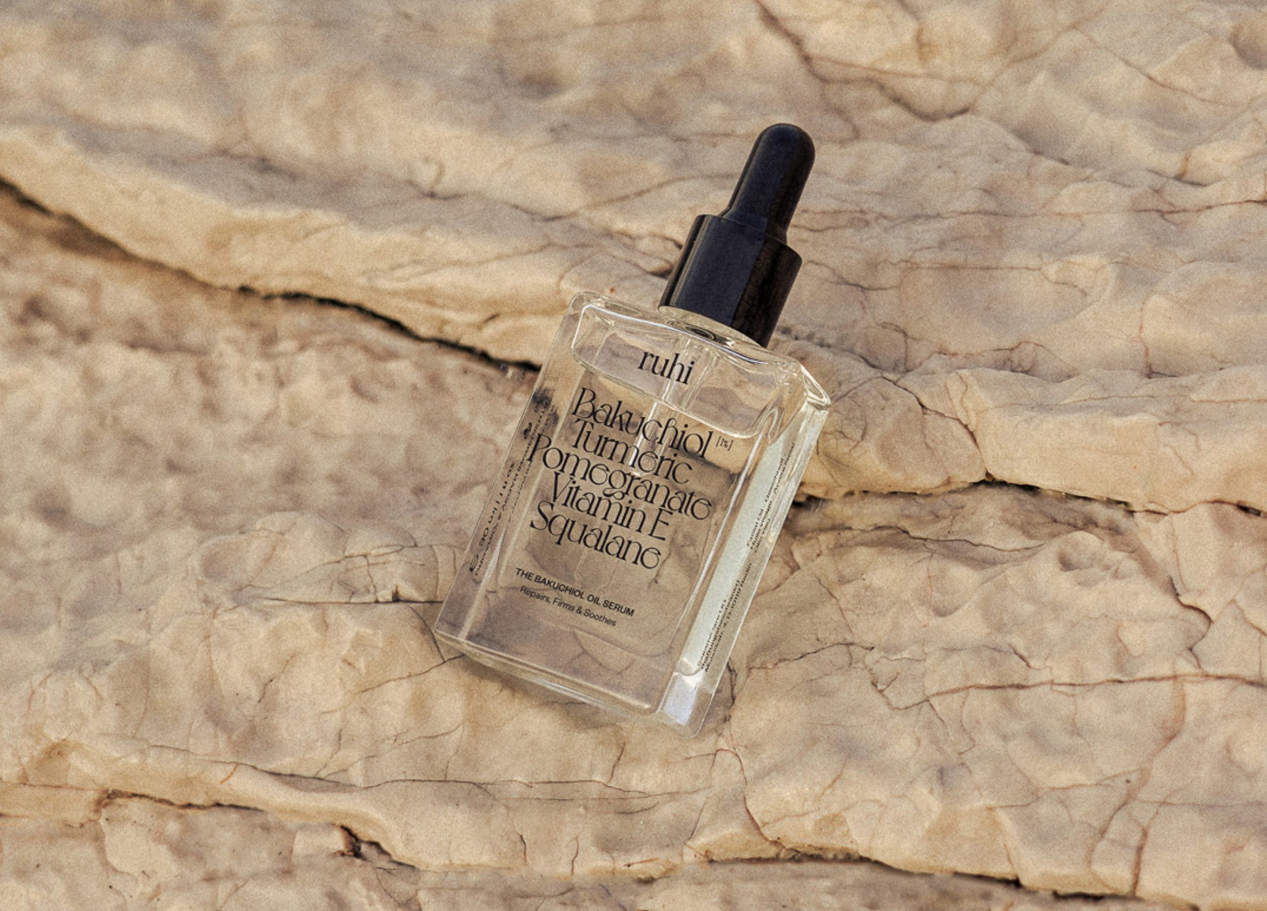
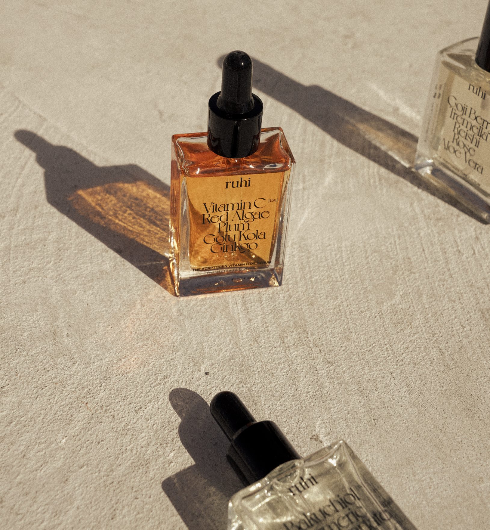
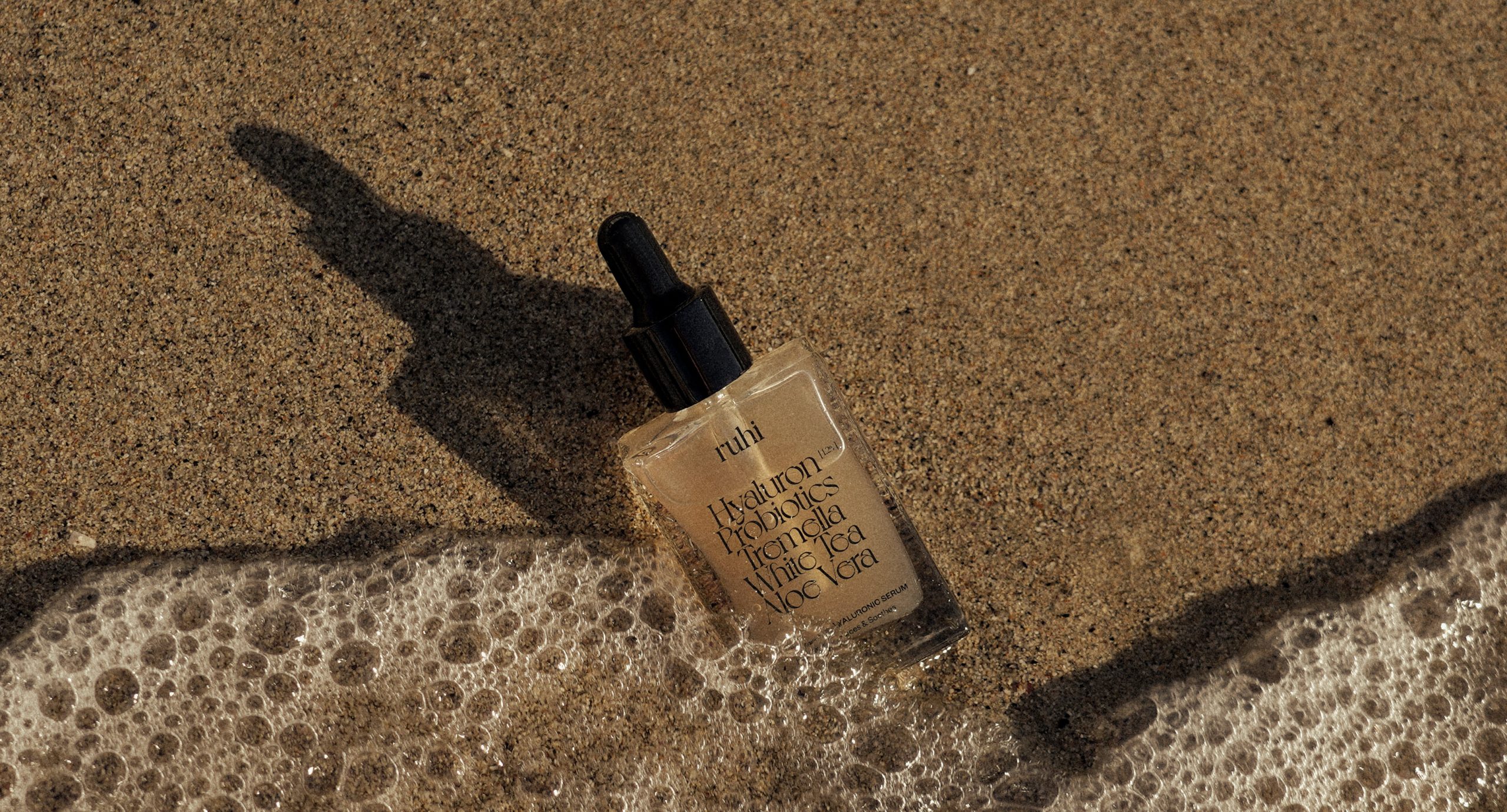
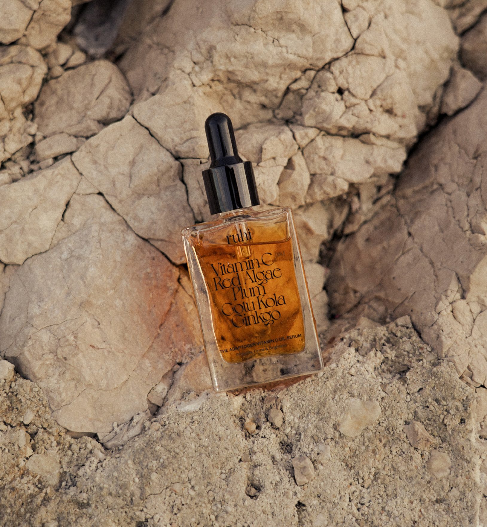
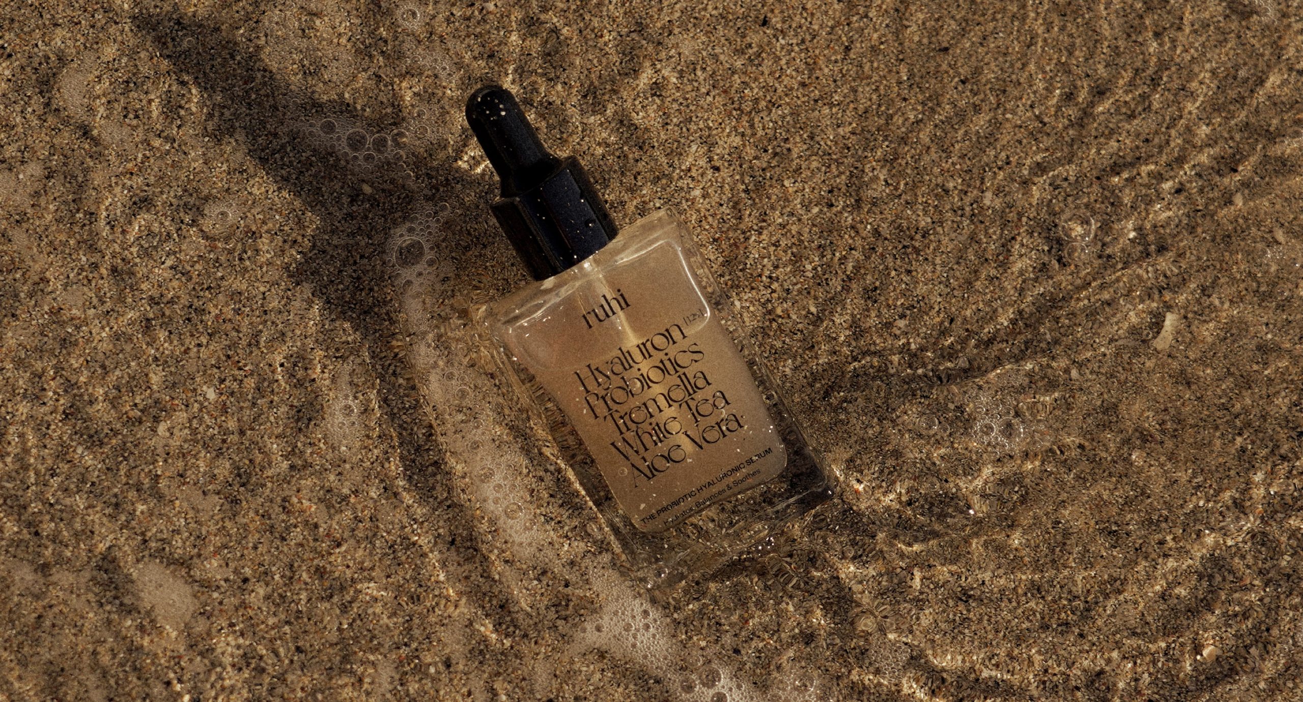
It was a priority for the natural ingredients to be the first thing consumers identified and read on the brands packaging, as the unique formulation of natural ingredients is a crucial aspect in setting this brand apart from the heavily saturated skincare market the brand sits within. A sophisticated yet elevated typeface is used for primary typography across packaging, creating a an elegant and characterful list of ingredients on the front of the glass product bottles and outer packaging - acting as the hero of the packaging design and becoming immediately identifiable to consumers.
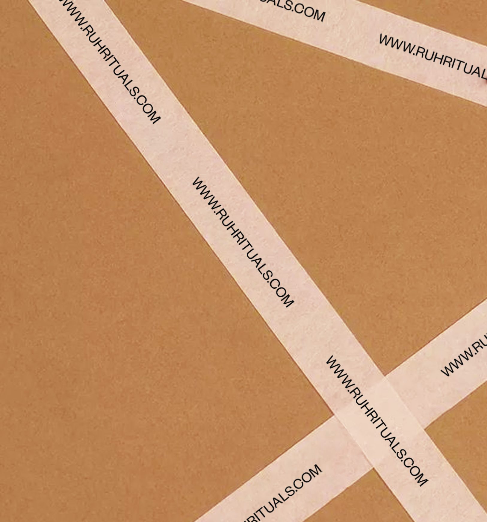
From the brand language through to packaging and campaign design, we strived to create a cohesive feel of calm with a strong connection to the natural world. Our goal was to create a cohesive packaging system that spotlighted the natural ingredients of the product while adopting a new packaging format that was both sustainable and broke the mold of what existed within skincare packaging; Reframing and reclaiming the skincare experience in a way not yet seen before.
Location: Berlin, Germany
Photography: xoberlin.de
Art Directors: Carla Palette & xoberlin.de