Soil Skincare
Brand Identity Design, Packaging Design and Art Direction
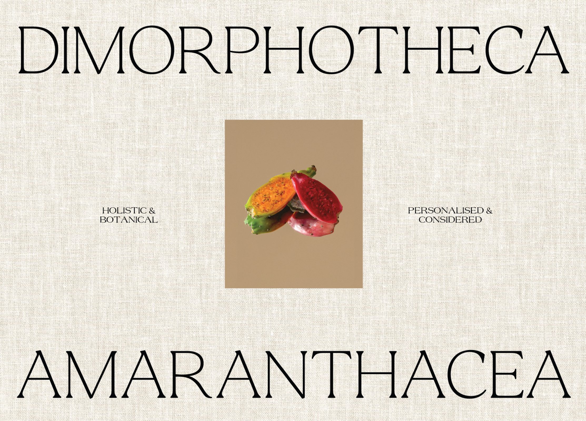
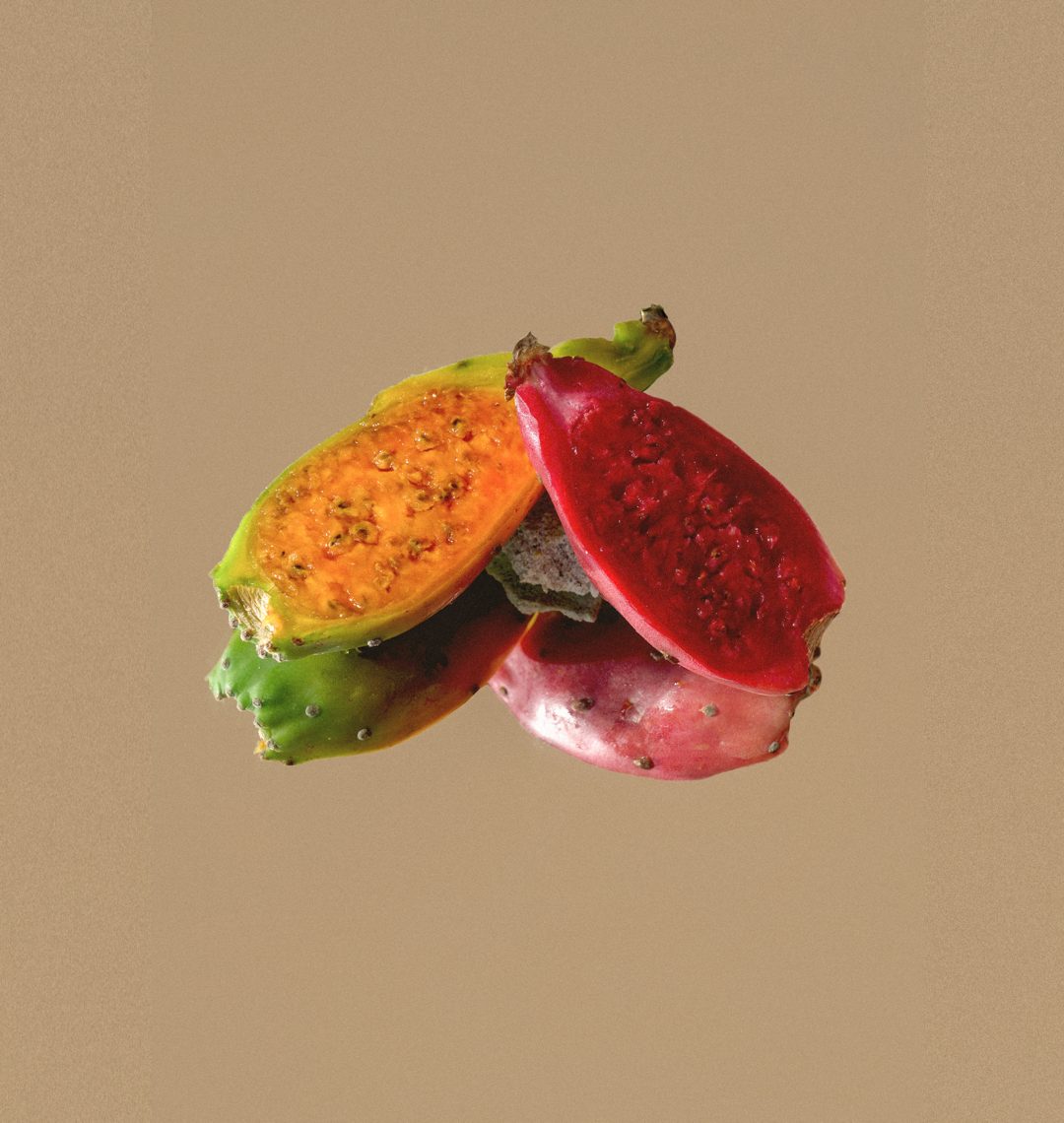
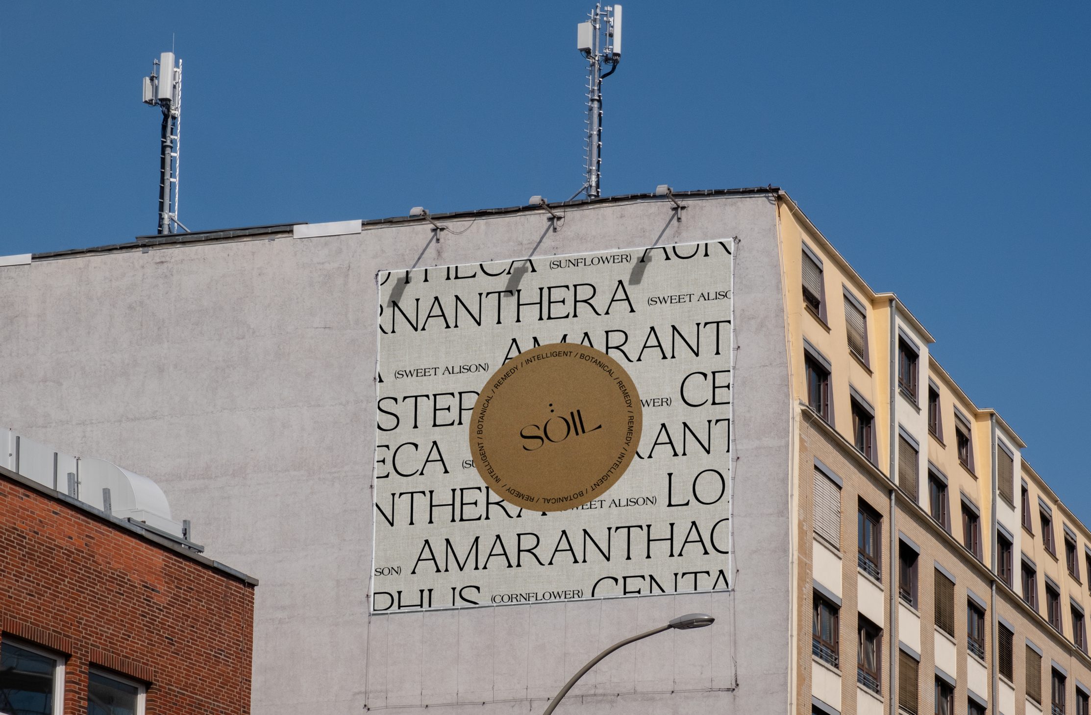
SOÏL stands for conscious consumption; a cosmetic brand with no blanket solutions, paying homage to the interplay between contemporary and historical skincare techniques. SOÏL believes that the causes of skin problems are individual and require tailor-made solutions, specific for each individual.
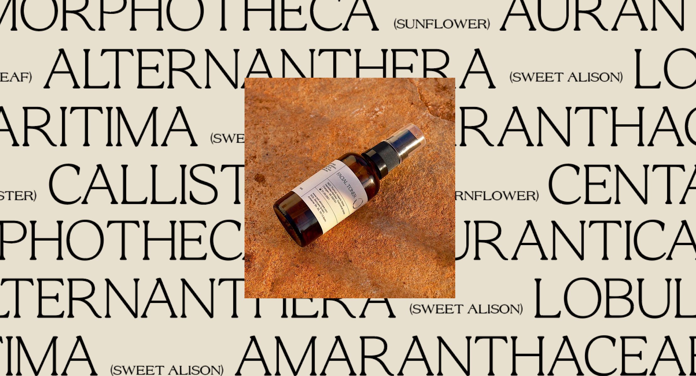
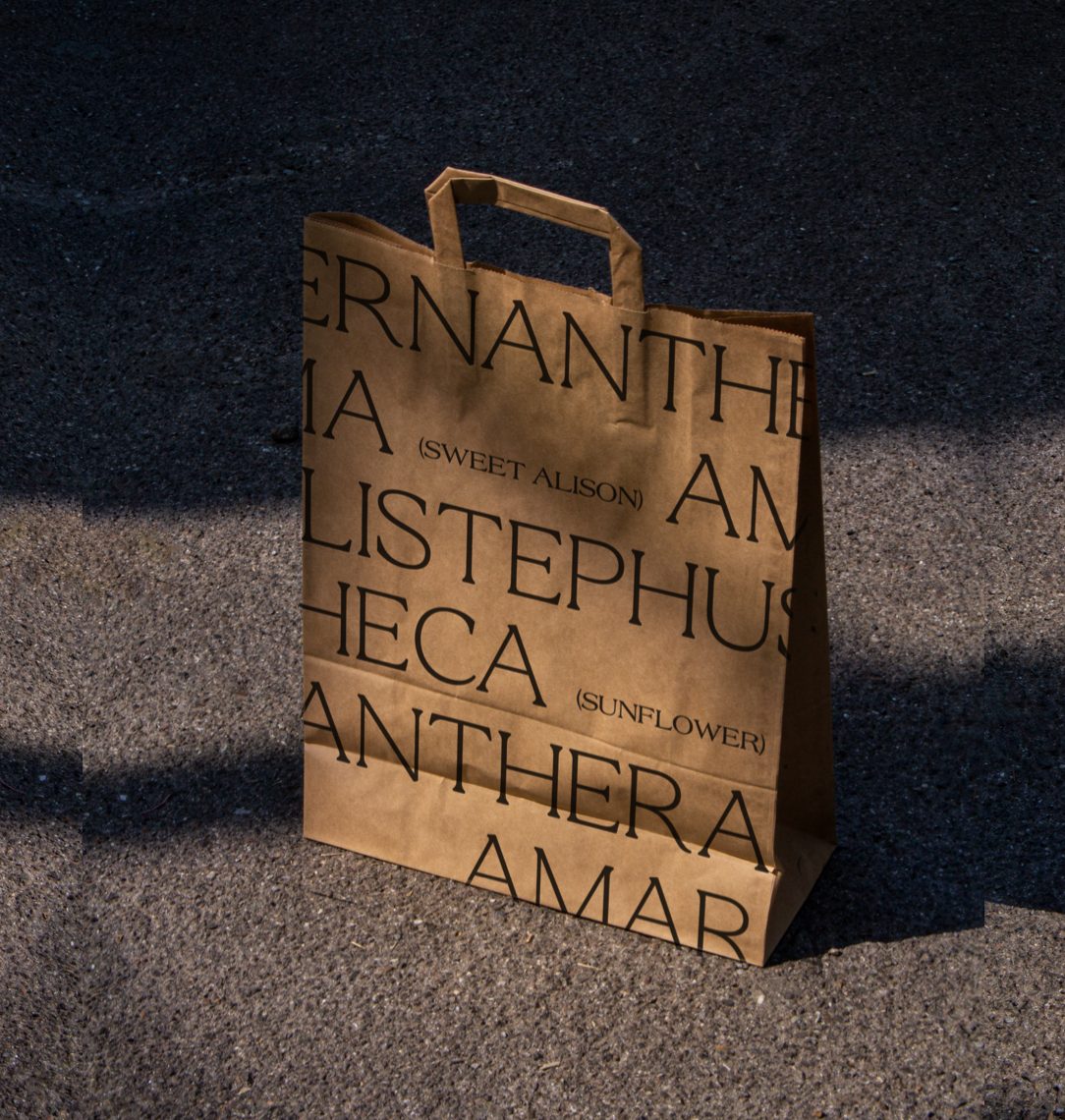
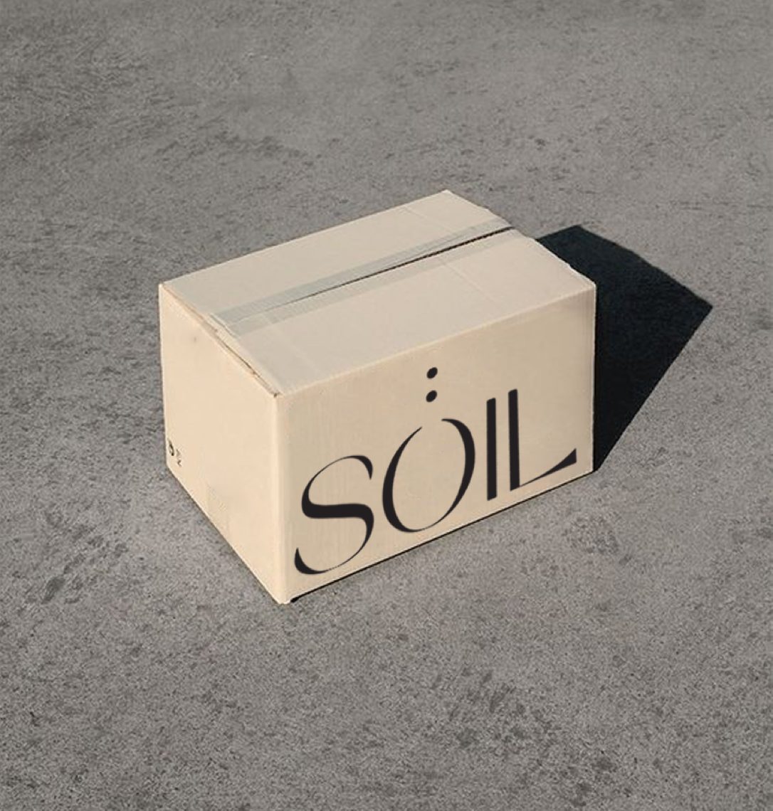
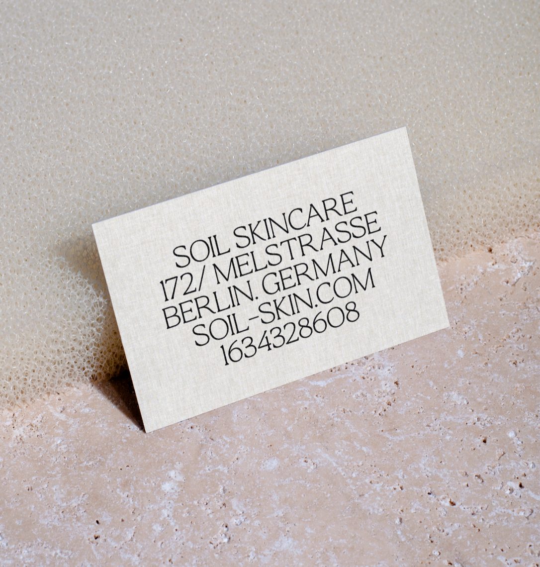
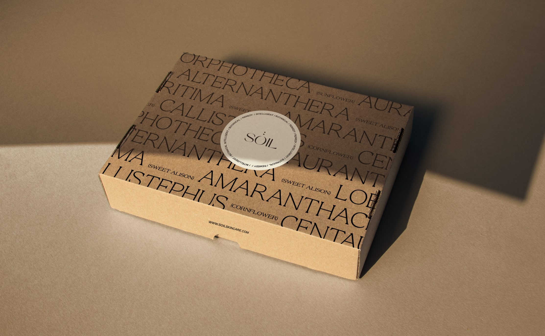
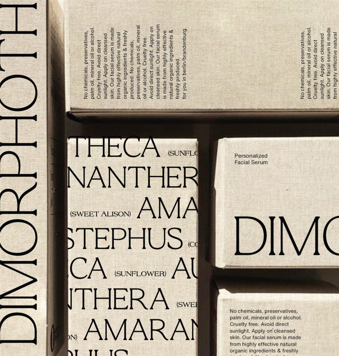
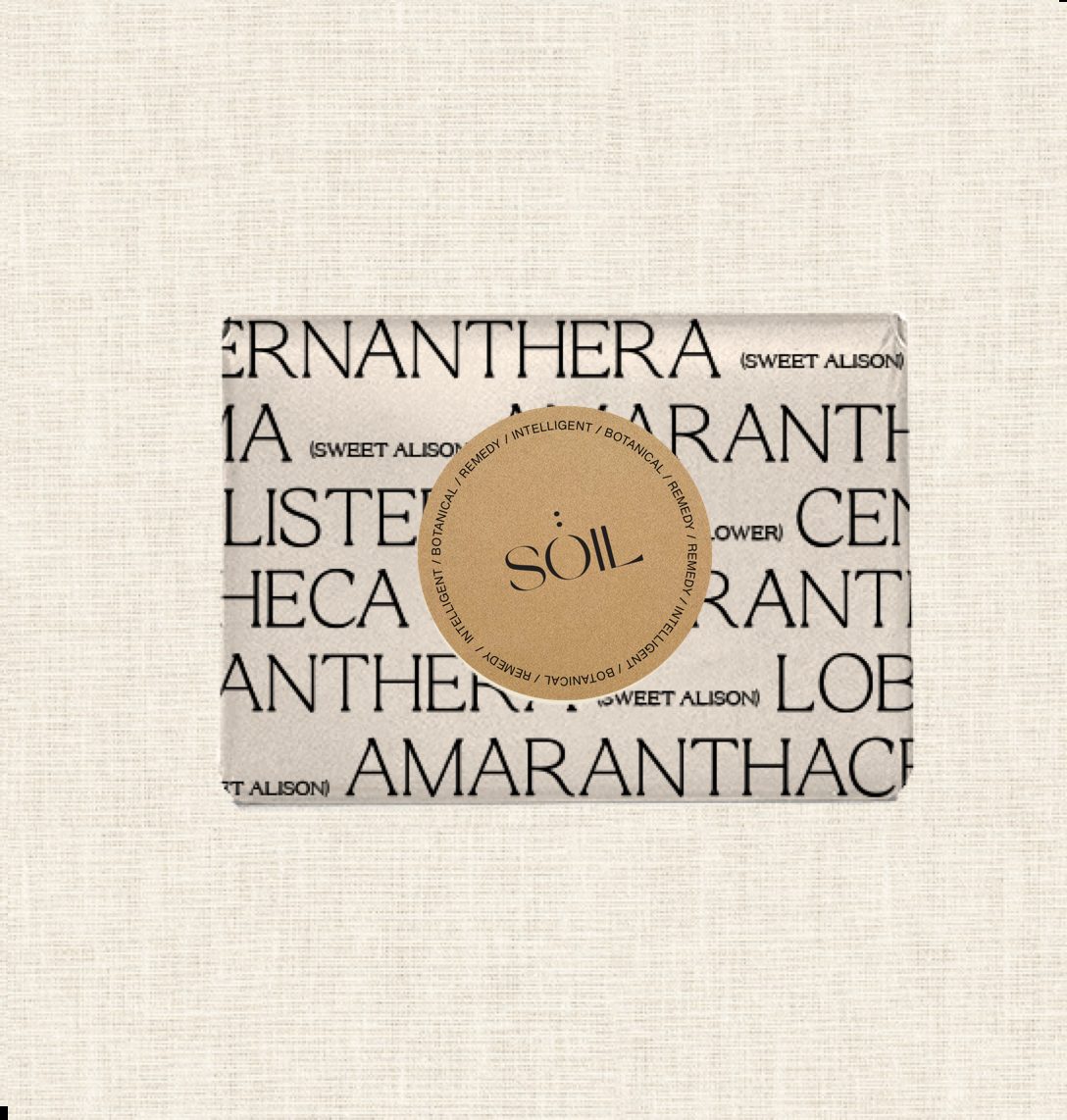
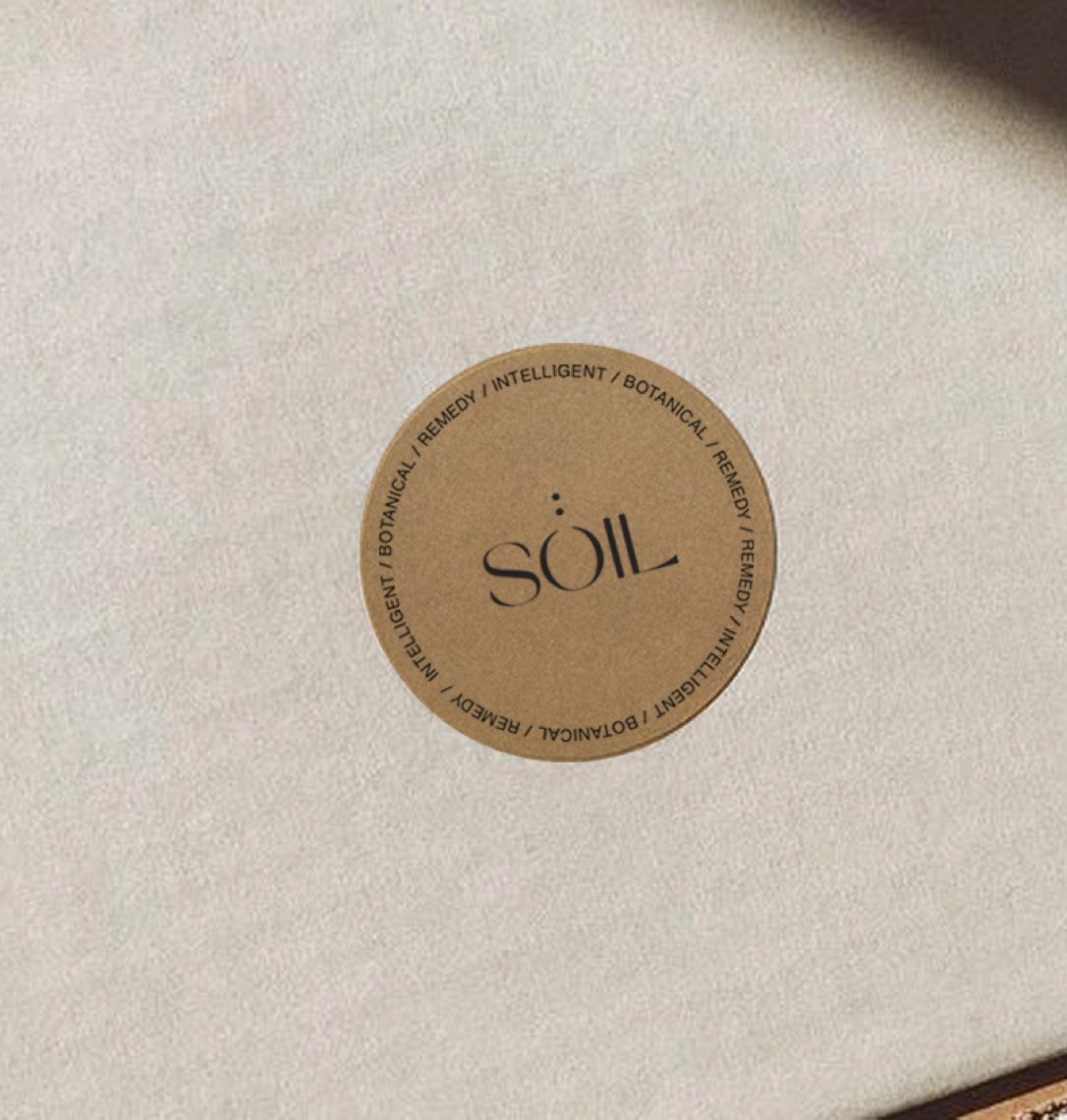
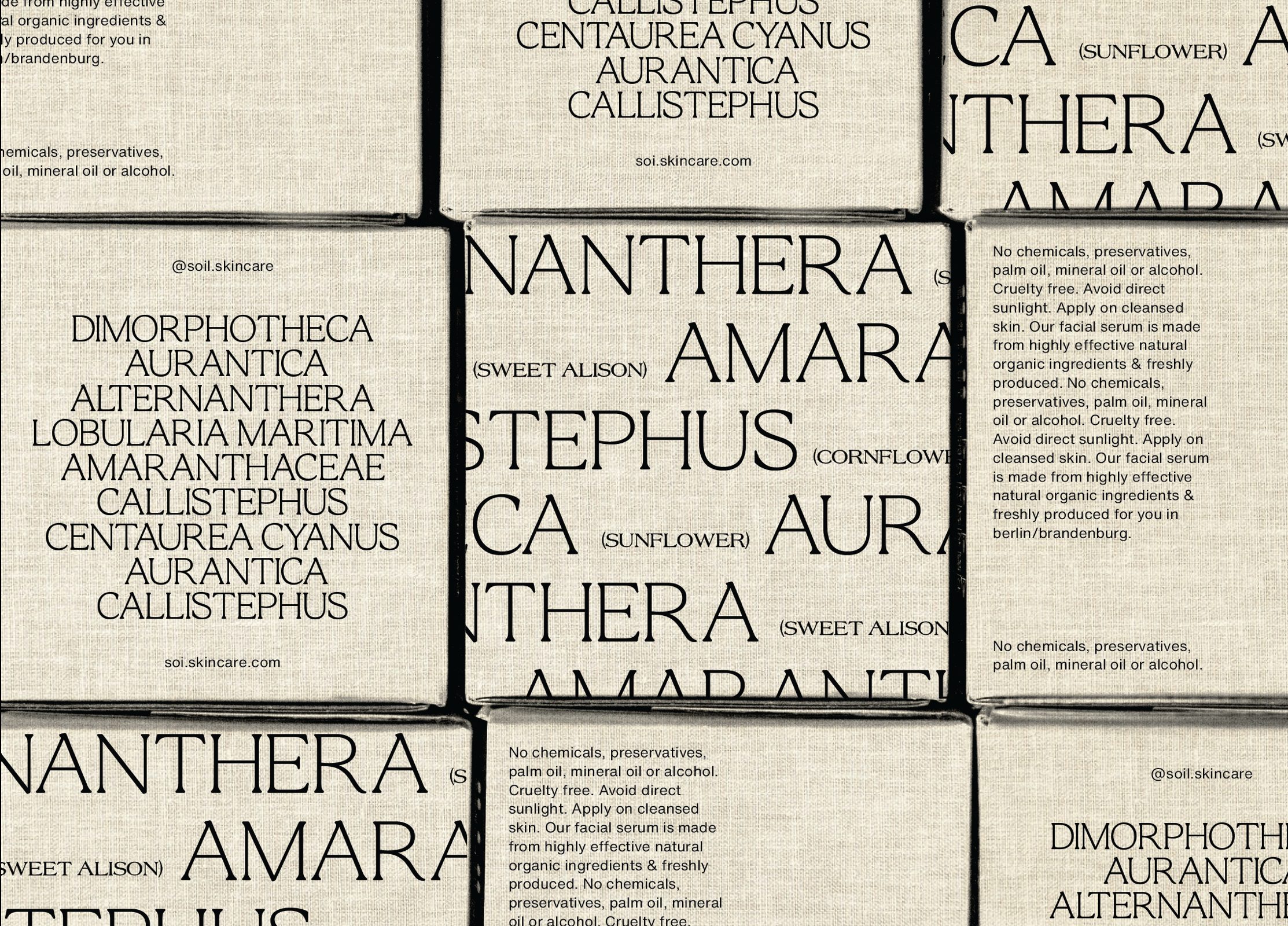
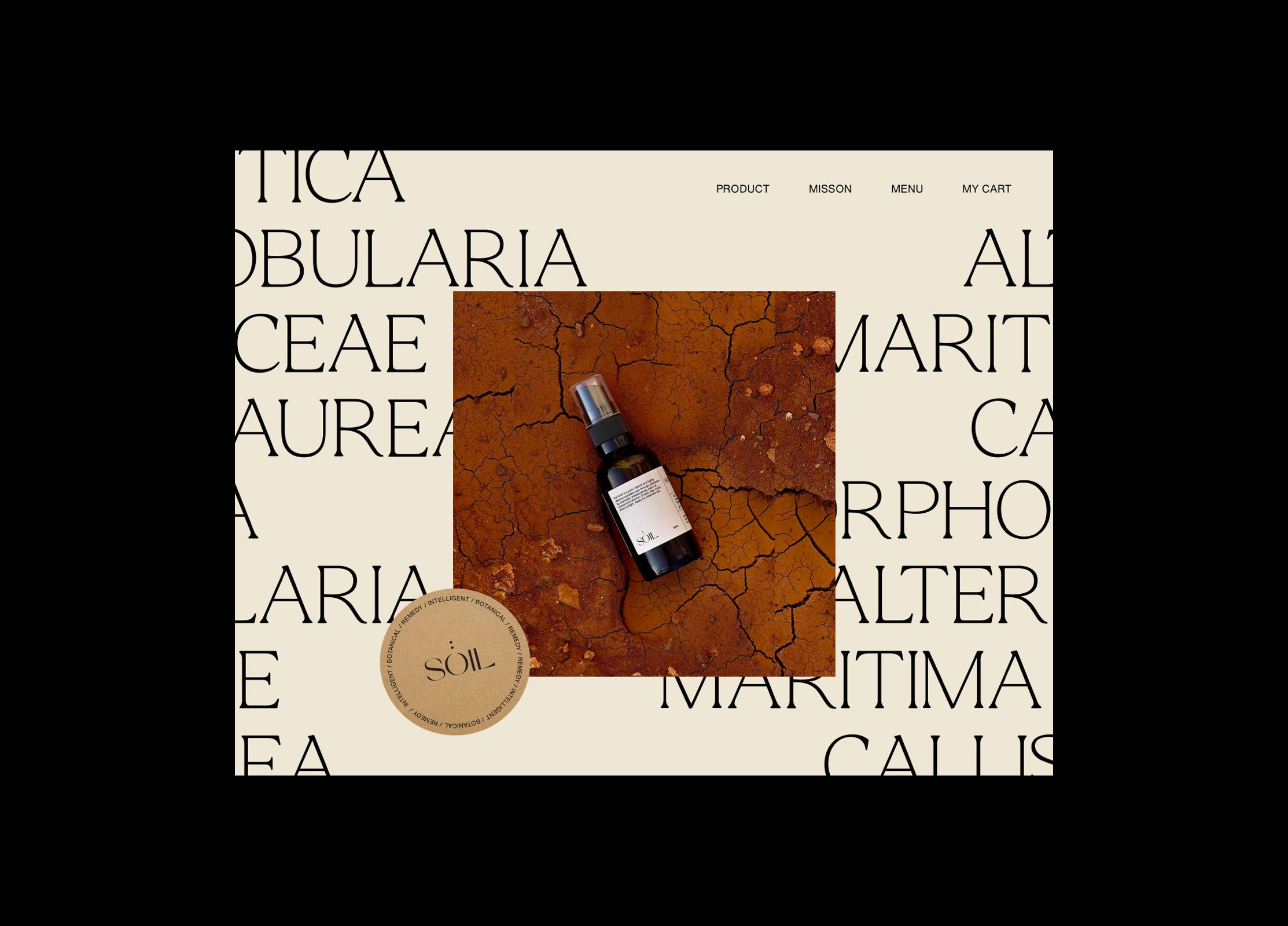
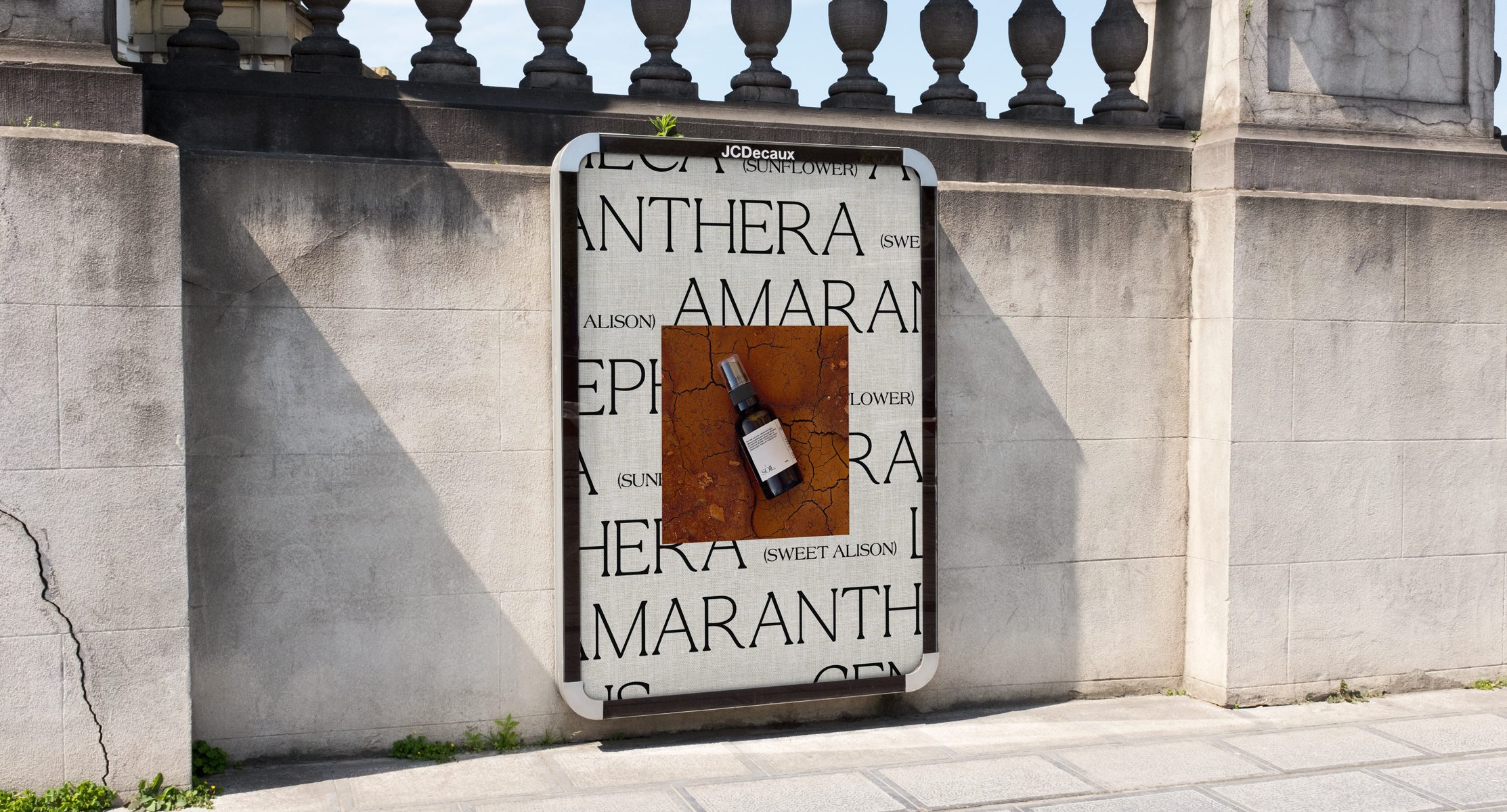
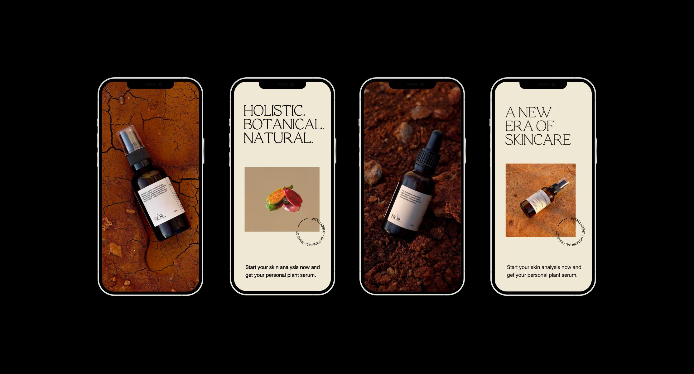
At the core of the identity is a bespoke serif wordmark. The construction of this wordmark was inspired by a number of different typefaces. This ideology is distinctly reflected in the brand’s identity and packaging design, aiming to feel as open and transparent as possible. We focussed on producing a graphic language inspired by the brand’s history through the use of simple and repetitive typography, negative space and delicate use of canvas material for an extra layer of sophistication.
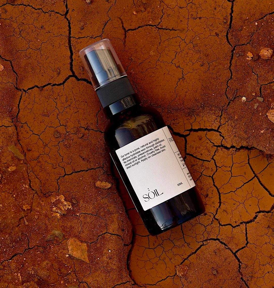
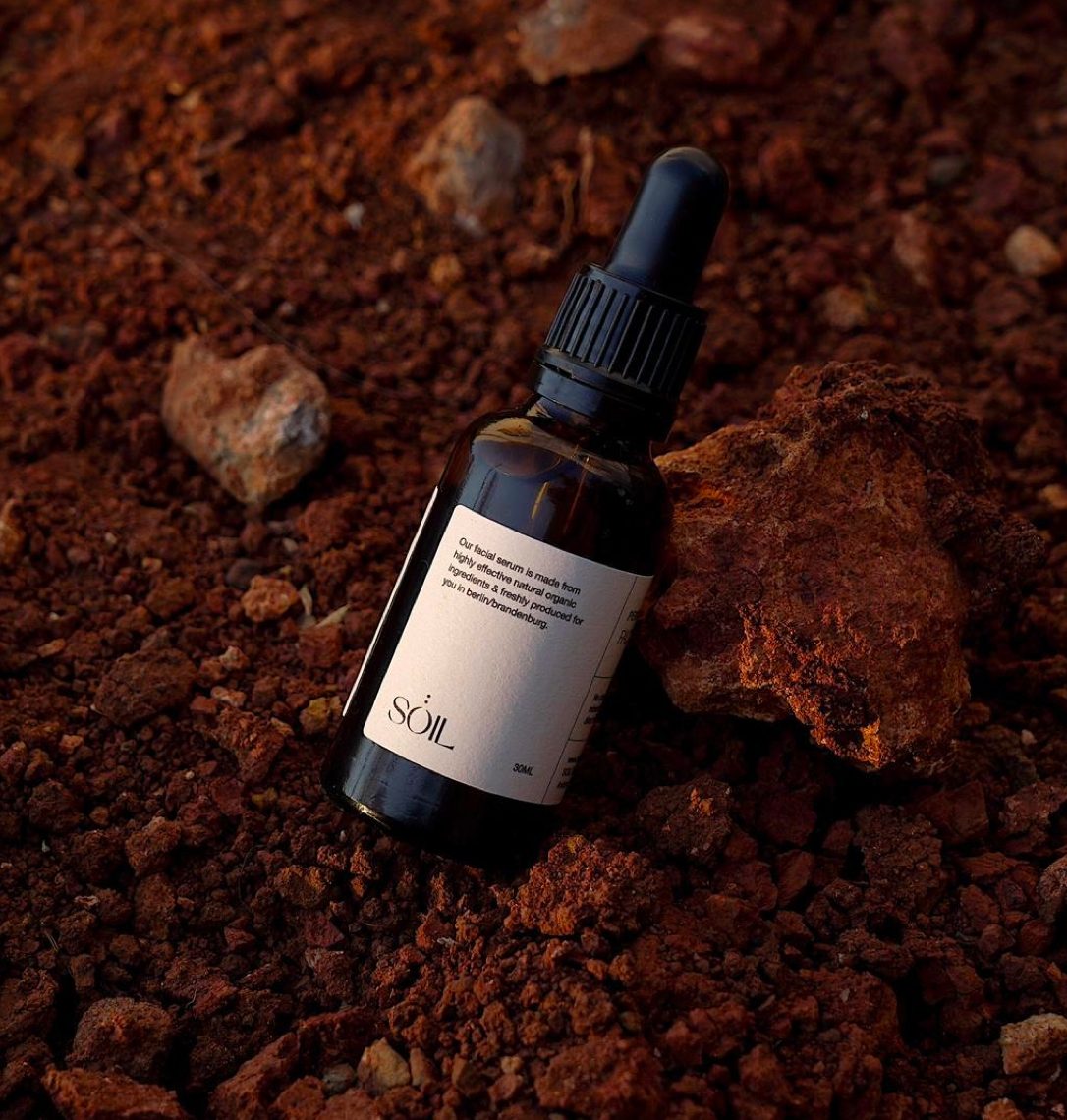
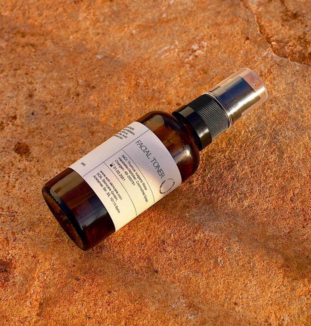
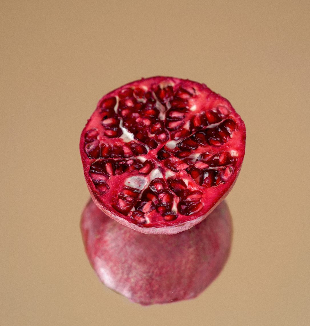
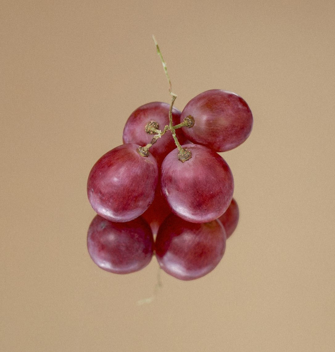
Echoing the natural tone of voice that the brand exudes, the subsequent art direction across the identity is in keeping with this mindful and artistic endeavor, making a direct correlation between natural textures of the earth and the brand ethos.
Location: Berlin, Germany
Photographer & Photography Art Director: Leonor Von Salisch - @xoberlin.de